
Wayfinding Signage Design: A Practical Guide for UK Venues
You arrive at a large hospital for a first appointment. The overhead signs identify departments, but the entrance you need is hidden behind glazing. At the first junction, the arrow points towards a corridor with no visible confirmation cue. If you're blind or have low vision, the route may end at a reception desk, not because you lack independence, but because the wayfinding signage design treats navigation as a collection of signs rather than a connected journey.
For UK estates teams, transport operators, universities and venue managers, that distinction matters. The Equality Act 2010 and UK accessible wayfinding requirements make accessibility a design and operational responsibility. BS 8300, Approved Document M and related sign standards provide the framework, but compliance alone doesn't guarantee that a visitor can find a ward, platform, room or exit without assistance.
What Wayfinding Signage Design Actually Has to Do
Effective wayfinding signage design has four jobs. It must satisfy the relevant UK standards, appear where people make decisions, support blind and low-vision visitors across the full route, and adapt when the building changes. A sign that looks polished but arrives after the turning point has failed. A tactile room sign that can't be found from the corridor has also failed, even if its lettering is technically correct.
The Equality Act 2010 places a duty on service providers and building managers to make reasonable adjustments for disabled visitors. That duty is broader than adding Braille to a door. It requires operators to consider how people enter, interpret information, choose a route, recover from an error and reach the final destination. BS 8300-2:2018 is widely used as a benchmark for accessible signage, including height, contrast, tactile lettering and Braille, as explained in this UK signage compliance guide.
Treat the route as the product
Start with the visitor's journey, not the sign schedule. Map the approach from the pavement, car park, bus stop, station entrance or drop-off area. Then identify the sequence of entrances, reception points, lifts, stairs, corridors, junctions and destination doors. Each transition needs a cue that answers three questions: Where am I? Where do I go? How do I know I'm still on the right route?
This is why room identification deserves the same discipline as directional signage. A consistent system for design and install room signs can help establish predictable locations, but the room sign still needs to connect to the route that leads visitors there.
Static signs work well for stable information, such as room names, floor identifiers, fire-safety information and permanent entrances. They can't reliably communicate a lift outage, a ward move, a temporary closure, an event layout or a platform change. Digital information can help, but it must complement the permanent system rather than replace it. A screen-only route leaves people behind when they can't see the display, can't interact with it, or arrive after the content changes.
Practical rule: If a visitor has to return to staff because the next decision point has no usable cue, the system is incomplete, regardless of how attractive the sign family looks.
UK Standards That Set the Rules for Legibility and Placement
UK wayfinding signage design is a system-of-systems decision, not a sign schedule in isolation. The Equality Act 2010 creates duties to make reasonable adjustments. BS 8300 gives widely used guidance for accessible built-environment design, and Approved Document M is a key reference for access to and use of buildings. Healthcare estates teams must also check relevant NHS technical guidance, including HTM 65 where healthcare signage and associated fittings apply.
The applicable specification depends on the building, the message and the sign's role in the journey. East Sussex building-control guidance gives practical placement advice: general wayfinding signs should be fixed consistently, ideally at eye level between 1.4m and 1.6m above floor level. Tactile signs should be between 1.4m and 1.7m high and approximately 0.5m from the wall or surface they identify. Review the East Sussex guidance note on wayfinding and signs before approving drawings for manufacture.
Specify measurable performance
Contrast requires measurement, not visual judgement. UK guidance cited in industry summaries points to a minimum 70% luminance contrast between text and background. Other UK summaries describe a 30-point Light Reflectance Value difference as the technical benchmark associated with BS 8300-2:2018. These are different assessment approaches. An access consultant should confirm which calculation and criterion apply to each sign type and project.
Specify matte or otherwise non-reflective finishes. Glossy laminates can produce glare under artificial lighting, reducing the practical benefit of strong contrast. Colour must not carry the navigation message alone. People with low vision or colour-vision deficiency may not distinguish the intended route.
| Element | Requirement | Standard reference |
|---|---|---|
| Luminance contrast | Specify and verify contrast using the project's adopted assessment method | BS 8300 and UK accessible-signage guidance |
| General sign location | Keep signs consistent and within predictable eye-level zones | Approved Document M and local building-control guidance |
| Tactile sign height | Use the applicable tactile mounting zone, with East Sussex guidance placing tactile signs between 1.4m and 1.7m | East Sussex building-control guidance |
| Finish | Prefer matte, non-reflective surfaces where glare could affect reading | UK accessible-signage practice |
| Symbol consistency | Use recognised symbols and a controlled visual language | BS EN ISO 7010 and related sign guidance |
Road signage introduces a separate compliance layer. The current Traffic Signs Regulations and General Directions came into force on 22 April 2016. BS EN ISO 7010 supports consistent symbols, while BS 5499 addresses fire-safety sign selection and maintenance. Record the applicable reference for each sign category instead of applying one specification to every message.
The Equality Act 2010 requirements for accessible navigation provide a concise explanation of the statutory baseline. Operationally, the schedule should record contrast, mounting, tactile content, illumination and maintenance for every sign family. That record gives estates and venue teams something they can inspect, approve and maintain after installation.
Auditing Sightlines and Placing Signs at Decision Points
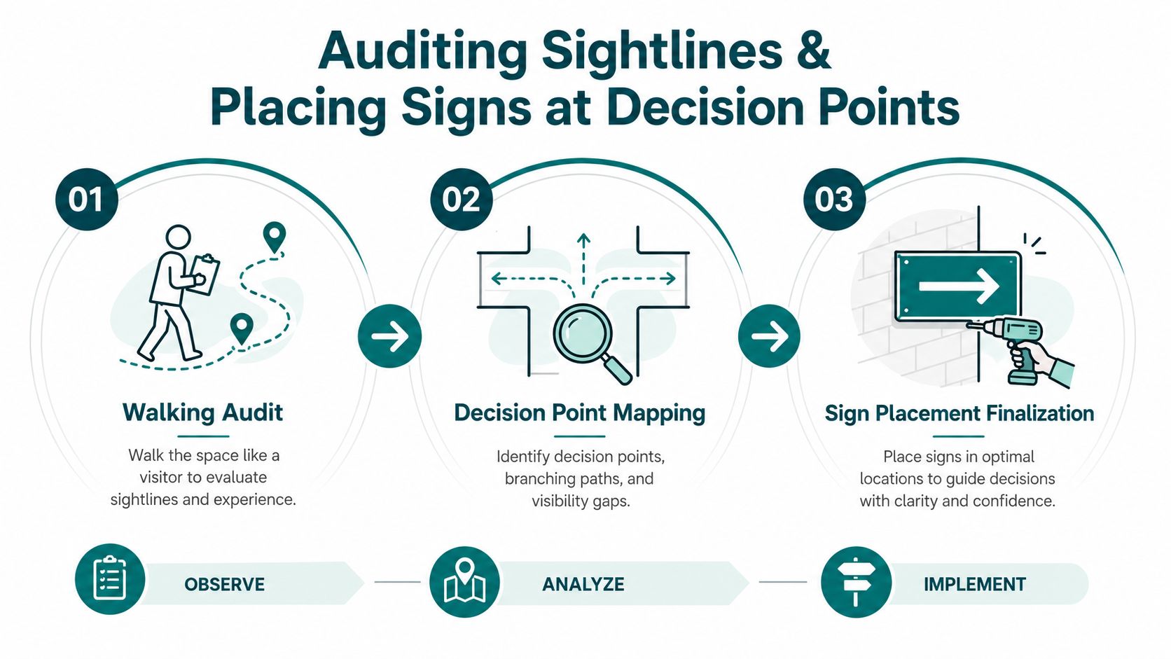
A reliable sign plan starts with a walking audit. Don't place signs where a wall happens to be available. Place them where a person must choose, interpret the environment or confirm that they're still travelling correctly.
Audit the route as people experience it
Walk at a normal pace, then repeat the route from a wheelchair eye-line. Photograph each junction and record the destinations that are invisible from the approach. Note glare, reflections, columns, planting, furniture, suspended lights, open doors and temporary displays. A plan view won't reveal that an otherwise well-positioned blade disappears behind a reception queue.
The next step is decision-point mapping. Classify the cues according to their job:
- Approach signs give information before a turn, allowing the visitor to prepare.
- Decision signs sit at the junction and identify the available routes.
- Confirmation signs appear after the turn and reassure the visitor that the choice was correct.
- Waymarkers support long corridors, repeated doors and areas where a missed cue would create uncertainty.
Teams can use floor mapping software for wayfinding planning to create a shared route record, but the map must be validated in the building. The drawing is a coordination tool, not proof that a visitor can find their way through the space.
Verify with real users
Re-walk every route with a low-vision volunteer and, where possible, people with different mobility and communication needs. Ask the tester to explain what they believe each sign means before moving on. Record hesitation and wrong turns, not just whether they eventually reached the destination.
Common audit failures include signs hidden behind glazing, blocked by hanging lights, positioned perpendicular to the direction of travel or mounted too far above the viewer's natural sightline. A sign can be visible from a reception desk and still be useless from the corridor where the decision occurs.
Designing for Blind and Low-Vision Visitors on the Full Route
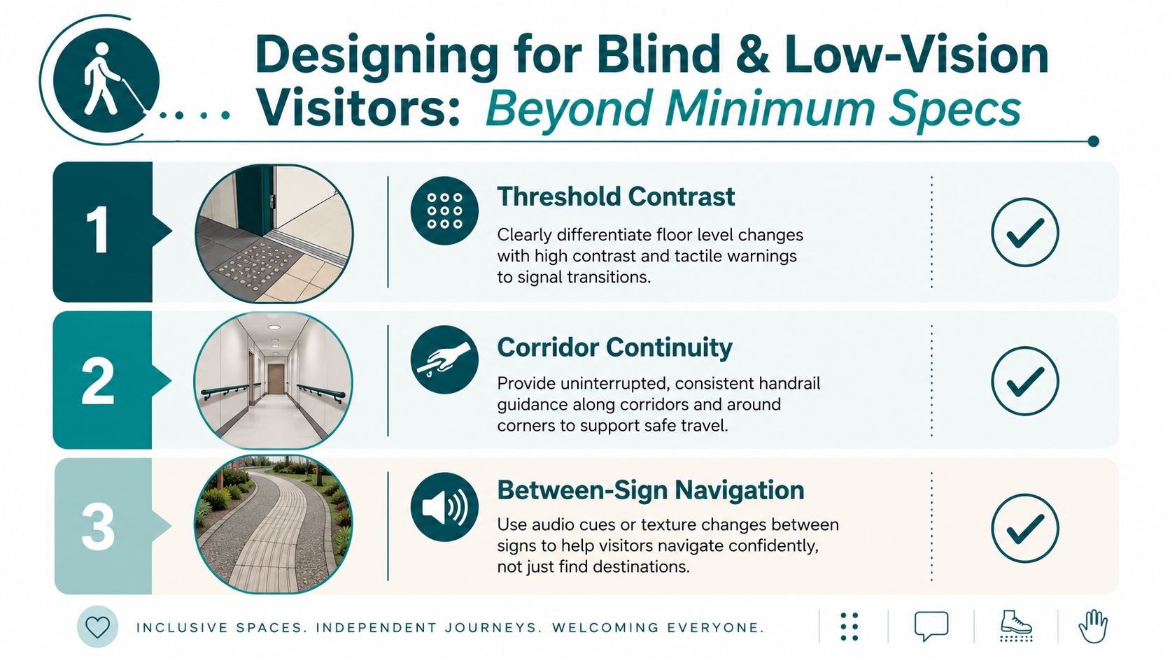
Meeting minimum specifications for contrast, character size and Braille doesn't automatically create an accessible route. Blind and partially sighted visitors often lose their reference frame between signs, particularly at thresholds, corridor junctions, lifts and entrances that look similar.
Build continuity between fixed cues
A continuous path of travel combines several cues. Tactile guidance paths can support orientation, with blister tactile surfaces used for guidance and corduroy surfaces used to communicate hazards or changes in level where appropriate. Audible beacons can identify important decision points, but their placement and message need careful coordination so they don't create competing sounds.
Use the same destination language across the system. If one sign says “Outpatients”, another says “Clinic Reception” and the appointment information uses a third term, visitors can't chain the instructions confidently. Keep messages short, use sentence case and left-align text. One sign should communicate one primary decision. These choices also support cognitive accessibility under BS 8300.
Pictograms should be large enough to identify quickly, with guidance in the brief calling for a minimum 150mm pictogram height. Sign planes need adequate lighting, with the referenced UK practice specifying 40 lux minimum task lighting on signage planes. Matte finishes reduce reflections that can erase contrast under artificial light.
Connect pre-visit information to the building
A visitor may need accessible directions before arriving. Pre-visit information should use the same entrances, landmarks and destination names as the on-site system. If the web page describes a “north entrance” but the building uses “main entrance”, that mismatch adds friction before the person reaches the first sign.
Braille and raised lettering remain important for room identification and close-range confirmation, but they don't tell someone how to get from the pavement to the correct corridor. Estates teams should agree the full route with their local authority sensory impairment team before procurement, not after installation. The guidance on support for visually impaired people reinforces why sign properties must be considered alongside the wider navigation experience.
A short video can help teams review the difference between sign compliance and route continuity:
When Static Signage Stops Working and a Digital Layer Helps
A visitor arrives to find the usual hospital route closed, the clinic moved, or a platform changed. The fixed sign still points confidently toward the old destination. That failure is not solved by better typography alone. Wayfinding signage design must work as a system of permanent cues, operational updates and accessible support.
Static signage performs well when information remains stable. It provides durable room identification, permanent safety messages and tactile information without relying on a battery, network or personal device. It also gives visitors a shared visual reference.
Its limits become clear when the environment changes faster than signs can be replaced. Hospitals close routes, campuses rename rooms, venues alter event layouts and transport operators change platforms. Reprinting blades or adding temporary notices can produce inconsistent wording, visual clutter and extra maintenance.
| Capability | Static signage | Digital layer |
|---|---|---|
| Content updates | Requires physical replacement or an additional temporary notice | Can be amended centrally when destination data changes |
| Multilingual information | Needs planned fixed content or multiple signs | Can present selectable language options |
| Incident rerouting | Relies on temporary signs and staff intervention | Can communicate revised routes when connected to current operational information |
| Tactile access | Suited to permanent room and facility identification | Cannot replace tactile information at the point of use |
| Maintenance | Requires physical inspection, cleaning and replacement | Requires content ownership, device support and service monitoring |
The NHS outpatient context shows why route performance matters. Around 6.9 million outpatient hospital appointments are missed each year in the UK, with an average cost of £108 per appointment, implying a direct annual system cost of roughly £745 million, as summarised in this UK guide to wayfinding signage. Poor wayfinding is one fixable contributor among several, especially in large hospitals where unclear destinations and confusing routes can delay arrival.
A digital layer earns its place when an operator manages frequent changes, complex routes, multilingual audiences or a large estate that is costly to update physically. Teams considering this approach can review dynamic digital signage solutions.
Digital must remain one channel within the system. A screen that is inaccessible, out of service or dependent on visitors finding the correct interface does not meet the practical purpose of reasonable adjustment. Static signs still carry orientation, room identification and tactile confirmation across the route.
Digital should absorb change. Permanent signage should preserve orientation. Neither layer works well when the other is neglected.
Assign content ownership and maintenance responsibility before installation. A dead kiosk, outdated map or unstaffed support channel can turn a capital project into another obstruction.
A Practical Rollout Plan for Estates and Venue Teams
A rollout should produce evidence at every phase. The responsible owner, deliverable and verification method need to be clear before procurement begins. For NHS estates teams, that discipline helps separate accessibility work from a purely cosmetic refresh. For venue managers, it prevents new signs from inheriting the same route gaps as the old system.
Four phases for controlled delivery
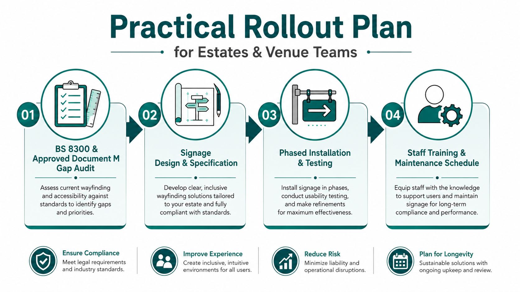
Phase one, audit the current system. Review the building against BS 8300 and Approved Document M. Measure contrast, check mounting heights, inspect sightlines at every decision point, verify tactile sign placement and record lighting or glare problems. The deliverable is an annotated route and sign register, signed off by the estates or facilities lead with accessibility input.
Phase two, standardise the sign family. Define the typeface, colour palette, module dimensions, arrow geometry, pictogram treatment, tactile specification and fixing method. The brief identifies FS Me, Arial or Helvetica as suitable typeface options. Choose one system and document it so a new ward, platform, room or tenant doesn't introduce a conflicting visual language.
Phase three, close the access gaps before procurement. Resolve missing approach, decision and confirmation cues. Add the tactile guidance, audible information or physical route changes identified during testing. Re-check the proposed installation against wheelchair sightlines and the needs of blind and low-vision users.
Phase four, integrate and maintain the digital layer. Add updateable information only after the static foundation passes audit. Assign responsibility for destination data, temporary closures, language content, device monitoring and review after layout changes. The implementation best-practice guidance for accessible navigation is useful when turning the plan into an operational process.
Make sign-off operational
Don't approve a sample sign in a meeting room and assume the estate is compliant. Inspect the installed sign under the actual lighting, from the intended approach and at the relevant viewing distance. Confirm that doors, furniture, cleaning equipment and temporary displays won't obstruct it.
A maintenance schedule should identify who checks signs, who removes obsolete information and who approves changes. The Equality Act 2010 reasonable-adjustment duty belongs to the operating organisation, so the evidence trail should remain with the venue, not only with the designer or fabricator.
FAQs on Wayfinding Signage Design
What is the legal baseline for wayfinding signage design in the UK?
The Equality Act 2010 is the legal baseline, and it requires service providers and building managers to consider reasonable adjustments for disabled visitors. BS 8300 and Approved Document M provide recognised design references for accessible signage, while the relevant fire, road and healthcare standards apply to specific sign categories.
What contrast should accessible wayfinding signs use?
UK guidance cited in the brief points to a minimum 70% luminance contrast between text and background, while a 30-point Light Reflectance Value difference is frequently used in UK summaries as the measurable contrast benchmark associated with BS 8300-2:2018. Confirm the applicable calculation with the project access consultant and record the result in the sign schedule. See the accessible-signage requirements guidance for practical considerations on glare, placement and testing.
How high should wayfinding signs be mounted?
East Sussex building-control guidance places general wayfinding signs ideally between 1.4m and 1.6m above floor level. It places tactile signs between 1.4m and 1.7m, approximately 0.5m from the wall or surface identified. Use one consistent mounting logic across the building and verify it in the completed environment.
Are Braille signs enough for blind visitors?
No. Braille and raised characters support close-range identification, but they don't provide a complete route from the entrance to the destination. Blind and low-vision visitors also need predictable decision-point cues, consistent destination language and, where appropriate, tactile, audible or digital support between signs.
When does a digital wayfinding layer make sense?
A digital layer makes sense when destinations, routes, languages or operating conditions change frequently. It can support revised information more quickly than replacing physical signs, but it must complement permanent accessible signage and have a named owner for content and maintenance.
How should hospitals and venues handle multilingual wayfinding?
Use concise destination names, recognised pictograms and a controlled language system across permanent signs. For changing or extensive information, a digital layer can provide language choices without filling corridors with duplicate messages, but operators must keep the core route understandable without requiring a screen.
What should a UK estates team audit first?
Start with a walking audit of every visitor route, from the arrival point to the final room, platform or facility. Record decision points, missing confirmation cues, contrast, glare, mounting height, tactile placement, lighting and obstructions, then validate the route with people who have relevant access needs before commissioning new signs.
Waymap offers an updateable navigation layer for indoor, outdoor and underground environments, using smartphone motion sensors and detailed maps to guide visitors to precise doors, platforms and points of interest without GPS, Wi-Fi or installed hardware. Visit Waymap to see how dynamic, hands-free guidance can work alongside a standards-led wayfinding signage design system.
