
Create a Train Station Floor Plan for Digital Wayfinding

Primary keyword: train station floor plan
Semantic variants: railway station floor plan, station layout plan, digital wayfinding map, station accessibility mapping, indoor station navigation
Meta description: Learn how to turn a train station floor plan into a digital wayfinding map that supports accessibility, operational updates, and reliable indoor station navigation.
You're probably dealing with one of two realities right now. Either your train station floor plan exists as a set of PDFs, CAD files, and marked-up survey drawings that different teams interpret differently, or you've already digitised part of the estate and discovered that a clean drawing still doesn't answer operational questions from passengers, accessibility teams, and station managers.
That gap matters. A station isn't just a building with platforms. It's a live operational environment where route choice, barriers, lifts, retail changes, closed entrances, platform access rules, and crowd behaviour all affect whether people can get where they need to go.
At Waymap, we look at station mapping from the navigation end, not just the design end. A useful station plan has to do more than show walls and doors. It has to support decisions, route guidance, and accessibility in practice. That means treating the floor plan as a structured, updateable data layer, not a finished drawing.
Why Your Static Train Station Floor Plan Is No Longer Fit for Purpose
A static drawing can still satisfy an architectural record. It can't run a station.
The problem becomes obvious at scale. London Liverpool Street station handles 260,000 daily passengers, a volume that makes static signage and traditional floor plans operationally inadequate for managing complex circulation across multiple concourses and platforms without creating congestion, according to CrossCountry's station facts overview. At that level of throughput, the floor plan is no longer a reference document. It's part of operations.
Most station plans fail because they describe geometry but not use. They show the ticket hall, gateline, stairs, lifts, and platforms, but they don't tell you which route remains usable during disruption, which entrance is best for step-free travel, or how a blind passenger should move from street to platform without relying on visual cues.
What static plans miss in daily operation
A PDF doesn't answer questions like these:
- Access choice: Which entrance gives the shortest step-free route to the correct platform?
- Temporary conditions: What happens when one lift is unavailable or a corridor is partially closed?
- Route logic: Can a passenger move from the concourse to the platform without crossing an operational pinch point?
- Passenger understanding: Does the layout support people who can't rely on overhead signs alone?
That's why many operators are now treating station plans the same way estates teams treat live asset data. The map has to be queryable, maintainable, and connected to operational reality. For teams reviewing broader estates workflows, SaberTask's FMS recommendations are a useful reference point because they reflect the wider shift from static documentation to live facility information.
A station drawing becomes valuable when operations, accessibility, and passenger information teams can all use the same underlying map.
Why this change is urgent
The pressure isn't only about crowding. It's also about digital expectation. Passengers already expect clear indoor guidance, and accessibility teams need something more useful than a wall-mounted schematic. The old assumption that signage plus a printed layout is enough has broken down.
That's especially clear indoors and underground, where Google Maps indoors still leaves important gaps for exact indoor guidance in complex venues. In stations, the physical plan has to work harder because GPS often doesn't.
If your current railway station floor plan can't support route calculation, accessibility queries, and fast updates, it isn't finished. It's only the starting material.
How to Survey and Capture Data for Accessibility
A digital map is only as good as the survey behind it. If the survey team captures walls and doors but misses tactile paving, ramp transitions, lift thresholds, and surface defects, the final map will look complete and still fail users.
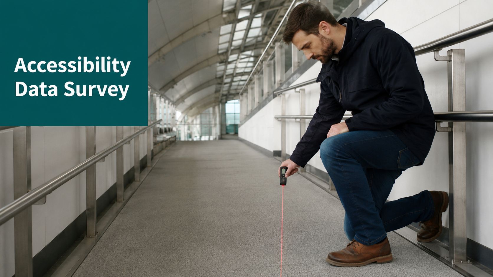
Start with passenger-critical routes
Don't survey the building in arbitrary blocks. Survey it by journeys first.
The most important routes usually include entrance to gateline, gateline to platform, platform to accessible toilet, platform interchange, and station to onward transport. If those paths are accurate, the map becomes useful quickly. If they aren't, the rest of the detail won't rescue it.
Capture each route in both directions. In stations, a route that works outbound often behaves differently inbound because of fare barriers, one-way flows, or platform access controls.
Record the features that standard drawings often ignore
A conventional station layout plan often under-specifies accessibility details. The survey has to correct that.
Focus on:
- Surface condition: note level changes, worn edges, drainage issues, and local defects.
- Vertical circulation: identify whether the connector is stairs, escalator, ramp, or lift, and whether alternatives exist nearby.
- Tactile features: record tactile paving, warning surfaces, and changes in underfoot texture.
- Decision points: mark places where a passenger must choose between two or more paths.
- Assistance assets: hearing loops, help points, seating, accessible toilets, and quiet spaces should be mapped as usable destinations, not background detail.
Network Rail's design standards mandate that floor walking surface irregularities must not exceed 5 mm, a benchmark that matters both for trip prevention and for step-based navigation accuracy, as set out in the Design Standards for Accessible Railway Stations.
Practical rule: If a survey would matter to a blind passenger, a wheelchair user, or a parent with luggage, it belongs in the data model.
Use more than one capture method
No single tool is enough in a busy station. Good teams combine measured drawings, on-site walk validation, and spatial capture.
A practical mix often includes:
| Survey need | Best approach | Why it matters |
|---|---|---|
| Base geometry | Existing CAD and measured checks | Speeds up map creation while catching legacy errors |
| Floor detail | On-site inspection | Finds thresholds, clutter, and usable width issues |
| Complex interiors | 3D LiDAR scanning for indoor mapping | Helps resolve irregular spaces and retrofit complexity |
| Route truthing | Staff walk-throughs | Confirms the map reflects actual passenger movement |
Capture what changes frequently
Retail units change. Temporary barriers move. Queue systems appear and disappear. Staff often know these friction points better than the original drawing set does.
So build a survey process that separates fixed fabric from operationally variable elements. That distinction saves time later because you won't need to redraw the whole station every time an operator changes a queuing line or relocates a ticket machine.
A strong accessibility survey doesn't just describe the station. It describes how the station is experienced.
What Are the Drawing Conventions for a Digital Wayfinding Map
Once the survey is complete, the next failure point is structure. Many mapping projects lose value here because they create a visually tidy file that machines can't reason over properly.
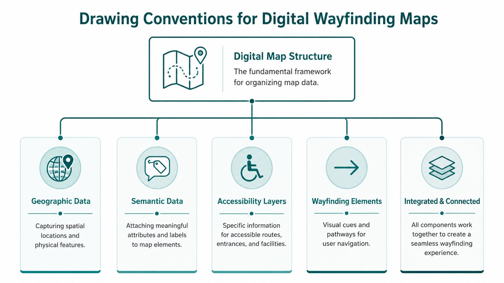
A usable digital wayfinding map needs rules. Not artistic style. Rules.
Build a clear spatial hierarchy
The map should define spaces in layers. That means station, level, zone, room or area, pathway, and point of interest. If you skip the hierarchy, route instructions become vague because the system can't distinguish between being on a platform, inside a waiting area, or at a specific doorway.
A simple hierarchy might look like this:
- Station level: whole site identity
- Floor or sub-surface level: concourse, mezzanine, street, platform level
- Zones: gateline east, retail arcade, platform access core
- Path segments: corridors, ramps, lift connectors, stairs
- Points of interest: ticket machines, toilets, exits, help points
This is what allows the map to answer questions in operational language rather than architectural language.
Tag by function, not just by name
Too many station maps label an object but don't classify it. “Room 1.14” isn't useful to a passenger or a routing engine. “Accessible toilet” is.
Each object needs semantic tagging that tells the system what it is, how it's used, and whether it affects accessibility. Teams exploring browser-friendly structures often find mapping in HTML useful as a way to think about content, hierarchy, and machine readability together.
The best station maps don't just say where something is. They say what it does, who can use it, and how it connects to everything else.
Define pathway behaviour explicitly
A route segment isn't just a line between two points. It has properties.
Some pathways are step-free. Some are staff-only. Some depend on time of day, fare control, or lift availability. If the data model doesn't store that logic, the map can draw a route that looks correct and still sends someone the wrong way.
Use structured tags for:
- Access type: public, restricted, staff-only
- Movement type: level, stairs, escalator, lift, ramp
- Accessibility state: step-free, partially accessible, inaccessible
- Directionality: bidirectional or one-way
- Conditional use: event mode, disruption mode, temporary closure
Keep naming conventions boring and consistent
In digital mapping, consistency beats cleverness. A station accessibility mapping project fails quickly if one team uses “Lift A”, another uses “Platform Lift”, and another uses “Elevator North”. Pick one standard and enforce it.
A short example helps:
| Element | Weak convention | Strong convention |
|---|---|---|
| Lift | Main lift | Lift L1 Concourse to Platform 3 |
| Toilet | WC | Accessible Toilet Concourse West |
| Exit | Side door | Exit E2 Bishopsgate Street |
The point isn't bureaucracy. It's retrieval. Clear naming improves maintenance, route scripting, and user-facing guidance.
A digital train station floor plan should read like structured operational language. If it behaves like a pretty drawing, it won't support wayfinding for long.
How to Convert Blueprints into Actionable Digital Formats
Most operators already have some form of station drawing archive. The issue isn't whether the information exists. The issue is whether the information can support routing, updates, and accessibility decisions without manual reinterpretation every time.
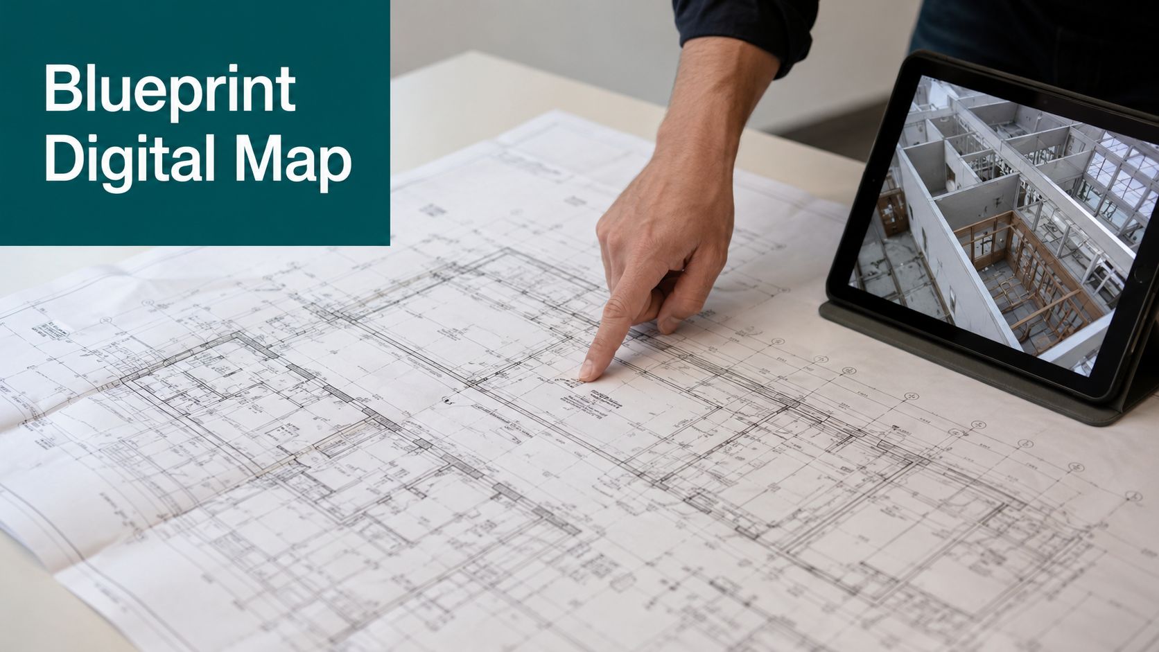
A PDF can be shared. A CAD file can be edited. Neither is automatically an operational map.
Choose a format based on use, not habit
Many projects drift because teams choose a format because the design consultant prefers it, not because the operator needs it.
Formats such as GeoJSON, IndoorGML, and IMDF each have a place. The right choice depends on what the station needs the file to do:
- GeoJSON: flexible and widely understood for geometry plus attributes
- IndoorGML: useful where indoor spatial relationships and navigation logic matter
- IMDF: strong for structured indoor place data in consumer-facing ecosystems
The decision should come down to maintainability, interoperability, and whether the format can store route-relevant properties cleanly.
Convert geometry into logic
The real step isn't file conversion. It's logic conversion.
That means turning blueprint content into:
- connected path networks
- routable vertical connectors
- classified points of interest
- accessibility attributes
- updateable operational states
If you're starting from scans or older paper sets, it helps to first extract clean, structured Markdown from scans and notes so labels, room schedules, and asset references don't remain trapped in images.
A blueprint shows what was designed. A digital wayfinding file needs to show what can be used.
Why the operational case is stronger now
Accessibility challenges persist, as capital works alone do not resolve them. Despite a £500 million investment programme, over 90% of the UK's 2,500+ railway stations still lack full step-free access, as outlined by the House of Commons Library briefing on station accessibility. This is precisely where static plans prove inadequate. While they can document limitations, they do not assist a passenger in maneuvering around them in the moment.
For operators, the friction is practical. Hardware-heavy wayfinding systems create maintenance tasks across a high-footfall estate. Static signage changes slowly. A digital map can be revised as operations change. That's why teams looking at the broader category often start with floor mapping software for accessible navigation.
Avoid these conversion mistakes
A surprising number of station layout projects become unusable because of a few repeatable errors:
- Over-trusting legacy CAD: old files often reflect design intent, not current operation.
- Flattening levels: mezzanines, split concourses, and platform transitions need explicit vertical logic.
- Leaving accessibility in notes: if a feature only appears in a legend or appendix, the routing engine can't use it.
- Treating updates as redraws: the data model should support edits without rebuilding the map from scratch.
A converted file is only actionable when station teams can maintain it without starting a new project every time the building changes.
How Do You Test and Validate a Digital Train Station Floor Plan
A digital map becomes trustworthy only after testing in the physical station. Desktop review catches data errors. It doesn't prove that a real person can follow the route under normal station conditions.
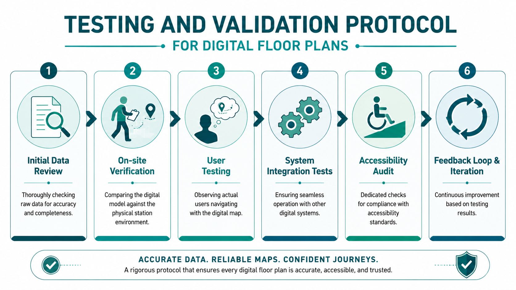
Check logic before you test people
Start with the map model itself. Every point of interest should connect to the correct network. Every lift should serve the levels you claim it serves. Every accessible route should avoid stairs unless explicitly labelled otherwise.
Many hidden failures emerge. A route may be mathematically connected but operationally wrong because a gate line blocks entry from one side, or because a platform link exists only for staff.
Test the journeys that matter most
The best validation plans focus on high-consequence journeys, not random walks.
Use route sets such as:
- Street to platform: including fare control and platform decision points
- Interchange movement: especially where passengers switch levels
- Platform to accessible toilet: a common real-world need that exposes poor tagging quickly
- Exit to onward transport: bus stand, taxi rank, pickup area, or street access
Observe what happens when instructions meet noise, crowding, and local ambiguity. That's where a station accessibility mapping project either earns trust or loses it.
If a route works only when the station is quiet and the user already knows the building, it hasn't been validated.
Validate for accessibility, not just accuracy
A route can be geometrically correct and still unusable. Accessibility testing has to examine instruction timing, decision-point clarity, and whether the guidance reflects the actual experience of moving through the space.
For that reason, validation should include technical review plus lived-user testing. Teams running this process usually combine estates staff, accessibility leads, and dedicated accessibility testing methods for digital navigation.
The standard to aim for isn't just “the line matches the plan”. It's “the person arrives confidently without needing to guess”.
Why precision matters in indoor navigation
In complex stations, indoor guidance has to operate where GPS is unreliable or absent. That's why validation must confirm that the map supports dead reckoning using device-native sensors and that instructions remain dependable at sub-3-metre accuracy in infrastructure-free environments. Those are not abstract technical preferences. They determine whether guidance lands a passenger at the correct platform entrance, gate, or facility.
Testing is where you prove that the digital train station floor plan is no longer a document. It's a working navigation asset.
Integrating Your Plan with Waymap for True Accessibility
Once the map is structured and validated, the remaining question is straightforward. Will it support real navigation without adding hardware and maintenance burden across the estate?
For transport operators, that question usually comes down to cost, resilience, and compliance. Beacon-based systems can work, but they add an asset layer that someone has to install, monitor, replace, and explain to operations teams. In stations with constant passenger flow and frequent layout adjustments, that burden grows quickly.
Why infrastructure-free navigation fits station reality
Waymap is designed around dead reckoning using the phone's native sensors, which means the navigation layer doesn't depend on GPS, Wi-Fi, or installed beacons. In practice, that matters most in signal-poor station environments such as underground corridors, interchanges, and enclosed concourses.
It also changes the update model. When the map is the intelligence layer, operators can revise destinations, access routes, and points of interest without commissioning physical hardware changes. That's a much better fit for stations where operational conditions shift faster than capital programmes.
Named deployments matter more than generic claims
A transport authority doesn't need another abstract promise about “smart stations”. It needs proof that the approach works in public transport environments with scale and complexity.
That's why named deployments matter. WMATA in Washington, D.C. is a relevant example because the network context is familiar to rail operators: multiple stations, varied passenger needs, and a requirement for dependable guidance without installing beacon infrastructure across the estate. The lesson for UK operators is practical. If the map structure is good enough, the navigation layer becomes easier to maintain than hardware-led alternatives.
Connect the map to duties, not just technology
Policy is a critical factor. In the UK, accessibility isn't optional under the Equality Act 2010. Operators need to think not only about station fabric, but also about whether journeys are reasonably usable in practice.
The planning context is shifting as well. The UK's draft National Planning Policy Framework allows for high-density housing development near “well-connected” stations, linking a station's floor plan and its accessibility directly to regional economic and housing strategy, as discussed in LandTech's analysis of well-connected train stations and development. That raises the stakes. Station layout and accessibility are no longer only passenger-experience issues. They affect how stations support growth around them.
A station plan that supports navigation, accessibility, and rapid updates is now part of transport delivery, not just building documentation.
For transport authorities, the operational friction is familiar. Capital budgets are scrutinised. Maintenance teams are stretched. Estates change. A dynamic digital layer works because it reduces dependence on physical wayfinding infrastructure while improving how people use the station that already exists.
Frequently Asked Questions About Train Station Floor Plans
What is a train station floor plan
A train station floor plan is the spatial layout of a station, including entrances, concourses, platforms, vertical circulation, rooms, and passenger routes. For digital wayfinding, it also needs structured data about accessibility, routing logic, and points of interest.
How is a digital train station floor plan different from a PDF drawing
A digital train station floor plan is structured for search, routing, and updates. A PDF mainly shows the layout visually and usually can't support dynamic route guidance or operational changes without manual reinterpretation.
What should be included in a station accessibility mapping survey
A station accessibility mapping survey should include surface condition, step-free routes, lifts, ramps, stairs, tactile paving, accessible toilets, help points, entrances, and decision points. It should also capture route constraints that affect how passengers actually move through the station.
Why do static station layout plans fail for indoor navigation
Static station layout plans fail for indoor navigation because they don't hold route logic, accessibility states, or live operational changes in a form that navigation systems can use. They describe the station, but they don't help a passenger move through it reliably.
Which standards matter when creating a railway station floor plan for accessibility
The main standards and frameworks depend on the project, but UK teams commonly need to account for Network Rail accessibility design standards, BS 8300, PAS 78, BS EN 17210, and the Equality Act 2010. The key point is that accessibility information must be built into the map data, not left in separate documents.
Can a digital wayfinding map work without GPS or beacons
Yes. A digital wayfinding map can work without GPS or beacons when the navigation system uses device-native sensors and a well-structured indoor map. That approach is especially useful in underground or enclosed station environments.
If your organisation is rethinking how a train station floor plan should work in practice, Waymap can help you turn static station drawings into a precise, updateable navigation layer that works indoors, outdoors, and underground without GPS, Wi-Fi, or installed hardware. We work with transport operators and complex venues that need accessibility, operational flexibility, and dependable guidance built into the map from the start.
