
Mapping in HTML: Best Practices for 2026 Accessibility
Meta description: Mapping in HTML still matters, but old methods fall short for accessibility and indoor wayfinding. Learn what works, what fails, and how venues should evaluate modern map options.
By Tom Pey, Founder at Waymap and blind accessibility technologist.
If your venue already has a digital map, a harder question follows. Can people find their way with it, or can they only look at it?
That gap sits at the heart of most discussions about mapping in HTML. Many teams mean a sitemap for pages and search engines. Others mean a visual map embedded on a website or in an app. Neither automatically delivers usable wayfinding for a person who is blind, a wheelchair user relying on keyboard input, or a visitor trying to find a specific entrance, platform, clinic, gate, or shop inside a large building.
For venue operators, the issue isn't just technical. It's operational, legal, and reputational. A map that works only for sighted touch users is not the same thing as an accessible navigation service.
Is Your Digital Map Truly Navigable for Everyone?
A digital map can look polished and still fail the basic test of navigation. That happens when teams confuse visual orientation with functional wayfinding.
An HTML sitemap is a structured list of pages. It helps discovery and, if built well, accessibility. A visual venue map does something different. It shows space, routes, locations, and points of interest. The problem is that many venues stop at the visual layer and assume they've solved navigation.
Seeing a map isn't the same as using a place
A shopper looking for a café might manage with zoom and pan. A passenger changing lines in a station, or a patient trying to reach the right department, needs more than that. They need instructions that reflect how the environment works.
That means the digital layer has to answer questions such as:
- Where am I now
- Which entrance is step-free
- Is this route still open
- Does this lift connect to the level I need
- Can I reach the destination without relying on visual cues
Those are wayfinding questions, not graphic design questions.
The compliance gap usually starts in the content model
Most venue teams inherit map tooling from marketing, leasing, web, or visitor-experience projects. The result is often a map designed to display brands, units, or amenities, not to support accessible movement through a building.
Practical rule: If your map depends on pinching, dragging, spotting icons, or interpreting colour-coded layers, it isn't enough on its own.
This matters under the Equality Act 2010, and it matters for public bodies and large venues expected to meet WCAG standards and publish accessibility statements. Good inclusive design starts earlier than interface polish. It starts by deciding that the non-visual and keyboard-operable experience is a first-class requirement, not a fallback. Waymap has written more on that in our piece on inclusive design principles.
What Did Mapping in HTML Originally Mean?
Originally, mapping in HTML meant an image map. Developers placed an image on a page, then defined clickable regions over it using the <map> tag and one or more <area> elements.
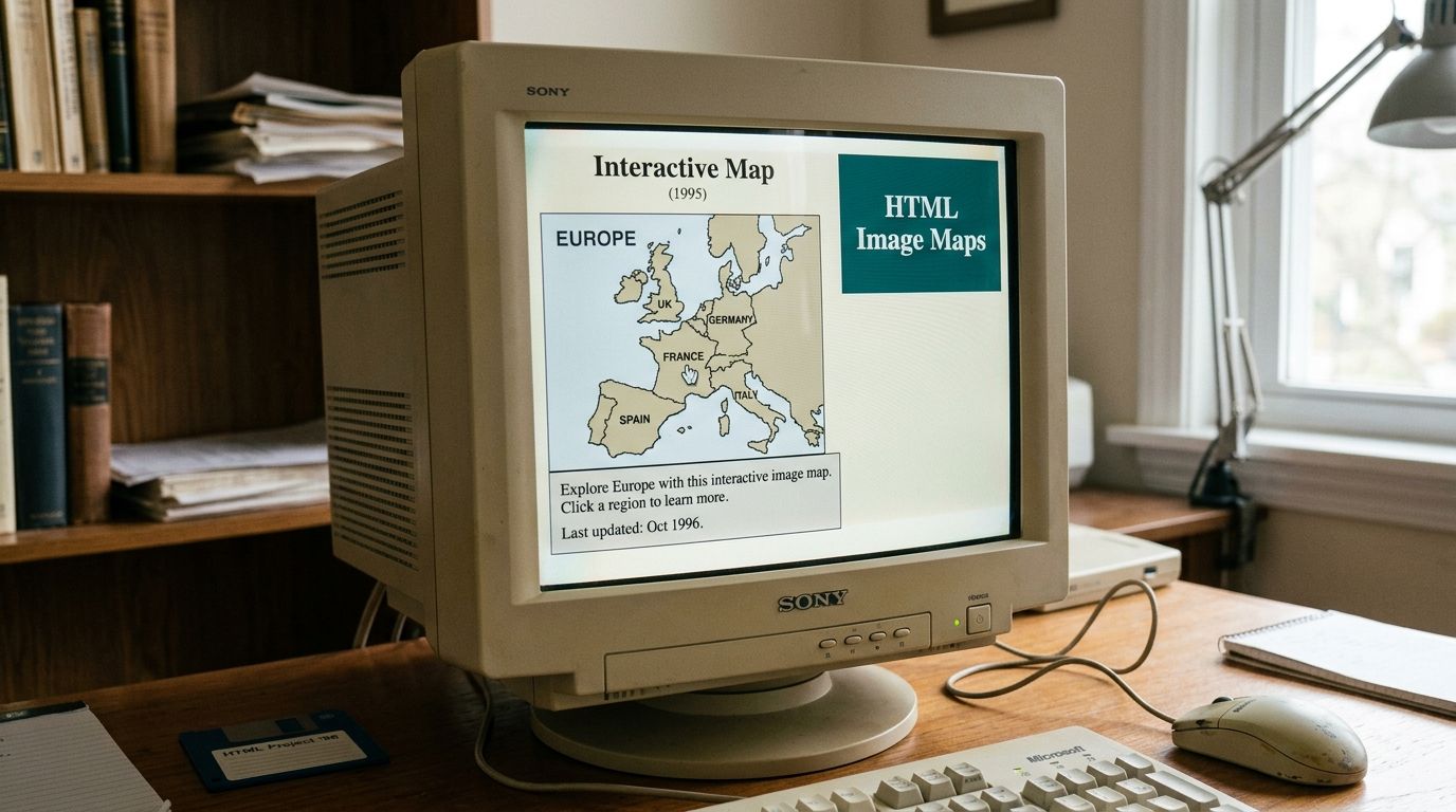
A rectangle could link to one page, a circle to another, and a polygon to something else again. For its time, it was useful. It gave websites a way to make a static image interactive without building a full application.
How the old HTML image map works
The model is simple:
- Start with an image such as a floor plan or regional map.
- Assign coordinates to zones on that image.
- Link each zone to a page, panel, or destination.
That method still works for some narrow tasks. If you want a static seating plan or a simple building diagram where each room opens a detail page, image maps can still be serviceable.
The limitation is fundamental, not cosmetic. The traditional HTML <map> tag operates solely within 2D plane coordinates and lacks native geospatial awareness, which is why teams end up relying on external JavaScript libraries for geospatial rendering, with added dependency overhead and latency, as outlined in W3Schools' reference for the HTML map tag.
Why it breaks down in real venues
An image map doesn't understand that a corridor turns, a lift is out of service, or a door has changed status. It doesn't know what a platform, concourse, ward, or storey means. It only knows that a user clicked a shape drawn over pixels.
That mismatch becomes obvious in airports, hospitals, shopping centres, campuses, and rail networks. Operators need routing through space. Image maps only offer interaction on a picture.
A clickable floor plan is not the same thing as a navigation system.
For a broader look at how these technologies developed, see our article on technology in mapping.
How Modern Web Mapping Evolved with APIs and SVG
The web moved beyond static image maps as HTML matured. The first version of HTML was written by Tim Berners-Lee in 1993, and the shift to HTML5, which became the de facto standard around 2010, enabled advanced features such as SVG and integration with JavaScript APIs, helping transform the web from static documents into interactive applications, as summarised by HTMHell's history of HTML.
SVG gave teams control inside the browser
SVG changed what was possible for browser-based maps. Instead of overlaying clickable zones on a fixed image, teams could define vector shapes directly in the page.
That brought practical advantages:
- Scalable graphics that stay sharp at different zoom levels
- Custom interactions for hover states, labels, filtering, and animation
- Tighter design control for branded venue maps and bespoke layouts
SVG is especially useful when a venue wants a custom visual model rather than a generic basemap.
APIs made maps dynamic, but added dependencies
The other major shift came from mapping APIs and libraries such as Google Maps, Mapbox, Leaflet, and D3.js. These tools made panning, zooming, layering, and data overlays much easier to implement. For outdoor mapping, they became standard.
For venue operators, though, this convenience comes with trade-offs.
| Consideration | What it means in practice |
|---|---|
| External dependency | Your map experience depends on third-party services, release cycles, and terms |
| Privacy and governance | Data handling, analytics, and user flows may be shaped by an outside platform |
| Indoor complexity | Indoor maps often need bespoke modelling, not just a basemap with markers |
| Maintenance effort | Custom overlays, accessibility fixes, and route logic all need ongoing attention |
Better graphics didn't solve navigation
This generation of web mapping solved interactivity. It did not automatically solve precise, accessible wayfinding inside complex buildings.
A zoomable map can still leave a user stranded if it doesn't expose routes in a non-visual form, if controls aren't usable without a mouse, or if the spatial model lacks the detail required for turn-by-turn guidance. Our explainer on how a navigation system works goes deeper into that distinction.
Why Most Digital Maps Fail Accessibility Standards
Most venue maps weren't built around accessibility from the start. They were built to display space, not to support independent movement through it.
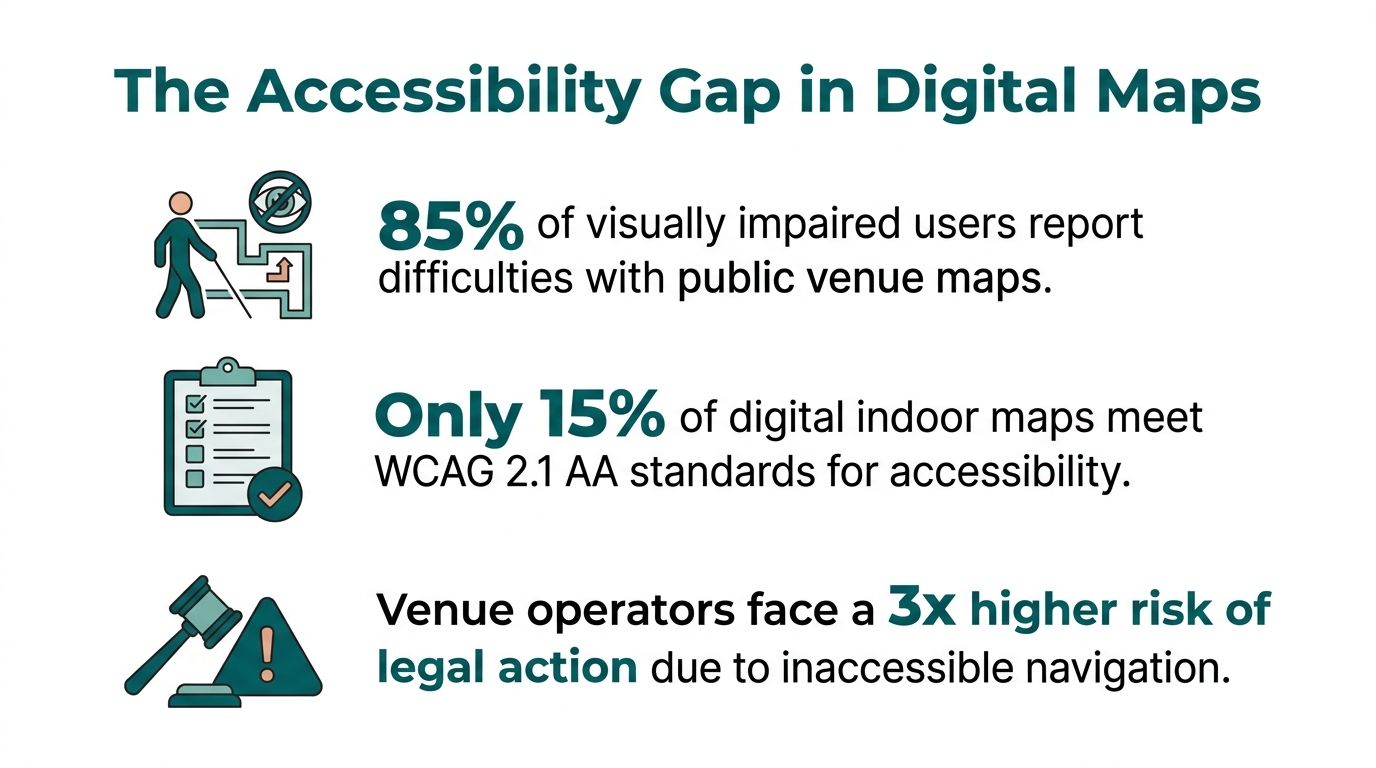
That design bias shows up in the data. A systematic evaluation of UK digital map tools found that 78% fail basic keyboard operability and text alternative requirements under WCAG 2.2 AA, and Google Maps Embed scored 7% on compliance in that review, according to the peer-reviewed study on accessible digital map tools.
What failure looks like for real users
For a blind user, an unlabeled interactive map can become a blank surface. For someone who can't use a mouse, a pan-and-zoom interface may be partially or entirely unreachable. For a user with low vision, colour-only distinctions can erase critical information.
These aren't edge cases. They're common consequences of map interfaces that rely on visual scanning and gesture-based control.
If the only way to understand your map is to see it, your digital wayfinding excludes part of your audience by design.
The UK context makes this especially important. Public sector bodies are expected to meet WCAG 2.2 AA and publish accessibility statements. Private operators also face duties under the Equality Act 2010 to avoid discriminatory barriers in services. A venue that provides digital navigation but makes it inaccessible creates a problem that isn't solved by adding a phone number in the footer.
Why embedded maps are often the worst offender
Teams often assume that embedding a popular map product is the safe option. It usually isn't. An embed can be fast to deploy, but it also locks in somebody else's interaction model.
That creates several recurring failures:
- Keyboard access is insufficient for complex route exploration
- Text alternatives are weak or missing for spatial information
- Indoor context is thin compared with the needs of hospitals, transit interchanges, campuses, and malls
- Accessibility remediation is limited because the core component belongs to another provider
For shopping centres, mixed-use developments, and public transport sites, digital mapping often begins to conflict with compliance obligations and visitor experience goals. We explored a retail version of that issue in our piece on the map of malls.
Why visual compliance checks miss the point
A map can pass an internal design review because it looks clean, branded, and mobile friendly. That says little about whether a disabled visitor can complete a route independently.
Accessibility in mapping isn't just about labels and contrast. It's about whether the service communicates the environment in a form the user can act on.
Comparing HTML Mapping Approaches for Venues
Decision-makers usually don't need another abstract debate about frontend tooling. They need to know which approach creates the least risk and the most usable result inside a live venue.
The table below compares the main options teams consider when discussing mapping in HTML.
Comparison of Web Mapping Technologies
| Approach | True Accessibility | Maintenance Burden | Indoor Wayfinding Suitability | Infrastructure Dependency |
|---|---|---|---|---|
| Traditional HTML image maps | Weak. Can support basic linked regions, but they don't express routes, spatial context, or robust non-visual guidance well | Low to moderate at small scale. Harder once layouts change often | Poor for complex indoor routing | Low |
| Custom SVG maps | Better potential than image maps, but only if accessibility is designed and tested thoroughly from the start | High. Bespoke interaction, updates, and QA all sit with the venue team or supplier | Moderate for visual exploration, limited for guidance unless paired with route logic | Low |
| Embedded map APIs | Often inconsistent. Fast to publish, harder to control deeply | Moderate. Vendor updates simplify some tasks but limit control | Moderate outdoors, often weak for indoor precision and accessible routing | High |
| Dedicated indoor navigation platforms | Strongest option when built around non-visual guidance and accessible interaction | Varies by platform and data model | Best fit for complex venues where route accuracy matters | Varies. Hardware-based systems increase burden, infrastructure-free models reduce it |
What matters most to operators
A venue team should assess map technology against practical questions, not feature lists.
- Will this still work when layouts change often
- Can estates, operations, and accessibility teams maintain it without specialist rebuilds
- Does it help people reach exact destinations, not just view a plan
- Will it reduce operational friction rather than create another hardware estate to manage
Operational lens: The cheapest map to publish is often the most expensive one to maintain once accessibility gaps, complaints, and content updates start to accumulate.
The right answer depends on your environment. A museum exhibit page and a rail interchange do not have the same wayfinding requirements.
The Solution Beyond Visuals: Infrastructure-Free Indoor Navigation
Most indoor mapping projects fail for one of two reasons. They either stop at visual display, or they move into hardware-heavy positioning systems that operations teams then have to maintain indefinitely.
Beacon-based systems are the classic example. They can support indoor positioning, but the burden is obvious in large estates: installation, calibration, monitoring, battery replacement, physical damage, procurement, and change control. In venues with high footfall and frequent layout changes, that becomes an operational commitment many teams underestimate.
Why hardware-based indoor positioning struggles
Wireless beacons such as iBeacon typically deliver 3 to 7 metres of location accuracy, which is not enough for precise door-level guidance, according to Navigine's overview of indoor navigation methods. For a user trying to find the correct clinic entrance, platform access point, lift bank, or shop unit, that gap matters.
A few metres may sound acceptable on a slide deck. In a real building, it can place someone at the wrong doorway, on the wrong side of a barrier, or short of a decision point where independent travel depends on exact instruction.
What a modern indoor navigation layer needs
A venue-grade navigation system should do three things well:
- Model the environment semantically, not just visually.
- Guide users to exact destinations, not approximate zones.
- Avoid fragile infrastructure where possible.
Infrastructure-free navigation changes the equation. Waymap's approach uses dead reckoning with device-native sensors on the smartphone rather than GPS, Wi-Fi, or installed hardware. In practice, that means the guidance layer isn't dependent on beacons across the estate, and it can support sub-3-metre accuracy in infrastructure-free environments for precise routing.
That matters for transport operators especially. Stations and interchanges change constantly. Temporary closures, retail churn, engineering works, and crowd management all make fixed hardware harder to justify.
For readers comparing options, our article on whether GPS works indoors explains why outdoor positioning assumptions break down so quickly inside buildings and underground networks.
Why this matters in complex public environments
The operational case is straightforward. If your navigation service depends on maintaining physical devices throughout a large estate, you have created another asset class to inspect, repair, and budget for.
The accessibility case is just as clear. Precision matters because users don't travel through venues as abstract dots on a map. They move through doors, thresholds, lifts, ticket gates, ramps, corridors, and platforms.
A short demonstration helps make that difference concrete.
In practice, that's why public transport agencies and large venues look beyond old web map patterns. A visual map can inform. A navigation layer has to direct.
Best Practices for Implementing Genuinely Accessible Maps
Accessible mapping starts before interface design. It starts with the data and operational model behind the user experience.
A building that supports reliable indoor navigation needs more than a floor plan. Real-time indoor guidance depends on semantic information such as clearly defined storeys, spaces, and the functional states of elements like doors, as described in research on BIM-oriented models for indoor navigation requirements.
Start with non-visual access, not visual polish
If the map is designed first as a graphic, accessibility usually becomes a retrofit. That leads to thin text alternatives, partial keyboard support, and route information that still assumes visual interpretation.
A stronger approach is to define the non-visual journey first:
- Destination naming must be clear so users can select and confirm the right endpoint
- Route instructions must be actionable rather than descriptive only
- Interface controls must work without touch gestures as a primary requirement
- Changes in the environment must be updateable without redesigning the whole system
Test with disabled users in the real venue
Lab testing catches some issues. It doesn't replace live route testing with the people the service is meant to support.
A station concourse, hospital entrance sequence, or shopping centre circulation route introduces noise, stress, interruptions, and decision points that desktop reviews miss. Teams should involve blind and low-vision users, keyboard-only users, and people with different mobility needs early enough to change the design, rather than making validation a final step.
The strongest accessibility programmes don't ask whether users can access the map. They ask whether users can complete the journey independently.
Choose standards and partners that match the operational problem
Venue teams often reference WCAG first, which is right for digital access. But indoor navigation also sits alongside built-environment standards and obligations. In the UK, that includes the Equality Act 2010 and commonly referenced design guidance such as BS 8300 and PAS 78 when organisations are thinking seriously about inclusive services.
For organisations operating across borders, the conversation increasingly overlaps with digital product duties too. This guide to complying with EU digital accessibility is a useful primer for teams aligning venue technology with wider accessibility governance.
Use a practical implementation checklist
Not every venue needs the same tooling, but every serious project should answer these points:
- Data quality: Are rooms, entrances, storeys, amenities, and route constraints defined consistently?
- Change management: Who updates closures, relocations, and points of interest when the venue changes?
- Accessibility ownership: Is there a named lead responsible for testing and sign-off?
- Operational fit: Does the solution avoid adding hardware, maintenance rounds, and unnecessary capital spend?
- User validation: Have real users completed representative journeys successfully in the live environment?
Good mapping in HTML can still support content, structure, and presentation. It just can't carry the full burden of modern accessible wayfinding on its own.
Frequently Asked Questions About Venue Mapping
What does mapping in HTML usually mean?
It usually means either an old-style HTML image map built with <map> and <area>, or a web page embedding a visual interactive map. Neither automatically provides accessible indoor wayfinding.
Are HTML image maps still useful?
Yes, for simple static interactions. They aren't suitable for precise, accessible navigation in complex venues because they describe clickable areas on an image, not navigable space.
Is embedding Google Maps enough for accessibility compliance?
No. A widely used embedded map can still fail accessibility requirements. The accessibility study cited earlier found significant compliance problems in common digital map tools, including Google Maps Embed.
What's the difference between a visual map and wayfinding?
A visual map shows a place. Wayfinding helps a person move through that place to a destination using instructions they can follow.
Why do indoor venues need more than GPS or beacons?
Because indoor guidance needs reliable precision at decision points such as doors, lifts, platforms, and entrances. GPS performs poorly indoors, and beacon accuracy can still be too coarse for exact guidance.
What should venue operators look for in a mapping solution?
They should look for robust accessibility, a maintainable data model, support for exact destinations, and an operating model that doesn't create unnecessary hardware maintenance.
How does mapping in HTML relate to WCAG?
Mapping in HTML relates to WCAG because any web-based map interface must provide keyboard operability, text alternatives, and accessible interaction patterns. A visually rich map that can't be used non-visually is still a compliance risk.
If your organisation is reviewing digital wayfinding for stations, shopping centres, hospitals, campuses, or civic venues, Waymap shows what precise, accessible navigation looks like when it isn't tied to GPS, Wi-Fi, or installed hardware. Explore how our platform supports exact indoor, outdoor, and underground guidance for real public environments.
