
Inclusive Design Principles: Public Spaces Guide 2026
Inclusive design principles start with scale. Millions of people use public spaces with permanent, temporary, or situational access needs, and operators ignore that reality at their own cost. Public spaces don't serve an edge case. They serve the public.
For venue operators, campus estates teams, and transport authorities, the practical question is not whether inclusion belongs in the plan. The question is whether the venue can move people through it safely, confidently, and with as little avoidable friction as possible. That is an operational issue, a service quality issue, and a commercial one.
At Waymap, we see the pressure points clearly in large, complex environments. A visitor who cannot find the right entrance, platform, clinic, lecture theatre, toilet, or exit creates more than an accessibility failure. Staff are pulled into wayfinding support. Queues build in the wrong places. People miss appointments, services, and spending opportunities. In transit hubs, stadiums, and campuses, those small failures stack up fast.
Inclusive design works best when it is treated as infrastructure for decision-making. Clear routes, consistent information, usable digital touchpoints, and reliable wayfinding reduce uncertainty for blind and low-vision visitors, older adults, families with buggies, first-time visitors, and people moving under time pressure. Digital tools are now a central part of that work, especially in venues where static signage cannot answer every journey need. Our work on digital wayfinding for public good initiatives reflects that shift from policy language to day-to-day operational delivery.
The strongest organisations build inclusion into how the place runs, not just how the building reads on paper. That changes design choices early, lowers support demand later, and makes the environment more usable for a far wider share of the people who rely on it.
Why Inclusive Design is a Strategic Imperative
In the UK, disabled people make up a large share of the population and of the people who use public services, transport networks, campuses, and event venues. The Office for National Statistics reports that disabled people account for around a quarter of the population, which makes inclusive design a planning and operating issue with direct commercial consequences (UK disability prevalence data from ONS).
For venue operators and city planners, the point is practical. If people can move through a space confidently, they complete more journeys, arrive on time more often, ask staff for help less often, and are more likely to return. If they cannot, the costs show up across the operation. Frontline teams spend time on directions instead of core service tasks. Congestion builds in the wrong places. Missed appointments, delayed entry, and abandoned purchases become routine rather than exceptional.
This matters most in complex public environments. A rail station, stadium, hospital campus, or university does not fail on accessibility only at the front door. It fails at handoffs between physical layout, signage, staffing, ticketing, and digital information. That is why inclusive design should sit with operational planning, not only with compliance or capital projects.
What strong operators plan for
Inclusive design improves day-to-day performance in ways operators can see and measure.
- Lower support demand: Better route clarity and clearer information reduce avoidable requests for help.
- Higher completion rates: More people reach the right platform, gate, clinic, lecture hall, or seat without dropping out partway through the journey.
- Wider practical reach: The same design choices that help disabled visitors also help older adults, first-time visitors, families with buggies, and anyone under time pressure.
- Stronger trust: People remember whether a place felt usable, predictable, and respectful of their time.
In practice, the trade-off is rarely between inclusion and efficiency. The fundamental trade-off is between investing early in a system that works for more people, or paying for confusion later through staffing pressure, complaints, reputational damage, and expensive retrofits.
One test I use is simple. Can a person complete a critical journey independently, without relying on a member of staff to fill in the gaps left by the environment? If the answer is no, the venue is carrying operational risk.
That is also where digital wayfinding has become commercially important. In large venues, static signs cannot cover every route decision, disruption, or access need. Operators that combine physical design with accurate digital guidance are in a better position to reduce friction at scale. Work such as Waymap's App for Good initiative shows how inclusion can be delivered as an everyday service, not treated as a side programme.
Teams that leave inclusive design until late usually end up with bolt-on fixes. Teams that build it into route planning, information hierarchy, procurement, and digital service design get a place that runs better for everyone who depends on it.
What Are the Core Inclusive Design Principles?
The British Standards Institution's BS 7000-6 guidance, first published in 2005, defines inclusive design as the design of mainstream products and/or services that are accessible to, and usable by, as many people as reasonably possible without the need for special adaptation or specialised design (BSI definition cited here). That definition still matters because it moves inclusion out of the specialist corner and into mainstream design practice.
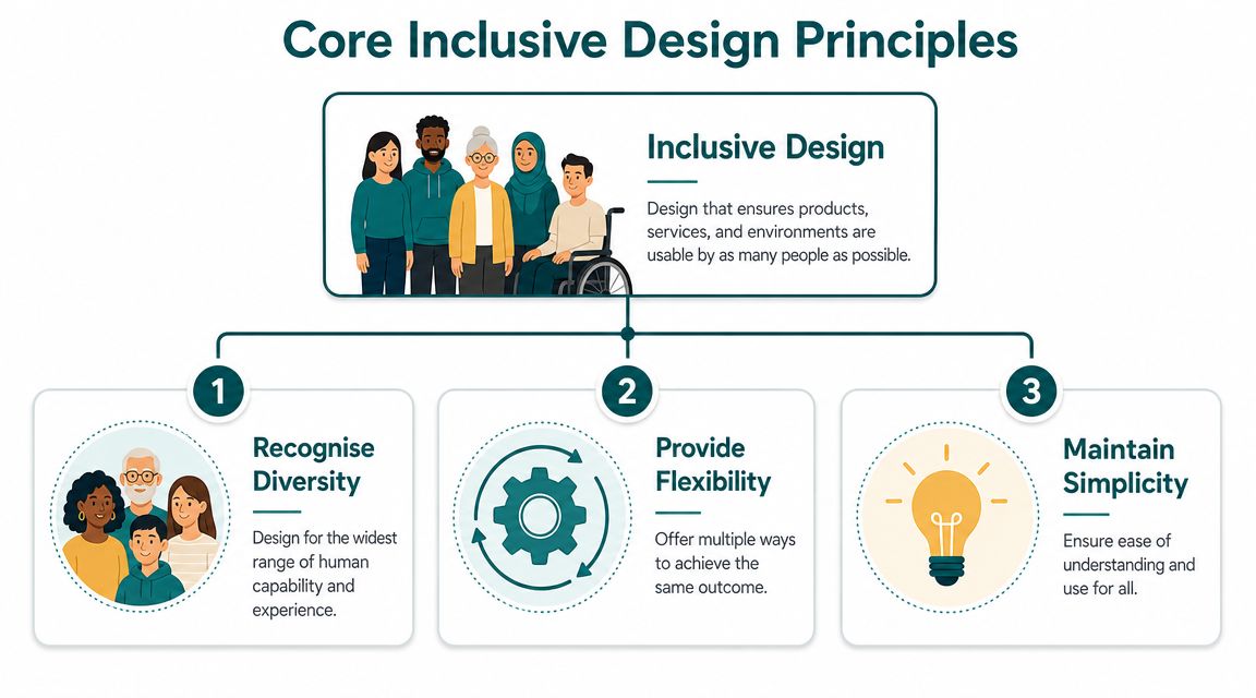
The seven principles decision-makers should know
Equitable use
A design should be useful to people with different abilities without separating them into a second-class route or experience.
In a venue, that means the accessible entrance should function as a real entrance, not a side-door workaround that depends on staff intervention.Flexibility in use
People should be able to complete the same task in more than one way.
A visitor might rely on signage, spoken instructions, a staffed help desk, or a navigation app, depending on context and preference.Simple and intuitive use
The design should be easy to understand, even for first-time users or people under stress.
A hospital or station should not require local knowledge to understand where to go next.Perceptible information
Essential information must be communicated in ways people can detect and understand.
Visual signs alone won't help everyone. Audio, tactile cues, plain language, and consistent naming all matter.Tolerance for error
The environment should reduce the impact of mistakes and help people recover quickly.
If someone takes a wrong turn, the system should help them reorient without penalty or confusion.Low physical effort
Using the space or service shouldn't demand unnecessary strength, reach, stamina, or repetitive effort.
Long detours, heavy manual doors, or ticketing points placed awkwardly all increase exclusion.Size and space for approach and use
People need enough room to approach, interact, turn, wait, and move with assistive devices, luggage, or companions.
A route that works only for a person walking alone and unencumbered is not inclusive.
What works and what doesn't
A common failure is treating these principles as abstract values rather than design tests. Operators approve a sign family, a digital kiosk, or a route plan because it looks coherent. Then users struggle because coherence is not the same as usability.
A better approach is to test each principle against real journeys:
| Principle | Weak implementation | Strong implementation |
|---|---|---|
| Simple and intuitive use | Too many decision points at once | One clear next action at each stage |
| Perceptible information | Information appears in one format only | Information is available across formats |
| Tolerance for error | Wrong turns create dead ends | Users can recover quickly and continue |
| Low physical effort | Long, complex routes are standard | Routes minimise unnecessary effort |
Good inclusive design is rarely about adding more. It's usually about removing ambiguity, effort, and dependence.
Teams working on digital experiences should also think beyond building regulations and signage manuals. Inclusive interaction patterns matter just as much in apps, kiosks, and journey planning tools, especially for users with visual impairments. That's one reason practical examples such as products for vision-impaired users are useful to review during procurement and service design.
How Are These Principles Applied in Large Public Venues?
In complex estates, inclusive design principles are easiest to understand when you look at everyday failures. The pattern is usually the same. A place assumes local knowledge, visual confidence, and plenty of time. Real users arrive with none of those advantages.
Transit hubs
Stations often look information-rich and still perform badly. That happens when information is fragmented, signs are positioned too late, and route decisions depend on quick visual scanning in a crowded environment.
A poor design pattern is common. A passenger enters a concourse, sees multiple signs competing for attention, hears an announcement that isn't repeated clearly, and reaches a ticket gate line before realising they chose the wrong side. Every one of those moments increases stress.
A better transit experience applies inclusive design principles directly:
- Perceptible information: Platform, line, and exit information is consistent across signs, audio, and digital channels.
- Tolerance for error: Wrong turns can be corrected without walking long distances back through barriers or congested flows.
- Low physical effort: The route to lifts, step-free access, toilets, and assistance points is direct and obvious, not hidden behind secondary signage.
WMATA is a useful named example because large transit systems face the same challenge everywhere. They aren't managing one route. They're managing thousands of journeys with changing passenger needs, time pressure, and variable familiarity with the network.
University campuses
Campuses are notoriously difficult to get around because they evolve over time rather than being designed as a single coherent visitor experience. Building names change. Entrances are inconsistent. Pedestrian desire lines don't match official routes. Temporary closures break wayfinding logic quickly.
The bad version is familiar to any estates team. A new student or visitor follows a map to the “front” of a building only to find the accessible entrance elsewhere, the reception relocated, and the route signage starting too late.
The better version is more disciplined:
- Simple and intuitive use: Routes are structured around how people arrive, not how planners think they should arrive.
- Equitable use: The inclusive route is not a hidden exception. It is part of the main wayfinding logic.
- Flexibility in use: People can use physical signs, mobile directions, reception support, or QR-linked route guidance without losing continuity.
If a first-time visitor needs three separate clues to find a destination, the venue hasn't solved wayfinding. It has distributed the problem.
This matters especially on healthcare-linked and mixed-use campuses where people may already be anxious, late, or distracted.
A visual walkthrough can help teams spot these issues in context:
Major venues including stadiums and shopping centres
Large venues often invest heavily in architecture and branding, then underinvest in orientation. The result is a place that feels impressive on arrival and frustrating five minutes later.
In shopping centres such as Westfield London, one common failure is assuming that directory boards are enough. They aren't. Visitors need continuous guidance across multi-level environments, car parks, entrances, lifts, toilets, family facilities, and exits. In stadiums, the pressure is different but just as severe. Ticket holders must find the correct gate, security point, concourse, block, seat area, and amenities within a narrow arrival window.
Good inclusive design in these venues usually includes:
- Clear zoning: Distinct naming and consistent terminology across tickets, websites, signs, and staff language.
- Multiple guidance modes: Visual, audio, staffed, and digital guidance all point to the same destination using the same labels.
- Recovery paths: If someone enters through the wrong gate or level, the route back is obvious and not punitive.
- Inclusive amenities: Changing Places facilities, accessible toilets, lifts, and seating areas are integrated into the main navigation system, not buried in a PDF.
Operators looking at mall environments in particular can learn a lot from practical mapping approaches for malls, because retail navigation breaks down fastest when naming, route continuity, and digital touchpoints don't align.
What Role Does Digital Technology Play in Inclusive Design?
Physical design sets the baseline. Digital technology determines whether that baseline becomes usable in real time. In large public spaces, people don't just need a compliant environment. They need guidance at the moment they are making decisions.
That is where digital tools make the biggest difference. They can provide route-specific information, adapt to closures, support different languages and interaction modes, and remove the need to decode a complex environment from static signs alone.
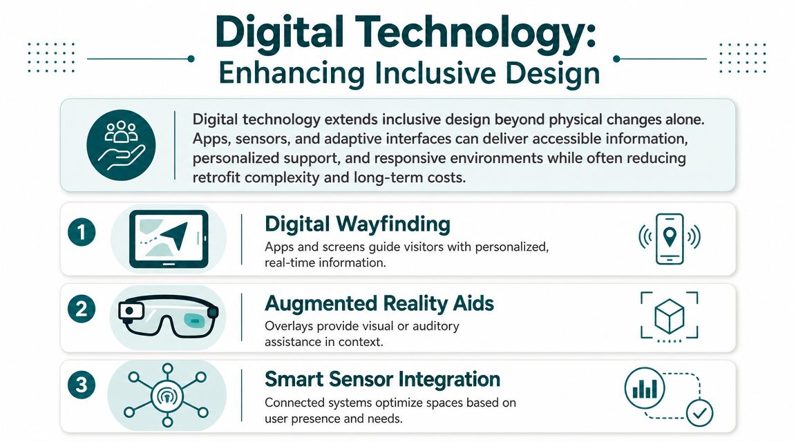
Where digital tools help most
Digital inclusion is not about adding an app because it looks modern. It is about filling the gaps that buildings and signs cannot solve on their own.
- Perceptible information improves when route guidance can be delivered through audio, text, and interface patterns that suit different users.
- Tolerance for error improves when systems can reroute after a missed turn instead of leaving people to work it out alone.
- Simple and intuitive use improves when each step is presented as the next clear action rather than an overview map that users must interpret.
That logic applies across kiosks, mobile wayfinding, digital journey planning, and destination-specific service apps. Teams building these products should also look beyond accessibility checklists and study mainstream UX discipline. A practical reference is this guide for app founders on UX, especially when internal teams are deciding how much cognitive load to place on a user during navigation-heavy tasks.
Digital wayfinding as an inclusive design layer
Digital wayfinding is especially effective in environments where routes change, landmarks repeat, or the user cannot rely on vision alone. A strong implementation doesn't compete with the built environment. It translates the environment into decisions a person can act on.
One example is Waymap, which provides indoor, outdoor, and underground navigation through smartphone motion sensors and detailed maps rather than GPS, Wi-Fi, or installed hardware. In inclusive design terms, that maps cleanly to several principles. Audio guidance supports perceptible information. Step-by-step instructions support simple and intuitive use. Automatic route correction supports tolerance for error.
What operators should ask before buying technology
Digital tools can also fail badly. The most common mistakes are procurement-led.
| Question | Weak answer | Strong answer |
|---|---|---|
| Does it work in signal-poor environments? | “Usually” | Proven route continuity in the target estate |
| Can staff update destinations easily? | Vendor-only changes | Operator-managed content updates |
| Does it support different user needs? | One default interaction model | Multiple modes and accessible journey logic |
| Does it fit venue operations? | Standalone pilot only | Works with maps, signage, and service workflows |
For transport and venue teams assessing navigation systems, technology in mapping is a useful operational lens because the key question isn't whether technology is available. It's whether it reduces friction for the people using the space.
How Can Venues Implement an Inclusive Design Strategy?
Most organisations don't fail because they reject inclusive design principles. They fail because they isolate them. Accessibility sits with compliance, digital sits with IT, signage sits with estates, and customer service sits with operations. The visitor experiences all of that as one journey.
The practical fix is to run inclusive design as an operating model, not a side project.
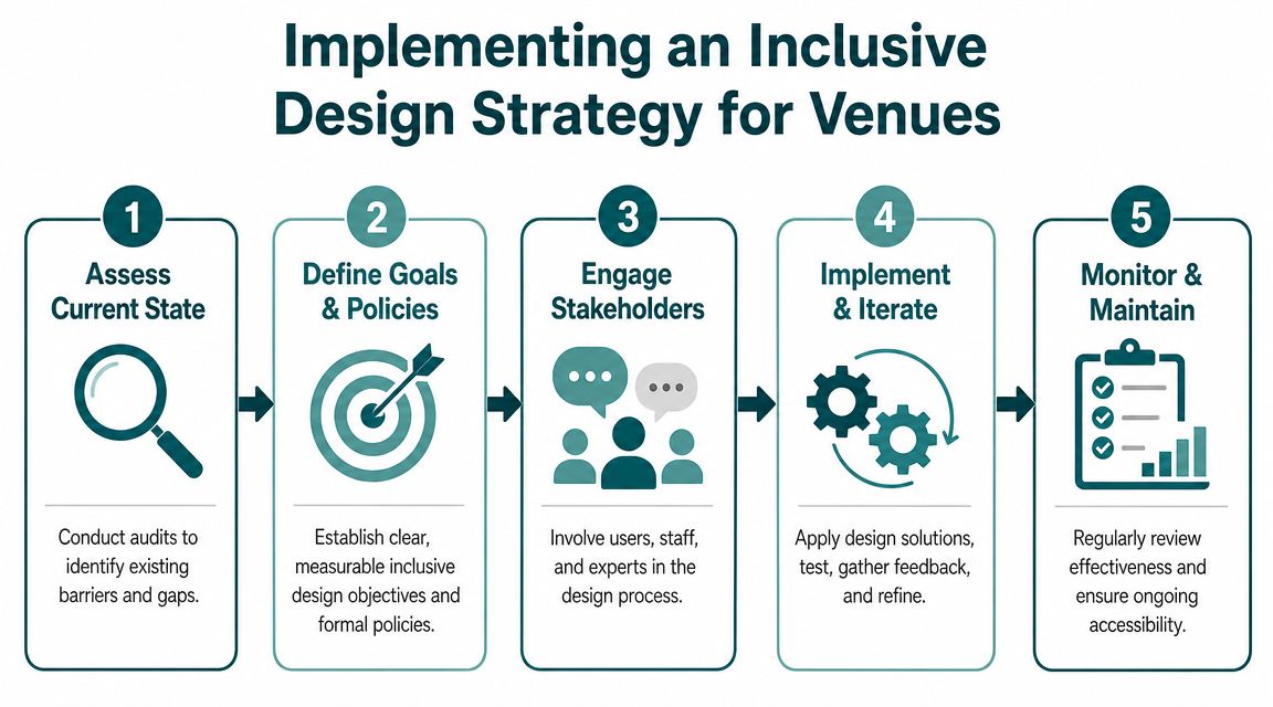
A workable process for venue teams
Audit whole journeys, not isolated assets
Start with end-to-end tasks such as arriving from street level, reaching a platform, finding a clinic, locating a seat, or exiting after an event. An isolated signage audit or website review won't show where the experience breaks. Follow the journey across website, app, entrance, circulation space, and staffed touchpoints.Co-design with people who face real barriers
Invite disabled users, older users, parents, and first-time visitors into walkthroughs and testing. They will find issues internal teams normalise. Co-design works best when it happens early enough to influence route logic, naming, procurement criteria, and service policy.
Operational advice: Don't ask users whether they “like” the design first. Ask whether they can complete the journey independently, confidently, and without needing a workaround.
Set procurement rules before the next tender goes out
Through procurement, many strategies become real. If a kiosk, booking flow, map platform, or venue app doesn't meet your inclusion requirements, it should not pass procurement. In the UK public sector, the Public Sector Bodies (Websites and Mobile Applications) Accessibility Regulations 2018 require digital services to conform with WCAG 2.2 AA, which makes inclusive design an operational requirement for digital procurement in government, transport, and education (regulatory baseline referenced here).Prioritise fixes by user impact and operational load
Not every issue carries the same consequence. Some failures cause inconvenience. Others stop journeys entirely or force staff intervention. Prioritise the points where users get stuck, turn back, call for help, or depend on ad hoc assistance.Build maintenance into business-as-usual operations
Routes change. Departments move. Event layouts shift. Temporary closures appear. Inclusive design won't hold if the information layer falls out of date. Ownership must sit with teams who can update maps, destinations, and service content quickly.- Policy without enforcement: The organisation has an inclusion statement, but project teams can still buy inaccessible tools.
- One-off audits: Problems are documented once and then drift back as the estate changes.
- Fragmented ownership: Nobody owns the whole journey, so each team fixes only its own piece.
- Visitor task completion: Can people reach the correct destination without asking for help or abandoning the journey?
- Wayfinding-related staff demand: How often do front-line teams stop to give route guidance, escort visitors, or explain confusing layouts?
- Customer feedback quality: Look for recurring comments about stress, confusion, independence, ease of use, and confidence.
- Problem location patterns: Track where people routinely get lost, hesitate, or request assistance. Those points usually reveal route logic failures rather than user error.
Where strategy often breaks down
Three issues come up repeatedly.
For capital projects and complex estates, 3D site models for planning and accessibility coordination can be useful because they help teams align physical layout decisions with real user movement, not just plan drawings.
How Can You Measure the Impact of Inclusive Design?
If inclusive design principles only appear in policy language, they won't survive budget pressure. Leadership teams need operational evidence. That means measuring outcomes that matter to service delivery, visitor experience, and commercial performance.
The metrics that matter in practice
A useful measurement set usually includes a mix of service, operational, and behavioural indicators.
How technology helps measurement
Digital systems give operators a much clearer picture of where journeys succeed or fail. Navigation tools, journey planning platforms, and digital directories can show where users stop, recalculate, or fail to complete a route. Even when data is anonymised and used at aggregate level, it can reveal which entrances, transitions, and destinations create the most friction.
The best ROI case for inclusive design is often operational. Fewer confused visitors, fewer interruptions for staff, and fewer broken journeys.
What not to do
Don't rely on compliance status as your only metric. A building or digital service can meet a formal requirement and still be hard to use in practice. The better question is whether people can complete important journeys with dignity, confidence, and minimal effort.
A strong measurement approach links inclusive design to daily performance. If the change reduces confusion, improves journey completion, and lowers support burden, it is doing operational work, not just reputational work.
Frequently Asked Questions About Inclusive Design Principles
What are inclusive design principles in simple terms
Inclusive design principles are practical rules for creating products, services, and spaces that work for as many people as reasonably possible. They focus on reducing barriers caused by ability, age, context, unfamiliarity, and effort.
Are inclusive design principles the same as accessibility compliance
No. Accessibility compliance sets a baseline, while inclusive design principles shape whether the actual experience is usable and welcoming. A compliant service can still be confusing, high-effort, or dependent on local knowledge.
Do inclusive design principles only apply to disabled users
No. They directly support disabled users, but they also help older adults, people with temporary impairments, visitors carrying luggage, families with children, and anyone under stress or in an unfamiliar place. Good inclusive design improves mainstream usability.
What is the difference between inclusive design and universal design
They are closely related, but they are not identical. Universal design often aims for one solution that works broadly, while inclusive design is more comfortable providing multiple ways for people to complete the same task.
Why should venue operators care about inclusive design principles
Because poor design creates operational drag. It increases confusion, staff intervention, missed destinations, and negative visitor experiences. Better design improves navigation, confidence, and service flow across the whole estate.
How do digital wayfinding tools support inclusive design principles
They support inclusive design principles by giving people route guidance in forms they can use, including step-by-step and audio instructions. They also help users recover from mistakes and reduce dependence on static signage alone.
If you're planning a transport hub, stadium, campus, hospital, shopping centre, or civic building, Waymap can help you assess how navigation fits into your inclusive design strategy, especially where complex routes and real-time visitor guidance are part of the operational challenge.
