
Show on Map: A Guide to Waymap's Dynamic POI Features

A venue manager usually finds the same problem waiting on Monday morning. A tenant has moved. A clinic entrance has changed. A lift is out of service. An event has taken over a concourse. The map on the wall is already wrong, and staff are already answering the same question at the desk.
That's where Show on Map stops being a design feature and starts becoming an operational tool. If you run a shopping centre, hospital, stadium, campus, rail station, or airport, the value isn't in having a prettier map. The value is in giving visitors the right route, in the right language, with the right accessibility information, without sending your team into another cycle of printed updates, contractor callouts, or hardware maintenance.
At Waymap, we look at show on map through the lens of live operations. The map has to work indoors, underground, across multiple levels, and for people who don't get around the same way. It also has to be manageable by the people who run the venue. That means fast point of interest updates, clear visibility controls, support for accessible guidance, and testing that reflects real footfall rather than ideal conditions.
Why Static Signage Fails in Modern Venues
By 9 a.m., the problem is visible. A clinic has been moved for the day, one lift is out of service, and the route printed on the wall is no longer the route your visitors can use. Staff catch the failure first, at reception, on radio, and in the stream of repeat questions that pull them away from higher-value work.
Static signage struggles because venue operations are not static. In hospitals, transport hubs, campuses, stadiums, and mixed-use sites, routes change for safety, crowd flow, maintenance, and temporary use. A sign can name a destination. It cannot reflect live conditions, audience-specific access rules, or a step-free alternative when the standard path breaks.
The accessibility impact is immediate. Disabled people in the UK already face barriers in the built environment, as the UK Government's disability facts and figures make clear. For venue operators, that turns wayfinding from a communications issue into a service and compliance issue. If a posted route sends someone to stairs, a locked corridor, or an unusable entrance, the problem is not the visitor's confidence. It is the venue's information layer.
What static signs can't handle
Physical signs fall short in the places where operational complexity is highest.
- Temporary changes: decanted departments, event overlays, short-notice closures, or managed one-way flows
- Accessible routing: step-free paths, lift-dependent journeys, quieter routes, or routes that avoid known barriers
- Different user groups: visitors, patients, staff, contractors, event guests, and people with timed appointments
- Complex buildings: basements, interchanges, mezzanines, linked blocks, underground areas, and multi-level circulation
A practical test is simple. If your team regularly says, “the sign is right, but you need to go this way today,” the building information is already behind operations.
Why hardware-heavy systems often stall
I see many venue teams recognise the weakness in static signage, then hesitate because the replacement looks expensive to buy and difficult to maintain. Beacon-led or infrastructure-dependent systems often bring capital approval, installation work, battery replacement, recalibration, and specialist support into what should be a day-to-day operational process.
That is the wrong trade-off for high-change venues. You do not need another asset class to maintain just to show people where to go.
Infrastructure-free mapping changes the equation. With Waymap's show on map capability for indoor wayfinding, teams can update destinations and route information without modifying the building fabric or waiting on hardware interventions. That reduces capex pressure, removes a large share of the maintenance burden, and gives operators a practical way to keep guidance aligned with what is happening on site.
For venue managers, that is the primary value. Better routing matters, but so do fewer staff interruptions, faster response to closures, clearer accessible guidance, and less risk of your wayfinding becoming inaccurate the moment the building changes.
How to Add and Instantly Update Your Points of Interest
A venue manager usually sees the problem first at the help desk. A clinic moves for two days, a gate changes after a security review, or a temporary check-in desk goes live before an event. Staff know the change. Visitors do not. If the map cannot be updated in minutes, the burden shifts straight onto frontline teams.
That is why points of interest should be managed as live operational data, not as a finished design asset. Start with the destinations that create queues, repeated questions, missed arrivals, or accessibility risk. Expand once those high-friction journeys are covered.
Start with the destinations that create friction
The first POIs to add are rarely your architectural landmarks. They are the locations that create avoidable operational noise.
A strong first batch usually includes:
- Arrival points such as main entrances, taxi drop-offs, ticket halls, reception desks, and car park lifts
- High-demand amenities including toilets, accessible toilets, baby changing, information desks, customer service, and water points
- Mission-critical destinations such as clinics, platforms, gates, lecture theatres, security checkpoints, or event entrances
- Support points like hearing assistance counters, lost property, mobility services, or prayer rooms
- Temporary or seasonal locations such as pop-ups, testing rooms, temporary check-in, or fan zones
This order matters. If a visitor can find the entrance but not the accessible toilet, or reaches the right building but not the correct clinic reception, the journey has still failed.
Use a live publishing workflow
Operations teams need a process they can run without waiting on hardware changes, specialist installers, or a redesign cycle. That is one of the main advantages of infrastructure-free indoor mapping. The venue can update the digital layer as the building operates, without adding physical equipment to buy, maintain, or recalibrate.
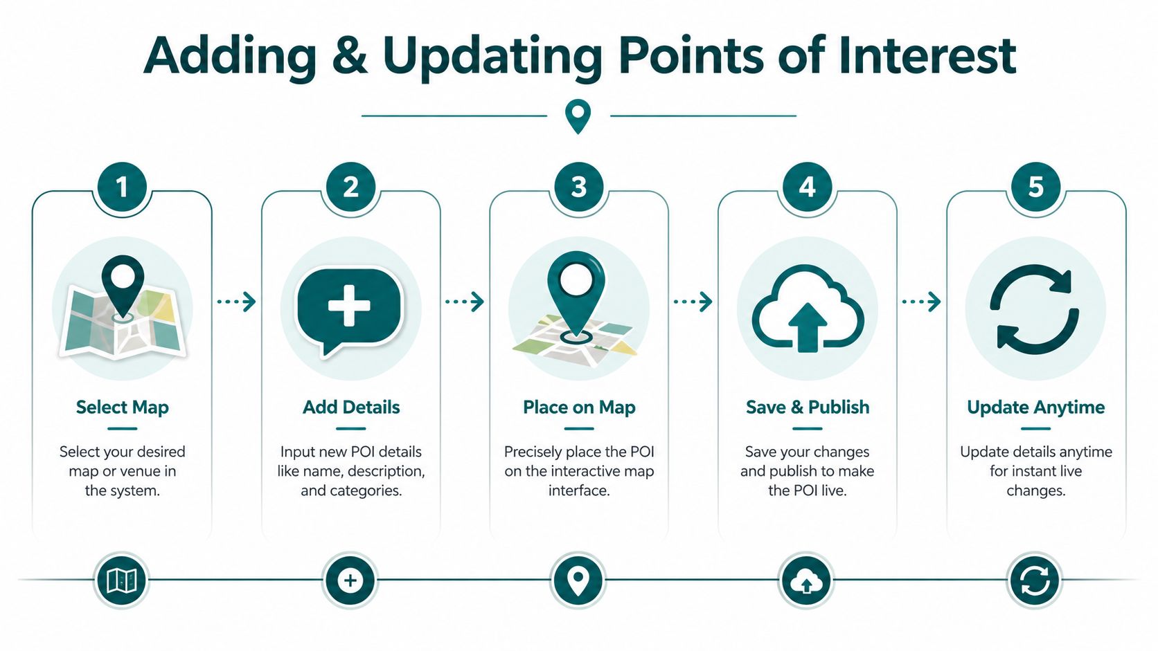
A practical workflow looks like this:
- Choose the map layer: select the building, floor, or venue area where the POI belongs.
- Add the destination details: name, description, category, and any visitor-facing guidance that clarifies purpose.
- Place the pin precisely: indoor accuracy matters. “Near reception” is not enough in a multi-entrance site.
- Publish changes live: make the destination visible to users as soon as it is approved.
- Review and retire: hide outdated POIs instead of deleting them if they may return for future events or seasonal use.
For temporary layouts, event overlays, and short-notice operational changes, Waymap's map your show overview shows how venue teams can manage these updates without adding new infrastructure.
What works in high-change venues
Westfield London is a useful model for the type of environment that exposes weak POI management. Retail units change, activations appear, circulation shifts, and visitor demand varies by time of day. In that setting, a map has to reflect operating reality, not a static floor plan approved months earlier.
Infrastructure-free positioning reduces a common source of delay. If guidance depends on installed hardware, every layout change can trigger extra coordination, maintenance work, or internal approval for more kit. Using device-native sensors and dead reckoning avoids much of that overhead. For venue operators, that means lower capital pressure, fewer maintenance tasks, and faster response when a destination changes.
The map should sit with the team running the building.
Common mistakes when adding POIs
Operators usually run into the same problems:
| Mistake | What happens |
|---|---|
| Adding too many POIs at launch | Users cannot distinguish high-priority destinations from low-value clutter |
| Using internal names only | Visitors do not recognise labels used by estates or leasing teams |
| Leaving temporary POIs live | People follow valid routes to destinations that are no longer available |
| Pinning approximate positions | The route ends close to the target, but not where the visitor needs to arrive |
Keep labels public-facing. Pin destinations exactly. Review the live set often, especially before event days, clinic changes, or temporary closures. That discipline reduces staff interruptions, improves arrival success, and helps keep guidance aligned with accessibility duties.
How Do You Configure Map Visibility and Custom Labels
Once your POIs are live, the next question is control. Not every destination should be visible to every user, and not every label should say the same thing to every audience.
A stadium on an ordinary fixture day doesn't operate like the same stadium on an international event day. A university campus doesn't show the same destinations to a first-year student, a visiting lecturer, and an estates contractor. Good show on map design reflects that operational reality.
Build visibility around user need
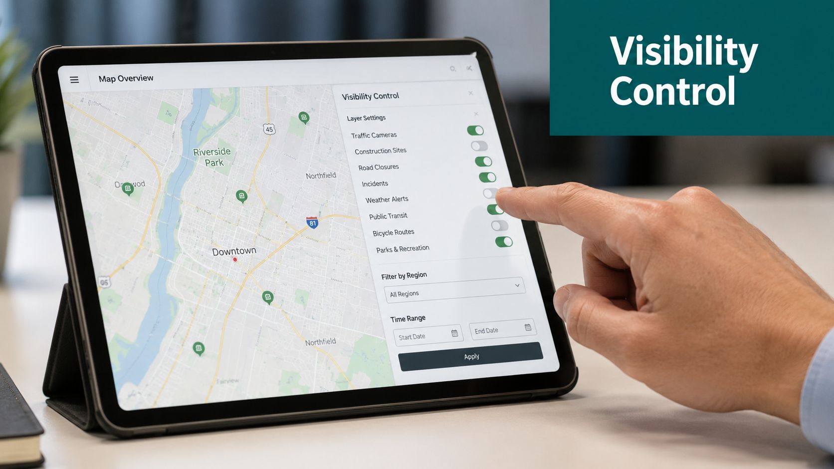
The most effective visibility model is role-based and context-based.
Think in layers such as:
- Public visitor layer: entrances, concessions, toilets, accessible toilets, exits, information, retail units
- Accessibility layer: step-free routes, lifts, quieter waiting areas, hearing support points, accessible seating access
- Staff layer: service corridors, loading points, control rooms, staff welfare, security offices
- Event layer: temporary gates, fan zones, sponsor activations, media entrances, hospitality lounges
At Lord's Cricket Ground, for example, matchday logistics can change considerably depending on the event profile. A flexible map layer lets the venue present one set of destinations for general spectators and another for operational teams without forcing everything into one cluttered interface.
Labels should reflect how visitors search
Custom labels matter because people don't search the way estates teams name rooms.
A venue might call a space “North Concourse Vertical Transport Core 2”. A visitor is looking for “lift to platform”, “accessible entrance”, or “family toilet”. Show on map works better when labels mirror user intent rather than internal nomenclature.
This is especially relevant across campuses and mixed-use sites where one destination may need multiple understandable labels. A student may search for a department name. A visitor may search for the building. A contractor may need the service entrance. Those naming decisions shape whether the map reduces friction or adds another layer of confusion.
For broader examples of layered digital mapping in large estates, interactive campus map guidance is a useful benchmark.
Keep icons and wording consistent
A messy icon system creates the same problem as messy physical signage. It shifts cognitive effort onto the user.
Use a short governance checklist:
- One icon per destination type: don't use several symbols for the same facility.
- Accessible terminology first: choose labels people recognise quickly and respectfully.
- Brand second, clarity first: venue style matters, but wayfinding language has to remain obvious.
- Review for multilingual translation: avoid idioms and internal shorthand that won't convert cleanly.
A clear label is more valuable than a clever one.
When to hide rather than delete
Operators often delete destinations when they should just change visibility. That creates unnecessary churn.
Hide a POI when it's tied to:
- temporary closures
- event-only access
- phased openings
- seasonal services
- staff-only functions that may later become public-facing
Delete only when the destination no longer exists in any useful form. Visibility control is what keeps the map stable while operations keep changing.
What Is Required for Accessible and Multilingual Guidance
A visitor arrives for an outpatient appointment, follows the map, and ends up at the right building but the wrong entrance. For a venue team, that is not a minor UX flaw. It creates missed appointments, more calls to front desk staff, and a poor accessibility outcome that is hard to defend if someone asks whether your guidance is usable.
Accessible guidance starts with positional accuracy, but venue operators also need a delivery model they can maintain. If every improvement depends on installing, auditing, and replacing hardware across the estate, accessibility becomes another capital project with a long tail of maintenance work.
That is why infrastructure-free indoor guidance matters. Indoor positioning can support map-based navigation, tracking, and location sharing without relying on external references like GPS or radio signals, which is particularly useful in signal-poor environments such as stations, stadiums, and large public buildings, as described by Cambridge Consultants on advanced positioning for map-based indoor navigation.
Precision affects compliance and day-to-day service
For UK venues, the Equality Act 2010, BS 8300, PAS 78, and BS EN 17210 all point to the same operational standard. Access has to work in practice. If a person is left a few metres short of the correct door, lift, assistance point, or platform entrance, the guidance has not done its job.
For blind and low-vision users, that gap is serious. For venue teams, it also drives avoidable support demand. Staff get pulled into escorting visitors, reception desks become fallback wayfinding points, and complaints rise because the route looked right on screen but failed at the final approach.
What the guidance layer needs to include
Accessible and multilingual show on map requires a guidance layer that operators can keep accurate without creating parallel systems for each audience.
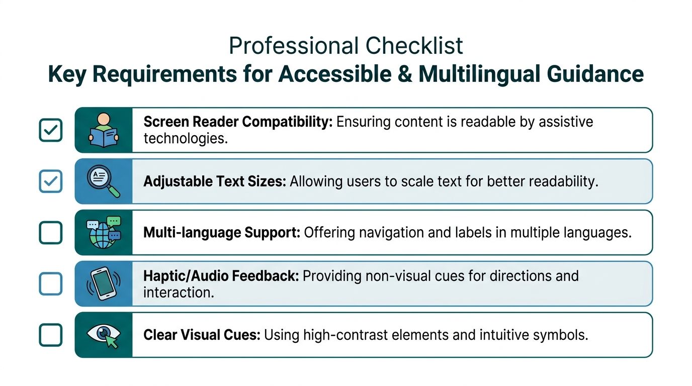
Include:
- Exact destination placement: routes should end at the correct entrance, desk, gate, platform access point, or facility
- Accessible route logic: step-free and barrier-aware routing where the venue can support those paths
- Non-visual guidance: audio and haptic prompts for people who are not relying on the screen
- Readable visual design: high contrast, clear icons, scalable text, and predictable interactions
- Centralised language control: one map and content model that supports multiple languages without multiplying update work
Waymap's multilingual support for digital wayfinding is a practical example of that model. The same managed map layer can serve different visitor groups while keeping governance with one operational team.
Why infrastructure-free matters to venue managers
I see the same pattern across transport hubs, healthcare sites, campuses, and entertainment venues. Operators do not object to accessibility improvements. They object to the hardware burden that often comes with them.
Beacon-based estates add procurement, installation, battery replacement, physical inspections, and fault tracking. Wi-Fi-dependent systems inherit signal inconsistency and often need recalibration after layout or occupancy changes. Those costs rarely sit neatly in one budget line, which is why projects stall even when the user need is obvious.
An infrastructure-free approach changes that decision. It reduces upfront spend, removes a layer of ongoing maintenance, and makes it easier to keep guidance current during refurbishments, phased openings, event overlays, and service changes. That matters for compliance, but it also matters for operations because the best accessibility layer is the one your team can keep accurate month after month.
Accessible guidance should be maintained with the same discipline as fire routes, event overlays, and customer information. If it is not built into operations, it will drift out of date.
How Can You Test Your Map in Complex Environments
A map that works in a demo can still fail in service. Testing has to reflect how people move when the building is busy, unfamiliar, partially obstructed, and noisy.
That's especially true in underground and multi-level settings. GPS weakness is obvious below ground, but the harder problem is behavioural. People hesitate at forks, overrun stairs, stop in crowds, and change direction when they think they've missed a turn. Good testing captures those moments.
Test journeys, not just destinations
Don't test whether “the café pin works”. Test whether a real person can get from a real starting point to the destination with confidence.
A practical testing set should include:
- First-time visitor routes: entrance to reception, entrance to clinic, gate to baggage reclaim, station entry to platform
- Accessibility routes: step-free entrance to service point, accessible toilet to exit, platform to lift, concourse to assistance desk
- Operational routes: delivery access, staff welfare, temporary event entrance, security reroutes
- Failure routes: what happens when a lift is unavailable or a corridor is blocked
Use diverse testers and real conditions
The strongest user acceptance testing includes people with different navigation habits and needs. That means testing with blind and low-vision users, people unfamiliar with the site, staff who know the building too well, and users carrying luggage, pushchairs, or equipment.
WMATA is the right mental model here. A complex, underground metro environment doesn't forgive vague positioning. If your guidance can't stand up to platform approaches, mezzanines, ticket halls, and subterranean transfers, it won't hold up in most other high-footfall settings either.
For teams building a formal test cycle, accessibility testing guidance is a useful place to structure acceptance criteria.
Test the route on the day you'd least like to launch it. Busy periods reveal the defects quiet walkthroughs hide.
A practical acceptance checklist
Before launch, confirm that testers can answer yes to these questions:
| Test question | Pass condition |
|---|---|
| Can users find the destination from more than one realistic start point? | The route remains clear from each entry context |
| Do accessible routes stay accessible in practice? | Lifts, ramps, and barrier-free paths align with the guidance |
| Are labels understandable to non-staff users? | Testers use them without explanation |
| Do temporary changes publish correctly? | Closures and reroutes appear when needed |
| Does guidance remain reliable underground or indoors? | Users can continue without GPS dependence |
If any of those checks fail, don't assume training will compensate. Poor wayfinding design usually reappears as support demand.
How to Use Analytics to Improve Visitor Experience
A visitor misses a clinic appointment because the app sent them to the right department, but the wrong entrance. A steward gets stopped six times in an hour to explain where the accessible toilet has moved during an event changeover. Those are not edge cases. They are operating costs.
Show on map analytics help you find those failures before they become complaints, queue pressure, or accessibility risks. For venue operators, the value is practical. You can see where people search, where they hesitate, where they abandon a route, and which destinations generate repeated demand. That gives estates, operations, and customer service teams a shared view of what needs fixing, without adding hardware to the building or taking on the maintenance burden that comes with beacon estates.
What to look for in map analytics
Useful analytics point to a decision.
Start with the patterns that expose friction in the venue:
- Popular searches: destinations visitors actively need, especially those your team is often asked about
- Repeated reroutes: places where route guidance and real movement do not match
- Drop-off points: locations where users stop, pause, or restart because confidence falls away
- High-demand facilities: toilets, lifts, reception desks, help points, and other services with sustained search volume
- Route concentration: corridors, entrances, and junctions where traffic consistently builds
Each pattern has an operational use. In a hospital, repeated searches for imaging or outpatient check-in usually mean the naming on the map does not match the language patients hear in letters and at reception. In a transport hub, route concentration can show where queue management or temporary barriers are creating avoidable congestion. In a campus setting, persistent drop-offs around one building often point to a poor arrival point, not a user problem.
For teams that want to visualise movement across a site, Waymap's 3D heat map example shows how route data can be turned into an estate-level view that supports layout, staffing, and service decisions.
Turn insight into operational decisions
Analytics matter when they change how the venue runs.
A monthly review should answer questions like these:
- Which destinations are searched often enough that they need better labels, stronger prominence, or a simpler route?
- Where are visitors leaving the suggested path because the physical decision point is unclear?
- Which temporary closures or event changes caused avoidable confusion, and how quickly did the map reflect them?
- Are accessible destinations and step-free routes easy to find, or are users having to search for them repeatedly?
- Which help points, receptions, or service desks are carrying demand that should be reduced through clearer map guidance?
That review is where digital wayfinding starts paying back operationally. If searches for one facility spike every week, that is a case for relabelling, repositioning, or changing staffing assumptions. If one route consistently produces pauses or abandonment, fix the route logic or the destination naming before adding more signs and hoping for the best.
Use analytics for accessibility and compliance
Accessibility teams need evidence, not assumptions.
If wheelchair users repeatedly search for lifts near the same entrance, or if accessible toilets generate high search volume despite being nearby, the issue may be poor surfacing on the map, inconsistent labels, or a route that does not reflect how people move through the building. Those are fixable problems. Analytics give you a record of where they occur and whether changes improve outcomes over time.
That record also helps with governance. Venue managers are often asked to show that accessibility information is current, usable, and maintained as layouts change. Analytics support that process because they show demand patterns, route use, and recurring friction points in a way anecdotal staff feedback cannot.
Waymap supports this approach with precise map-based guidance indoors, outdoors, and underground using device-native sensors rather than installed hardware. For operators, that means the same navigation layer that helps visitors find their destination can also support route analysis and ongoing updates, without adding capital expenditure for infrastructure or a new maintenance estate to manage.
Frequently Asked Questions About Waymap's Show on Map
What does Show on Map mean for a venue operator
It means visitors can see their destination and route on a digital venue map, while your team can update points of interest and route information without replacing physical signs.
Why is Show on Map better than static signage
It's better because it can be updated when the venue changes. Static signs stay fixed when entrances move, services relocate, or temporary event layouts alter circulation.
Can Show on Map work indoors and underground
Yes. Indoor positioning technologies can support map-based navigation without relying on GPS or radio signals in environments where those signals are weak or unavailable, as noted earlier in this guide.
How does Show on Map support accessibility
It supports accessibility by making routes, destinations, and facilities easier to locate in formats that can include non-visual guidance, clearer labels, and route logic that reflects how people physically move through complex sites.
What should venue teams update first
Start with entrances, reception points, toilets, accessible toilets, help desks, lifts, and any destination that staff are repeatedly asked to explain.
How does Show on Map help with multilingual guidance
It gives venue teams a central place to manage labels and destination information so the same operational update can be reflected across multiple languages rather than reworked sign by sign.
Is digital wayfinding already established in the UK
Yes. The United Kingdom accounts for 7% of the global Indoor Positioning and Navigation Market, which indicates meaningful adoption of digital wayfinding infrastructure in sectors such as retail, according to Fortune Business Insights on the indoor positioning and navigation market.
Does Show on Map replace every sign in a venue
No. It works best as a dynamic layer alongside essential physical wayfinding, especially where routes change often, accessibility needs vary, or visitors need more precise guidance than static signage can provide.
If you're reviewing how to modernise wayfinding across a station, campus, shopping centre, stadium, or public building, Waymap shows what an infrastructure-free approach can look like in practice.
