
3D Heat Map: A New View of Venue Operations
By the time a facilities team sees a “hotspot” on a standard footfall map, they're usually already discussing the wrong response. More staff at the entrance. Extra cleaning on the ground floor. Another sign near the escalator. In a multi-level venue, that can be a costly mistake.
What looks like one problem area is often several different flows stacked on top of each other. A concourse, mezzanine, staircase and underpass can collapse into one blob when the data is flattened. That's why a 3d heat map matters operationally. It shows where activity is happening in volume, not just where it appears to happen when everything is pressed into a single plane.
For transport hubs, hospitals, shopping centres and stadiums, that shift is practical, not cosmetic. It changes staffing, accessibility planning, cleaning routes, queue management and the decisions you make about signage.
Your Operational Blind Spot Is Three-Dimensional
A Saturday peak doesn't fail because you lacked data. It fails because the data was flattened before anyone acted on it.
A typical example is the “main entrance bottleneck” that keeps appearing on a dashboard. Operations teams react sensibly. They move staff, adjust barriers, and review sightlines. But once you inspect the building in section rather than plan, the hotspot often resolves into separate patterns: arrivals at street level, dwell time on a café mezzanine, and a lower-level link route feeding in from parking or rail interchange.
That's the blind spot. Most venue analytics still assume movement is mostly horizontal, even when the building plainly isn't.
Why this matters in real venues
In a one-level retail park, a flat map might be good enough. In a station, hospital or arena, it usually isn't. People move through lifts, ramps, stairs, tunnels, bridges, concourses and platforms. If you compress all of that into 2D, you lose the operational truth.
A 3d heat map restores that truth by showing density and flow across height as well as floor area. That gives operators a view that matches the built environment they're running.
A building with stacked circulation needs stacked analytics.
The opportunity is especially clear in British public environments where complexity is high and accessibility obligations are real. Research on 3D heat maps emerged around 2015, but use in UK public venues for accessibility and operational efficiency is still relatively recent, which leaves room for venue operators to set the standard. That matters in places such as the London Underground, which serves over 1.3 billion passengers annually, where visualising crowd density in complex spaces is not an academic exercise but an operational requirement (PubMed research on early 3D comparative visualisation).
Where flat reporting leads teams astray
The most common failure isn't technical. It's managerial. Teams trust a simplified view because it's familiar.
That creates three predictable problems:
- Staffing goes to the wrong place. A hotspot may reflect vertical overlap, not a true ground-level crowding issue.
- Accessibility pain points stay hidden. A route can look quiet in plan view while being confusing or congested across level changes.
- Commercial and service decisions drift. Operators may under-rate upper or lower level traffic because the map doesn't separate passing flow from stacked occupancy.
Once you start treating vertical space as operationally material, your building becomes easier to run. Not because the venue changed, but because your picture of it finally did.
Why a Flat Map Fails in a Tall Building
At 8:45 a.m., the ground-floor concourse looks overloaded on a standard heat map. Operations sends staff to the entrance, opens extra barriers, and prepares for a queue that never fully appears. Actual pressure sits one level up at the escalator landing, where arriving passengers, step-free users and cross-flow traffic are colliding in the same vertical zone.
That is the core failure of 2D reporting in a multi-level venue. A flat map collapses stacked movement into one surface, so different floors, landings and transition spaces can appear as one hotspot. In a shopping centre, station, hospital or arena, that leads teams to solve the wrong problem.
People do not move through tall buildings as dots on a plan. They move through lifts, stairs, ramps, mezzanines, ticket gates and narrow decision points. Those are operational spaces, not just architectural features.
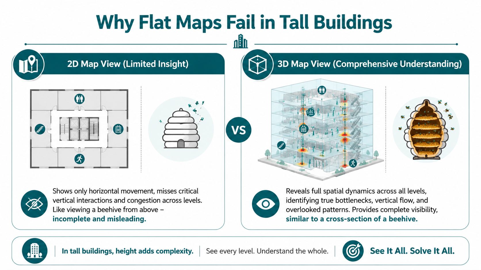
Where 2D analytics breaks down
Stairs and escalators are the obvious example, but they are not the only one. Lift lobbies, bridge links, split-level retail thresholds and platform interchanges all create vertical overlap. In plan view, those flows merge. In operations, they behave very differently.
A 3d heat map separates three conditions that a flat map often confuses:
| Decision area | What a flat map suggests | What a 3d heat map can reveal |
|---|---|---|
| Staffing | “Main entrance is overloaded” | Separate flows above, below and through the entrance volume |
| Cleaning | “Ground floor needs more attention” | Peak use may be concentrated on link routes or upper connectors |
| Retail placement | “This unit has weak passing trade” | Traffic may be strong on the level above or below |
| Accessibility | “The route is open” | The route may be vertically confusing or crowded at transitions |
That distinction matters most for accessibility. A route can look clear on a floorplan and still fail a wheelchair user, a blind traveller, or anyone avoiding stairs because the actual friction sits at the change of level. If the map cannot isolate that transition, the venue cannot diagnose the problem properly.
I have seen this in transport and public venues repeatedly. Teams focus on floor area because that is how many reporting tools are configured. The service issue sits in the section of the building, not the plan. You do not fix that with better colour gradients. You fix it by modelling the space as people use it.
The spatial model has to match the operating reality
Operators, architects and digital teams need the same reference model. If design drawings describe the venue in section but daily reporting reduces it to flat layers, maintenance, staffing, wayfinding and accessibility decisions start to drift apart. Resources such as Armox Labs creative workflow for architects are useful in that context because they reinforce volumetric thinking instead of treating the building as a set of disconnected plans.
For existing buildings, the starting point is accurate geometry. If the base model misses stair cores, lift positions, ceiling height changes or link corridors, the analytics will miss them too. Waymap's guide to 3D LiDAR scanning for indoor mapping is worth reviewing because it focuses on spatial capture that supports navigation and operations, not just visual presentation.
If your analytics cannot distinguish between a platform, a mezzanine and a stair core, they cannot support reliable operational decisions.
Flat maps still have a place in simple, single-level sites. In tall, busy venues, they hide the very conditions that drive delay, crowding and accessibility failure.
How a 3D Heat Map Is Built Without Infrastructure
The first objection most operators raise is sensible. If this needs cameras, beacons, cabling and a major install, the business case gets shaky very quickly.
It doesn't have to work that way.
A modern 3d heat map can be generated from software-based sensor fusion rather than fixed hardware. In practice, that means using the motion sensors already inside smartphones, such as accelerometers and gyroscopes, to infer movement patterns and aggregate them into a spatial model of footfall. That approach can cut deployment and maintenance costs by up to 70% compared to Bluetooth beacon installations, and the same source notes its relevance to RSSB guidance on dynamic passenger flow monitoring (Eric Baker 3D heat map paper).
What the stack actually looks like
The workflow is less mysterious than many buyers expect.
Map the venue geometry
You need a reliable digital representation of levels, circulation routes, entrances, thresholds and points of interest.Read motion from the handset
The phone's sensors provide movement signals without requiring venue-installed hardware.Fuse and position the movement data
The software reconciles stride, direction and orientation against the mapped environment.Aggregate anonymously
The useful output for venue operations is not an individual trace. It's a density field that shows where movement accumulates over time and by level.
If you need a broad non-technical explainer for colleagues who still think “3D” means only design visualisation, this guide to 3D for businesses is a decent primer because it frames 3D as a business tool rather than a creative novelty.
Why operators prefer software over installed hardware
Beacon-first projects often look manageable in procurement and difficult in year two. Devices need maintenance. Batteries fail. Layouts change. Temporary works interfere. Refits break assumptions. Then teams are left maintaining an invisible estate of dependencies just to keep analytics alive.
Sensor-fusion approaches avoid much of that burden because they rely on what users already carry. For operators, that changes the rollout discussion from capital installation to service deployment.
Practical rule: If your footfall system depends on dozens or hundreds of physical devices staying perfectly maintained, budget for drift, not just installation.
There's also a governance advantage. Camera-led systems can trigger immediate privacy concerns. Aggregated motion-sensor data is still a data responsibility, but it usually fits more cleanly into an anonymisation-by-design approach.
A clear overview of how detailed maps support this kind of navigation-led analytics sits in Waymap's work on mapping and navigation. The important point for operators is simple: a useful 3d heat map doesn't require turning your venue into a hardware project.
To see the idea in motion rather than as a diagram, this short video is a helpful reference point.
From Data Visualisation to Operational Decision
Monday at 8:45 a.m. is when weak spatial reporting shows up. Queues form at one bank of lifts, a stair core stays underused, staff get pulled into repeat wayfinding questions, and a manager is left with a flat dashboard that explains none of it clearly.
A 3d heat map becomes operationally useful when it supports a decision with cost, staffing, accessibility, or risk attached to it.
What operators can act on
Facilities teams usually need timing and location together. A corridor that looks minor on a 2D plan can carry a sharp surge between parking, lifts, and a clinic or event space. That affects cleaning windows, waste collection timing, and where support staff need to be during handover periods.
Security teams get a better read on vertical movement. Stairwells, escalator approaches, mezzanine links, and lift lobbies often look quieter than they are because standard reports split flow by floor. In a 3D view, those connectors show up as shared pressure points, which helps with patrol routes, incident response positioning, and queue management.
Commercial and guest experience teams see a different problem. Poor performance is not always low demand. Sometimes people are present in the building but are not discovering the upper level, the accessible route, or the retail offer tucked behind a vertical transition. That is a layout and wayfinding issue, not just a leasing one.
Accessibility teams should read the same model through another lens. Repeated hesitation near lift banks, junctions, or transitions between concourse and platform level can indicate cognitive load or poor route clarity, even when total footfall looks healthy. That is where a spatial model earns its keep. It helps operators separate crowding from confusion.
What turns a model into a decision tool
The useful question is not “where is it busy?” The useful question is “what will we change because this space behaves that way?”
In practice, that usually leads to decisions like these:
- move staff coverage to vertical connectors during known surge periods
- adjust cleaning and replenishment windows around short, intense bursts rather than daily averages
- relocate or simplify signage where people pause, reverse, or cluster before choosing a level
- review whether the accessible route is visible and legible under peak conditions
- test tenant placement or temporary activations against actual inter-level discovery patterns
Teams working from detailed 3D site models for complex venues can tie those actions back to the building form, not just to a colored overlay on a floor plan.
Good spatial reporting changes staffing, signage, and route design.
Don't confuse a quick heat map with an operational one
A fast visual can help in a meeting. It rarely answers operational questions on its own. If a colleague needs a lightweight refresher on the basics, this guide on how to make heat maps quickly is a reasonable starting point.
The harder work is operational interpretation. Analysts need to check whether a hotspot reflects true congestion, a short dwell caused by uncertainty, a bottleneck at a vertical transition, or a service point that is absorbing avoidable staff time. Those distinctions matter because the interventions are different.
A venue operator should press on questions like these:
- Which routes look acceptable in plan view but fail once level changes are included?
- Where do assistance requests cluster relative to lift lobbies, stairs, or decision points?
- Which zones create avoidable signage and staff workload because the space itself is hard to read?
That is the shift from visualisation to management. The map is only useful if it leads to a better operating pattern.
The Next Frontier Dynamic Cues for Accessibility
Historical insight is valuable, but it's still retrospective. The more important opportunity is to use live 3d spatial signals to shape the journey while it's happening.

That matters most in accessibility. If a system can recognise a dense zone ahead, a confusing intersection, or a vertical transition likely to be difficult in peak conditions, it shouldn't stop at showing that on a manager's dashboard. It should inform guidance.
The gap in current practice
Current research does not provide an established framework for converting real-time thermal or density streams into accessible audio or haptic cues. That gap is important because it sits exactly at the junction of data visualisation and inclusive design (Esri discussion of next-generation heat maps).
In practical terms, that means venues still tend to use heat maps as management artefacts rather than user-facing signals.
What dynamic cues could do in practice
For a blind or low-vision traveller, a real-time density signal could support decisions such as:
- Avoid this route now. The corridor ahead is unusually crowded.
- Prefer the quieter interchange. An alternative connection is less complex at this moment.
- Prepare for a level change. Density is building around the escalator zone.
For operators, that same live layer could inform temporary interventions. A venue team might adjust steward positioning, issue route advice, or alter how a service desk directs arrivals during short-lived pressure peaks.
A strong foundation for this kind of work is a spatial model that already understands the venue in three dimensions. Waymap's work on 3D site models points to why that matters. If your model doesn't represent volume, transitions and route context properly, your live guidance won't either.
A static sign can only describe the building. A dynamic wayfinding layer can respond to what the building is doing right now.
That's the essential frontier for the 3d heat map. Not prettier reporting. Better, more adaptive journeys for people who need the environment to communicate clearly.
Best Practices for Implementation and Measurement
A weak deployment usually starts with a vague objective. “Improve insight” sounds fine in a steering meeting and fails in operations. A stronger brief names the decisions you want to improve.
Start with one operational question
Pick a use case that already has an owner and a pain point. Examples include congestion at interchanges, underused entrances, confusing arrival routes, or repeated complaints about wayfinding at level changes.
Don't start with estate-wide ambition. Start with one part of the venue where bad spatial understanding already causes friction.
Build the governance before the dashboard
This matters more than teams expect. If people don't trust how movement data is handled, the project slows down.
Use a simple checklist:
- Anonymisation by design. Aggregate movement patterns for operational analysis rather than exposing individual journeys.
- Clear retention rules. Keep what the venue needs and no more.
- Defined access. Facilities, accessibility and operations leads may need different views of the same data.
Make the visualisation readable
A 3d heat map can become misleading if the rendering is over-styled or badly framed. Operators don't need dramatic colour. They need legibility.
Good practice usually includes:
- Consistent viewpoints so comparisons across time are meaningful.
- Controlled colour scales so small changes aren't visually exaggerated.
- Level-aware labelling to separate floor activity from vertical connector activity.
- Operational overlays such as lifts, ticket gates, clinics, exits or service points.
Measure outcomes that people already care about
If the KPI only matters to the analytics team, the deployment won't stick. Tie measurement to existing operational reporting.
| Area | Better KPI choice | Weak KPI choice |
|---|---|---|
| Accessibility | Reported navigation pain points by route | Number of dashboard views |
| Facilities | Cleaning schedule alignment with actual use | Total heat map sessions |
| Operations | Queue or dwell issues at known pinch points | Number of visual layers created |
| Guest experience | Route clarity at arrivals and transitions | General platform engagement |
The most useful review rhythm is short. Check whether the 3d view changed a decision, whether that decision was implemented, and whether the affected area became easier to operate.
If it didn't, either the visualisation wasn't tied to a real workflow or the question was too broad. Both are fixable. What isn't fixable is deploying spatial analytics with no owner and no operational measure of success.
Frequently Asked Questions about 3D Heat Maps
What is a 3d heat map in a venue context
It's a visual model of movement or density across width, depth and height inside a real space. In practice, it helps operators see how people use stairs, escalators, concourses, mezzanines and linked floors without collapsing them into a misleading flat view.
Are 3d heat maps only useful in transport hubs
No. They're most useful anywhere circulation happens across multiple levels or route transitions. That includes hospitals, shopping centres, campuses, stadiums, airports and large civic buildings.
Do you need beacons or cameras to deploy one
No. A 3d heat map can be built using software-based sensor fusion from smartphones rather than installed hardware. That reduces maintenance overhead and avoids turning the project into a hardware estate.
How do 3d heat maps help accessibility teams
They reveal where vertical complexity, crowding and route ambiguity overlap. That helps teams identify routes that may be legally open but operationally difficult, especially for blind and low-vision visitors.
Can 3d thermal mapping support underground accessibility work
Yes, and this is still an underexplored area. There is a significant research gap and an emerging opportunity to use 3D thermal mapping to improve accessibility in underground environments, including identifying potential slip hazards from condensation and mapping thermal comfort zones that may help vulnerable users with wayfinding (Utah State report on 3D uneven extreme heat distribution).
What's the biggest implementation mistake
Treating the system as a visualisation purchase instead of an operational tool. If you don't define the decisions it should improve, you'll get an attractive model and very little change.
What should a venue measure first
Measure one operational outcome tied to one route or zone. Good starting points are reported navigation issues, pressure at a level transition, or repeated demand for staff assistance in a known problem area.
If your venue needs navigation that works indoors, outdoors and underground without GPS or installed hardware, Waymap is built for exactly that challenge. It gives operators a practical way to turn detailed spatial mapping into accessible, step-accurate guidance for real people moving through complex environments.