
How to Map Your Show: A Venue Manager's Guide for 2026
If you're managing a venue and trying to map your show properly, you're probably already dealing with last-minute stand changes, service corridors that visitors accidentally enter, questions about step-free access, and staff who spend half the day giving directions. That's normal. What isn't workable any more is treating the event map as a poster, a PDF, or a floor plan built mainly for exhibitors.
Map Your Show and similar platforms matter because they reflect how event operations have changed. Map Your Show presents itself as a trade show management platform that combines exhibitor management, floor-plan building, mobile app navigation, session scheduling, and real-time event updates in one system, which is why it's relevant for large venues coordinating multiple halls and high participant volumes through a single operational layer (Map Your Show trade show management software). But if you're responsible for visitor experience, accessibility, and compliance as well as commercial delivery, you need to think beyond booth placement and sponsor visibility.
We write this as the Waymap team, from the perspective of accessibility and operations. The practical question isn't only how to create a map. It's how to create a map people can use under pressure, in an unfamiliar building, with different mobility, sensory, and language needs.
Laying the Foundation for Your Event Map
Static maps fail visitors for a simple reason. They show space as the organiser sees it, not as the visitor experiences it. A hall may look clear on a plan, yet the actual journey involves ticket checks, temporary barriers, acoustic confusion, closed lifts, queue build-up, poor sightlines, and decision points where people hesitate.
If you want to map your show well, start by treating the map as an operational dataset, not a design file. The quality of that dataset determines whether your navigation works on day one or causes more confusion than the printed signs it replaced.
Collect the venue data before you think about routes
Your first pass should gather the building information that rarely sits neatly in one place. Venue CAD files, fire plans, exhibitor layouts, catering plans, accessibility notes, security overlays, and housekeeping updates often live with different teams. Pull them together before any digital mapping begins.
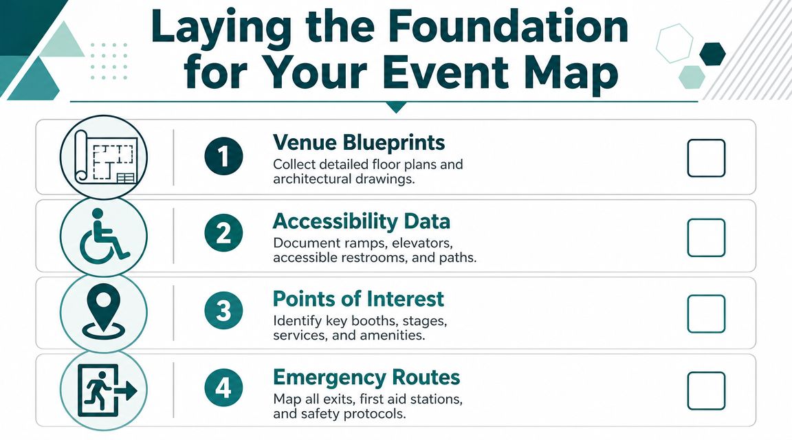
A usable base dataset should include:
- Entrances and arrivals: Public entrances, staff-only doors, drop-off points, taxi ranks, car park access, registration desks, security screening, and ticket collection.
- Vertical movement: Lifts, ramps, stairs, escalators, platform lifts, and any route restrictions that affect step-free travel.
- Core services: Toilets, accessible toilets, baby changing, first aid, prayer rooms, quiet rooms, water points, cloakrooms, charging points, and food outlets.
- Event features: Stands, stages, theatres, meeting rooms, sponsor zones, demo areas, press rooms, and help desks.
- Safety and resilience: Emergency exits, refuge points, medical response locations, steward positions, and temporary closures.
A seating layout often exposes hidden circulation problems before build-out starts. Ticketsmith's guide to creating an event seating chart is useful here because seating plans often affect aisle widths, crowd flow, and sightlines long before visitors interact with your digital map.
Map what disabled visitors need, not just what operations teams track
The most common omission is accessibility detail. Teams often mark the accessible toilet and stop there. That isn't enough for real navigation.
You need to capture:
- Step-free route continuity: Whether a route is uninterrupted from entrance to destination.
- Door behaviour: Heavy manual doors, automatic doors, security-controlled doors, and doors that are frequently propped open or shut.
- Surface changes: Carpet to tile transitions, external paving changes, temporary cable covers, and thresholds.
- Decision-point clarity: Places where audio guidance or visual prompts must be precise because the wrong turn sends someone into a back-of-house area.
- Rest and support points: Benches, waiting areas, lower-noise zones, and staffed assistance points.
Practical rule: If a member of staff regularly gets asked for the same direction, that location belongs in your map dataset.
Many venue teams discover that a floor plan is only the start. A digital navigation layer has to reflect the actual conditions of use. If you're evaluating tools for this stage, Waymap's overview of floor mapping software is a useful reference point because it frames mapping as an operational task, not just a design exercise.
Build a master map that can survive change
Temporary event layouts break brittle systems. Build your master dataset with layers that can be updated independently. Keep the permanent venue structure separate from temporary stands, pop-up catering, sponsor activations, queue systems, and one-off room uses.
That approach saves time when something moves on the morning of the event. It also avoids the worst failure pattern in venue mapping. Rebuilding the whole map because one part changed.
What Is the Best Way to Create a Digital Map for an Event?
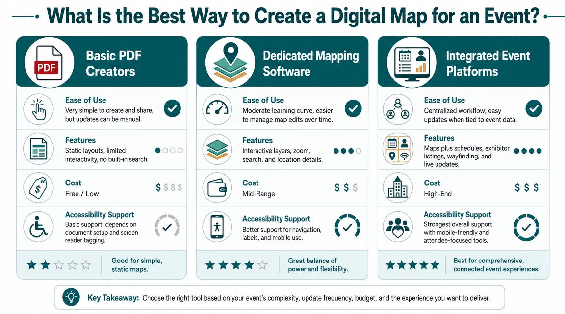
When venue managers search how to map your show, they usually find three categories of tool. A simple PDF workflow. An exhibitor-focused event platform. Or a dynamic navigation system built for live environments. They don't solve the same problem, so choosing well depends on what the map is expected to do.
Good for publishing, poor for operations
A static image or PDF is still common because it's quick. Design teams can produce one fast, attach it to confirmation emails, and print it at scale. For a small, stable event, that can be enough.
The weakness appears as soon as the live environment changes. A relocated exhibitor, a closed entrance, or an out-of-service lift turns a neat PDF into misinformation. Static maps also put the burden on the user to interpret the building. They don't guide, adapt, or confirm progress.
Better for organiser workflows than visitor journeys
Exhibitor-focused platforms sit in the middle. Platforms like Map Your Show position themselves as all-in-one trade show management systems that centralise exhibitor information, floor-plan building, and attendee engagement. This model is common for large UK conference centres that must coordinate hundreds of participants across multiple halls, but primarily serves the event organiser and exhibitors rather than the end-to-end visitor journey (Map Your Show trade show management software).
That distinction matters. These systems are often strong at:
- Booth sales and exhibitor listings
- Session scheduling and directory search
- Mobile event app integration
- Post-event reporting for organisers
They are less strong when the requirement is precise, inclusive navigation inside a complex building. If your core question is "How does a first-time visitor get from the car park to registration to Hall B to a quiet room without confusion?", an exhibitor platform may only solve part of the problem.
Best for live environments where access matters
A dynamic navigation model is operationally different. Instead of publishing a map and hoping people can interpret it, the system guides them through the venue and can reflect changes without reprinting anything.
The key decision criteria are usually these:
| Option | Works for | Main weakness |
|---|---|---|
| PDF or image map | Small events, stable layouts, basic orientation | Hard to update, poor accessibility support |
| Exhibitor event platform | Exhibitor management, directories, attendee engagement | Organiser-first rather than journey-first |
| Dynamic navigation system | Live routing, accessibility, frequent change, complex sites | Requires disciplined map governance |
Some venue managers assume dynamic navigation means beacons, Wi-Fi tuning, or infrastructure rollout. That assumption often slows projects before they start. A different model is possible. For example, 3D LiDAR scanning for venue mapping can support accurate digital spatial capture without turning the whole project into a hardware installation programme.
A map for exhibitors helps people find a stand number. A map for visitors helps people complete a journey.
That's the practical dividing line. If your venue's commercial team owns the brief, an exhibitor platform may be sufficient. If operations, accessibility, and customer service are involved, the standard should be higher.
How to Build an Accessible Event Wayfinding Map
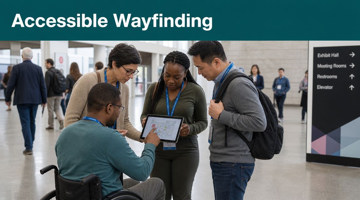
An accessible event wayfinding map starts with one decision. You are not building a digital brochure. You are building a guidance layer that people will rely on while walking, listening, pushing a buggy, using a wheelchair, or navigating with a cane in a busy venue.
The need is mainstream, not specialist. In the UK, an estimated 2 million people live with sight loss, and around 340,000 are registered blind or partially sighted, which makes accessible indoor navigation a customer service and compliance issue for public spaces including major venues (PR Newswire on accessible navigation context).
Start with routes that people can actually follow
Many event maps begin by plotting destinations. Accessibility-led mapping begins by validating routes. A destination is only useful if someone can reach it safely, clearly, and independently.
Build your route network around:
- Arrival paths from entrances, car parks, transport stops, and drop-off points.
- Primary circulation corridors that stay open and legible during peak periods.
- Alternative accessible paths where stairs, gradients, or bottlenecks exclude some users.
- Support routes to toilets, help desks, first aid, quiet rooms, and exits.
Precise path tagging is essential. Mark route width constraints, lift dependency, surface changes, and any points where a user must choose between multiple visually similar corridors.
Tag accessibility information as core map data
Accessibility metadata shouldn't sit in a separate note for customer services. It needs to be embedded in the map itself.
That includes:
- Step-free status for each route segment
- Lift locations and availability dependencies
- Ramps and gradient changes
- Accessible entrances and counters
- Door type and likely friction points
- Refuge areas and assistance points
A lot of teams still build from the organiser's perspective. Stand number, theatre, sponsor lounge. The more reliable method is to build from the visitor's questions. Where do I enter? Is there a step-free route? What happens if the nearest lift is unavailable? Can I reach the destination without asking for help?
For teams refining their process, this guide to UX accessibility testing is a helpful reminder that interface compliance and real-world usability are not the same thing.
The map isn't accessible because it includes an accessibility icon. It's accessible when a disabled visitor can complete the journey with confidence.
Write guidance for ears, not just eyes
Accessible wayfinding depends on instruction quality. Visual maps tolerate ambiguity because the user can scan and self-correct. Audio guidance doesn't. "Turn left near the entrance" is weak if there are three entrances and crowd barriers have changed the space.
Good wayfinding prompts are:
- Specific: Use clear landmarks and decision points.
- Timed properly: Give the instruction early enough to prepare, then confirm progress.
- Unambiguous: Avoid relying on venue jargon or temporary branding that may change.
- Consistent: Use the same naming logic across every route.
This matters especially for blind and low-vision visitors, but it also helps anyone moving through a noisy or crowded event.
A practical example of venue-scale navigation is visible in Waymap's work on maps for malls, where the challenge is not merely plotting stores but guiding people through a layered, busy indoor environment with variable entrances and decision points. In event settings, the same discipline applies to halls, concourses, meeting suites, and public amenities.
Here is a useful demonstration of accessible navigation thinking in practice:
Check your compliance assumptions
Under the Equality Act 2010, the question isn't whether your venue has an accessible policy document. It's whether disabled visitors can use the venue with reasonable independence and dignity. A map that sends people to a staircase, hides quiet spaces, or omits accessible entrances creates avoidable barriers.
That's why the build process must include accessibility and operations staff together. Neither team can do it alone. Accessibility teams understand barriers. Operations teams understand what changes in real time. Your map needs both forms of knowledge.
Why You Must Test Your Map with Disabled Users
A route that looks perfect in a back-office review can fail in under a minute on the event floor. The turn is too late. The corridor sounds similar to the next one. The accessible toilet is technically nearby but hidden behind a badge-controlled door. None of that becomes obvious from a screen review alone.
Testing with disabled users isn't a courtesy round at the end. It's the point where the map stops being hypothetical.
Desk validation misses the hardest problems
Operations teams are used to checking accuracy against plans. That's necessary, but it isn't enough. A correct floor plan can still produce poor guidance if the route relies on assumptions users don't share.
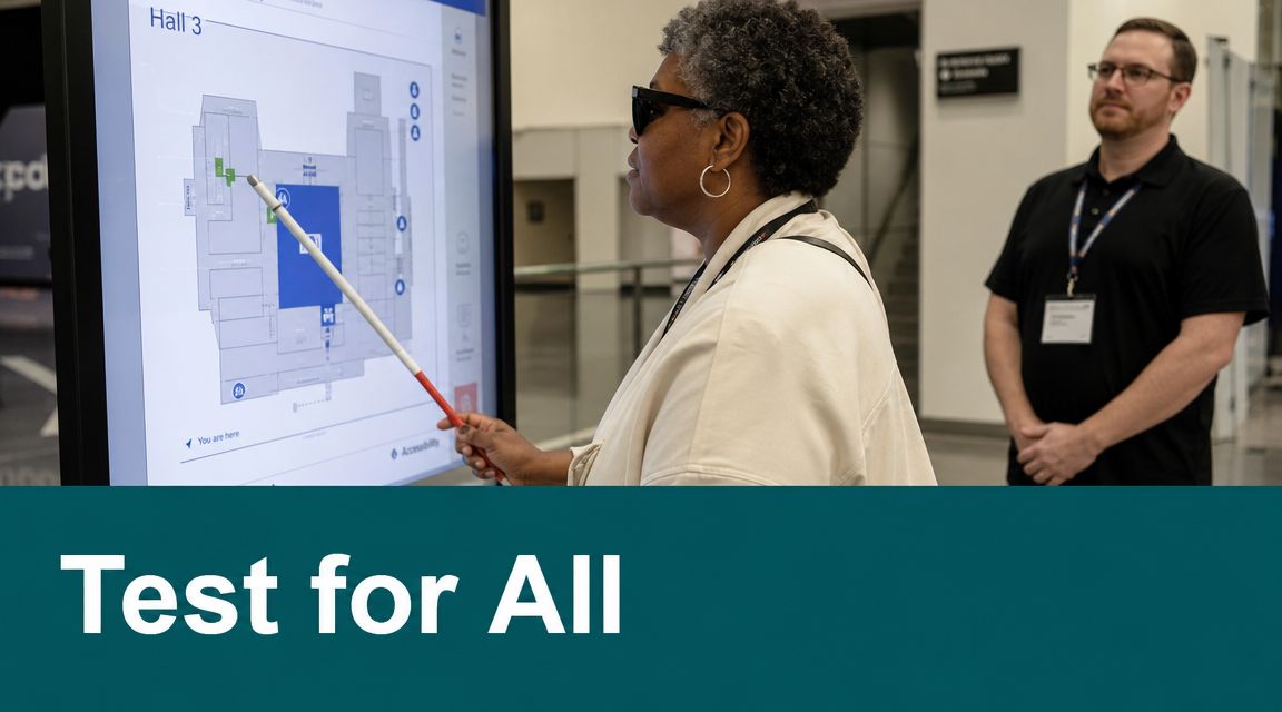
Common failures include:
- Audio that arrives too late at stairs, lifts, or junctions
- Directions built around visual landmarks that are useless to blind users
- Step-free routes that break down because of heavy doors or temporary barriers
- Quiet rooms and welfare spaces that are mapped but hard to approach independently
A wheelchair user, a blind visitor, and a neurodivergent attendee may each reveal a different failure in the same route. That isn't a problem with testing. It's the reason to test.
Test live journeys, not just features
The most useful sessions are task-based. Ask participants to complete real journeys that matter during an event. Entrance to registration. Registration to Hall C. Hall C to accessible toilet. Theatre exit to taxi rank.
Observe where users hesitate, where they ask for reassurance, and where they need human intervention. Then adjust the map, naming, route logic, and prompt timing.
"If users need a staff escort for a journey your map claims to support, the route isn't finished."
That applies especially in venues where routes cross public and semi-controlled spaces. A guidance system for blind and low-vision users has to be tested under realistic crowd, noise, and obstruction conditions. Waymap's work on products for vision impaired users is relevant here because it centres navigation around non-visual use rather than treating accessibility as a secondary display layer.
Include operations staff in the feedback loop
A good testing session includes front-of-house supervisors, accessibility leads, security, and facilities. They often know where visitors get stuck long before formal reports appear.
Capture two kinds of feedback:
| Feedback type | What it tells you |
|---|---|
| User feedback | Whether the journey is understandable and independent |
| Operational feedback | Whether the route will remain usable during real event conditions |
Without that loop, teams tend to fix only the visible problem. The better habit is to fix the cause. Poor naming. Weak prompt timing. Inconsistent destination labels. Unclear route ownership.
How to Publish, Update, and Measure Your Map's Success
Publishing the map is the easy part. Running it well during a live event is harder. Most failures happen after launch, when a temporary entrance changes, an exhibitor relocates, a lift goes out of service, or the event timetable shifts and nobody updates the navigation layer fast enough.
Publish through the channels visitors already use
Visitors won't hunt for your map if access is awkward. Put it in the places they already check before arrival and while on site.
Use a simple launch pattern:
- Pre-event communications: registration confirmations, joining instructions, and accessibility guidance
- On-site prompts: QR codes at entrances, help desks, and concourses
- Staff workflows: front-of-house teams should know exactly how to direct users to the live map
- Support pages: event FAQs, access pages, and travel information
If the map is hidden three clicks deep in an app menu, usage will drop and staff direction requests will rise.
Treat updates as an operations function
Traditional event workflows often revolve around signage replacement. Modern digital wayfinding changes the risk profile. The main issue becomes stale data, not whether a sign has physically failed. That's why update ownership must be clear.
A workable model assigns one operational owner for map changes and one approval path for urgent updates. Prioritise the changes that affect journey completion first:
- Access changes such as closed entrances or unavailable lifts
- Safety and welfare changes such as first aid relocation
- Destination changes such as moved sessions or stand numbers
- Service changes such as catering or help desk relocation
For high-footfall venues, digital visibility helps here. A tool such as Waymap's 3D heat map can support operational review by showing how people move through the venue, which is more useful than relying on anecdotal complaints alone.
Measure success by completed journeys
Map Your Show's public materials place strong emphasis on analytics such as behavioural metrics, revenue prediction, and risk monitoring for organisers and exhibitors (Map Your Show on data-driven trade show decisions). That's useful for commercial planning. It doesn't tell you whether visitors could find the entrance, complete a step-free route, or reach a welfare space without staff intervention.
For venue managers, the more useful measures are:
- Journey completion: Did users reach the intended destination?
- Support burden: Are staff spending less time giving repetitive directions?
- User confidence: Do visitors report that routes were clear and dependable?
- Accessibility performance: Were access needs met in practice, not just listed in policy?
- Update responsiveness: How quickly were route-affecting changes reflected in the live map?
Operational test: If your analytics can report exhibitor interest but can't tell you whether a visitor reached an accessible entrance, you're measuring the wrong outcome for wayfinding.
That's the point many teams miss. A successful event map is not the one with the most features. It's the one that optimizes movement for attendees through the venue without friction.
Frequently Asked Questions About Event Mapping
What does Map Your Show do for an event organiser?
Map Your Show is positioned as a trade show management platform that helps organisers plan exhibit halls, manage exhibitors, engage attendees, and support event revenue growth. It combines functions such as floor-plan building, session scheduling, mobile app navigation, and real-time event updates in one system.
Is Map Your Show enough for accessible venue navigation?
Not always. It can support event mapping and attendee engagement, but accessible navigation requires more than a floor plan and exhibitor directory. You need route logic, accessibility data, precise guidance, and continuous map maintenance.
What is the biggest operational risk after launch?
The biggest risk is stale map data. In modern wayfinding workflows, the failure mode shifts from signage hardware problems to poor digital map governance, which is why venues need a disciplined update process rather than event-by-event improvisation.
How often should an event map be updated?
Update it whenever a change affects a real journey. That includes entrances, lifts, welfare spaces, room uses, temporary barriers, and relocations that alter how visitors move through the venue.
Should I build the map around exhibitors or visitors?
Build around visitor journeys first. Exhibitor information matters, but visitors also need to find toilets, first aid, quiet spaces, step-free routes, exits, and help points without guesswork.
What makes a digital event map genuinely inclusive?
An inclusive map supports independent navigation for people with different sensory, mobility, and cognitive needs. That means accessible route tagging, clear instruction design, disabled user testing, and operational ownership once the event goes live.
If you're reviewing how to map your show and want a navigation layer that supports accessibility, operations, and real visitor journeys, explore Waymap. We work with venues and public environments that need precise indoor, outdoor, and underground navigation without installed hardware, with a strong focus on inclusive guidance and maintainable map operations.
