
Interactive Campus Maps: A Guide for UK Campuses

Open day starts at 9am. By 9:20, reception is already answering the same questions. Where’s the engineering building? Which entrance is open? Is there step-free access to the lecture theatre? Why does the online map show one route while the temporary works fencing forces another?
Most campuses already have “a map”. That isn’t the primary issue. The issue is that a university estate changes by the hour, while the information people rely on often changes by term, or not at all.
Facilities teams live with the consequences. Student services picks up the frustration. Accessibility leads inherit the complaints. Marketing promises a polished campus experience, then visitors hit a reality made up of static PDFs, outdated signage, patchy indoor positioning and staff who become human wayfinding systems.
That gap is why interactive campus maps matter. Not as a nicer visual layer, but as operational infrastructure. When they work, they reduce avoidable enquiries, support recruitment, improve orientation, and give estates teams a live view of how people move through the campus. When they don’t, they become another digital veneer over the same old navigation failures.
From the Waymap Team, this is the practical view. Not a feature tour. A decision framework for leaders who need to choose between a map that looks modern and a navigation platform that actually works.
Your Campus is More Complex Than a PDF Map
A campus map used to be a document. It showed buildings, roads, maybe a legend for parking and accessible entrances. That was good enough when estates changed slowly and most journeys happened in predictable patterns.
That isn’t how campuses operate now.
A modern university has overlapping users with different needs at the same time: first-year students, conference delegates, contractors, visiting academics, applicants, parents, delivery drivers, and people who need precise step-free or non-visual guidance. Add temporary closures, room moves, security restrictions, event routing and seasonal pressure points, and the old model breaks down fast.
Static maps fail when the campus changes faster than the document
The practical problem with a PDF isn’t that it’s digital paper. It’s that it can’t respond. It can’t tell a visitor that the most obvious entrance is closed. It can’t account for indoor transitions. It can’t adjust to a user who needs an accessible route rather than the shortest one.
That failure shows up in operational drag:
- Front-of-house teams absorb the overflow when visitors can’t self-serve.
- Academic and support staff lose time giving directions instead of doing their actual work.
- Accessibility teams carry the risk when navigation support works for sighted users but not for people who are blind or have low vision.
- Estates teams lose feedback because static maps don’t show where people search, where they fail, or where traffic builds up.
Practical rule: If your map can’t change with closures, events, accessibility constraints and live routing needs, it isn’t a wayfinding system. It’s a reference document.
The reputational cost shows up before anyone files a complaint
Prospective students and visitors judge an institution long before they reach the room they were meant to find. Confusion at the gate, uncertainty at the entrance, and inconsistent information between signs, web pages and apps all create the same impression: this place is harder to use than it should be.
That matters in recruitment, but it also matters in retention and inclusion. A poor first-week orientation experience isn’t just inconvenient. It subtly tells people whether the campus was designed with them in mind.
Interactive campus maps are valuable when they behave less like brochures and more like live operational tools. That’s the standard worth buying against.
What Do We Mean By An Interactive Campus Map
“Interactive campus map” gets used too loosely. In procurement meetings, it can describe anything from a clickable estate plan to a full indoor-outdoor navigation platform. Those are not the same purchase.
The easiest way to think about it is the same way people think about road navigation. A paper atlas, a web map with pins, and a live navigation app all show geography. Only one gets you to the right entrance at the right time.
Level one is a digitised static map
This is the common starting point. A PDF or image becomes web-based. Users can zoom, pan and tap a building label or point of interest.
It’s better than emailing an attachment. But the capability ceiling is low.
A digitised static map usually works for broad orientation. It does not solve route guidance, accessibility choice, indoor transitions or live operational updates. Many universities believe they have interactive campus maps when what they actually have is a cleaner format for static information.
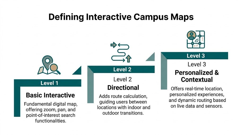
Level two adds search and points of interest
Mapping offers considerable utility for visitors. Users can search for buildings, departments, parking, cafés, lecture theatres or student services. Categories help. Information cards help. In some deployments, users can also see opening times or short descriptions.
For many estates teams, this level delivers quick wins. It reduces the “where is it?” problem. It still doesn’t solve the “how do I get there from where I am, through this campus, right now?” problem.
The gap matters because the hardest journeys on campus are rarely about identifying a destination. They’re about navigating complexity between origin and destination.
Level three is a dynamic navigation platform
This is the category that changes operations. The system doesn’t just show places. It guides people to them.
A dynamic navigation platform combines mapped routes, location awareness and a delivery method that can support indoor and outdoor navigation in real conditions. It can also reflect route logic such as step-free access, preferred entrances, temporary changes, and the transition from public realm to building interior.
That’s the standard to compare against if you’re dealing with a large, mixed-use estate.
A useful test is simple:
Map typeWhat the user can doWhere it usually failsDigitised staticBrowse campus visuallyLive changes, routing, accessibility choicePOI-drivenSearch destinations and categoriesTurn-by-turn guidance, indoor precisionDynamic navigation platformNavigate from current location to exact destinationDepends on underlying positioning approach
The positioning approach is where many projects succeed or fail. A platform may look advanced in a demo and still collapse in use if it relies on weak indoor positioning.
That’s why buyers need to ask how location is calculated, not just how the interface looks. The technical model matters more than the icon set. If you want a deeper view of what sits underneath modern navigation systems, how indoor navigation works in practice is the question to ask before comparing vendors.
Why Legacy Wayfinding Fails At Scale
The usual promise sounds familiar. Add some indoor positioning, connect it to a digital map, and the campus becomes navigable. On paper, that seems reasonable.
In practice, many legacy wayfinding systems fail because they depend on infrastructure that doesn’t stay accurate, doesn’t stay maintained, or doesn’t support all users equally.
GPS works outside and then stops helping
GPS is useful on approach to campus. It’s weak inside large buildings, unreliable in dense urban estates, and of limited value once the journey includes corridors, foyers, stair cores, basements or underground links.
That matters because the most stressful part of campus navigation usually starts when the building appears to be “right there”. The final stretch is where confidence drops and poor guidance causes the most friction.
Wi-Fi positioning rarely delivers the precision people assume
Wi-Fi triangulation can be attractive because the estate already has wireless infrastructure. The temptation is obvious. If the network exists, why not use it for indoor positioning?
Because network design and navigation design aren’t the same thing. Wi-Fi was usually deployed to deliver connectivity, not precise location. The result can be inconsistent positioning across buildings, variable performance during network changes, and poor reliability in the exact places where users need certainty.
That doesn’t just frustrate visitors. It undermines trust in the map itself. Once people see the blue dot drift, jump floors, or lag behind movement, they stop following it.
Beacon-first systems create a maintenance estate of their own
Bluetooth beacons are often sold as the answer to indoor wayfinding because they provide local signals where GPS can’t. The catch is operational, not conceptual.
Every beacon-based deployment creates a second estate for the facilities team to manage. Devices need placement, calibration, inspection and replacement. Batteries expire. Signals interfere with one another. Environments change. Devices get moved, obscured or fail. Accuracy drifts, and the burden accumulates building by building.
Most beacon projects don’t fail in procurement. They fail in year two, when the estate has to maintain them properly.
This is why large campuses should evaluate total operating complexity, not just pilot performance. A controlled demonstration in one block can look convincing. Sustaining that across teaching spaces, libraries, residences, sports facilities and public-facing venues is a different question.
Accessibility is where most legacy mapping falls short
The biggest failure is often hidden in plain sight. Many campus maps are designed for sighted users first and only lightly adapted for everyone else.
According to analysis of campus map accessibility gaps in UK higher education, 78,000 disabled students report navigation barriers, and platforms that do not offer hardware-free, audio-based navigation fail to meet the proactive accessibility adjustments required by the UK’s OfS condition B3 for 2023 to 2025.
That point changes the whole procurement conversation. If a platform depends on visual interpretation, weak indoor location, or infrastructure that frequently degrades, it won’t deliver equitable access in real use.
What works in a brochure often fails in the estate
A simple comparison helps:
- GPS-led tools work for campus approach, then struggle indoors.
- Wi-Fi-led tools can be convenient to trial, but often lack stable precision.
- Beacon-led tools can perform in bounded areas, but create ongoing hardware operations that many estates underestimate.
- Visual-first map interfaces help some users while excluding others.
The practical lesson is blunt. The more your wayfinding system depends on installed hardware and visual interaction, the harder it is to run at scale and the easier it is to exclude the very users who most need precise guidance.
The Business Case Beyond Visitor Convenience
Senior teams rarely fund navigation projects because visitors occasionally get lost. They fund them when poor wayfinding creates operational waste, avoidable support load, accessibility risk, and missed commercial value.
That’s the primary business case for interactive campus maps.

The useful data isn’t the map itself
A mature platform gives facilities and operations teams data they can act on. Search patterns show what people can’t find easily. Footfall trends show where demand clusters. Failed searches expose naming problems, missing amenities, and route friction.
At UK institutions, mapping analytics used for facilities management have led to targeted improvements that boosted on-campus spending by 18% annually, while campuses with integrated mapping saw a 25% reduction in maintenance costs through predictive asset monitoring in high-traffic areas.
Those numbers matter because they move the conversation away from “nice to have” and into budget language. Estates directors can justify intervention when navigation data supports space planning, asset prioritisation and revenue decisions.
Accessibility is not a side requirement
Too many projects still treat accessibility as a compliance workstream that sits beside the core user experience. That’s backwards. If the navigation model only works for confident, sighted smartphone users, the system is incomplete from day one.
An accessible navigation layer improves the campus for everyone. Parents carrying luggage, visitors who don’t know the site, staff moving between unfamiliar buildings, delegates under time pressure, and students navigating in low confidence all benefit from clearer guidance and better route logic.
Operational view: Accessibility-led design usually exposes the hidden weaknesses in a campus map faster than any standard usability test.
That’s one reason hardware-heavy systems struggle. They add fragility where reliability matters most. If batteries fail, signals drift, or routes become stale, the users with the least margin for error pay the highest price.
ESG and long-term estate logic point in the same direction
Universities are under pressure to show that digital transformation isn’t creating unnecessary physical overhead. That should affect map procurement more than it often does.
A hardware-dependent wayfinding model means more devices, more replacement cycles, more maintenance journeys and more failure points across the estate. A software-led model has a different profile. Fewer physical components means less operational burden and a cleaner sustainability story.
This is also where procurement teams should stop separating digital and physical infrastructure. An interactive campus map becomes part of the built environment once students, visitors and staff depend on it to move confidently. It needs the same scrutiny you’d apply to lifts, signs or door access systems. Reliability, maintainability and inclusivity matter more than interface polish.
Recruitment and brand are downstream effects
Visitors notice if a campus is easy to use. Applicants notice whether digital exploration reflects the experience on site. But those benefits come after the fundamentals.
The strongest business case starts with four questions:
- Where are we currently absorbing avoidable wayfinding demand?
- What accessibility gaps remain unresolved because current tools are visual-first or unreliable indoors?
- What operating burden are we accepting from infrastructure-heavy positioning models?
- What decisions could we make better if we had real search and movement data?
If a proposed platform can’t answer those questions clearly, it’s probably a map interface rather than a strategic campus system.
The Superiority of Sensor-Fusion Navigation
The cleanest answer to the campus wayfinding problem is to remove the dependency that causes most failures. Don’t rely on GPS indoors. Don’t rely on Wi-Fi triangulation for precision. Don’t build an estate of beacons that someone has to keep alive.
Use the sensors already in the phone.

Why sensor-fusion fits the campus environment
Sensor-fusion navigation calculates position by combining data from the smartphone’s internal sensors with a detailed map of the environment. In practical terms, that means the system uses motion data, orientation and mapped context to understand where the user is and how they’re moving, rather than waiting for an external signal to tell it.
That model suits universities because campuses are mixed environments. A user may start outside, move through a courtyard, enter a building, pass a stair core, cross a corridor network and end in a basement seminar room. Any method built around signal availability will be weakest exactly where the route becomes most complex.
According to data on sensor-fused navigation performance in UK campus contexts, this approach achieves less than 1 metre error, reaches a 95% success rate in signal-denied environments, outperforms beacon systems at 85% reliability, and cuts maintenance costs by 70% versus static signage.
Accuracy matters differently for different users
A sighted visitor can sometimes recover from a vague blue dot. Someone who is blind or has low vision often can’t. That is why hardware-free, step-accurate guidance changes the standard, not just the user experience.
What matters is that the guidance must match how the individual actually moves through space, not just that the system knows the route. Stride length, pace, turns and orientation all matter when the instruction is delivered as audio rather than visual approximation.
That’s also why sensor-fusion is operationally stronger. It doesn’t ask the estate team to maintain a network of devices across hundreds of rooms and routes. It asks for accurate maps, a reliable update process, and route logic that reflects the environment.
For a closer technical view of that model, sensor-based mapping technology for indoor navigation is the relevant category to understand.
Here’s a short demonstration of the approach in action.
What this means in procurement terms
When buyers compare systems, they often compare surfaces. Search bar quality. Visual design. CMS screens. Those things matter, but they are not the hard part.
The hard part is whether the navigation layer still works:
- Inside buildings without GPS
- Across different building types
- For users who need non-visual guidance
- Without creating a maintenance estate of physical devices
Waymap is relevant as one example of a sensor-fusion approach. It uses the phone’s motion sensors and mapped routes to provide step-by-step navigation indoors, outdoors and underground without relying on GPS, Wi-Fi or installed hardware.
Buy against failure modes, not feature lists. The strongest campus wayfinding systems are the ones with the fewest dependencies.
That principle tends to sort the market quickly. If a platform needs multiple layers of external infrastructure to provide dependable indoor guidance, the campus will carry that complexity for the life of the contract.
How to Procure and Implement a Campus-Wide Solution
Campus wayfinding shouldn’t be procured as a standalone app. It should be treated as service infrastructure with digital, accessibility and estates consequences from the start.
That changes how you scope the project and how you test vendors.
Start with the problem statement, not the demo
Most institutions can identify the symptoms quickly: repeated visitor enquiries, missed appointments, open-day confusion, poor orientation, inaccessible routes, outdated signage, inconsistent naming and weak indoor navigation.
Turn that into a one-page problem statement before issuing anything to market. Keep it specific. Which journeys fail most often? Which users are least well served? Which buildings generate the highest support burden? What updates currently take too long to publish?
That document stops the project drifting into interface theatre.
A useful first pass often looks like this:
- Operational pain points: reception load, event routing, temporary works, room moves.
- Accessibility gaps: non-visual guidance, route certainty, entrance logic, indoor independence.
- Data needs: search analytics, traffic patterns, failed searches, route demand.
- Estate realities: maintenance capacity, mapping updates, integration constraints.
Build the stakeholder group before procurement starts
This is one of the most common mistakes. A university buys a mapping platform through one budget line, then discovers implementation needs decisions from five departments that were never aligned.
You need facilities, accessibility, IT, digital, student services and communications in the room early. Marketing may care about recruitment journeys. Accessibility may care about non-visual navigation. Estates may care about route updates and maintenance. IT will care about integration and support. None of those views is optional.
The fastest route to a weak deployment is to let one team buy for everyone else.
Set success measures that reflect campus outcomes
If you only ask whether users like the interface, you’ll get a shallow implementation. Better measures tie directly to institutional outcomes.
Research summarised in UK higher education mapping and recruitment data shows that 64% of prospective students engage with virtual campus tours, 78% of UK applicants prioritise such tools when shortlisting universities, and campuses offering real-time interactive maps see a 15 to 20% uplift in application conversion rates alongside a 40% reduction in visitor inquiries.
That doesn’t mean every institution should buy on recruitment alone. It means the return should be assessed across recruitment, operations and accessibility at the same time.
Ask harder implementation questions
Don’t stop at feature lists. Ask the vendor what ongoing work your own teams will inherit.
A practical due-diligence checklist should include:
- Update model
How are route changes, closures and points of interest maintained? Who owns the workflow? - Positioning dependency
Does the system rely on GPS, Wi-Fi, beacons, or smartphone sensors? What fails if the environment changes? - Accessibility method
Is guidance usable without visual interaction? - Mapping process
How are floor plans translated into navigable routes? What’s the revision cycle? - Support model
What happens after launch when buildings change?
If your procurement team wants a broader benchmark for evaluating operational partners and procuring technical services in built environments, it can be useful to compare how different service models handle maintenance accountability, change control and response obligations.
For campuses assessing route creation and update workflows specifically, floor mapping software for navigable indoor environments is the level of implementation detail worth reviewing before contract award.
Your Next Steps and Common Questions
Most campuses don’t need another strategy paper. They need a controlled first move.
If you’re responsible for facilities, accessibility or digital transformation, the next ninety days should produce enough evidence to decide whether this is an operational priority, what kind of platform you need, and what risks you’ll accept.
A practical ninety-day plan
Days 1 to 30. Audit where navigation breaks.
Walk the campus as different users. Start at the station, bus stop, car park and main pedestrian approaches. Follow the route to teaching buildings, student services, accessible entrances, event venues and low-traffic departments. Log the points where a new visitor would hesitate, make a wrong turn or need to ask for help.
Days 31 to 60. Bring the right owners together.
Hold a short working session with estates, accessibility, IT, front-of-house, student services and digital. Don’t ask what platform they want. Ask where current wayfinding creates avoidable workload, exclusion or reputational friction.
Days 61 to 90. Define a procurement brief around outcomes.
Write down the user groups, journey types, building priorities, update needs, and mandatory accessibility requirements. Then ask vendors to respond to those conditions rather than showing a generic campus demo.
Use analytics to choose where to start
If you already have some digital mapping, use its search and route data to identify the highest-friction journeys first. If you don’t, your helpdesk logs, reception teams and event staff will usually tell you the same story.
According to analytics from large-campus interactive mapping platforms, 68% of searches target parking and transit, contributing to 15 to 20% overcrowding at entry points. The same analysis shows dynamic routing can redistribute this traffic by 30%. It also found that when 40% of traffic heads to libraries on certain days, campuses can justify nearby amenities such as coffee outlets, with reported revenue gains of 12 to 18%.
That’s a useful reminder that interactive campus maps are not only about navigation. They are a way to see where the estate is working against itself.
A good pilot doesn’t prove the map loads. It proves the institution can maintain accurate routes and act on what the data reveals.
FAQ
What is an interactive campus map in practical terms
An interactive campus map is a digital navigation system that lets users search places, understand routes and, at the higher end, receive guidance across indoor and outdoor spaces. The practical difference isn’t whether the map is clickable. It’s whether it can guide people accurately through a changing campus.
Why are static campus maps no longer enough
They’re no longer enough because campus conditions change faster than static documents can keep up. Closures, events, temporary access changes, accessibility requirements and indoor route complexity all make fixed maps incomplete the moment the environment changes.
Are Bluetooth beacons still a sensible option for universities
They can work in limited, controlled areas, but they create long-term maintenance obligations that many campuses underestimate. Battery cycles, calibration, interference and device management make beacon estates hard to sustain across large and mixed-use campuses.
What should a facilities director ask a vendor first
Ask how positioning works and what your team will need to maintain after go-live. Those two questions usually reveal whether you’re buying a durable navigation platform or a system that pushes hidden operational burden back onto the estate.
How do interactive campus maps support accessibility
They support accessibility when they provide route options and guidance that work for people with different mobility and sensory needs, including non-visual navigation. A map that only improves the experience for sighted users isn’t an accessibility solution.
What analytics should a university expect from the platform
A university should expect data on search behaviour, destination demand, route usage, missed searches and movement patterns at a minimum. The value of that data lies in operational decisions, such as where signage is failing, where congestion builds, and where amenities or access routes need to change.
Do interactive campus maps help recruitment or only operations
They help both when implemented well. Prospective students increasingly use digital exploration tools during shortlisting, but the operational value remains just as important because better navigation reduces avoidable enquiries and improves first impressions on site.
How should a university pilot a new wayfinding system
Pilot it on high-friction journeys, not easy ones. Include a mix of indoor and outdoor routes, event-day pressure, accessible journeys and destinations that frequently generate help requests. A pilot should test maintenance reality as much as user experience.
What makes a campus navigation system future-proof
Low dependency on installed hardware, a clear update workflow, strong accessibility support and a positioning method that still works in signal-poor environments. Future-proofing is less about visual design and more about reducing the number of things that can fail.
If your team is reviewing interactive campus maps and wants to assess a hardware-free navigation model for a complex estate, Waymap shows how step-by-step guidance can work indoors, outdoors and underground without relying on GPS, Wi-Fi or installed beacons. That makes it a useful option to evaluate when accessibility, maintainability and operational simplicity all matter at once.