
Retail Store Layout: Design Principles for Modern Shops
Retail store layout still decides a lot of what gets sold, because physical stores still carry most of UK retail value. The British Retail Consortium said in-store sales accounted for about 80% of total UK retail sales value in 2023 (British Retail Consortium cited in retail design research), so the floor plan is not decoration, it's a revenue system. If the paths are wrong, the zones are weak, or the sightlines are cluttered, the store loses sales before anyone notices the problem.
That's why the best operators treat layout as a measured operational decision, not a visual exercise. Sales per square foot, dwell time, customer flow, and sales per linear metre all tell a clearer story than a mood board ever will, especially in UK stores where sales area and back-of-house space compete for every metre. For a practical retail checklist, retail layout strategies from Display Guru is a useful starting point, but the hard part is turning advice into a plan that fits your format.
The right question isn't whether a shop looks good. It's whether the layout helps shoppers move, decide, and buy without creating friction for disabled customers, staff, or seasonal resets. That's where the trade-offs start.
Why Retail Store Layout Still Drives Revenue
In-store sales still dominate the UK retail mix, and that changes how leaders should think about space. The British Retail Consortium reported that physical stores still carried the bulk of UK retail sales value in 2023, so when a retailer reworks an entrance, widens an aisle, moves a fixture, or changes adjacency, it is not rearranging furniture, it is shaping the path to revenue.
Retail planning teams already know this in practice. Store designers routinely track sales per square foot, dwell time, and customer flow because traffic patterns and merchandising placement can change conversion materially, as shown in retail design research. That is the lens I use on site too. If a change does not improve how people enter, orient, browse, and reach the basket-building zones, it usually will not hold up under real traffic.
A useful comparison is the way managers discuss footfall in retail. Footfall alone does not tell you whether the store is working, but it does show where layout decisions either help or fight customer movement. The strongest layouts make circulation feel obvious without making the store feel empty or over-managed.
Practical rule: if a layout change does not improve measurable space productivity, it is a design preference, not an operational win.
The upside is that small changes can matter. In retail design research, tighter category placement and cleaner customer flow are linked to stronger store performance, and the biggest gains usually come from stores where sightlines, fixture height, and aisle logic all work together. That does not mean every store will see the same result. It does mean layout deserves the same discipline retailers already give pricing, staffing, and stock flow.
For a manager, the takeaway is simple. Layout is one of the few levers that affects both browsing and basket size at once, which is why it belongs in the revenue conversation from day one. It also sets the ceiling for accessibility. If circulation only works for the fastest shopper, the store may look efficient on paper while creating friction for disabled customers and staff who have to live with the plan every day.
The trade-off is real. Sales-optimised layouts often push density, display pressure, and directional control, while accessibility compliance requires clear routes, usable turning space, and layouts that do not trap people at dead ends. Infrastructure-free wayfinding can reduce that tension because it guides movement without adding physical clutter or forcing a fixed route through the store, which matters in formats that need frequent resets. That is where operational judgment matters more than theory, because the right plan is the one that protects revenue without making the shop harder to use.
The Four Main Retail Layout Types and When to Use Each
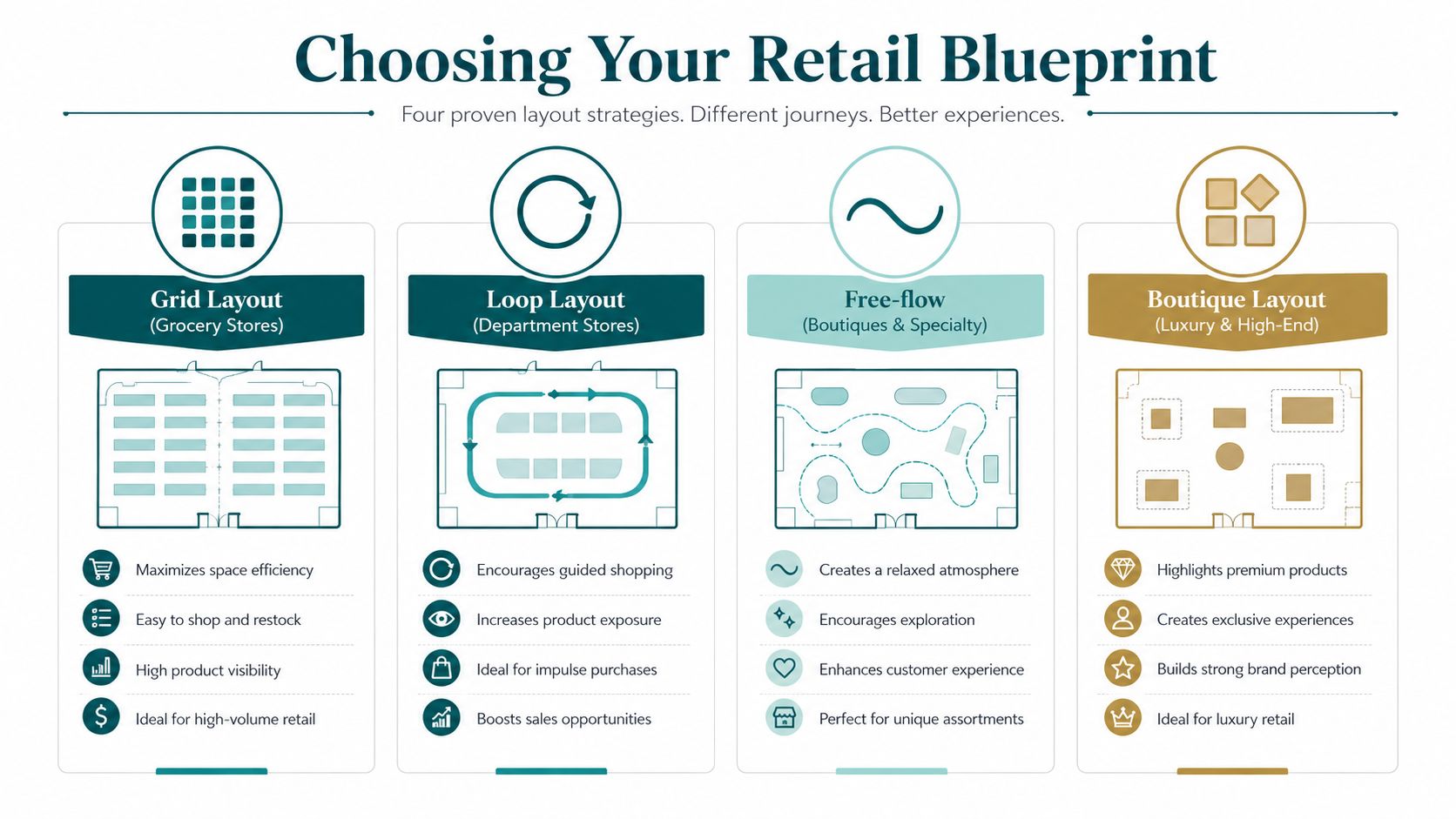
The right layout depends on how much guidance your customers need and how much space you can afford to devote to browsing. Retail store layout choices aren't neutral. They decide whether the shop behaves like a fast-moving utility space or a destination that invites discovery.
Grid layouts suit speed and stock density
Grid layouts work best in supermarkets, convenience stores, pharmacies, and other high-velocity formats because they make the most of shelf space and keep categories predictable. They also support efficient replenishment, which matters in stores where staff are constantly restocking and customers want a familiar route. The trade-off is that grid formats can feel impersonal and visually repetitive.
That repetition isn't always a flaw. In a store where customers come in for known missions, predictability is a service feature. The problem starts when the grid is so rigid that it kills browsing or makes premium categories disappear into the background.
Loop layouts suit guided exploration
Loop, or racetrack, layouts work when you want shoppers to pass through a planned route. They're common in department stores and larger multi-category formats because they increase exposure to more departments before a customer reaches the till. The downside is that they reduce freedom, which can frustrate shoppers who know exactly what they came for.
This is a decent choice for retailers that want controlled discovery, but it needs discipline. If the loop is too long or too narrow, it feels forced rather than curated.
Free-flow layouts suit browsing-led formats
Free-flow layouts are a better fit for boutiques, specialist retailers, and high-end stores where the point is to encourage wandering. They create a more relaxed atmosphere and can make the merchandise feel more considered. The trade-off is operational. These layouts are harder to manage at scale, and customers can lose the thread of the store if there's no visual anchor.
Boutique layouts suit intimacy and smaller assortments
Boutique layouts carve the shop into smaller zones, which works well for luxury retail and curated ranges. They create a sense of exclusivity and let each zone tell its own story. What they don't do well is throughput. If you need fast circulation or large baskets, the format can start to feel crowded.
A good way to compare the four is simple:
- Grid, when you need density, speed, and repeatable navigation.
- Loop, when you need controlled exposure across departments.
- Free-flow, when the customer journey should feel exploratory.
- Boutique, when curation and intimacy matter more than volume.
The YouTube walkthrough below is useful if your team needs a visual reference before sketching the next plan. It's especially handy for new managers who inherit a floor plan but not the logic behind it.
For a broader planning view, shopping malls floor plans show why the same store type can behave very differently depending on how circulation connects to entrances, anchors, and adjacent tenants. Layout choice is never just a store-level decision.
Core Design Principles That Move the Sales Needle
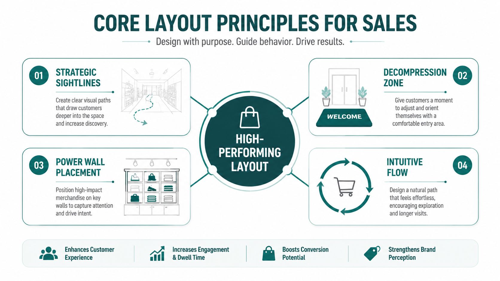
The layouts that perform best usually do four things well at once. They create clean sightlines, give shoppers a short decompression period at the entrance, place related items in strong adjacency, and use focal points to guide movement without choking the floor. That balance is harder than it looks, especially once merchandising wants more display space and operations still has to keep the route open for customers who need clear access.
A store can look busy and still sell badly. The job is to make the floor easy to read, easy to move through, and strong enough at the shelf edge to support basket growth.
Start with the entrance sequence
The first 2 to 5 metres inside the entrance is the decompression zone (retail plan essential guide). Shoppers need that space to reorient before they respond to product displays, so key fixtures and promotional clutter should stay out of that landing area. If the opening feels crowded, the entrance becomes harder to read and the rest of the store starts at a disadvantage.
I have seen stores improve flow by moving the first fixture back and giving the eye a clear path into the next zone. The entrance should introduce the store, not compete with it.
Let customers orient first. Sell to them once they've stepped into the space.
Use sightlines to pull traffic deeper
Sightlines should do one job, which is to draw people deeper into the store and break the moment when the front zone feels complete too quickly. High-margin categories can sit where they get early visibility, but bulky fixtures should not block the deeper parts of the shop. End-caps and focal points need to support the route, not stop it.
Adjacency matters just as much. Items that are naturally bought together should sit close enough to feel obvious, because layout should support basket-building, not just product display. A clean pairing between seasonal footwear and socks, or between coffee and accessories, often does more for conversion than another feature table at the front. If the customer has to backtrack to finish the shop, the floor is working against itself.
Treat end-caps as high-value real estate
End-caps deserve their own plan because they carry disproportionate selling power. Their value is strongest when the product match is clear, the message is simple, and the unit sits in a traffic path that already has momentum. An infographic detailing four core principles for designing a high-performing retail store layout to boost sales results. captures the basic logic well, but the practical test is whether the feature helps shoppers continue forward instead of causing a pause that breaks the flow.
The other rule is restraint. Too many focal points create visual noise, and too much density makes the store feel smaller than it is. Clear routes, deliberate category pairing, and disciplined front-of-store planning usually move more sales than flashy fixtures ever will.
For managers comparing fit-out options, inclusive design principles are worth reading alongside visual merchandising guidance, because a store that looks premium but makes movement harder is still underperforming. The same planning tension shows up in Tanger's Furniture commercial design guide, which is useful on presentation, while the harder question is how the layout performs for people with different mobility and wayfinding needs.
Accessibility Compliance as a Layout Design Constraint
Accessibility isn't a side issue that comes after merchandising. In the UK, the Equality and Human Rights Commission's 2010 Code of Practice for Services says providers must make reasonable adjustments for disabled people, and that duty is anticipatory, which means retailers should plan before a problem appears (SAGE article on the EHRC Code of Practice). That changes the brief for every store fit-out. Circulation width, obstacle-free routes, and wayfinding clarity are compliance issues, not optional extras.
The tension is real. Merchandising teams want density, display power, and more opportunities for impulse buying. Operations teams need clear routes, no dead ends, and layouts that still work when a season changes or a fixture gets moved. If those goals are handled separately, the store ends up serving neither one properly.
Design for movement, not just display
A peer-reviewed retail study defines store layout as the physical arrangement of aisles, shelves, fixtures, signage, entrances, exits, and service points, while another paper breaks it into floor plan, product placement, traffic flow, passageways, and cash-register placement (IJFMR paper). That definition matters because accessibility sits inside layout, not outside it. If a route is too tight, unclear, or blocked by display fixtures, the store is failing as a movement environment before sales even enter the picture.
Mainstream layout advice often stops too early. It tells you where to put the impulse bin, but not how a blind shopper, a low-vision shopper, or someone using a mobility aid reaches the till, lift, or fitting room when the floor changes week by week. A more useful guide is one that starts with the actual path and works outward from there.
Keep reasonable adjustments visible in the plan
The avoid ADA inspection failures piece is written for a different market, but the planning lesson carries across. You can't bolt accessibility on at the end and expect the layout to hold. In retail, that means the design team, the store manager, and the fit-out contractor need to agree where clear routes are protected, where signage is readable, and where high-density merchandising stops.
Practical rule: if a fixture makes navigation harder for one group, it's a layout problem, not an accommodation problem.
For teams working on larger environments, what is accessibility testing is a good companion read because it shifts the conversation from assumptions to verification. Retail leaders don't need more abstract inclusivity language. They need a floor plan that still works when the store is busy, remerchandised, and staffed by people who weren't there last month.
Measuring Layout Performance with Data and Testing
Good layout decisions should survive contact with numbers, not opinions. That means testing the plan against sales per square metre, conversion rate, and dwell time, then checking traffic patterns to see whether the change altered behaviour. Layout optimization works best as a loop, measure, adjust, then measure again, rather than a one-time redesign.
The most common mistake is judging a change by how tidy it looks. I've seen visually attractive refits underperform because they pushed customers away from the categories that mattered most, while plainer changes improved conversion. The floor should answer to POS data, not just a presentation deck.
Test against matched control stores
The cleanest approach is to compare one layout change against a matched control store, then watch for differences in sales and traffic behaviour. Retail conditions vary by location, daypart, staffing, and local shopping pattern, so a single-store anecdote tells you very little unless you can compare it with a similar store that did not change.
Use heatmaps and path data to check where people moved after the change. Then compare that movement with tills and basket outcomes. If traffic rises in one zone but conversion stalls, the problem might be signage, adjacency, or a weak category mix rather than the layout itself.
Use the right metrics for the right decision
For space-heavy formats, sales per square metre is the cleanest way to judge whether the footprint is working. For more browsing-led stores, dwell time and route completion matter more. Conversion still matters everywhere, but it means different things depending on whether the customer journey is mission-led or exploratory.
If the store gets more traffic but less purchase intent, the layout has probably improved visibility without improving decision-making.
A 3D heat map is useful here because it makes path patterns easier to interpret than a spreadsheet alone. It does not replace sales data, but it helps teams spot dead zones, bottlenecks, and overexposed fixtures faster.
Treat micro-layout moves as testable assets
End-caps deserve special attention because they often carry disproportionate influence. In practice, their value depends on category fit, traffic flow, and whether the display supports the main shop mission or distracts from it. A well-placed end-cap can outperform a broader planogram change because it concentrates attention where the customer is already moving, but only if the execution is disciplined and the aisle remains easy to use.
For managers who want the most reliable baseline possible before a refit, retail layout optimization with digital twins is a strong reference point because it shows how spatial accuracy reduces avoidable redesign mistakes. Once the plan is in place, the work starts with measurement.
Dynamic Wayfinding for Large Retail Venues
Large retail environments create a problem that static layout advice rarely solves. The store can be visually well planned and still be difficult for blind and low-vision customers to find their way when departments shift, seasonal zones move, or a layout changes after hours. That's where infrastructure-free wayfinding becomes relevant, because the challenge isn't only selling space, it's helping people reach the right space without asking for help every few minutes.
Waymap is one option here, because it uses dead reckoning with device-native sensors rather than relying on GPS, Wi-Fi, or installed hardware. In infrastructure-free environments, it is designed to provide sub-3-metre accuracy and to adapt to spaces where maps change often. For retail operators, that matters when a centre re-merchandises constantly, staff turnover is high, and the cost of maintaining beacons across multiple zones starts to look less attractive than a software-based layer.
The practical use case is clear in venues like Westfield London, where route guidance has to work across a large and changing retail environment, and in transport-linked environments such as WMATA, where exact destination guidance matters inside complex public settings. The same idea applies in accessibility-focused venues such as the Royal Hospital for Children and Young People, where navigation needs to be reliable even when people are under stress and can't afford to wander. Those examples show the operational pattern, a dynamic route layer is more useful than static signage alone when the environment keeps changing.
For retail managers, the friction point is simple. Sales teams want flexibility for seasonal ranges, while accessibility teams need consistency and findability. A dynamic wayfinding layer lets you update points of interest, support multilingual guidance, and reduce dependence on physical hardware that has to be maintained, replaced, and rechecked.
That's why layout and wayfinding shouldn't be separated. A store can still sell well and still be hard to get around. The stronger model is a floor plan that performs commercially and a route layer that keeps the experience usable when the plan changes.
Frequently Asked Questions About Retail Store Layout
How often should a retail store layout be refreshed
A retail store layout should be refreshed whenever traffic patterns, merchandise mix, or accessibility needs change enough to affect customer movement. Seasonal resets, category changes, and fixture updates are common triggers.
What metrics should I track first
Start with sales per square metre, conversion rate, and dwell time. Those three give you a clearer view of layout performance than appearance alone.
How do I balance online and in-store experiences
Use the store to do what online can't, which is physical discovery, guided movement, and immediate product comparison. The layout should make those strengths obvious.
What tools help with traffic analysis
Heatmaps, POS reporting, and path analysis are the most useful starting points. If you need a spatial baseline before changing fixtures, a digital twin can help verify the current plan.
If your team is rethinking a shop floor, Waymap can help you connect retail store layout with accessible navigation that works when the space changes. Visit Waymap to see how dynamic wayfinding fits alongside merchandising, compliance, and real-world store operations.
