
Outdoor Wayfinding Signs: A Complete Guide for 2026
A visitor steps out of Manchester Oxford Road station at peak time and faces several questions at once. Which way is the platform exit? Where is the bus stand? Does the lift serve the route ahead? The cycle hub is somewhere around the interchange, but the visitor still doesn't know which side to take. Outdoor wayfinding signs earn their place. They provide an immediate answer without an app, signal, battery or digital confidence.
The mistake is treating physical signs as the complete wayfinding solution. They're one layer in a wider system, alongside accessible digital guidance, staff support, maps and clear route design. The practical question for UK estates, transport and venue teams is no longer how to add more boards. It's how to place the right information at the right decision point, reduce clutter, meet accessibility duties and give people another way to find their way when static signs can't answer a live question. The Waymap team explores that approach in why accessibility matters.
Why outdoor wayfinding signs still matter in 2026
A good sign does something digital navigation often struggles to do. It communicates with everyone in the space at the same time, including people who haven't downloaded an app, don't have mobile data, are conserving battery or just want to look up and orient themselves. A clear entrance marker, platform direction, lift symbol or cycle-route sign can settle a decision in seconds.
That trust depends on consistency. The UK's road sign system designed by Jock Kinneir and Margaret Calvert between 1957 and 1967 created a recognisable national design language that continues to influence public navigation. Yet the existence of a national road-sign system hasn't prevented local fragmentation. An audit found at least 32 separate pedestrian wayfinding systems in London's central Congestion Charging Zone, according to the research on UK wayfinding systems.
That fragmentation creates operational problems:
- Visitors see competing hierarchies. One sign prioritises a venue brand, another prioritises a transport operator and a third uses a local council style.
- Estates teams inherit redundant information. Old destinations remain on panels after entrances, services or routes change.
- Accessibility information gets separated from the main journey. A step-free route may be shown only on a specialist panel, rather than at the point where people choose between routes.
- More signs can make orientation harder. Visual clutter forces visitors to filter information when they're already under pressure.
Our position: A sign system should reduce uncertainty at decisions, not display every fact the estate knows.
Active Travel England treats signage and wayfinding as part of the transport system. Its guidance expects pedestrian- and cyclist-specific signs and road markings at decision points and junctions, while also stating that signs should be kept to the minimum needed to reduce clutter and maintenance costs. Highway signs must comply with TSRGD or receive special authorisation, whereas non-highway routes can use customised signage, as set out in Active Travel England's signage and wayfinding guidance.
That principle applies beyond highways. Keep physical signs for the public-realm spine, such as entrances, interchanges and major junctions. Use an additional navigation layer for personal routes, less obvious branches and changing conditions. The result should be fewer, better signs, not a forest of boards.
What counts as an outdoor wayfinding sign
An outdoor wayfinding sign is defined by the decision it supports, not by its material, shape or branding. A freestanding panel, fingerpost, monolith or building marker can all serve wayfinding, but only when the information helps someone understand where they are, where to go or whether they're still following the correct route.
The four core functions are straightforward:
- Inform people about the available destinations and their relationship to the current location.
- Direct people towards a destination using arrows, route names, symbols or clear instructions.
- Reassure people after a decision, confirming that they remain on the intended route.
- Identify entrances, buildings, platforms, facilities and accessible services.
| Function | Typical sign types | Where you see it outdoors |
|---|---|---|
| Inform | Site maps, directories, “you are here” boards | Campuses, hospitals, transport interchanges and large venues |
| Direct | Fingerposts, directional panels and arrows | Paths, forecourts, car parks and cycle routes |
| Reassure | Confirmation signs, route markers and destination repeats | Long paths, complex campuses and park routes |
| Identify | Building names, entrance markers and facility symbols | Hospitals, stations, retail sites and civic spaces |
A commercial sign can support wayfinding, but advertising, branding and traffic regulation aren't wayfinding functions in themselves. A tenant logo may identify a destination. A promotional message does not tell a visitor which route to take. A “staff parking only” sign regulates access. A directional sign to staff parking guides movement.
This distinction matters because each function needs a different information hierarchy. An identification sign should be visible before someone reaches an entrance. A directional sign must be understood while a person is deciding whether to turn. A reassurance marker is useful after the turn, when the visitor needs confirmation rather than another directory.
The UK's Kinneir and Calvert legacy shows why consistent visual language matters, but a modern estate still needs a local system specification. Define the function first, then set the typography, colour, symbols, mounting, maintenance and ownership rules. That makes a sign auditable. “It looks attractive” isn't a performance test.
Design decisions that change reading distance and decision time
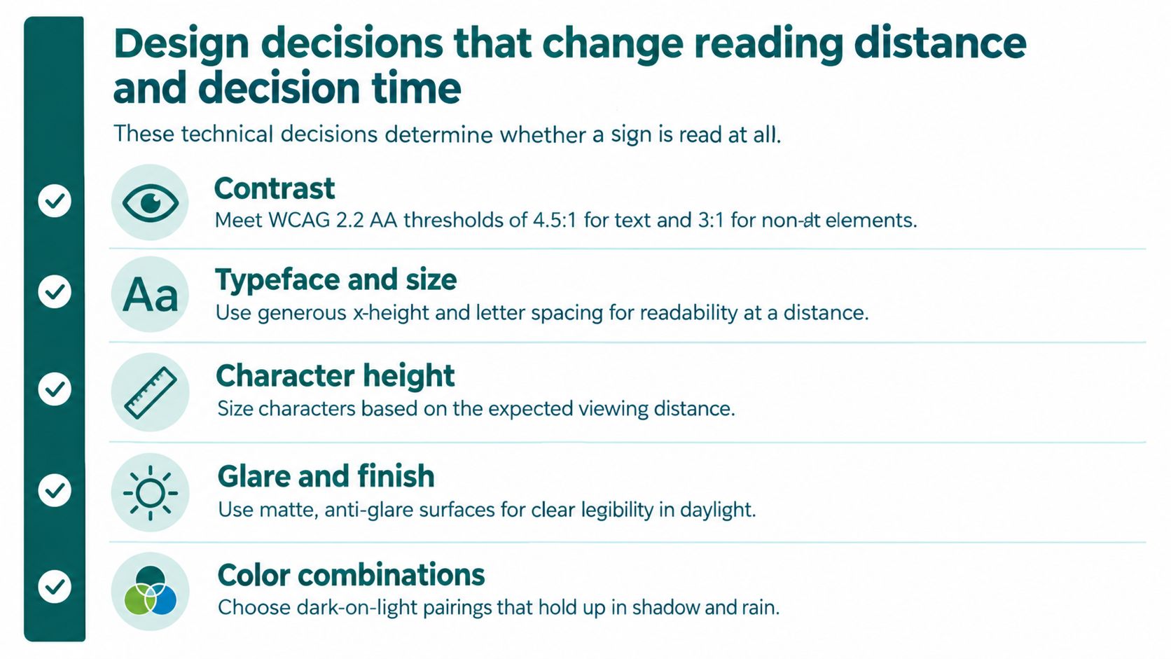
Legibility starts with contrast, not colour preference. Transport for London's standard uses a contrast ratio of 4.5:1 for normal text and 3:1 for large text, matching WCAG AA thresholds. Apply those thresholds to the finished sign face, background and viewing conditions, not only to a clean design proof on a monitor. The TfL text legibility standard also supports clear sans-serif type, sentence case, matt finishes and consistent mounting. Record the relevant TSRGD, BS 8300 and Regulation 8 requirements in the project brief where they apply.
Specify for the conditions on site
Choose a typeface with open forms, a generous x-height and sufficient stroke weight. Transport, New Transport or another humanist sans-serif can work, but the typeface name does not replace testing. Check the smallest destination name, the shortest viewing angle and the route used by people carrying bags, using a wheelchair or moving through a crowd.
A sign that reads well in a design meeting can fail outdoors because of glare, rain, shadow or surface wear. Specify a matt, glare-reducing finish, then confirm the durability of anti-graffiti and UV-resistant coatings with the fabricator. Inspect a physical sample in daylight before approval. A digital visualisation cannot show how the finished face performs in changing weather and light.
Give the fabricator a measurable brief
Your specification should identify:
- Contrast: Require the applicable WCAG AA contrast threshold and test the finished sign, not just the artwork.
- Typeface and case: Use a clear sans-serif, sentence case and enough spacing for letters to remain distinct.
- Character height: Select type size from the expected viewing distance and movement speed.
- Finish: Use a matt surface that limits reflections in direct sun and wet conditions.
- Mounting: Keep sign faces within a natural sightline and clear of landscaping, vehicles and temporary barriers.
- Arrows and symbols: Use one consistent arrow style and a stable symbol set across the site.
TfL's guidance shows why physical dimensions affect performance. One published UK standard places directional signs in stations at about 1300 mm to the top edge and recommends repeated signs on long routes to maintain reassurance and directional confidence. Use that as a design reference, then validate the position against users, sightlines and site constraints.
Specification rule: Approve signage at the distance and angle people will use it, under the light conditions in which they will travel.
The sign should answer one decision cleanly. If the panel needs a paragraph to explain its arrows, the information hierarchy has failed. For a fuller breakdown of sign face, typography and mounting decisions, see the Waymap guide to wayfinding signage design.
Where to place signs, how often, and how high
Put a sign where a person must choose, not where the project team happens to have spare space. The critical locations are junctions, changes of level, entrances, crossings, route splits and transitions between a familiar zone and an unfamiliar one. A sign placed after the turn may reassure a confident visitor, but it won't help someone who has already taken the wrong branch.
Audit the decision sequence
Walk the route in both directions. Mark every point where a visitor must decide:
- Which route continues to the destination?
- Does the step-free route diverge from the standard route?
- Does a ramp, lift or staircase change the available options?
- Does the public path cross a service road, forecourt or cycle route?
- Does the destination name change between external and internal signage?
At each point, check whether the sign is visible from the approach, whether the arrow can be interpreted without turning the body and whether a wheelchair user or person with restricted vision can reach the sign without encountering an obstruction. The guidance associated with BS 8300-1:2018 says routes to accessible facilities should be clearly indicated, and that information should be visible from all directions without being hidden by shrubbery or vehicles, as summarised in this BS 8300 wayfinding guidance.
Height is a trade-off. Mount a sign too low and crowds, planting or parked vehicles can hide it. Mount it too high and people may miss it, especially where the sign sits outside the natural cone of vision. Check the height against the user's approach, not just a standard drawing detail.
Remove clutter before adding information
Active Travel England's minimum-sign principle is the right default for most outdoor systems. Remove obsolete panels, duplicate destination names and competing arrows before commissioning new hardware. A smaller sign that presents the correct decision is more useful than a larger sign that tries to serve every audience at once.
The following video provides a useful prompt for reviewing signs as part of the wider route rather than as isolated objects.
A repeat sign should confirm a route where a person might reasonably doubt it. Don't repeat information mechanically. Repeat it because the route has become ambiguous, the environment has changed or the next decision requires confidence.
Accessibility gaps that signage alone cannot close
A compliant sign is not the same as an accessible journey. The Equality Act 2010 requires organisations to consider reasonable adjustments, while BS 8300 provides design guidance for accessible buildings and environments. Neither turns a static sign into a live route description.
Tactile paving can identify a hazard or crossing condition, but it doesn't tell someone which building entrance contains the correct service. A high-contrast map can help many people, but it may still be difficult for a person with limited vision, cognitive overload or limited English to interpret under time pressure. A step-free route shown on a panel can become unusable when a lift is closed, a gate is locked or a diversion redirects the route.
The Sensory Trust outdoor accessibility guidance emphasises visible signs at junctions, positioning within the cone of vision and adaptations for different users. It also discusses tactile elements, symbols and clear indications for accessible routes, parking, toilets and diversions. Those are essential design considerations, but they still depend on the information remaining accurate at the moment of travel.
The hardest decision is usually the live one
Static signage answers a planned question:
“Where should I go if the environment matches the plan?”
A visitor often needs a different answer:
- Is the lift available?
- Has the entrance changed?
- Which path avoids steps?
- Does the accessible route rejoin the main route?
- Is the temporary diversion usable with a wheelchair?
- Can I reach the exact platform, reception desk or door from this side?
Physical signs can communicate a closure or diversion, but staff must update them and visitors must find the relevant panel. Digital navigation can provide personal instructions, but it must be governed with the same discipline as physical information. An inaccurate digital route isn't an accessibility solution.
The practical conclusion is uncomfortable but useful. Treat regulation as the minimum obligation, not the finished experience. Keep signs visible, legible and positioned at decisions. Add another channel where the route is complex, changes frequently or requires user-specific instructions. The Waymap team's accessibility best practices reflect that wider responsibility.
Physical signs and digital wayfinding as complementary layers
The procurement decision shouldn't be “signs or technology”. Physical outdoor wayfinding signs and digital navigation solve different problems.
Signs provide shared orientation. They work for first-time visitors, regular commuters, staff, children and people who don't use smartphones. They remain available during a power or connectivity problem, and they're the correct channel for statutory transport information, entrance identification and major public-realm decisions.
Infrastructure-free digital navigation handles the parts a static panel can't personalise. Waymap uses smartphone motion sensors and detailed maps to provide step-by-step navigation indoors, outdoors and underground without relying on GPS, Wi-Fi or installed hardware. Its potential role is to guide someone from the street to an exact entrance or platform, support an accessible route and accommodate route information that changes more often than physical panels can be replaced.
That doesn't eliminate operational work. Physical signs require surveys, fabrication, installation, cleaning, repairs and replacement when destinations or layouts change. Digital navigation requires accurate mapping, content governance, route testing and a clear process for closures and diversions. The maintenance burden changes shape rather than disappearing.
| Factor | Physical outdoor wayfinding signs | Infrastructure-free digital wayfinding, for example Waymap |
|---|---|---|
| Best role | Shared orientation, entrances, major junctions and statutory information | Personal, step-by-step routes and complex branches |
| Availability | Visible without an app, account or signal | Requires a suitable phone and access to the navigation service |
| Information style | Fixed, shared and quickly scanned | Personalised instructions that can follow a defined route |
| Accessibility contribution | Contrast, symbols, route identification and reassurance | Additional route guidance for people who need more detailed instructions |
| Change management | Physical replacement or temporary overlays | Map and content updates, with testing and governance |
| Site impact | Adds hardware, visual mass and maintenance points | Can reduce the need for secondary panels, while introducing digital governance |
| Procurement question | Where must everyone be oriented immediately? | Where does a user need individual guidance between physical decisions? |
Use signs for the spine of the site. That means the public entrance, the main interchange, the primary pedestrian routes, key facilities and any decision with a safety or statutory consequence. Use digital navigation for the branches, including quieter routes, step-free alternatives and journeys that continue from outside into a complex building.
A joined-up specification should require the two layers to use the same destination names, symbols and route logic. If the sign calls a facility “North Entrance” but the digital map calls it “Building A Door 3”, the system creates doubt instead of removing it. The Waymap navigation app information provides context for how a digital layer can sit alongside, rather than replace, physical navigation.
A practical framework for UK venues and transport hubs
Start with triage. Don't ask whether every existing board looks dated. Ask whether each sign is legally required, operationally useful or merely inherited.
Regulation 8 already requires signage in all new multi-occupied residential buildings above 11 metres, including existing buildings undergoing relevant material alterations, according to the UK Government fact sheet on wayfinding signage. Other transport and accessibility requirements depend on the site, route and sign purpose. Highway signs must be considered against TSRGD, while accessible routes and information should be reviewed against the Equality Act and relevant BS 8300 guidance.
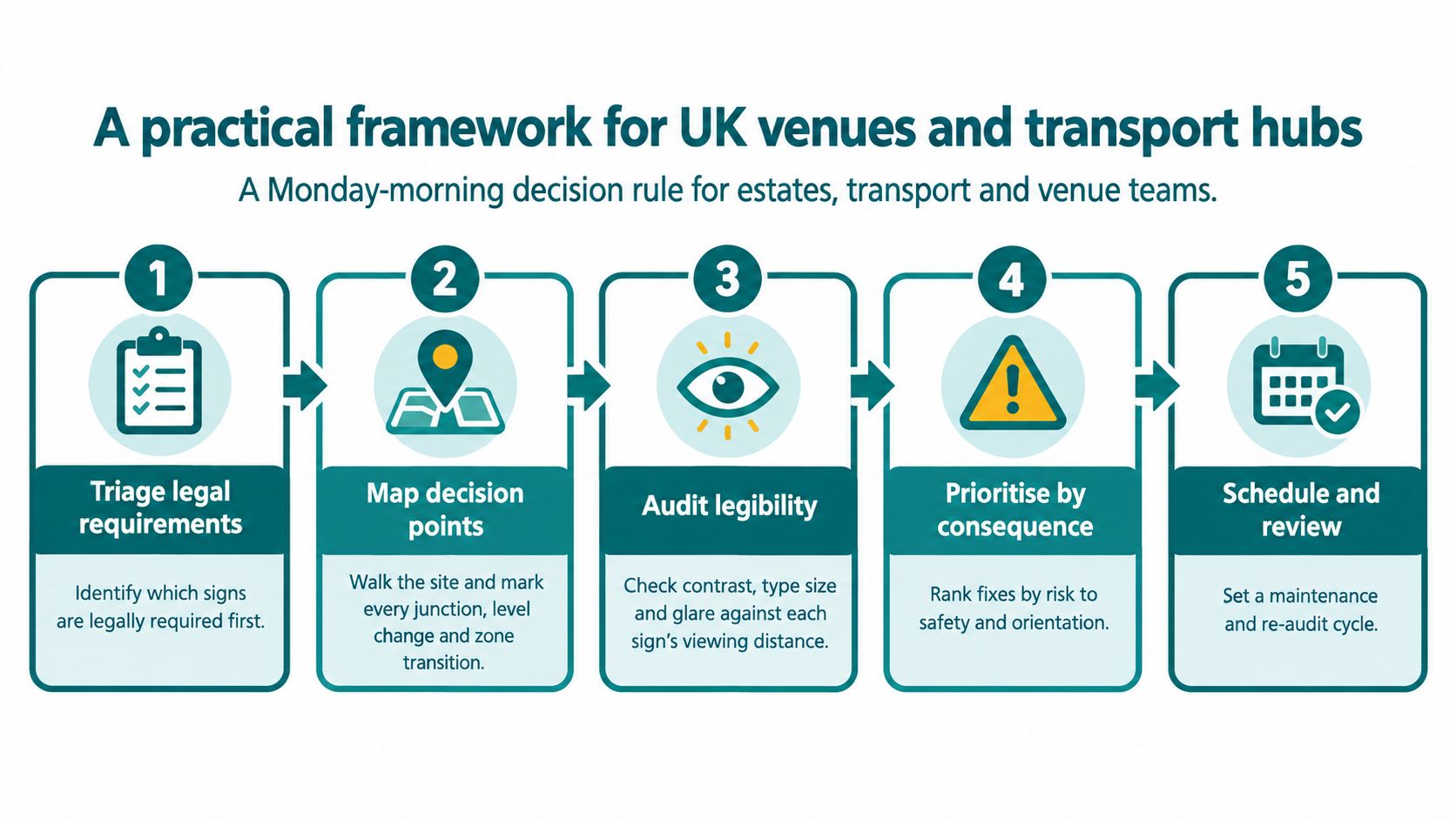
Use five decisions on Monday morning
Triage legal requirements. Record signs required by building, fire, highway, transport and accessibility obligations. Separate mandatory information from local preference.
Map decision points. Walk the site and mark junctions, changes of level, crossings, entrances and transitions between zones. Record the approach direction and what a visitor must decide.
Audit legibility. Test contrast, type size, mounting, glare and obstruction from the actual viewing position. Photograph the sign from the user's approach, not from the centre of the pavement.
Prioritise by consequence. Fix signs that can send people towards a wrong entrance, inaccessible route, hazardous crossing or missed transport connection before improving low-consequence branding panels.
Schedule and review. Assign ownership for destination changes, temporary diversions, cleaning, repairs and route updates. Measure whether visitors reach the intended destination, whether staff receive repeated direction requests and whether people using accessible routes encounter avoidable detours.
Digital layers should also be included in the governance plan. The Public Sector Bodies (Websites and Mobile Applications) Accessibility Regulations become relevant when a public body introduces a digital service, but digital navigation never removes the duty to make the physical environment reasonably accessible.
The Waymap guide to UK accessibility standards is a useful starting point for connecting physical and digital accessibility decisions. The framework will fail, however, if nobody owns the sign register. Give one accountable officer responsibility for the system and protect a refresh budget. Otherwise, redundant panels and contradictory route names will return as soon as the next refurbishment, tenant change or temporary closure arrives.
Frequently asked questions about outdoor wayfinding signs
Which British Standard governs outdoor wayfinding signs?
BS 8300-1:2018 is a key UK reference for accessible information and routes, but it isn't a single all-purpose standard for every outdoor sign. Estates teams should also check highway requirements, building regulations, transport guidance and the specific use of the site. The correct specification depends on whether the sign identifies a building, guides pedestrians, supports an accessible route, regulates vehicles or forms part of a fire-safety system.
What minimum contrast ratio applies to outdoor wayfinding signs?
Use a contrast ratio of 4.5:1 for normal text and 3:1 for large text, as stated in TfL's legibility standard. Check the finished sign face, including the effect of matt or textured materials, lighting, weather and adjacent backgrounds. Don't approve colour combinations solely from a brand palette.
Are tactile and Braille elements legally required at every decision point?
The Equality Act 2010 requires reasonable adjustments, but it doesn't create one universal tactile and Braille sign specification for every outdoor location. Assess the users, destination, route and risk. Tactile information, symbols and accessible-route indicators may be appropriate where visual signs alone don't provide an equivalent means of finding a facility.
Do temporary event signs need to meet accessibility expectations?
Yes, temporary signage remains subject to the same accessibility duties that apply to the event and its operator. A temporary route shouldn't send wheelchair users towards steps, conceal the accessible entrance or use low-contrast information that would be unacceptable on a permanent sign. Include accessible routes, toilets, parking and diversions in the event sign plan.
How high should pedestrian totem signs be mounted?
Mounting height should keep information within a clear, unobstructed sightline and suit the people approaching the sign. There isn't one universal height that works for every totem, path and audience. TfL guidance gives a station directional-sign reference of about 1300 mm to the top edge, while the surrounding route, crowd conditions and sign purpose still need assessment.
What spacing rule applies on a long pedestrian approach?
Place signs at decision points and repeat them where route confidence would otherwise fall, rather than applying a blind distance interval. Active Travel England recommends signs at decision points and junctions while keeping them to the minimum needed to reduce clutter and maintenance. Long routes need confirmation, but the correct interval depends on visibility, route complexity and the likelihood of doubt.
How does digital wayfinding affect the Equality Act duty?
Digital wayfinding doesn't remove the Equality Act duty, but it can provide additional evidence that an organisation has considered reasonable adjustments. The service must be usable, maintained and consistent with the physical environment. It should supplement clear signs and accessible routes, not excuse missing information or inaccessible entrances.
Should an organisation tender physical signs and digital navigation separately?
Tender the two layers against one destination and route specification, even if separate suppliers deliver them. Require consistent names, accessible-route data, change-control ownership and testing at real decision points. Public-sector buyers should also check relevant Crown Commercial Service frameworks and their own procurement rules before selecting a route.
Waymap helps venues and transport operators add a maintained, infrastructure-free navigation layer to outdoor, indoor and underground journeys, including step-by-step guidance to precise destinations. Visit Waymap to see how your team can reduce secondary sign clutter while giving visitors another accessible route through the space.
