
Museum Wayfinding Guide for Accessible Visitor Journeys
Between April 2023 and March 2024, DCMS-sponsored museums and galleries recorded 40.8 million visits, up 17% from 34.9 million in 2022/23, against 49.8 million in 2018/19. London accounted for approximately 37 million of those visits, according to the DCMS annual performance indicators. That volume turns museum wayfinding into an operational problem, not a graphics task. Exhibitions move, doors close, and the same questions land on the desk every hour.
By Tom Pey, Founder of Waymap and a blind accessibility technologist.
What Museum Wayfinding Means and Why It Matters
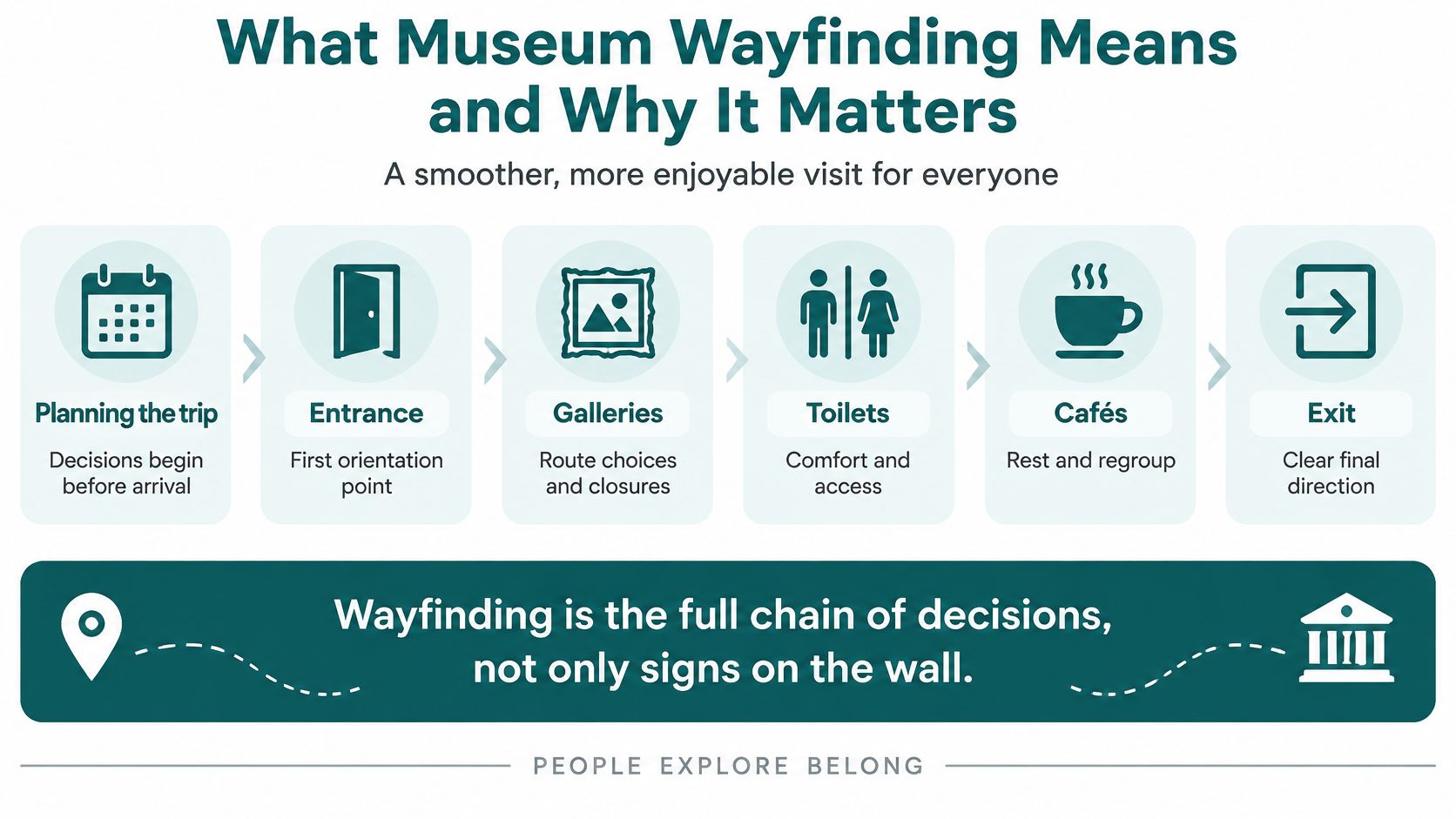
Museum wayfinding is the full chain of decisions a visitor makes. It starts on the access page before anyone leaves home, and it ends only when they have left by a route they can use. Signs on the wall are one link in that chain, with the website, the entrance sequence, staffing and the routes themselves carrying the rest.
The first failure is often pre-visit: an address with no step-free route, no working entrance, no lift status and no toilet location. After arrival, the same gaps reappear at junctions, level changes, cafés and exits. A route is a behavioural variable. Make the step-free option obvious and visitors spread through the building; leave it implied and they bunch at the main desk, miss side galleries and abandon floors.
Fixed, location-specific wording is expensive to keep true. A new exhibition, a closed stair, or a relocated shop can make yesterday's arrow wrong. High repeat traffic makes the error visible quickly, because regular visitors notice when a familiar route no longer matches the sign.
Who has to be able to complete the journey
Three groups feel a weak route first.
- First-time visitors don't know which door is the main entrance, or which stair is a dead end. They need a cue before they commit to a direction.
- Disabled visitors need a step-free or low-vision route that is named, not implied. A general statement that the museum is accessible doesn't say which lift, which level, or which toilet.
- Front-of-house staff answer the same questions all day when the building and website don't answer them. That is a design failure, not a training gap.
I would treat indoor navigation as a visitor-service layer for the whole audience, not as a niche add-on. The same route data that gets a wheelchair user to a lift also stops a family circling a closed gallery. Get the pre-visit answer and the route right, and the wall signs have less to rescue.
How Visitors Move Through a Museum, Stage by Stage
Each stage has one question. If the building and the website can't answer it, the visitor asks a person.
| Stage | Visitor question | What wayfinding must provide | Common gap |
|---|---|---|---|
| Before arrival | Can I get in step-free, and by which route? | Entrance location, step-free route, lift and toilet locations, closures | Address given with no route detail |
| Arrival | Which entrance is the accessible one? | Clearly marked accessible entrance and assistance point | Nominal entrance is not the practical route |
| Circulation | Which way is this gallery? | Consistent cues at every junction, lift and ramp | Cues missing at decision points |
| Amenities | Where is the nearest accessible toilet or rest area? | Named toilets, rest areas and quiet spaces, with their level | Facilities listed but not placed on the route |
| Exit and onward travel | How do I leave and reach my next transport? | Step-free exit route and link to station or bus information | No link to transport information |
Before anyone is on site
The decision often happens at home. Historic England's 2025 survey found that 41.38% of disabled respondents who had visited heritage sites identified barriers that stopped them visiting, including uncertainty caused by insufficient accessibility information, as set out in Historic England's account of disabled people's experiences. A 2024 VocalEyes survey of 1,700 UK museum websites found that 27% provided no access information for disabled visitors planning a visit, while only 30% supplied information useful to blind or partially sighted visitors. Only 5% used a detailed access-audit service such as Euan's Guide or DisabledGo, according to the VocalEyes survey write-up.
An address and a postcode don't answer the question. Publish the practical entrance, the step-free route, lifts, toilets, and anything closed today. Put the same facts in formats a blind or partially sighted visitor can use alone, including whether assistance dogs are welcomed, and whether large print, tactile maps, Braille, or audio-described tours exist.
More signs inside the galleries won't raise attendance if someone can't tell, the night before, whether the trip is possible.
From the door to the way out
At arrival, the grand door is often the wrong door. Historic buildings regularly put steps on the ceremonial entrance and the lift around the side. Mark that side entrance as the accessible entrance, and put an assistance point where someone can find it.
During circulation, the cue has to appear before the choice. A sign after the visitor has already turned is a sign that creates a wrong turn. At amenities, listing “accessible toilets” on a webpage is not the same as placing that toilet on the route, with its level. Quiet spaces and rest areas belong on the same route. People leave when they can't sit down.
At the exit, connect the step-free way out to the station or bus the visitor is using. A customer journey map is only useful if that last link is on it.
Run one real visit as a test. At each of the five stages, try to get the answer without asking staff. Log every stage where you can't. That log is the work list.
Which Routes Work for Every Visitor
A route is a network of attributes, not a line drawn on a pretty floor plan. Lifts, ramps, stairs, door widths, and temporary closures have to be encoded so a path can be calculated. A note in the corner of a PDF doesn't change the path anyone is offered.
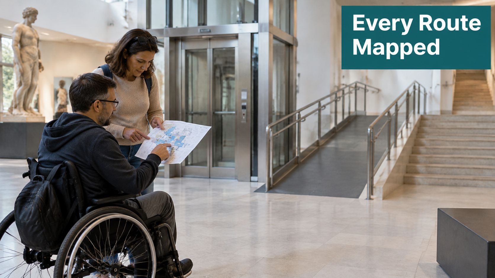
People already behave this way. UKRI-funded museum-wayfinding research identifies confusing buildings and inaccessible routes as reported barriers, and treats step-free routing and congestion avoidance as core functions. Analysis of more than 42,000 British Museum visitor journeys found that accessibility and proximity, particularly avoidance of stairs, shaped paths more strongly than thematic organisation, as reported in that museum wayfinding analysis. Visitors don't walk your curatorial sequence if the sequence includes a stair they won't use.
The short route is often the wrong route
The shortest path is not the most accessible path. A slightly longer route can be the better one if it avoids stairs, a narrow corridor, or a junction that jams at 11am. Offering only the short route pushes wheelchair users, people with limited stamina, and anyone who needs a predictable lift onto a path the building has already made difficult.
That is why step-free access is a behavioural variable, not a compliance sticker. If the map doesn't know where the lift is, the route you publish will keep sending people toward the stair. The same is true of a door that is locked after 4pm, or a ramp closed for a delivery.
When a lift fails or a gallery shuts for a changeover, rerouting should happen without a radio call to the desk. The closure is an attribute of the network. Remove that link, and the next route uses the ramp or the other lift. Staff stay on exceptions, not on directions that the map should already know. Our note on accessibility requirements is the standard we hold a route to before we call it usable.
What to count, separately
Track step-free routes and standard routes apart. A blended average hides the route that fails.
- Route completion: Did the visitor reach the gallery they named at the start?
- Wrong turns: Where did they reverse, and was a cue missing there?
- Lift or stair avoidance: Which vertical option did they take?
- Dwell at decision points: A long pause at a junction means the cue is late, small, or contradictory.
- Arrival at the target: Getting to the building is not the same as getting to the object.
Ask three questions of every route before you publish it. Where is the step-free alternative? What cue marks the lift before the visitor has to choose? How is a closure shown at the start of the route, not only at the closed door?
What Sign Placement and Type Size Standards Require
Placement is a cause-and-effect problem. If the sign isn't where the eye and the hand expect it, people search, hesitate, and ask. Predictable positions and one repeated visual format cut that load.
UK accessibility sign guidance, published with a government contracts notice, puts signs at logical decision points, with no gaps along the route. It calls for consistent formats, sentence-case lettering, strong foreground-to-background contrast, and illumination that avoids glare and backlighting.
| Specification | Reference value | Source |
|---|---|---|
| Wall-mounted sign height | 1,400–1,700 mm above finished floor level | UK accessibility sign guidance |
| Suspended sign head clearance | Minimum 2,300 mm | UK accessibility sign guidance |
| Graphic panel text | Minimum 18-point | National Historic Ships access guidance |
| Main introductory text | At least 48-point | National Historic Ships access guidance |
| Printed publications | Minimum 12-point | National Historic Ships access guidance |
Heights and type that people can actually use
Wall-mounted signs belong at about 1,400–1,700 mm above finished floor level. Suspended signs need a minimum 2,300 mm head clearance so they don't become an obstacle. Those two numbers are the first things to check on a walk-through. A beautiful sign at the wrong height is a missed sign.
Type size is the other half of “can they read it”. National Historic Ships access guidance for UK heritage venues sets a minimum 18-point size for graphic-panel text, at least 48-point for main introductory text, and a minimum 12-point size for publications. The same guidance expects signs to identify barriers such as steps and their gradient, and to show where assistance is available. A visitor should not have to discover a flight of steps by arriving at it.
BS 8300 is the design guidance estates teams use for accessible buildings, alongside these figures. The Equality Act 2010 requires service providers to make reasonable adjustments. Placement, contrast, and an honest description of steps are evidence that a route is usable. They are not decoration.
For how a panel is fixed so it stays at that height and stays readable, the Colorado Art Services signage guidance is a practical companion to the measurements. Installation quality is what keeps a compliant height from drifting after the first rehang. Our wayfinding signage design notes set out the same discipline for museum junctions.
Formats beyond the printed panel
Sighted visitors are not the whole audience. The physical layer has to point to alternatives a blind or partially sighted person can use independently. In the 2022 Heritage Access Report, only 10% of heritage websites listed Braille resources, 11% listed tactile objects, and 6% offered recorded audio-described guides, across the sites reviewed by CultureHive's Heritage Access 2022 report. Publish what you hold, and say how to get it on the day, not only that it exists somewhere in the building.
Practical rule: At every junction, confirm the sign is visible on the approach, readable at the size above, and clear of the head-height zone.
Audit the route as a sequence. Entrance, lift, stair, gallery threshold, toilet, café, exit. Each choice needs an identifiable cue before the visitor commits.
Common Museum Wayfinding Problems and How to Fix Them
The usual assumption is that a museum with a map and a set of hanging signs has wayfinding. Most of the failures we walk are simpler than that, and most of them don't need a capital project.
A junction with no cue. The cause is a route that was signed from the designer's desk, not from the point where someone has to turn. Walk it. Stand where the choice happens, and add the sign there. That is a day of work if you already have a panel system. It is a week if you have to commission the panel.
The named entrance isn't the usable one. Websites and building guides still send people to the ceremonial door. Publish the step-free entrance in the guide and on the visit page, with a photo of the door, not a dot on a block plan. Rewriting the page is a day. Moving the assistance point, if it sits at the wrong door, is a week.
Signs that still name last season's exhibition. Physical panels lag because someone has to print and fit them. Change the information visitors see on the same day the object moves, using whatever layer you can edit without a ladder. Fitting a new panel can wait until the next cycle. Leaving the wrong name up until then shouldn't.
A lift or ramp closes, and nobody is told until they arrive. Post the closure at the start of the route and on the online access information before the first visitor of the day. A same-day notice is a day of discipline. Retrofitting a second lift is the capital project. Don't wait for the second lift before you tell people the first one is shut.
Crowded circulation that wheelchair users can't use. Disabled visitors describe busy places as unsuitable for wheelchair use, a point recorded in the Fashion Museum Bath consultation summary alongside Historic England's findings. Offer a quieter alternative and a rest point on that path. Setting the alternative is a week of route work. Rebuilding a corridor is capital, and it isn't the first move.
The route lives in three people's heads. When those people leave, the building forgets its own doors. Write the route guide and attach it to the access records, so the next duty manager isn't starting from scratch. That write-up is a week. It is the cheapest insurance you will buy.
Prioritise by calendar, not by how impressive the fix looks. Days first, then weeks. Put capital on the list only when a day or a week can't remove the barrier.
Which Digital Wayfinding Option Fits Your Museum
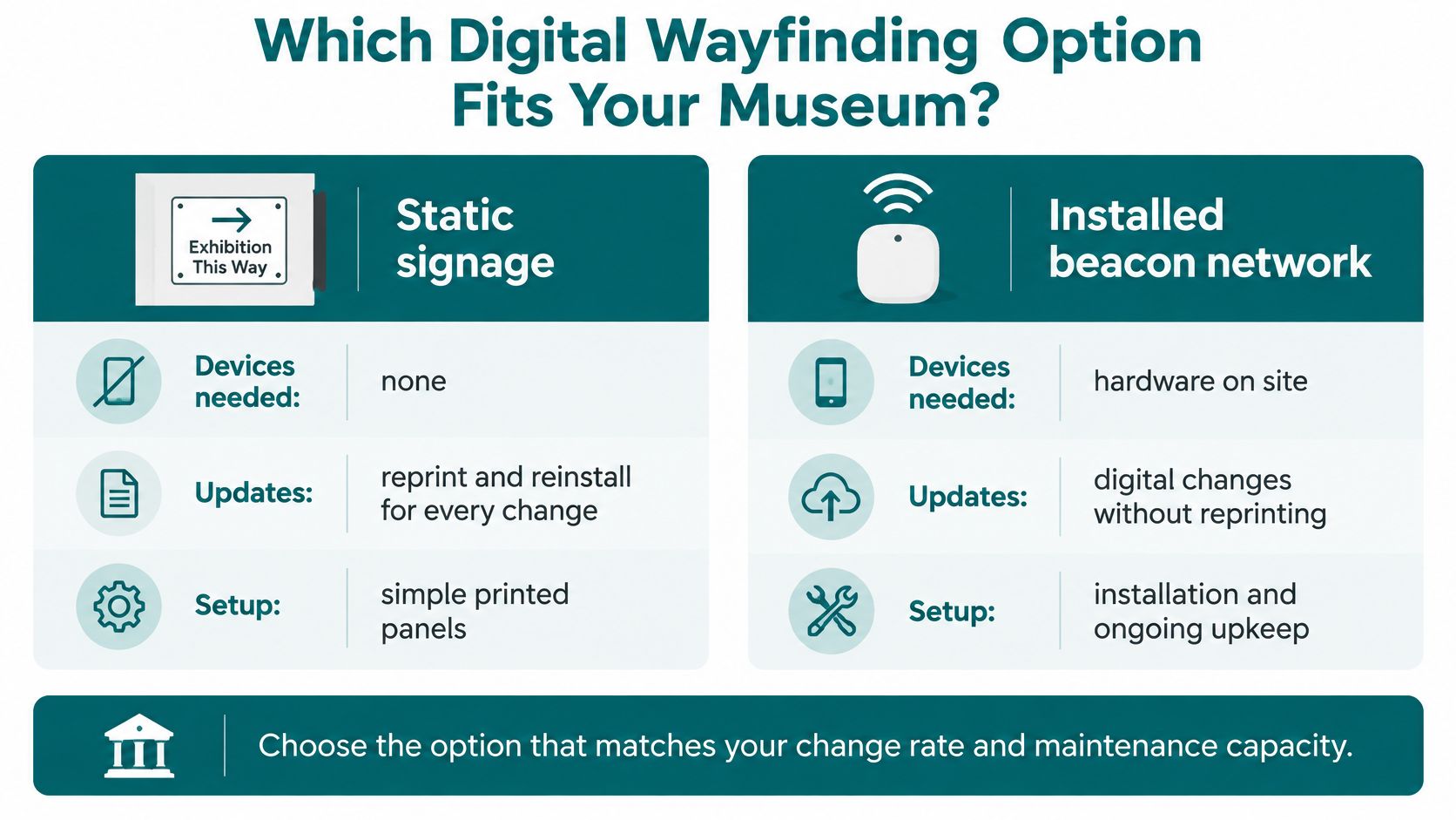
The layer you choose decides which routes a visitor can be offered, and where they end up walking. Static signage needs no handset and no network. It also has to be reprinted and refitted every time a gallery, a door, or a toilet changes. That is a sound choice for fixed decision points that rarely move. It is a poor choice for a programme that changes monthly.
Hardware, budgets, and what actually has to be installed
An installed beacon network can push a route to a phone, and a text change doesn't always mean a new panel. It does mean hardware on the walls or ceilings, batteries or power, and someone who keeps that estate working in a busy, changing building. For estates managers, that spend sits in a capital cycle. The approval is often politically hard: the cost is visible, the maintenance never quite ends, and a closed gallery still needs a human to update both the hardware map and the signs.
| Approach | Installed hardware | Needs GPS, Wi-Fi or Bluetooth | Updates when layout changes | Best fit |
|---|---|---|---|---|
| Static signage | None | Not applicable | Reprint and reinstall | Fixed decision points |
| Installed beacon network | Yes, on site | Bluetooth beacons | Hardware and software maintenance | Stable layouts with hardware budget |
| Venue branded app | None beyond the app | Check the app's location method | Venue updates the app | Venues that already run an app |
| Web app via QR code | None | Check the web app's location method | Map updated in the CMS | Visitors who will not download an app |
| Waymap | None | No, uses phone motion sensors and venue maps | CMS updates published after approval | Changing indoor, outdoor and transit journeys |
The two middle rows are the ones to confirm before you buy. A branded app or a QR web app only avoids GPS, Wi-Fi, and Bluetooth if the location method itself avoids them. Ask that question in the specification. Don't assume the word “app” answers it.
How Waymap is built, and where it is already in use
Waymap doesn't use beacons. Guidance works by dead reckoning: the phone's own motion sensors are fused with a detailed map of the venue, so the route doesn't depend on GPS, Wi-Fi, Bluetooth, or mobile data, and nothing is mounted in the building. The first step is practical. The venue shares CAD drawings or floor plans, and Waymap's team combines those plans with movement patterns to build the navigation model. Step-free routing, directions to accessible toilets, and food and drink options are built in as standard, so the step-free alternative doesn't sit behind a separate accessibility mode.
That model has to survive real sites. At Lord's, the brief was step-by-step audio and on-screen instructions to seats, amenities, and exits. Robert E., MCC Director of Estates, put the aim this way. “Our partnership with Waymap allows us to lead the way in accessible innovation, ensuring that every visitor, regardless of ability, can experience the magic of Lord's with greater ease and independence.” In user testing at Liverpool ONE, visitors reached exact store destinations, and the app led to a notable reduction in use of static wayfinding kiosks for directions. The WMCA deployment at Birmingham New Street had three aims: support independent navigation for passengers with visual impairments and mobility challenges, improve flow and cut congestion, and show a model that other major UK stations could scale.
Once a venue is live, staff use the CMS to monitor points of interest, hide or rename them, and publish updates to the app after approval. A closed lift or a moved exhibition can go out the same day, without a contractor on site. Visitors can follow the route in the Waymap app, in a venue's own branded app, or in a browser, which means the route can also be checked from home before the visit rather than discovered at the door. The wider trade-offs in choosing a digital wayfinding system sit beside this comparison.
Physical signs still belong at the key decision points. A phone can't replace a panel that a whole crowd can read at once, and it can't help someone whose battery is dead. Use the digital layer for the route that changes, and for the step-free alternative the panel can't personalise. Keep the panel for the choice everyone has to see.
Start a Museum Wayfinding Audit This Quarter
Five actions, in order. Each one uses a check you can already run.
- Walk the five stages with one sample visitor. Log every stage where the answer was missing. Don't brief them on the “right” door first, or you will have tested the briefing, not the building.
- Time the step-free route and the standard route apart. Record wrong turns, and whether people avoided the lift or the stair. One combined time will flatter the route that only some visitors can use.
- Apply the placement and type-size table at every junction. Visible on approach, readable at the stated size, clear of the head-height zone. Failures get a date, not a note that says “review signage”.
- Update the website and any app. Practical entrance, lifts, toilets, rest areas, and current closures, against the categories VocalEyes looked for in 2024. If a blind visitor can't use the format, it isn't published yet.
- Pick a digital layer that matches how often you change. Waymap maps indoor sites including museums, conference centres, and hotels. Share CAD drawings or floor plans, then publish a browser-based route by QR code so visitors don't have to download an app. Make closure and exhibition changes live the same day as the physical change. The disabled access standard is the bar for that page.
Count success in three places. Fewer routine questions at the desk. More routes finished without assistance. A dated record of what changed when an exhibition moved, so the next change isn't a fresh argument.
Frequently Asked Questions About Museum Wayfinding
What is museum wayfinding?
Museum wayfinding is the full chain of decisions a visitor makes, from checking access information before the trip to finding the exit at the end. It covers entrances, galleries, toilets, cafés, lifts, and routes between floors, not only the signs on the wall. The failures that matter tend to happen before arrival or at a junction, and each unanswered decision sends the visitor to the desk instead of the gallery.
Which UK standards apply to museum wayfinding signs?
Signage guidance places wall-mounted signs at 1,400–1,700 mm above finished floor level and requires 2,300 mm of head clearance for suspended signs. National Historic Ships guidance sets a minimum 18-point size for graphic panels, at least 48-point for main introductory text, and 12-point for printed publications. BS 8300 covers accessible building design, and the Equality Act 2010 requires service providers to make reasonable adjustments so those routes are usable.
How do blind and partially sighted visitors navigate a museum?
Independently, if the information reaches them in the right format. Braille, tactile plans, and audio description do the work that a single "accessible" label on a webpage cannot. Publish the practical entrance, level changes, and assistance point in those formats, and keep them current when a route closes. A blind visitor plans the route before leaving home, so the website carries as much weight as the sign at the door.
Can museum wayfinding work without GPS or Wi-Fi?
Yes. Waymap's algorithm uses the smartphone's motion sensors and the venue's detailed maps, so it works without GPS, Wi-Fi, or any hardware installed in the building. The venue shares CAD drawings or floor plans first, and once live, staff publish later changes through the CMS after approval.
Do visitors need to download an app for museum wayfinding?
No. Waymap's web app opens in a browser from a QR code with nothing to install. The same routes also run in the Waymap app or a venue's branded app, free for every visitor once the venue is live, so a first-time visitor and a regular member get identical guidance through whichever channel suits them.
Waymap gives museums turn-by-turn routes to entrances, galleries, lifts, and accessible toilets, indoors and outdoors, with step-free routing built in rather than added as a separate mode. If your access information still stops at an address, your floor plans can become routes your visitors follow. Visit Waymap to talk through a first deployment.
