
Customer Journey Mapping for Venues & Transit
A visitor buys a ticket on a polished app, arrives at the station, follows one sign, then a second sign that conflicts with the first, asks a member of staff for help, takes the wrong escalator, and misses the platform entrance by a few metres. On paper, that customer journey can still look healthy. The digital touchpoints worked. The payment cleared. The push notification sent.
That's exactly why customer journey mapping often misleads venue and transit teams. In complex physical environments, the journey doesn't fail on the homepage. It fails in the handoff between planning and movement, between screen and space, between what the system says and what the building enables.
At Waymap, we see this gap repeatedly in rail, retail, hospitals, campuses, and large public venues. Standard maps tend to flatten the journey into stages borrowed from marketing. Real operational journeys are messier. They involve entrances, kerbs, lifts, ticket barriers, platform changes, crowded concourses, temporary closures, unclear staff ownership, and accessibility barriers that only become visible once a person is moving through the site.
Why Most Customer Journey Maps Fail in Complex Venues
A useful journey map for a venue is not a funnel diagram. It's an operational model of how a person completes a task across digital, physical, and human touchpoints.
That distinction matters because the highest-friction moments usually sit between channels. The Nielsen Norman Group advises teams to analyse channel transitions, time spent, and “moments of truth” in a journey, which is exactly where many venue maps break down: the move from app to entrance, from entrance to gate, from signage to staff support, from concourse to exact door or platform location (Nielsen Norman Group on analysing journey maps).
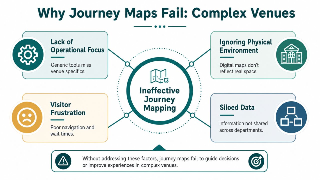
Digital success can hide physical failure
A team might report strong app usage, healthy booking completion, and a low complaint volume. None of that proves the on-site journey works.
In a shopping centre, the failure point may be the final turn to a specific unit. In a metro network, it may be the transition from paid area to correct platform edge. In a hospital, it may be the last stretch from the main entrance to the right clinic. These failures create stress for visitors and extra work for front-line staff.
The problem gets worse when departments map only their own slice:
- Marketing maps discovery: They stop at purchase or arrival.
- Operations maps incidents: They focus on what went wrong, not how the journey unfolded.
- Facilities maps assets: They know where lifts, doors, and corridors are, but not how people experience them.
- Accessibility teams map barriers: They often don't control the digital and service layers that shape the whole journey.
Most templates weren't built for real places
Generic customer journey mapping templates assume a mostly digital path. They capture awareness, consideration, purchase, and loyalty well enough. They're weaker when the journey depends on crowd flow, signage, staff intervention, temporary route changes, and uneven environmental conditions.
Practical rule: If your map can't show where a visitor stops, hesitates, backtracks, or asks for help, it isn't detailed enough for a complex venue.
That's also why hardware-heavy wayfinding schemes often underperform operationally. If the map changes faster than the infrastructure does, the customer journey drifts out of sync with reality. For teams reviewing alternatives to fixed-location systems, this creates the same maintenance burden discussed in Waymap's notes on Bluetooth access points.
A strong map for a venue has to treat the building as part of the service. It has to show where physical movement becomes a customer experience issue, not just a facilities issue.
A Modern Framework for Mapping Physical Journeys
By the late 2010s, customer journey mapping had settled into a practical operating model: define scope, gather evidence, map stages, find pain points, and act. IBM's guidance reflects that shift, which is why the method now works as a repeatable governance tool for complex physical venues rather than a workshop exercise alone (IBM on customer journey maps).
For transport operators, retail destinations, hospitals, and campuses, a five-stage model usually works better than a classic sales funnel.
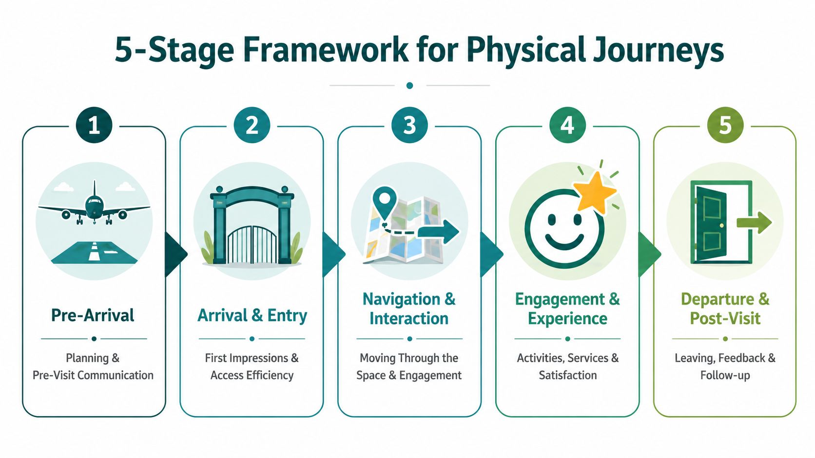
The five stages that matter on site
| Stage | What to map | What usually gets missed |
|---|---|---|
| Pre-arrival | Website, app, ticketing, travel planning, accessibility information | Whether instructions match the real entrance and route conditions |
| Arrival and entry | Car parks, drop-off points, station forecourts, entrances, gates | The first point where visitors lose confidence |
| Navigation and interaction | Corridors, platforms, lifts, escalators, stores, waiting areas | Handoffs between signage, staff, and digital guidance |
| Engagement and experience | Appointment, event, shopping, travel, service use | How confusion earlier in the journey affects the core experience |
| Departure and post-visit | Exit routes, onward travel, feedback, rebooking | Whether the final leg is harder than the inbound leg |
A short explainer is useful here before teams start fieldwork:
What to ask at each stage
The framework only works if each stage includes observable questions.
For pre-arrival, ask whether the route description is specific enough for a first-time visitor. “Use the main entrance” sounds clear to staff and vague to everyone else. In a multi-entrance site, that wording is often the start of the problem.
For arrival and entry, watch behaviour rather than relying only on survey responses. Do people pause at the threshold. Do they turn in circles. Do they queue in the wrong place. Do they follow other visitors because the route isn't self-explanatory.
For navigation and interaction, treat every transition as a potential failure point. A venue may need support from operations, estates, security, and digital teams at once. That's why crowd movement and stewarding practice matter. Teams that manage events or surges may find useful operational context in ABCO Security Services Australia's guide to crowd management techniques.
How to gather evidence without overcomplicating it
Start with one user goal. “Get from street to Platform 4” is better than “understand passenger behaviour”.
Then collect evidence from several sources:
- Observe live journeys: Follow first-time visitors and note stops, wrong turns, and requests for help.
- Review support logs: Reception desks, customer service teams, and security staff usually know the recurring failures.
- Compare planned versus actual routes: This reveals where route instructions and built reality diverge.
- Check map maintenance workflows: If layouts change often, static wayfinding becomes unreliable faster than many teams expect.
For operators moving from static floorplans to a managed navigation layer, Waymap's overview of mapping and navigation is a useful reference point for what that operational shift involves.
How to Measure the Metrics That Actually Matter
A journey map without measurement is still only a hypothesis. In venues, the wrong metrics are easy to choose because they're already available. Footfall, app installs, average satisfaction, and complaint totals all have their place. None of them tell you precisely where the journey broke.
The more reliable approach is to tie metrics to stages and transitions. Smaply's guidance is clear on this point: the strongest maps combine qualitative evidence such as interviews and diary studies with quantitative data such as analytics and survey data, and they work best when teams use stage-level KPIs and failure rates rather than a single overall score (Smaply on customer journey maps).
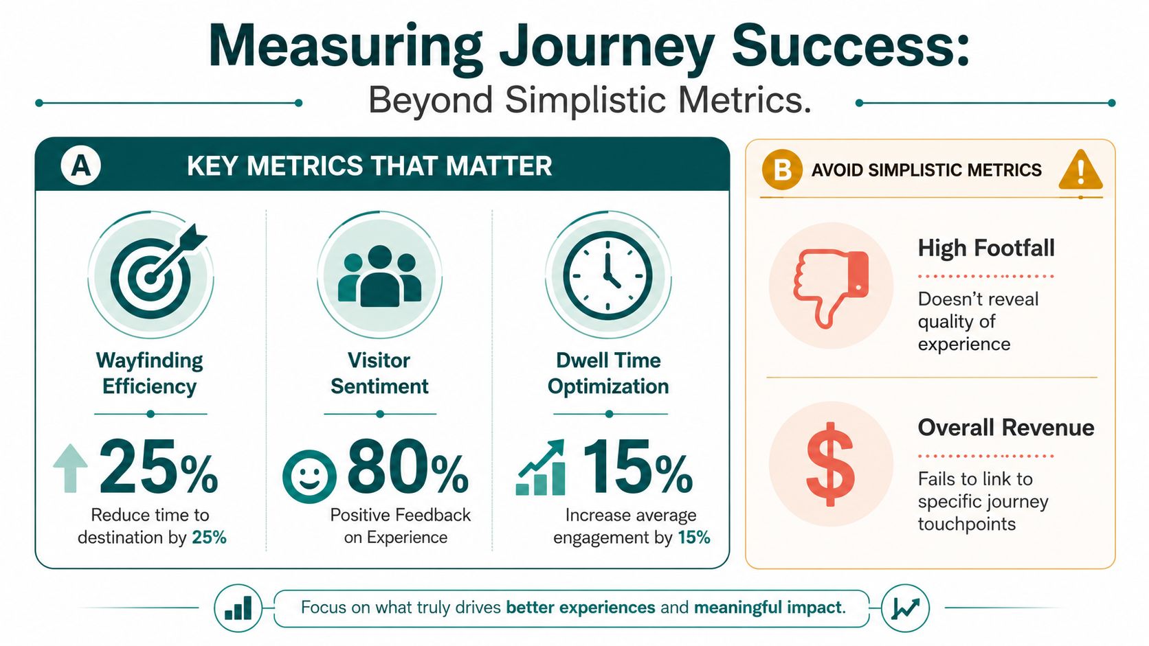
Better metrics for physical customer journeys
The most useful venue metrics tend to be operational, not promotional:
- Staff intervention rate: How often does a visitor need directions or clarification from staff?
- Route failure rate: Where do people abandon, restart, or deviate from the intended path?
- Decision-point hesitation: Which entrances, junctions, lifts, or gates cause visible pauses?
- Non-productive dwell time: Where do people linger because they're uncertain rather than engaged?
- Handoff delay: How long does it take to move from digital instruction to successful physical execution?
These measures make a finance conversation easier because they connect visitor friction to labour, service consistency, and avoidable disruption.
A high satisfaction score can hide a weak route if visitors eventually arrive but need staff rescue to do it.
What works better than a single dashboard score
One composite “experience score” tends to flatten the problem. It tells a board that something is broadly right or wrong, but it doesn't tell an operations team what to fix on Monday morning.
A more effective structure is a stage-by-stage view:
| Journey stage | Primary signal | Supporting evidence |
|---|---|---|
| Arrival | Delay or confusion at entry | Observation notes, queue behaviour |
| Navigation | Wrong turns or pauses | Route logs, staff queries |
| Core service | Late arrival or stress carry-over | Feedback comments, service desk notes |
| Departure | Exit congestion or missed onward step | Exit observations, visitor comments |
When teams need to prove that mapping is affecting retention and repeat use, it also helps to connect route success with longer-term behaviour. Waymap's article on user retention metrics is relevant here because it shows why usage data needs context, not just volume.
Connecting Journey Maps to Your Accessibility and ESG Goals
A broken journey is not only inefficient. In many settings, it's exclusionary.
What counts as a minor inconvenience for one visitor can become a complete barrier for someone who is blind, low vision, neurodivergent, unfamiliar with the site, travelling with children, carrying luggage, or moving under time pressure. That's why customer journey mapping should sit much closer to accessibility governance than it usually does.
Accessibility starts where assumptions stop
The Equality Act 2010 changed the standard for UK organisations by making accessibility a matter of reasonable adjustment, not optional good practice. In the built environment, that means operators need to think beyond whether a route exists on paper. They need to understand whether people can complete it independently and reliably.
Digital-first thinking often misses that because it assumes a single dominant user behaviour. That assumption is weak. Adobe's discussion of maintaining journey maps points to a more hybrid reality, including Ofcom data from 2025 showing that 96% of UK adults had internet access at home, 93% used the internet in the previous three months, yet 18% said they never go online, which reinforces the need for multi-channel service design and aligns with the UK Government Digital Service approach to serving both digital and offline users (Adobe on effective customer journey maps).
ESG claims need operational evidence
The “S” in ESG often gets reduced to policy language. Journey mapping gives it operational substance. It shows whether equal access exists at the point of use.
That matters in several common situations:
- Capital constraints: NHS estates teams and public bodies may struggle to justify additional hardware across large estates.
- Maintenance pressure: Transit operators can't easily support fragile infrastructure across busy, changing environments.
- Layout volatility: Retail and event venues change units, routes, and temporary installations frequently.
- Service resilience: If the accessible route depends on one member of staff knowing the answer, the system isn't dependable.
Inclusive design becomes credible when an organisation can identify the exact stage where exclusion occurs and show what changed afterwards.
For teams building that capability, Waymap's guidance on inclusive design principles is relevant because it connects accessibility decisions to how people move through real spaces rather than abstract digital journeys.
Customer Journey Mapping in Action at Leading Venues
The value of a map appears when it changes a real journey in a real place. In public venues, the pattern is usually the same. The organisation already knows that visitors get confused. What it doesn't always know is exactly where the journey breaks, who owns that failure, and what kind of fix will hold up under day-to-day operational pressure.

WMATA and the underground handoff problem
In a network such as WMATA, the critical issue is rarely “can people plan a trip”. It's whether they can execute the final underground stages consistently when GPS is weak, routes branch, and stress rises.
A useful journey map in that environment has to capture the transition from trip planning to station entry, then from mezzanine to platform, and then from platform to correct boarding position or exit. It also has to account for the operational burden of maintaining any physical hardware across a large transport estate. If the mapping exercise only captures digital planning, it misses the most expensive part of the journey.
Westfield London and the commercial cost of confusion
Retail destinations face a different version of the same problem. A visitor may know the brand they want and still fail to find the right route quickly in a large centre. That weakens the visit before the commercial interaction even starts.
For shopping centres, journey mapping should include route clarity, confidence at decision points, and whether people spend time where the venue intends or drift into dead zones because they're disoriented. That's also why physical design choices matter. Teams planning temporary activations or branded environments often review specialist work in areas such as exhibition booth design because the physical arrangement of space changes how people discover, approach, and move through retail experiences.
Royal Hospital for Children and Young People and anxiety reduction
Hospitals make the stakes more human. Families arrive stressed, often late, and may be visiting an unfamiliar site for the first time. In that context, every unclear turn adds cognitive load.
The journey map needs to cover the route from car park or drop-off to reception, then from reception to the correct ward, department, or clinic. It also needs to reflect accessibility realities, because a route that depends on reading dense signage or interpreting ambiguous corridors won't serve everyone equally.
Salesforce's customer experience data helps explain why these details matter commercially as well as operationally. 88% of customers say the experience a company provides is as important as its products or services, and 71% have switched brands after a single poor experience (Salesforce on customer journey mapping). In public venues, the equivalent risk shows up in trust, repeat visits, reputation, and staff workload.
How to Turn Your Journey Map into Action with Wayfinding
Most customer journey mapping projects fail at the same point. The team identifies friction accurately, agrees on the pain points, and then has no practical way to change the journey without a long infrastructure programme.
That's where the operational layer matters more than the workshop output. Once you know where people lose confidence, you need a way to guide them through those exact transitions and keep the guidance current when layouts, entrances, or service conditions change.
What implementation should look like
A practical response usually includes four elements:
- Prioritise broken transitions rather than trying to redesign every touchpoint at once.
- Define route ownership so operations, estates, digital, and accessibility teams know who maintains what.
- Choose an updateable guidance layer that can adapt faster than static signage alone.
- Measure route success after launch using the stage-level signals already defined in the map.
This is the point where infrastructure choices become strategic. Beacon-based or Wi-Fi-dependent systems can add maintenance, procurement, and estate-management complexity, especially in transport networks, hospitals, and other high-change environments.
Where precise wayfinding fits
One option is Waymap, which uses dead reckoning from the phone's native motion sensors and detailed maps to provide sub-3-metre accuracy without relying on GPS, Wi-Fi, or installed hardware. For operators, that matters because the same customer journey mapping exercise that reveals broken handoffs often also reveals why hardware is politically or operationally hard to maintain. An overview of that model is available in Waymap's guide to the wayfinding app.
The map tells you where the journey fails. Wayfinding is what changes the journey at the point of failure.
In practice, that means guidance can extend from arrival to exact doors, platforms, clinics, stores, or points of interest, including in signal-poor indoor and underground settings. It also means route changes can be managed as an operational update rather than a capital works project.
Frequently Asked Questions about Customer Journey Mapping
What is customer journey mapping in a venue context
Customer journey mapping in a venue context is the process of tracking how a visitor completes a real task across digital, physical, and staffed touchpoints. For a station, hospital, airport, or shopping centre, that means mapping not only what people click, but also where they enter, hesitate, ask for help, change level, switch channels, and reach a specific destination.
What makes physical customer journey mapping different from a standard CX map
Physical customer journey mapping is different because it has to account for movement through space. A standard CX map often handles messaging, purchase, and support well, but it usually underrepresents entrances, signage, route choice, staff handoffs, crowding, and accessibility barriers.
Which teams should own customer journey mapping
Customer journey mapping should be owned jointly, not by one department alone. In most venues, operations, estates, digital, customer experience, accessibility, and front-line service teams all hold part of the evidence and part of the fix.
How often should a customer journey map be updated
A customer journey map should be updated whenever the journey materially changes. In venues, that usually means after route changes, refurbishments, new entrances, tenant churn, service redesign, or recurring evidence that visitors are using a different path from the one the organisation expects.
What data should be included in customer journey mapping
Customer journey mapping should include both qualitative and quantitative evidence. Useful inputs include interviews, observation, support queries, survey feedback, route analytics, and stage-level failure signals such as pauses, wrong turns, and staff intervention.
How do you secure budget for a customer journey mapping project
The strongest budget case links the map to operational waste and service risk. Decision-makers are more likely to fund the work when it shows where staff time is being consumed by preventable navigation problems, where accessibility commitments are weak in practice, and where journey failures undermine trust in the venue experience.
If your team is trying to improve navigation across a station, hospital, campus, shopping centre, or other complex site, Waymap can help you turn journey insight into practical wayfinding that works indoors, outdoors, and underground without installed hardware.