
A Guide to User Retention Metrics for Venues & Transport
Most venue and transport teams can tell you how many people came through the door yesterday. Far fewer can tell you how many of those people came back, whether they completed the journey they came for, or where repeat visitors still get stuck. That's the gap user retention metrics close.
For a shopping centre, that gap affects repeat spend. For a rail operator, it affects trust in the journey. For a hospital or campus, it affects whether people arrive calm, late, or not at all. If your reporting stops at footfall, app downloads, or map opens, you're measuring presence, not loyalty. Good retention analysis tells you whether visitors return because the experience works, and whether it keeps working for different groups, including disabled visitors who often face the highest friction.
Meta description: A practical guide to user retention metrics for venues and transport. Learn retention rate, churn, DAU, MAU, cohort analysis, privacy-aware measurement, and what good retention looks like in practice.
Why Visitor Footfall Is Not the Same as Visitor Loyalty
A venue manager looks at a strong footfall report and assumes the experience is healthy. A week later, complaints still come in about missed entrances, hard-to-find services, and people giving up on secondary destinations such as cafés, clinics, or shops beyond the main route. The numbers weren't wrong. They were incomplete.
Footfall tells you how many people entered a space. It doesn't tell you whether they returned by choice, whether they found what they needed, or whether the experience earned enough trust for another visit. That's a serious blind spot in transport hubs, hospitals, retail centres, universities, and stadiums where one frustrating journey can become a habit of avoidance.
What footfall misses in large venues
In physical environments, repeat behaviour is often tied to very practical questions:
- Did the first visit feel manageable? If wayfinding was confusing, many people won't repeat the journey unless they have to.
- Did visitors complete the core task? In transport, that might be getting from entrance to platform. In healthcare, it might be reaching the right department on time.
- Did different user groups have the same experience? A route that works for confident regulars may fail first-time visitors, older adults, or blind and low-vision users.
The useful shift is from counting entries to tracking repeated, successful journeys. That's the difference between traffic and retained value.
A retailer may already understand this from basket behaviour. The same logic applies to movement. If visitors repeatedly go to a store, service desk, ticket gate, clinic, or platform without friction, you have evidence of retention. If they don't, the issue may not be demand. It may be usability.
For operators already reviewing broader movement patterns, Waymap's perspective on footfall in retail environments is a good example of why movement data becomes more valuable when linked to behaviour rather than simple counting.
Footfall is a volume measure. Retention is a confidence measure.
Why loyalty matters more than raw traffic
High traffic can hide poor experience for a long time, especially in places people must use rather than want to use. Rail networks, hospitals, and public buildings often have captive demand. That doesn't mean users are satisfied. It means they have limited alternatives.
Retention analysis gives operators a stronger operational lens because it helps answer questions that footfall alone can't:
- Which journeys become repeat journeys
- Which entrances or routes cause early drop-off
- Whether onboarding inside the venue works for first-timers
- Whether accessibility improvements lead to repeated use, not just one-off compliance
That's what this means for your visitors and your bottom line. Repeat users are cheaper to serve, easier to support, and more likely to complete the journeys that matter to your operation.
What Are the Most Important User Retention Metrics
The core set of user retention metrics isn't complicated. The challenge is choosing the ones that reflect real behaviour rather than vanity numbers.
At a minimum, most venue and transport teams should understand retention rate, churn rate, active users, and stickiness. Then they should connect those metrics to the core journey they actually care about, such as repeat route completion, repeat station usage, or repeat navigation to a department or outlet.
The baseline metrics that matter first
According to Product Fruits on measuring user retention, the standard formula is Retention Rate = (Users at the end ÷ Users at the start) × 100%, while Churn Rate = (Number of Churned Customers ÷ Total Number of Customers) × 100. The same guidance notes that retention depends most strongly on smooth onboarding plus repeated value delivery.
That matters in physical settings because "value delivery" usually means one thing. The journey worked.
Here is a quick reference table.
| Metric | Formula | What It Tells You |
|---|---|---|
| Retention Rate | (Users at the end ÷ Users at the start) × 100% | How many users stayed active over the period you chose |
| Churn Rate | (Number of Churned Customers ÷ Total Number of Customers) × 100 | How many users dropped away in that same period |
| DAU | No standard formula in the verified data | How many unique users were active on a given day |
| MAU | No standard formula in the verified data | How many unique users were active in a given month |
| DAU/MAU | No standard formula in the verified data | How often monthly users also show up daily, a practical stickiness signal |
| Feature Adoption | No standard formula in the verified data | Whether users repeatedly use the core workflow, not just open the app once |
How to read these metrics in a venue context
Retention rate is your broad answer to "did they come back?" It's useful, but only if the period matches your real usage pattern. Daily return may matter for commuting. Monthly return may matter more for outpatient visits or shopping trips.
Churn rate is the inverse view. It helps identify where you lose people, but it won't explain why unless you pair it with journey or feature data.
DAU and MAU are often treated as software metrics, but they work well in venues too. If a rail passenger app has healthy monthly use but weak daily use, that may be fine for occasional travellers and a problem for commuters. Context matters.
Stickiness, usually interpreted through DAU/MAU, helps you understand habit. In transport, habit is often the point. In retail, habit may be seasonal or linked to anchor tenants and events.
A movement layer makes these metrics more useful. Operators looking at 3D heat mapping for venue behaviour often find that activity counts become more actionable when they can tie repeat visits to specific zones, routes, and destination types.
Practical rule: If a metric doesn't map to a repeat behaviour you can improve operationally, it probably isn't a priority metric.
What doesn't work
Three common mistakes show up repeatedly.
- Counting sign-ups as retention. Registration is intent, not proof of ongoing value.
- Averaging everyone together. Regular commuters, event visitors, and one-time patients behave differently.
- Tracking opens instead of outcomes. In wayfinding, a completed journey usually tells you more than a screen view.
The best reporting stack is usually small but disciplined. Start with retention rate, churn, DAU/MAU, and feature adoption around the journey that matters most.
How to Measure True Retention with Cohort Analysis
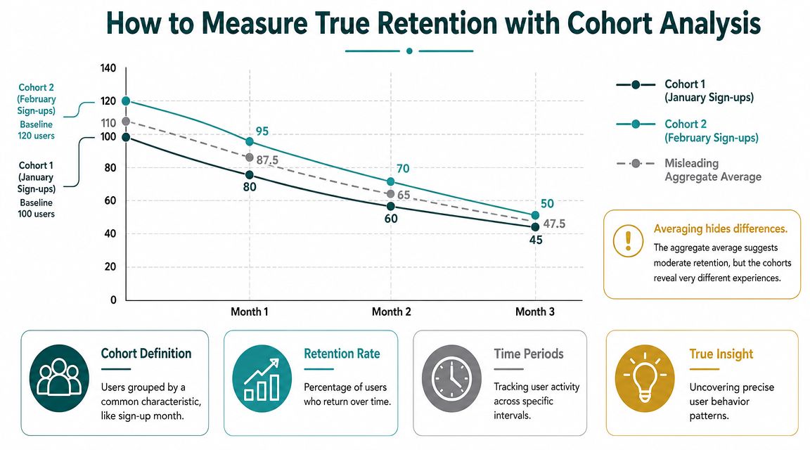
If you average all users together, you can miss the signal that matters. One group may love the experience while another drops away after the first use. That's why cohort analysis is usually the point where retention work becomes useful.
In UK digital products, June's guidance on user retention metrics argues that the most technically useful retention signal is usually not a single-point return rate but a cohort-based retention curve combined with DAU/MAU and feature-adoption tracking, because retention should be measured by who returns, when they return, and whether they use the core workflow repeatedly.
What a cohort actually is
A cohort is a group of users who share a starting point.
For venues and transport operators, useful cohorts might include:
- First-use month for a wayfinding app or visitor service
- Venue type or journey type such as outpatient, commuter, shopper, or event attendee
- Entry channel such as QR code, website referral, staff referral, or in-app search
- Feature exposure such as users who followed turn-by-turn navigation versus users who only viewed a static map
A lot of teams improve quickly through this approach. They stop asking, "What is our retention rate?" and start asking, "Which users return, after what experience, and for which journey?"
Why aggregate averages mislead
Suppose one cohort used the service during a disruptive period with poor onboarding, while another started after a content update and clearer arrival instructions. If you blend both groups, the average can look stable even though one cohort is underperforming badly.
That's why a retention curve is more revealing than a single percentage. It shows the drop-off pattern over time.
The embedded explainer below gives a useful visual walkthrough of how cohort thinking changes interpretation.
How to use cohort analysis in physical spaces
For transport operators, short-interval cohorts often reveal whether first use turns into habit. For hospitals or campuses, longer intervals may be more realistic because visits are less frequent.
A practical cohort review often includes:
- Define the return event. Not any app open. Use the event that reflects real value, such as completed navigation to a platform, department, or store.
- Choose an appropriate time window. Daily, weekly, or monthly depends on the operational rhythm of the venue.
- Segment by visitor type. A first-time station user should not be judged against a weekday commuter.
- Read the shape, not just the endpoint. Sharp early drop-off often points to onboarding or confidence issues.
- Overlay feature use. Users who adopt the core workflow usually tell you more than casual browsers.
If you want to go beyond simple snapshots and model patterns over time, some teams also borrow advanced time series techniques to separate seasonal fluctuations from genuine retention change.
Cohort analysis is where retention stops being a dashboard metric and becomes an operational diagnostic.
What Is a Good Retention Rate for Your Venue
There isn't one universal "good" retention rate for a venue. The right benchmark depends on why people come, how often they need to return, and how much friction the journey carries. A commuter rail app, a shopping centre navigation service, and a children's hospital all serve different rhythms of repeat behaviour.
That said, the useful question isn't "what's normal?" It's "what repeat behaviour would indicate that the experience is working for our users?"

Retail, transport, and healthcare don't retain in the same way
A shopping centre such as Westfield London will usually care about repeat visitation, return to specific zones, and whether navigation supports cross-site discovery rather than single-destination drop-ins. If users only come back for one anchor tenant, retention may look healthy on paper while wider commercial value remains weak.
A transport operator such as WMATA is looking for something different. Repeated usage often maps to trust and routine. If a rider uses journey support once but doesn't return, that may signal poor onboarding, missing confidence in station-to-platform guidance, or a mismatch between the app and the realities of repeated travel.
A healthcare campus such as the Royal Hospital for Children and Young People has another definition again. Here, retention can mean whether patients and families are willing and able to use digital navigation repeatedly across appointments. That's less about habit formation and more about reducing stress and improving reliability over time.
The UK baseline changes how you interpret retention
In the UK, 92% of adults were internet users in 2024, with 99% of adults aged 16 to 44 using the internet and 75% among those aged 75 and over. The same release reports that 98% of adults who used the internet in the previous three months accessed it on a mobile phone, according to the Office for National Statistics figures cited here. For venue operators, that means retention measurement now sits in a near-universal, mobile-first environment for working-age users, but age segmentation still matters.
This matters operationally for two reasons:
- Mobile continuity is now the baseline. If your journey support only works well as a one-off webpage, you're likely under-measuring real repeat use.
- Older users still need separate interpretation. Lower digital usage in older age groups doesn't automatically mean poor product value. It may reflect access patterns, confidence, or support needs.
If you work on accessibility, retention becomes more than a product metric. It becomes a service quality measure.
For teams thinking about the operational and human cost of navigation failure, Waymap's article on the hidden price of getting lost in large venues is worth reading alongside retention data.
What good looks like in practice
A good retention rate is one that aligns with expected return behaviour and supports your commercial or service objective.
Use these checks instead of chasing generic benchmarks:
- Retail: Are users returning to more than one destination type over time?
- Transport: Do first-time users become repeat journey completers?
- Healthcare: Do returning visitors rely on the tool again rather than reverting to staff help or arriving stressed and late?
- Campuses and civic spaces: Does repeat use spread across key buildings and services, not just one familiar route?
The strongest benchmark is behavioural. A good retention rate is one that reflects repeated success in the journeys your venue exists to support.
How Waymap Delivers Retention Insights Without Infrastructure
Many retention programmes stall before they start because the measurement model depends on hardware. Beacons need installation. Installed infrastructure needs upkeep. Layout changes create rework. In busy stations, hospitals, and retail sites, that becomes a budget line and an operational burden.
Waymap takes a different route. Its navigation uses dead reckoning from the smartphone's native sensors, rather than GPS, Wi-Fi, or installed hardware. That matters because it allows operators to observe repeated journey behaviour in infrastructure-free environments, including spaces with signal limitations, frequent changes, or restricted capital budgets.
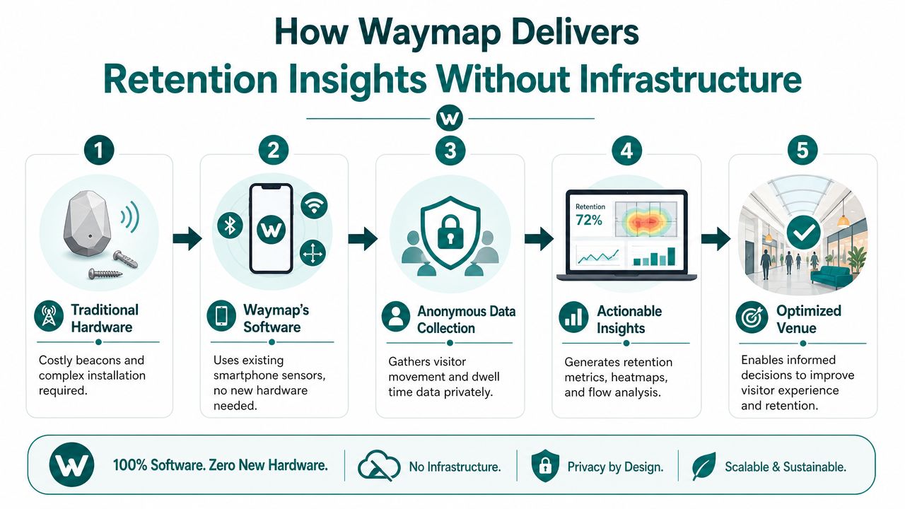
Why infrastructure-free measurement changes the economics
For transport operators and estates teams, software-only deployment changes the conversation from installation to usage. That's important in environments where maintenance teams are already stretched and where any physical rollout competes with other operational priorities.
It also makes retention analysis cleaner. You can focus on repeated successful journeys, route choice, and feature use, rather than conflating product value with patchy hardware coverage.
Waymap's internal navigation system approach is relevant here because it shows how precise guidance can be delivered without the physical maintenance model many operators are trying to avoid.
Why sign-up numbers still aren't enough
A useful UK lesson comes from public service digital adoption. The NHS App, launched in January 2019, reached 34.6 million registered accounts by March 2025, with more than 11 million users in the previous 12 months and 29 million repeat prescription orders in that period, as described in this overview of customer retention rate examples. The key lesson isn't the scale alone. It's the gap between registration and ongoing use.
For venue and transport operators, the implication is direct. Downloads, registrations, and onboarding completions matter, but they don't prove retained value. Repeat journey completion does.
This also connects to compliance. Under the Equality Act 2010, organisations don't just need digital services that exist. They need services people can use in practice. Measuring whether disabled visitors can complete and repeat journeys gives operators a more concrete way to assess whether access is working as intended.
In accessibility-led environments, retention is often the clearest proof that the service remains usable after the first attempt.
Four Actionable Tactics to Improve Visitor Retention
Retention improves when the journey becomes easier to repeat. In physical spaces, that usually means removing uncertainty, keeping information current, and learning from drop-off before it becomes abandonment.
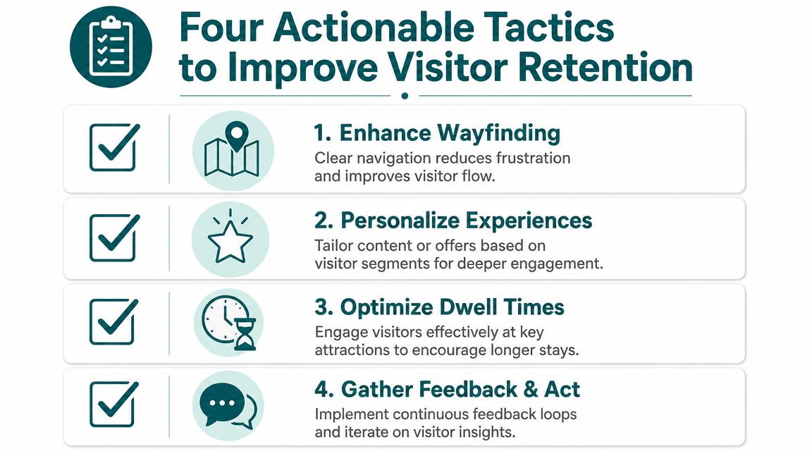
Fix first-use friction before you optimise loyalty
The first experience carries more weight than many teams admit. If a user can't confidently get from entrance to destination, they won't care about personalisation later.
Focus on:
- Arrival clarity: Make the first decision point obvious. Which entrance, which lift, which concourse, which department.
- Core-task onboarding: Don't teach every feature upfront. Get the visitor to a successful first destination.
- Accessible instructions: Use language and interaction patterns that work for blind, low-vision, older, and first-time users.
Keep the wayfinding layer current
A retained visitor expects the second journey to be easier than the first. That only happens if your content stays accurate.
In practice, this means prioritising:
- Temporary disruption updates such as closures, relocated entrances, and changed routes
- Named destination accuracy so people can search the way they naturally speak
- Operational ownership so updates don't wait on long digital release cycles
For retail teams, Waymap's guide on how wayfinding can benefit retail venues connects this directly to visitor flow and destination discovery.
Use privacy-aware cohorts instead of over-collecting data
Modern retention work doesn't need to rely on intrusive tracking. A more nuanced approach uses privacy-aware cohorts and anonymous journey states, which is particularly important in the UK where the ICO emphasises data minimisation and purpose limitation, as discussed in Product School's article on customer retention metrics.
That means you can still ask useful questions:
- Where do first-time visitors drop out?
- Which route types lead to repeat use?
- Which accessibility journeys need redesign?
Without collecting more personal data than you need.
Pair behaviour data with direct feedback
Movement tells you what happened. Feedback helps explain why.
If you're building a practical feedback loop, a solid starting point is this guide on how to conduct a UX survey. For venue teams, the most useful surveys are short, tied to a completed journey, and written in plain language.
A simple pattern works well:
- Identify a drop-off point from retention or cohort data.
- Ask a focused question after the journey.
- Compare responses by visitor type or route type.
- Fix the journey, then watch whether repeat use improves.
Better retention usually comes from fewer doubts per journey, not more messages per user.
Frequently Asked Questions about User Retention
What are user retention metrics
User retention metrics are measures that show whether people come back and continue using a service over time. In venues and transport, the most useful versions usually track repeated successful journeys, active use, and feature adoption rather than just downloads or page views.
What is the difference between retention and engagement
Retention measures whether users return over time. Engagement measures what they do while they're there.
A visitor might be highly engaged in one session and never come back. Another might use only one feature, but return repeatedly because that feature solves a real problem. For operators, retention usually matters more when you're assessing long-term service value.
How long should I track a retention cohort
Track a cohort for a period that matches the natural rhythm of the journey. Daily and weekly windows often suit commuter and high-frequency use. Monthly or longer windows often make more sense for hospitals, campuses, cultural venues, and destination retail.
If you're unsure, start with the interval that reflects a realistic repeat visit. Then review whether the curve reveals useful operational decisions.
Can you measure retention without a dedicated app
Yes, but it's harder to do well. If you don't have an app, you can still infer repeated use from digital touchpoints such as QR routes, web-based navigation starts, logged destination searches, or other consented journey events.
The trade-off is depth. Without a more persistent product layer, you usually get weaker visibility into repeat behaviour, cohort quality, and route completion.
Which user retention metrics matter most for transport operators
Transport operators usually benefit most from retention rate, cohort retention, DAU/MAU, and repeated completion of core journey flows. In practice, that means knowing whether first-time riders become repeat users of journey support, and whether regular travellers continue to rely on it under real operating conditions.
Which user retention metrics matter most for hospitals and campuses
Hospitals and campuses often get the most value from cohort retention, feature adoption, and repeat journey completion to specific destinations. The key question is whether visitors can return and complete the journey with less confusion, less staff intervention, and more confidence.
How does retention relate to accessibility and ESG goals
Retention helps turn accessibility from a policy statement into a measurable service outcome. If disabled visitors can repeatedly complete journeys independently, that supports inclusion in a practical sense and gives ESG leaders a clearer operational signal than one-off audits alone.
What is a bad sign in retention reporting
A common bad sign is when sign-ups or downloads rise while repeated use stays weak. Another is when aggregate retention looks acceptable, but specific groups such as first-time visitors or accessibility users drop away quickly. Those patterns usually point to onboarding friction, poor journey design, or outdated content.
If you're trying to measure repeat journeys in stations, hospitals, campuses, or retail destinations without taking on the cost and maintenance burden of installed hardware, Waymap is built for that reality. Our precision navigation platform helps operators understand how people move through complex spaces, improve accessibility, and turn wayfinding performance into a measurable part of visitor retention.