
Accurate Class Room Map: Easy Campus Navigation
Meta description: A practical guide to replacing the static class room map with a dynamic, accessible campus navigation system that improves usability, reduces maintenance burden, and supports compliance.
On the first week of term, the problem usually shows up before anyone logs a ticket. A new student lands on the university website, downloads a PDF class room map, pinches and zooms on a phone, and still can't work out whether Lecture Theatre B is next to the library, above it, or in a different building entirely. Reception gets the call. Porters give directions again. Academic staff start answering “Where is this room?” instead of getting on with teaching.
That experience isn't a minor inconvenience. It's the visible symptom of a campus navigation system that was designed for print, not for real journeys. Estates teams inherit the consequences: outdated floor plans, inaccessible embedded maps, room changes that ripple across signage, and a low-grade operational drag that never quite reaches a capital project threshold.
We see the same pattern across large venues. A static map looks cheap to maintain until you count the staff time, the reprints, the confusion, and the compliance risk. A better class room map isn't just digital. It has to be live, structured, accessible, and practical to run with the university's existing resources.
By Tom Pey, Founder of Waymap and blind accessibility technologist.
Beyond the PDF A New Standard for Campus Navigation
The old campus map model assumes people can stop, interpret symbols, mentally rotate a floor plan, and translate that into movement. Many can't do that quickly under pressure, especially on a crowded campus, on a small screen, or when the building is unfamiliar.
A PDF floor plan also breaks at the exact moment the user needs help most. It doesn't know where they are. It doesn't respond to closures. It can't guide someone around a blocked corridor or a temporary lift outage. It can't tell a wheelchair user whether a route includes a step, or a blind student whether the information behind the visual symbols exists in a usable text structure at all.
What a modern class room map has to do
A modern class room map should behave like an operational system, not an attachment on a webpage. It needs to:
- Locate rooms clearly so users can search by building, room number, department, or service
- Support live updates when teaching spaces move, facilities close, or events change circulation
- Carry accessibility data for routes, doors, ramps, lifts, toilets, reception points, and quiet spaces
- Work across channels including mobile web, kiosks, QR-triggered pages, and navigation apps
- Reduce dependency on staff directions for routine wayfinding
The strongest examples move beyond “find the building” and support “get me to the exact room, entrance, or desk”.
Static plans document space. Dynamic maps support movement.
Why universities are changing course
In UK geography education, digital mapping has already shown what happens when maps become active learning tools rather than passive diagrams. A classroom mapping methodology using Digimap for Schools and Ordnance Survey has students plot walking routes, measure distances, geo-locate photos, and categorise features. In that context, 90% of primary students demonstrated improved spatial reasoning after 6 weeks of map-based lessons, while 35% of UK teachers reported a ‘technology trap' when digital tools distracted from core geography concepts. The practical lesson is simple: maps work when they sit at the centre of the task, not as decoration around it, as noted in the UK government report on the digital future of geography lessons.
That's the same discipline universities need on campus. The map can't be an afterthought.
Many estates teams are already moving in this direction through interactive campus maps, because the standard PDF no longer matches how students and visitors find their way.
Why Your Static Campus Map Is Failing Everyone
A printed board in a foyer and a downloadable PDF still have a role as fallback artefacts. They should not be the primary wayfinding system for a modern campus.
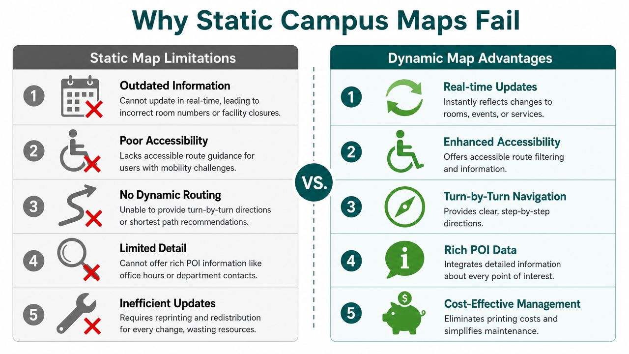
The first failure is obvious. Static maps go out of date. A seminar room changes use, a department relocates, an accessible entrance is temporarily rerouted, and the published plan is wrong until somebody notices, edits the file, republishes it, and replaces every physical version. Most campuses never complete that cycle as fast as change happens.
Static maps fail on accessibility first
The bigger problem is that static maps usually collapse under real accessibility requirements. UK schools have been legally required since 2002 to publish Accessibility Plans, but those plans rarely become dynamic wayfinding tools. The result is a practical gap where static classroom maps overwhelmingly omit details on curb cuts, ramps, and accessible doors, leaving wheelchair users without reliable route guidance, as set out by ALLFIE's work on accessibility plans in schools.
For a university estates manager, that gap matters because the anticipatory duty under the Equality Act 2010 isn't satisfied by uploading a floor plan that assumes every user moves and perceives space in the same way.
The hidden cost isn't printing. It's operational drag
Teams often underestimate the overhead because no single budget line captures it. The cost sits in:
- Reception interruptions: Staff become the live routing layer when the map fails.
- Signage churn: Minor room or service changes trigger avoidable reprints and replacements.
- Poor first impressions: Visitors judge the campus before they reach their meeting.
- Fragmented information: Estates, timetabling, accessibility, and web teams all hold partial truths.
If you still need PDFs for committee packs, contractor packs, or archive records, keep them. Just don't treat PDF export as your navigation strategy. For teams that need to generate controlled document outputs from live content, Transformy.io's Java PDF guide is a useful technical reference for producing PDFs from structured HTML without turning the PDF into the source of truth.
Practical rule: Make the live map canonical. Generate PDFs from it when needed, not the other way round.
There's also a user-expectation problem. People now expect digital wayfinding to behave like transport apps. A static blue dot on a non-interactive plan doesn't help much. That's why universities looking at the limits of blue-dot mapping are rethinking whether “showing location” is enough without meaningful routing.
How to Capture and Digitise Your Campus Floor Plans
Most universities already hold the raw material for a strong digital map. The issue isn't lack of plans. It's that the plans are trapped in formats built for design, compliance filing, or print issue, not for navigation.
The cleanest starting point is the latest CAD drawing, architectural plan, or estates record that reflects current circulation. If that's inconsistent by building, use what is current and reliable first. Perfection at portfolio level usually delays delivery at building level.
Start with structure, not graphics
A usable navigation map needs more than an image of a floor. Each room, corridor, stair, lift, and doorway should become a distinct object in a structured spatial layer. That's what allows later tagging, search, routing logic, and accessibility filtering.
A sensible capture workflow looks like this:
Audit your source files
Gather CAD, BIM exports, PDF plans, fire plans, and recent refurbishment mark-ups. Choose the version estates relies upon.Normalise the floor geometry
Clean duplicated walls, inconsistent labels, and broken circulation paths. Routing engines need continuity.Separate navigable space from non-navigable space
A map should know the difference between a corridor and a plant room, between a public entrance and a locked service door.Create stable identifiers
Rooms change names. IDs should survive renaming, departmental moves, and timetable changes.
Avoid the common digitisation mistakes
The most expensive mistake is over-surveying too early. Teams sometimes commission heavyweight remapping when the existing plans are already good enough to establish a usable digital twin. The second mistake is flattening everything into a visual asset that looks tidy on screen but carries no object-level intelligence.
A better test is operational. Can you update one room name without redrawing the floor? Can you mark a lift as unavailable without republishing an entire building plan? Can you distinguish step-free and non-step-free path segments in the data model? If the answer is no, you don't yet have a digital navigation asset.
For estates and capital teams, the discipline is similar to measurement accuracy in construction workflows. If you want a parallel example of how better source capture improves downstream decisions, this guide on how mobile measurement tools can boost accuracy in project bidding is worth a read. The principle carries over. Clean input data reduces friction later.
What good floor mapping software should support
When teams assess floor mapping software, these capabilities matter most:
| Requirement | Why it matters |
|---|---|
| Object-level map editing | Lets staff update rooms, routes, and facilities without redrawing whole plans |
| Multi-floor relationships | Supports stairs, lifts, entrances, and cross-building routes |
| Searchable metadata | Makes rooms, services, and departments discoverable |
| Route network logic | Enables step-by-step guidance instead of static display |
| Fast update workflow | Keeps maps current when campus operations change |
A class room map becomes useful when it stops being a drawing and starts being a maintained data layer.
Enriching Your Map with POIs Routes and Accessibility Data
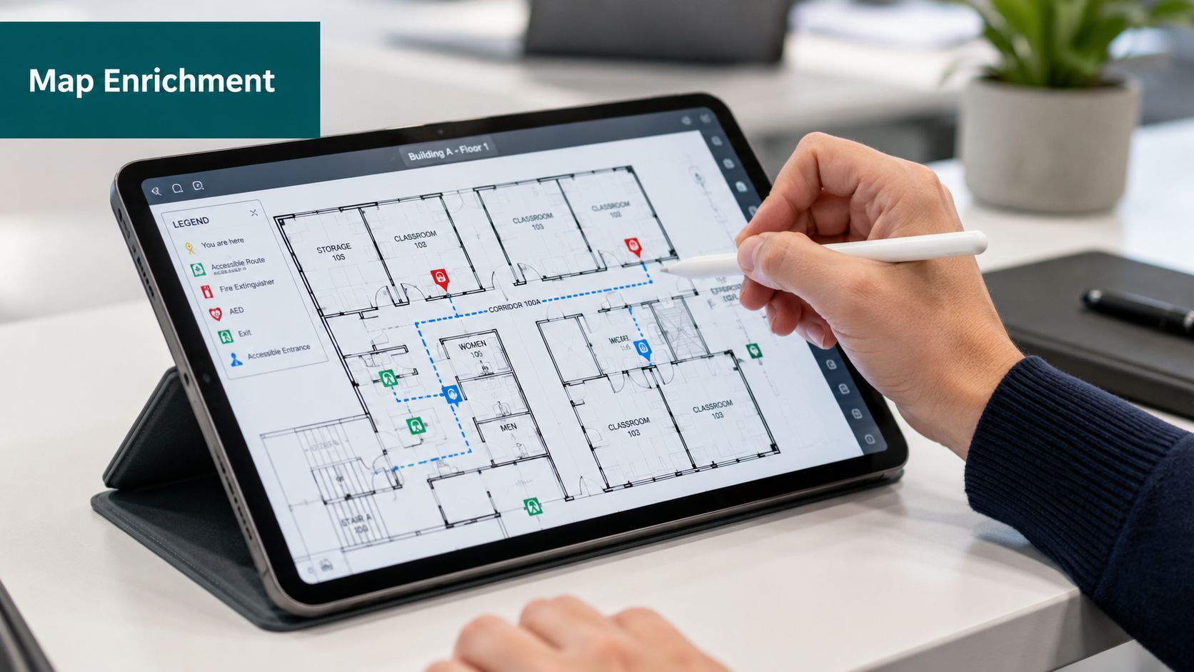
A floor outline with room numbers is still not enough. Users find their way to destinations, but they also work through decisions. Which entrance is accessible? Which route avoids stairs? Where is student services in relation to the lift, not just in relation to the building?
That enrichment layer is where most campus maps succeed or fail.
Build a proper point-of-interest model
Every destination that matters to a user should be mapped as a point of interest, not buried in a separate directory. That includes:
- Teaching spaces such as classrooms, lecture theatres, labs, and seminar rooms
- Support services including reception, student services, finance, disability support, and security
- Facilities such as toilets, lifts, prayer rooms, cafés, water refill points, and cycle storage
- Operational points including accessible entrances, help points, waiting areas, and evacuation refuges
Each POI needs useful metadata. A room name alone isn't enough. Add aliases, department ownership, floor, opening constraints, and any access notes that affect user choice.
Route data must reflect real access, not ideal geometry
Estates knowledge plays a vital role. A route network should encode not just the shortest path, but the usable path for different people.
That means recording:
- Step-free routes and where they begin and end
- Ramps, lifts, and accessible doors
- Temporary constraints such as closures, works, and alternative entrances
- Sensory considerations where appropriate, including quieter circulation options
- Decision points where a user needs instruction, not just a line on a map
The accessibility gap is not abstract. UK accessibility experts have made clear that making a map keyboard-navigable does not solve the harder problem of making visual map information accessible. Assistive technologies cannot interpret map symbols or spatial relationships without structured text alternatives, a failure highlighted by Edinburgh University's own admission that its digital maps are not fully accessible, as discussed by AbilityNet on maps and accessibility.
If the accessibility detail lives only in icons, colours, or shapes, many users will never receive it.
Treat accessibility information as first-class data
The strongest campus maps don't bolt accessibility on at the end. They model it from the start. That means a ramp is not an annotation. It is a route-relevant object. A lift is not just a symbol. It has a location, a state, and a relationship to accessible circulation.
A useful checklist for inclusive campus mapping includes:
- Text equivalents for spatial information: Route instructions and feature descriptions that screen readers can interpret
- Accessible entrance logic: The map should prefer the right entrance for the route type selected
- Door and threshold detail: Heavy doors, automatic doors, and restricted doors matter operationally
- Contextual instructions: “Use the lift opposite reception” is better than a generic visual marker
Universities doing this well usually follow broader inclusive design principles rather than treating digital accessibility and physical accessibility as separate projects.
How to Choose the Right Navigation Technology
Once the map exists, the next decision is delivery. Delivery allows estates teams to save themselves years of avoidable maintenance.
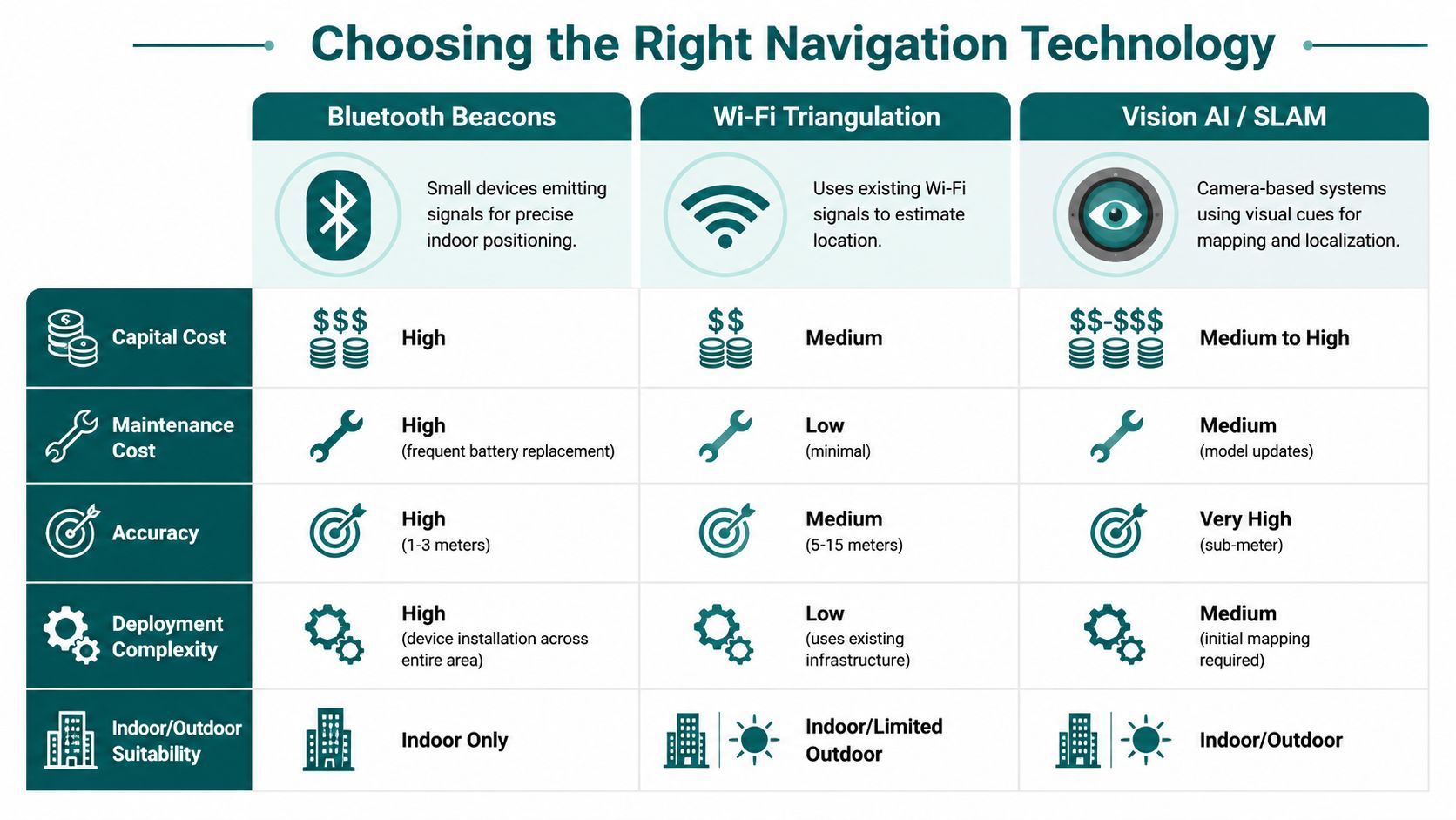
The market still presents hardware-heavy indoor positioning as the default answer. Bluetooth beacon systems, Wi-Fi triangulation, and camera-led approaches all have contexts where they fit. For universities with mixed building stock, constrained budgets, and frequent operational change, the wrong choice creates a support burden that outlives the pilot.
What estates teams should look at first
The central question isn't “What is technically possible?” It's “What can we deploy and keep reliable without adding another estate of hardware to maintain?”
That's especially important because accessibility is not a niche requirement. In the UK, 1 in every 4 people, approximately 16.1 million individuals, has a disability, which makes an accessible indoor navigation interface a core requirement for public-facing venues, as summarised in Tenet's UK accessibility statistics article.
A decision framework that works in practice looks like this:
| Decision factor | What to ask |
|---|---|
| Capital spend | Does this require device installation across multiple buildings? |
| Maintenance overhead | Who replaces batteries, recalibrates signals, or retrains models? |
| Accuracy in mixed environments | Will it work indoors, outdoors, and below ground across campus transitions? |
| Resilience | Does it depend on infrastructure that can drift, fail, or become inconsistent? |
| Accessibility fit | Can it support reliable route guidance for users who need precision? |
Why infrastructure-free navigation changes the economics
Infrastructure-free navigation avoids the recurring burden that usually kills scale. Waymap's approach uses dead reckoning from device-native sensors, fusing data from the smartphone's own motion sensors rather than relying on GPS, Wi-Fi, or installed beacons. In practice, that enables sub-3-metre accuracy in infrastructure-free environments across indoor, outdoor, and underground settings.
For universities, that matters for four reasons:
- No beacon estate to maintain: No batteries, mounting, replacement rounds, or hardware audits.
- Faster deployment: Buildings can be digitised and published without waiting for physical installation.
- Better fit for changing campuses: Refurbishments and departmental churn don't strand hardware investments.
- Single navigation model: Users don't have to switch between outdoor and indoor tools.
This is the same reason infrastructure-free systems have been used in complex venues such as the Royal Hospital for Children and Young People, where route reliability and accessibility matter but hardware overhead is a poor fit.
Decision test: If your preferred solution needs a maintenance schedule before it has users, the total cost of ownership will probably be wrong for a university estate.
Teams comparing options often start with broad indoor positioning systems and only later realise that hardware dependence, not software licensing, is the long-term cost driver.
Launching and Maintaining Your Live Campus Map
The launch is where many mapping projects falter. Not because the map is wrong, but because nobody owns the operating model after go-live.
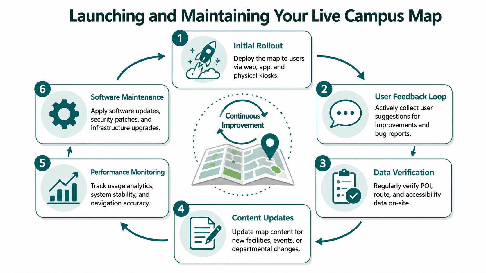
A live class room map needs governance, testing, and a simple update path. If every content change requires a supplier ticket, the map will drift. If nobody validates accessibility routes after a refurbishment, users will lose trust quickly.
Test with real users before you publish at scale
Do not sign off the map from a desktop review alone. Walk it with people who use the campus differently. That includes wheelchair users, blind and low-vision users, new students, staff who work in the building, and front-of-house teams who currently give directions.
A practical pre-launch test should check:
- Route correctness: Does the guidance reach the right door, not just the right building?
- Instruction clarity: Are route prompts understandable under real campus conditions?
- Accessibility logic: Does a step-free route remain step-free all the way through?
- Search quality: Do users find rooms using the language they naturally type?
Keep ownership simple
The best operating model is usually light, not elaborate. One named service owner in estates or campus operations. One update workflow. Clear escalation when closures or refurbishments affect routes.
A workable cadence often includes:
- Routine content updates for room changes, moves, and renamed services
- Planned works updates before closures go live
- Periodic on-site verification of key accessible routes
- User feedback review from support channels and app reports
Compliance is moving toward live accessibility, not static statements
The legal direction is clear. With the European Accessibility Act entering its full implementation phase in June 2025, with enforcement scaling through 2026, accessible indoor navigation interfaces become a legal prerequisite for large-scale facilities operating in the EU, according to Navigine's guide to accessible indoor navigation and compliance.
That doesn't mean every university needs a sprawling digital transformation programme. It means the map can no longer be treated as a brochure asset. It is part of the service environment.
Launch the minimum viable live map, then maintain it like any other operational system. Accuracy beats ornament.
A well-run map also gives estates teams a clearer view of movement patterns, recurrent confusion points, and where signage or room naming may be creating avoidable friction. Used properly, it informs campus planning as well as navigation.
Frequently Asked Questions About Digital Classroom Maps
What is a class room map in a university setting
A class room map is a campus wayfinding tool that helps students, staff, and visitors find teaching spaces and related facilities. The useful version is dynamic, searchable, and linked to route guidance rather than a static floor plan.
Are PDF campus maps still worth keeping
Yes, but only as secondary artefacts. PDFs are still useful for records, print packs, and fallback access, but they shouldn't be the primary navigation system for a live campus.
What makes a digital classroom map accessible
An accessible digital classroom map includes structured route data, accessible entrance and step-free information, and text alternatives for spatial content. It must support people who can't rely on visual symbols alone.
Does a university need hardware installed across campus for indoor navigation
No. Some systems do require installed hardware, but infrastructure-free options exist and are often easier to scale and maintain across mixed university estates.
What data should estates teams add first
Start with room identifiers, entrances, lifts, stairs, toilets, reception points, and accessible routes. Then add temporary closures, departmental services, and other route-relevant details.
Who should own the campus map after launch
One operational owner should coordinate it, usually in estates, campus operations, or digital services. Timetabling, accessibility, web, and front-of-house teams should contribute updates, but someone needs final responsibility.
How often should a live class room map be updated
Update it whenever route-relevant information changes. Room moves, closures, entrance changes, and accessibility impacts should go live as soon as they're confirmed.
If your university is still relying on PDFs and static signage, Waymap can help you move to a live, accessible navigation system that works indoors, outdoors, and underground without installed hardware. We work with complex venues to turn floor plans into precise, maintainable wayfinding that supports accessibility, lowers operational burden, and helps every visitor reach the right place with confidence.
