
Amusement Park Map Maker: The Modern Venue's Guide
A family arrives at a large amusement park just after opening. One child wants the nearest coaster, another needs a toilet, and a grandparent wants the least demanding walking route. The paper map at the gate looks attractive, but it doesn't answer the core question: where do we go from here, right now, given who we are and what the park is like today?
That gap is why the phrase amusement park map maker now means something very different from what it meant even a few years ago. A map for a modern venue can't stop at illustration. It has to support navigation, accessibility, live operational changes, and the practical reality that parks are dynamic environments with temporary closures, changing queues, seasonal overlays, and shifting guest priorities.
The wider market has already moved in that direction. Six Flags moved from static PDF maps to a unified interactive, real-time map across all 42 of its properties, as described in Concept3D's Six Flags case study. That matters because it reflects a broader change in venue operations. Parks no longer need only a branded park graphic. They need an updateable wayfinding layer.
At Waymap, we look at park mapping through that operational lens. The map has to help people find attractions, food, toilets, entrances, exits, rest points, and quieter routes. It also has to work for visitors who don't rely on visual information to find their way, or who need step-free options, or who don't want to decode a crowded illustrated plan while standing in the middle of a busy path. That's the difference between a decorative map and a usable system. Our view is set out in more detail in this piece on theme park maps and digital navigation.
Introduction Beyond the Paper Map
An amusement park map used to be a printed artefact. It helped with branding, gave guests a sense of the park, and offered a rough orientation tool. That still matters. Theme-park maps have long been a specialised form of cartography shaped by storytelling, branding, and spatial logic, not just plain street-map accuracy.
But operators now need much more than that.
A modern amusement park map maker has to think like a venue strategist. The work starts with guest navigation, but it quickly reaches queue pressure, staff enquiries, accessibility obligations, maintenance closures, temporary events, and multilingual information delivery. If the map can't reflect operational reality, it becomes stale the moment the venue changes.
Practical rule: If a map can't be updated as the site changes, it's a marketing asset, not a navigation system.
For UK parks, that's especially important. Venues such as Alton Towers, Thorpe Park, and Chessington World of Adventures operate at a scale where visitor flow and family experience are shaped directly by wayfinding quality. In practice, guests don't judge a map by whether it looks polished. They judge it by whether it helps them reach the right place with less stress.
That changes the brief. The job is no longer “draw the park”. The job is “build a digital model of the park that people can use confidently, across changing conditions, with accessibility built in”.
Why Static Park Maps No Longer Work
Static maps still have a place. They're useful as overview tools, gate handouts, and branded orientation pieces. They're just no longer enough on their own for a large, high-footfall venue.
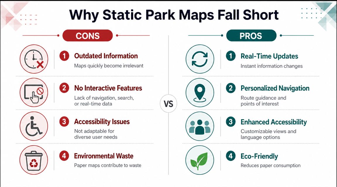
The core problem is operational. A paper map or exported PDF captures one version of the park at one moment in time. Parks don't stay still. Rides close temporarily. Food locations change opening status. Seasonal areas appear and disappear. Paths are redirected. Guest density changes where people should be sent next.
What breaks first in a static map
Most operators notice the same points of failure:
- Closures and diversions: A guest follows the printed route and reaches a dead end, fenced area, or unavailable attraction.
- Low-precision orientation: “You are somewhere near this icon” isn't enough when a family is trying to find the nearest accessible toilet.
- Search failure: Guests want to search for lockers, baby changing, halal food, shaded seating, or guest services. Static maps don't respond.
- Accessibility gaps: They rarely distinguish the route that is shortest from the route that is usable.
- Support burden: Every unclear route becomes a staff question.
A lot of “amusement park map maker” tools still focus on visual outputs rather than operational use. That's the market gap. As Mappedin's theme park guidance notes, the biggest gap in most amusement park map tools is their failure to handle real-world needs such as queue-time changes, temporary ride closures, or rerouting for peak-day crowds.
Static vs Dynamic Park Maps An Operational Comparison
| Feature | Static Map (Paper/PDF) | Dynamic Wayfinding (Waymap) |
|---|---|---|
| Attraction information | Fixed until reprint or re-export | Updateable as park data changes |
| Route guidance | Guest interprets map manually | Turn-by-turn guidance to destinations |
| Search | Limited or none | Searchable points of interest |
| Accessibility | Often broad symbols only | Route-level guidance based on accessible paths and facilities |
| Closures and diversions | Usually out of date quickly | Can reflect operational changes |
| Guest location awareness | Not built in | Supports live location awareness |
| Staff enquiry reduction | Limited | Better self-service navigation |
| Maintenance overhead | Reprint and redistribution | Data maintenance in the digital layer |
A park map should reduce decision-making load for the guest. If it makes them stop, rotate the map, and ask staff, it isn't doing enough.
What actually works in large venues
What works is a layered model.
Keep the illustrated overview map if it serves the brand and helps with broad orientation. Then add a digital wayfinding layer that can support live position, searchable amenities, route selection, and operational updates. The mistake isn't using a paper map. The mistake is expecting it to do a job it was never designed to do.
That's why static maps now function best as a companion asset, not the primary navigation system.
How to Conduct a Foundational Site Survey
A reliable digital map starts long before anyone chooses colours, icons, or labels. It starts on site, with disciplined data capture.
Professional theme park mapping is a specialist niche. A public presentation featuring Citigraph notes its work for major parks including multiple Six Flags parks, Dollywood, Silver Dollar City, and Universal Studios Singapore, which underlines how much expertise this work takes in complex venues with dense attraction and amenity networks, as shown in this theme-park mapping presentation.
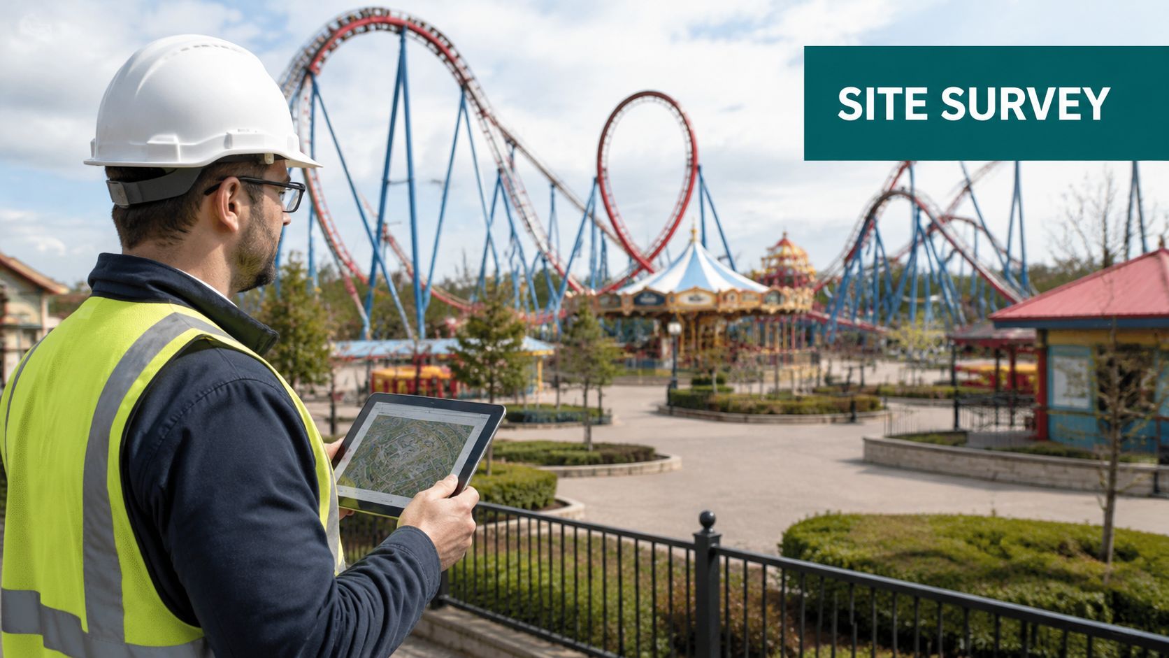
Capture the site as people use it
Many surveys fail because they capture only geometry. A navigation survey needs more than outlines of paths and buildings.
Survey for movement. Survey for decisions. Survey for barriers.
A good base includes:
- Path network: Main paths, secondary routes, bottlenecks, bridges, ramps, gates, queuing areas, and cut-throughs.
- Entrances and thresholds: Public entrances, staff-only boundaries, ticket barriers, re-entry points, and door behaviour.
- Points of interest: Attractions, toilets, first aid, food units, lockers, quiet spaces, guest services, buggy hire, shops, and transport stops.
- Accessibility details: Step-free routes, slopes, kerbs, tactile paving, seating, resting places, accessible toilets, hearing support points, and refuge areas where relevant.
- Environmental cues: Landmarks, distinctive facades, paving changes, canopy transitions, and acoustic differences that help orientation.
For the measured site layer, many operators already work with chartered surveyors. If you need a refresher on the kinds of baseline survey outputs that support built-environment projects, Survey Merchant construction surveys give a useful overview.
Build for maintainability from day one
The second mistake operators make is treating the survey as a one-off. Parks change constantly, so the survey method has to support future updates.
That means assigning stable identifiers to features, documenting naming conventions, and separating permanent assets from seasonal or temporary ones. A Halloween maze, summer stage, or temporary food cart should not be modelled the same way as a permanent attraction block.
For larger estates, rich spatial capture can also help. Detailed scanning and environmental modelling improve the fidelity of the underlying navigation layer, particularly where spaces are visually complex. Wayfinding teams using advanced venue capture methods often draw on resources such as this discussion of 3D LiDAR scanning for digital navigation.
What the site-survey brief should ask for
Don't ask only for a map-ready drawing. Ask for a navigation-ready dataset.
That usually means the survey brief should specify:
- Usable route logic, not just linework
- Asset metadata for each point of interest
- Accessibility attributes tied to route segments
- A change-management format for future updates
The survey is where bad assumptions become expensive. If the route network is wrong at this stage, every later layer inherits the error.
Designing the Map for Universal Usability
Once the survey is complete, the actual design work begins. Not visual styling first. Structure first.
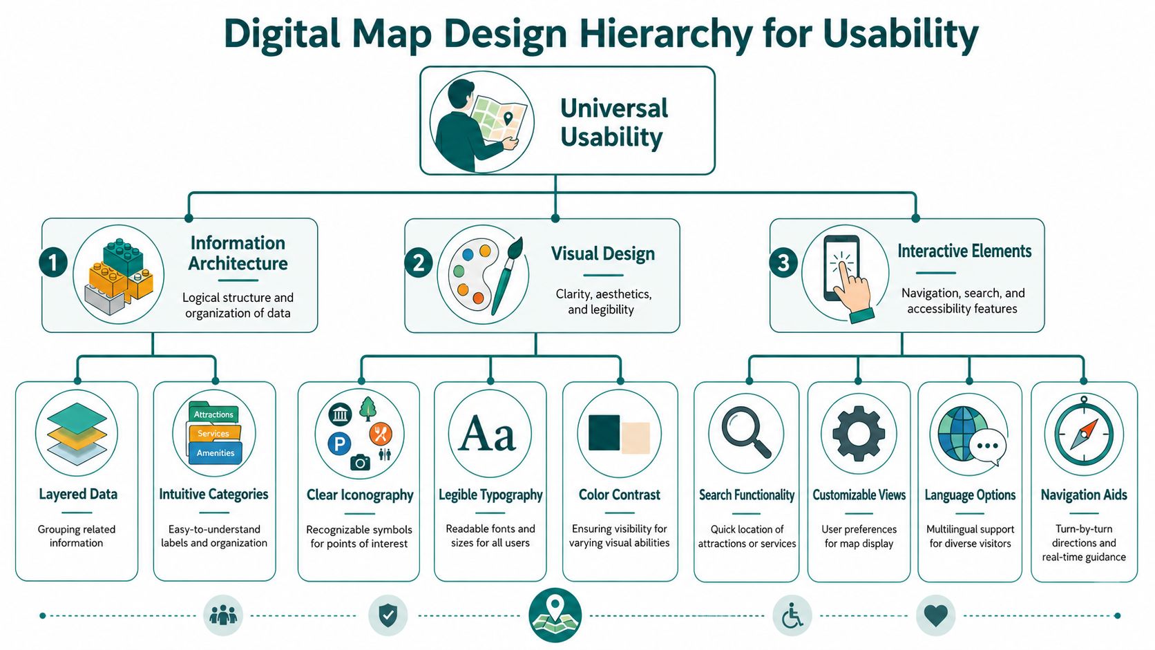
The digital map needs a clear information architecture so guests can find what they need quickly and understand what each route or point of interest means. The discipline here is closer to service design than poster design.
Define points of interest properly
A weak POI database is one of the biggest reasons digital maps underperform. “Food” is not enough. “Toilet” is not enough. Guests need usable distinctions.
A strong point-of-interest structure usually includes:
- Guest-facing name: The label visitors recognise on site.
- Category and subcategory: Ride, restaurant, kiosk, toilet, changing place, guest services, quiet room, retail, seating, transport.
- Access characteristics: Step-free, indoor, outdoor, family-friendly, staffed, seasonal, restricted-hours.
- Navigation endpoint: The exact place a guest should be guided to, not just the middle of the building footprint.
- Alternative labels: Common search terms, abbreviations, and multilingual naming where relevant.
Many simple amusement park map maker tools fall short in this area. While they generate a visual park plan, they don't create a comprehensive navigation database.
Accessibility can't be an add-on
Accessibility-first map making is not optional. In England alone, 16 million people are disabled and 80% of disabilities are not visible, which is why maps need to support orientation, rest points, and step-free routes, as noted by Pixelcut's discussion of theme-park map tools and their limitations.
For a usable park map, that means accessibility data has to be embedded at route level, not tacked on as a handful of icons.
Tag these features explicitly:
- Step-free route availability
- Accessible toilets
- Rest points and seating clusters
- Lower-sensory or quieter spaces
- Clear landmarks for orientation
- Alternative formats for non-visual navigation
- Route restrictions caused by stairs, narrow paths, or steep gradients
A visually polished map that hides route constraints is a poor accessibility outcome. It looks complete while withholding the information people need.
Make categories visible to stressed users
Guests don't browse maps in calm, ideal conditions. They use them while moving, carrying bags, watching children, managing fatigue, or recovering from a wrong turn.
That's why category design matters so much. Use categories people already think in:
| Guest need | Better label approach |
|---|---|
| “I need a toilet now” | Toilets nearby |
| “Where can we eat quickly?” | Quick food |
| “We need to sit down” | Seating and rest points |
| “How do we avoid stairs?” | Step-free route |
| “Where's help?” | Guest services and first aid |
This is also where inclusive content design matters. If you're building a digital venue map, the design principles used for accessible navigation systems are far more useful than generic map-poster advice. Wayfinding teams should be working from approaches like these inclusive design principles for navigation.
Good map design reduces ambiguity. Inclusive map design reduces ambiguity for more people.
Integrating Sensorless Positioning for Dynamic Wayfinding
A digital map becomes a wayfinding system only when it can locate the user reliably enough to guide them turn by turn. In a large amusement park, that's harder than it sounds.
GPS is often weak around dense built structures, covered queue areas, indoor attractions, arcades, transport shelters, and mixed indoor-outdoor transitions. Bluetooth beacon systems can work, but they add hardware, battery management, maintenance overhead, and ongoing estate complexity.
Why sensorless positioning changes the deployment model
Sensorless positioning takes a different approach. Instead of relying on installed hardware, it uses the smartphone's own motion sensors and a detailed mapped model of the environment to determine where the user is and how they're moving through the venue.
That matters in parks because the estate is broad, mixed, and operationally busy. Infrastructure-heavy solutions often become difficult to maintain in environments with seasonal overlays, hardwearing cleaning regimes, weather exposure, and frequent changes to guest routes.
The practical benefit is straightforward:
- No beacon estate to install
- No hardware maintenance round
- No dependency on local signal coverage
- One navigation model across outdoor, indoor, and transitional spaces
What this looks like in live venues
This deployment model is already relevant in other complex public environments. Waymap has implemented sensorless navigation in places such as WMATA and Westfield London, where users need accurate guidance through high-footfall, decision-heavy spaces rather than broad blue-dot orientation. That's the same category of problem a large amusement park faces: people moving through a complex environment and needing exact directions to a usable destination.
For operators evaluating navigation technology, the key question isn't whether the app can display a map. Most can. The question is whether the positioning method can support precise, maintainable, operational wayfinding at scale without creating another layer of infrastructure to manage.
That's also why internal navigation architecture matters more than many buyers realise. A park needs route logic, location confidence, and destination precision working together. This overview of an internal navigation system for complex venues is a useful reference point for that evaluation.
The trade-off to understand
Sensorless systems shift effort away from hardware deployment and towards map quality. That's a good trade if your venue is committed to maintaining an accurate digital environment model.
In other words, the map becomes operational infrastructure. That's exactly where it belongs.
Validating Your Map with Real-World User Testing
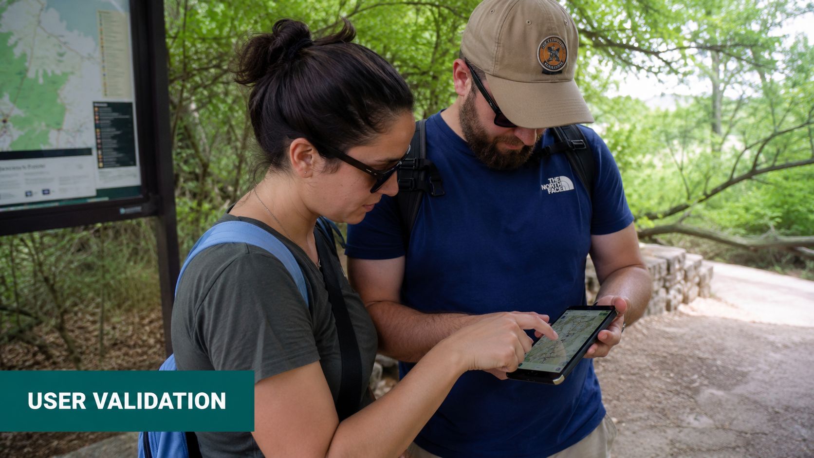
A park map isn't ready because the dataset is complete. It's ready when real visitors can use it confidently.
That sounds obvious, but many projects falter at this point. Teams test whether the route engine can calculate a path. They don't test whether the guidance makes sense in a noisy, crowded, distracting venue.
Test with the people the map is meant to serve
The testing panel should reflect actual visitors, not just internal staff who already know the site. Include people who are new to the park, families, older visitors, wheelchair users, and blind or low-vision users who rely on audio guidance.
A useful testing round checks more than route accuracy. It should examine:
- Instruction timing: Is the turn prompt early enough in a crowded area?
- Destination precision: Does the route end at the correct door, gate, or entry point?
- Language clarity: Are labels and instructions easy to understand under pressure?
- Accessibility reliability: Does the “accessible route” remain accessible in practice?
- Recovery behaviour: What happens if the user deviates from the suggested route?
Don't ask only “Did it work?” Ask “Could someone use this calmly on a busy day?”
Build a practical UAT routine
User acceptance testing works best when it mirrors actual venue conditions. Test during quieter periods and busier ones. Test in mixed weather where relevant. Test temporary barriers and event overlays.
A strong UAT routine usually includes:
Task-based journeys
Ask users to complete realistic tasks such as finding the nearest accessible toilet, navigating from the entrance to a specific ride, or locating a quiet rest point.Observation and debrief
Watch for hesitation points, repeated misreads, and places where users stop walking to decode the instruction.Issue logging by severity
Separate cosmetic issues from navigation-critical ones. A misspelt label matters. A route ending at the wrong gate matters more.
Later-stage optimisation often benefits from movement analysis as well. Heat and path-pattern reviews help teams spot where navigation instructions are still causing uncertainty, particularly around merges, plazas, and entrance clusters. This is the kind of operational insight discussed in Waymap's work on 3D heat map analysis for navigation environments.
The operational side of testing is easier to understand when you can see it in practice:
What sign-off should actually mean
Sign-off should mean the map is trustworthy enough for public use and maintainable enough for operational reality. It should not mean only that stakeholders liked the design.
If the map helps a first-time visitor move with less friction, and if the operator can update it without rebuilding the whole system, then it's doing its job.
Your Amusement Park Map Maker Questions Answered
What should an amusement park map maker deliver today
An amusement park map maker should deliver more than artwork. The output should include a maintainable digital map, structured points of interest, accessible route logic, and support for live wayfinding rather than only a static visual.
Is a paper map still useful in a large park
Yes, a paper map is still useful as an overview tool. It helps with broad orientation and branding, but it doesn't replace searchable, updateable navigation for a complex venue.
What makes a park map accessible
An accessible park map gives people usable route information, not just symbols. That includes step-free paths, rest points, accessible toilets, clear landmarks, and support for non-visual navigation.
How often should a digital park map be updated
A digital park map should be updated whenever the guest environment changes. In practice, that means temporary closures, redirected routes, seasonal overlays, and amenity changes all need a defined update process.
What is the biggest mistake in amusement park map design
The biggest mistake is treating the map as a design asset instead of operational infrastructure. If the system looks good but can't guide people accurately through changing site conditions, it won't solve the problem.
If you're reviewing options for a large venue, Waymap is designed for the operational side of navigation: precise indoor, outdoor, and underground guidance using smartphone motion sensors and detailed maps rather than installed hardware. For amusement parks, that means a digital wayfinding layer that can support accessibility, maintainability, and real guest movement across a changing estate.
