
Digital Theme Park Maps: Boost Visitor Experience
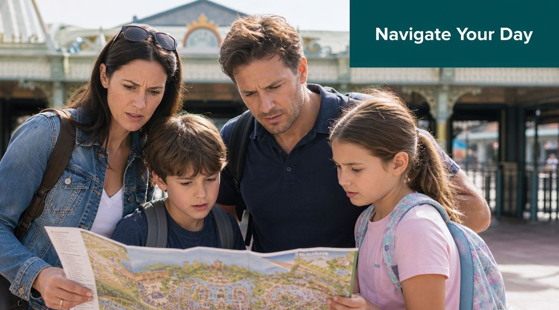
On a busy operating day, the weakness of most theme park maps shows up fast. A family stops at a junction, paper map open, trying to work out whether the accessible route to a ride still applies now that the queue entrance has moved. A staff member steps in, points them one way, then gets pulled into the same conversation by the next group. What looks like a small wayfinding issue is really an operations issue. It consumes staff time, creates friction for guests, and exposes the gap between what your map says and how your park is running.
That gap gets wider as sites get larger, busier, and more variable. If you're responsible for accessibility, guest experience, or day-to-day operations, the question isn't whether guests need a map. It's whether your current mapping approach is helping them move confidently through the venue, or forcing them to rely on staff intervention every time conditions change.
Why Your Theme Park Map Is More Than a Souvenir
A printed park map still has value. Guests like having something simple in hand, and for some visits it remains a useful orientation tool. But the moment a route changes, a queue line is redirected, or a visitor needs exact guidance to a specific accessible entrance, that printed map stops being the source of truth.
That matters more in large UK parks than many operators admit. Alton Towers opened as a theme park in 1980 and now covers roughly 550 acres, which is why a map has long been the primary tool for understanding distances, route choice, and access across the site, as noted in the Alton Towers Resort overview. At that scale, theme park maps aren't just visitor handouts. They're part of how the venue functions.
The map shapes the day before the guest reaches a ride
Guests use a map to answer practical questions long before they think about branding or illustration style.
- Where do we go first: They need to judge distance, not just location.
- Can we get there accessibly: They need to know whether the route works for a wheelchair user, a buggy, or someone who can't manage steps.
- Has anything changed: They need current information, not yesterday's layout.
If the map can't answer those questions, staff become the fallback navigation layer.
A map that can't keep up with live operations creates avoidable workload for front-line teams.
What operators miss when they treat maps as artwork
The usual brief for theme park maps focuses on design. Is it clear? Is it on brand? Does it show the rides attractively? Those questions matter, but they sit below the operational one. Can the map help guests make correct decisions in real conditions?
In practice, what works is a map that supports movement. What doesn't work is a beautifully drawn plan that assumes every path, queue, and entrance is static. In a live venue, they rarely are.
That is why the map belongs in operational planning, accessibility planning, and digital planning. Not just in marketing.
Print, Digital, and Truly Interactive Maps
Most venues say they have a digital map when what they have is a static asset on a screen. That's an important distinction. There are three very different categories of theme park maps, and they behave very differently under operational pressure.
Three map types, three levels of usefulness
The first tier is the printed map. It's easy to distribute, familiar to guests, and useful for broad orientation. It isn't easy to update, and it doesn't adapt when the park changes during the day.
The second tier is the digital static map, usually a PDF or image inside an app or on a mobile website. It looks more modern, but operationally it's often the same as print. It can be republished more easily than paper, but it's still a fixed visual.
The third tier is an interactive navigation system. This isn't just a map file. It's a navigational layer with searchable points of interest, route logic, and updateable wayfinding information.
Attractions.io makes a useful distinction here. Strong digital park maps need interactive, content-rich points of interest, so guests can access location, category, and pre-visit context for rides, food, and facilities to reduce search friction and route uncertainty, especially in dense resort layouts, as outlined in its guide to digital map requirements.
Comparison of Theme Park Map Technologies
| Attribute | Printed Map | Digital Static Map (PDF/Image) | Interactive Navigation System |
|---|---|---|---|
| Update speed | Slow. Requires reprint or manual overlays | Faster than print, but still requires asset replacement | Fast. Route and POI information can be updated within the system |
| Guest orientation | Broad overview only | Broad overview with zoom, if supported | Overview plus guided navigation to exact points |
| Accessibility support | Limited to symbols and labels | Better visibility controls in some cases, but usually still static | Can support functional routing, filtering, and guided directions |
| Operational flexibility | Weak during closures or temporary changes | Moderate, but still dependent on republishing assets | Strong, because information can change with operations |
| Data value | None beyond observation | Minimal | Useful for understanding search behaviour, route demand, and recurring friction points |
| Staff dependency | High when guests are uncertain | Still high in complex layouts | Lower when guests can self-serve directions |
Why the distinction matters to your wider digital estate
A lot of operators bundle maps into a venue app and stop there. That can work if the app is designed as a service tool rather than a brochure. Teams assessing broader app strategy may also find it useful to look at the benefits of a white label community app, particularly around branded communication and member engagement. But even a well-branded app doesn't solve navigation if the map inside it is static.
For large sites, the useful question is whether the map behaves like infrastructure. If you're reviewing how this works in other complex venues, our piece on interactive campus maps shows why searchable, updateable wayfinding matters well beyond universities.
If a guest can zoom but still can't decide where to go, you don't have interactive wayfinding. You have a larger brochure.
What Makes a Map Genuinely Accessible
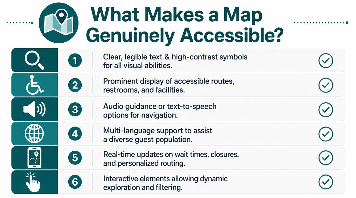
Most accessible theme park maps are only accessible in the narrowest sense. They add icons for accessible toilets, perhaps mark a step-free route, and call the job done. That improves information display. It doesn't guarantee independent navigation.
For many visitors, the requirement is functional guidance. They need to know which route works now, where the exact entrance is, whether the accessible toilet is on the same level, and how to avoid a blocked or noisy route. A static symbol on a map rarely answers those questions well enough.
The gap is not small. The RNIB estimates around 2 million people in the UK live with sight loss, yet most theme park map content still centres attractions and dining instead of step-by-step, exact-point guidance for independent navigation, according to RNIB's key statistics on sight loss.
Accessibility is about action, not labels
An accessible map helps a person do something specific.
- Reach a destination independently: Not just identify that the destination exists.
- Follow a route that matches their needs: Step-free, quieter, or more direct depending on the person.
- Adjust when conditions change: Because a route that was accessible at opening may not be the best route later in the day.
That applies to blind and low-vision guests, wheelchair users, families with buggies, and visitors who need simpler navigation in unfamiliar environments.
What to look for when evaluating accessibility
If you're reviewing theme park maps with an accessibility lead, ask harder questions than "Does it show accessible facilities?"
Ask these instead.
- Can a blind or low-vision guest find their way without depending on a companion or staff member?
- Can the system direct someone to an exact entrance rather than just a general attraction area?
- Can routing reflect temporary closures, queue changes, or altered access points?
- Can guests filter the environment based on their needs rather than accept one default route?
Practical rule: If accessibility depends on a guest reading a complex visual map correctly under pressure, it isn't robust enough.
Compliance is the floor, not the operating standard
Venue leaders often treat accessibility mapping as a compliance task. That mindset creates minimal solutions. The better standard is operational inclusion. Can the guest complete the journey with confidence, or not?
That shift matters commercially as well as ethically. Guests remember whether they could move around the park without stress. So do the people travelling with them.
How Does Precision Navigation Work Without GPS
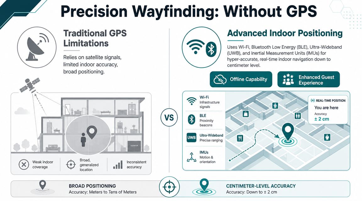
A large venue creates one of the hardest navigation environments to manage well. Guests move between open outdoor paths, covered queue areas, indoor shows, retail spaces, and back again. GPS doesn't handle that transition reliably enough on its own.
Mappedin puts the core issue clearly. Modern venues need a blend of indoor and outdoor mapping technologies, and continuous positional context matters as guests move between outdoor lands, covered queueing areas, and indoor shows without losing orientation, as described in its work on theme park mapping.
Why hardware-heavy approaches cause problems
Many operators first look at Bluetooth beacons, Wi-Fi triangulation, or other installed infrastructure. Those options can work in controlled conditions, but they come with practical burdens.
- They need upkeep: Hardware has to be installed, monitored, and replaced.
- They create dependency: If infrastructure drifts, fails, or gets moved, routing quality suffers.
- They complicate mixed environments: Outdoor and semi-covered spaces are particularly awkward.
That is why many teams now ask whether the phone can do more of the work itself.
Here is a useful technical primer on mapping and navigation if you're comparing positioning models across venue types.
A short demonstration helps make the difference easier to visualise.
What infrastructure-free navigation actually means
The simplest way to explain it is this. The phone already knows a lot about motion. It can detect steps, direction changes, and movement patterns through its built-in sensors. When that sensor data is matched against a detailed digital map, the system can keep track of where the person is moving without depending on GPS alone.
Waymap uses that model in practice. Its platform guides people indoors, outdoors, and underground to exact points without relying on GPS, Wi-Fi, or installed hardware, using the smartphone's motion sensors and mapped routes. For venue directors, the key implication is not novelty. It's lower infrastructure burden and a mapping layer that can function in signal-poor, mixed environments.
How Do You Keep Your Map Accurate When Your Park Changes
The true test of theme park maps isn't opening day. It's a wet Tuesday in peak season when one path is closed, a queue entrance has moved, a food kiosk has appeared for a seasonal event, and guest flow has shifted across the site.
Static maps fail structurally because they assume the park is a finished object. Operations teams know it isn't. The park is a live environment with temporary decisions layered onto permanent infrastructure every day.
A key operational problem is that theme park maps are often treated as brochures rather than live data infrastructure. That misses the routine need to manage fluctuating attendance, seasonal overlays, and temporary route changes, which is why live rerouting has become such an important capability in large venues, as discussed in this ArcGIS StoryMaps piece on amusement park mapping.
Accuracy depends on workflow, not design quality
A well-designed map can still become operationally useless if the update process is slow. The issue isn't only whether the cartography is good. It's whether your team can change the navigational layer quickly enough to reflect reality.
Three common scenarios expose this immediately.
- Temporary path closure: Print forces guests to improvise. Dynamic routing can send them another way.
- Queue management change: A static marker still points to the attraction, but not necessarily to the entrance guests must now use.
- Seasonal overlay: Pop-up retail, entertainment, and food locations alter movement patterns and need to appear in the same navigational logic as permanent assets.
What good operating practice looks like
The strongest setup is usually simple in governance terms. Someone owns the map data. Someone else can approve urgent operational edits. Changes are pushed into the live environment without waiting for a full redesign cycle.
That approach also reduces strain on front-line teams. If the digital route is correct, staff can focus on support that needs a human response.
For venues building or refreshing the spatial data behind their navigation, 3D LiDAR scanning is increasingly relevant because the quality of the route network and point data affects every downstream guidance decision.
Your guests don't care whether the map looked right in the design file. They care whether it was right when they needed it.
How to Measure the Success of Your Wayfinding System
Most internal business cases for wayfinding are weaker than they need to be because they focus on outputs, not operational outcomes. App downloads, map views, and QR scans may be interesting. They don't tell a venue director whether the system is reducing friction.
That matters because the UK's amusement and recreation sector is a substantial part of the leisure economy, and for venues in that sector, efficient crowd flow and visitor information are core operational necessities rather than optional extras, as noted by the Office for National Statistics.
Start with the problems you already pay for
The strongest measures usually come from existing operational pain points.
- Lost guest demand: Count navigation-related questions at guest services, ride entrances, and roaming staff positions.
- Route friction: Identify where people routinely stop, turn around, or ask for help.
- Accessibility performance: Track qualitative feedback from disabled visitors about whether they could complete journeys independently.
- Commercial flow: Review whether guests are reaching secondary destinations such as food, retail, and amenities with less confusion.
What to monitor after launch
A useful wayfinding scorecard combines operational, guest, and digital signals.
| Measure | What it tells you |
|---|---|
| Navigation-related staff queries | Whether guests can self-serve routine journeys |
| Searches for key facilities | Which destinations are hard to find or poorly signed |
| Route completion behaviour | Whether people abandon journeys or reach intended destinations |
| Guest feedback themes | Whether the system is reducing anxiety and confusion |
| Accessibility-specific feedback | Whether inclusive navigation is working in practice |
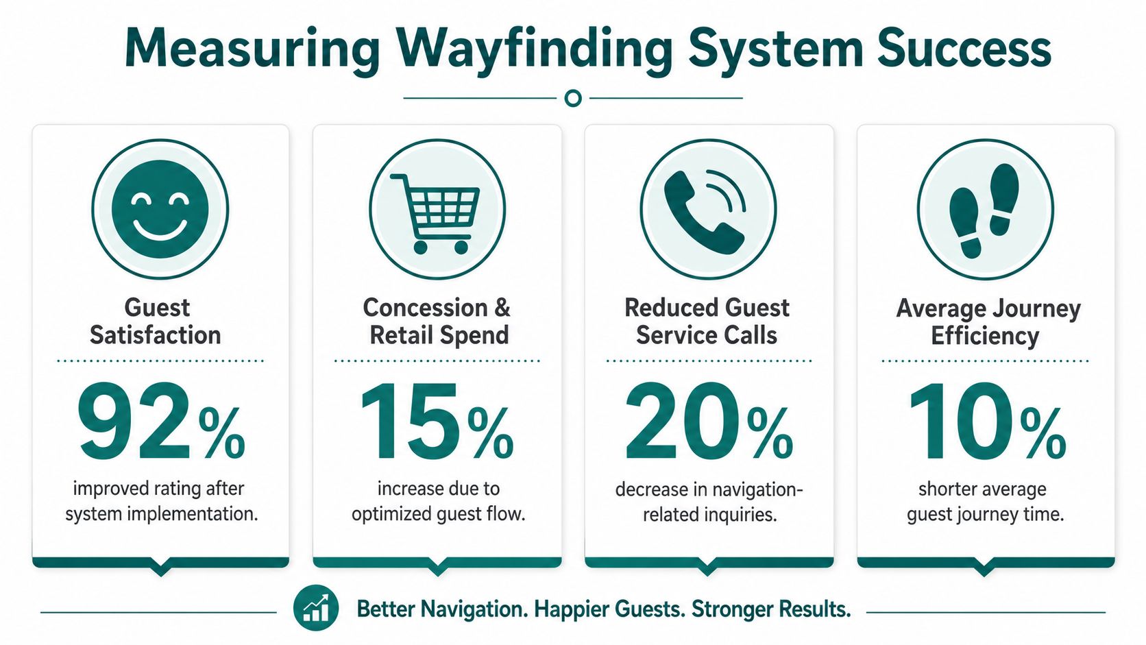
The infographic above includes sample performance figures as a design illustration, not as citable benchmark data. Your own baseline matters more than any generic target.
Measure fewer things, but measure the ones that change staffing pressure, guest confidence, and route performance.
Your Next Steps Towards Precision Navigation
If your current theme park maps are mostly illustrative, the next move isn't to ask for a better illustration. It's to decide whether mapping in your venue should stay a communications asset or become part of your operating model.
The shift usually starts with an honest audit. Walk the park as a first-time guest, as a wheelchair user, as a parent with a buggy, and as a blind or low-vision visitor using only the information your venue currently provides. Most leadership teams find the same thing. The weak points are obvious once you stop navigating as an insider.
Start with three decisions
First, define where wayfinding failure is costing you most. That may be front-line staff time, accessibility complaints, congestion at known choke points, or poor discovery of secondary amenities.
Second, set a standard for what "good" looks like. In most parks, that means guests can locate and reach rides, facilities, and services with minimal staff intervention, even when operating conditions change.
Third, test delivery models against total operational burden. A cheaper-looking system can become expensive if it relies on installed hardware, frequent manual workarounds, or constant staff correction.
What a serious evaluation should include
Use practical criteria, not feature theatre.
Map governance
Who updates route data, points of interest, and temporary closures?Accessibility performance
Can the system support independent navigation, not just accessible labels?Mixed-environment reliability
Does it work across outdoor paths, indoor venues, and covered spaces?Operational responsiveness
How quickly can the venue reflect a changed route or moved entrance?Maintenance model
What has to be installed, serviced, or replaced over time?
This isn't a branding decision. It's a service design decision with direct implications for guest confidence, staff workload, and how resilient your venue is when the day doesn't run to plan.
FAQs for Venue Operators
Do we still need printed theme park maps if we add digital navigation
Yes, in most parks you should keep them. Printed theme park maps still help with broad orientation, group planning, and guests who prefer a simple overview. They just shouldn't be your only navigation tool once your site is complex enough that live conditions regularly affect the route.
What's the difference between a digital map and a navigation system
A digital map is often just a static visual on a phone screen. A navigation system adds searchable locations, route logic, and guidance that can respond to how the venue is operating.
How do we know whether our current map is failing guests
Look at staff behaviour and guest behaviour. If staff spend a lot of time giving directions, if guests stop at the same junctions, or if accessible routes depend on verbal explanation, your current map is not doing enough.
Do accessible icons on a map count as accessible wayfinding
No, not on their own. Icons can highlight facilities, but they don't provide the exact, step-by-step guidance many visitors need to travel independently through a large and changing venue.
Will a dynamic system create more work for our team
Not if it's implemented properly. A dynamic system should reduce repeated manual direction-giving and make route changes easier to publish, but that depends on having a clear update workflow and ownership model.
Can one navigation system handle indoor and outdoor park areas
Yes, that's the requirement in most modern venues. Theme parks rarely operate as purely outdoor environments, so any serious solution needs to maintain orientation across indoor, outdoor, and covered spaces.
What should we ask suppliers before procurement
Ask how updates are made, how accessible routing works in practice, what infrastructure is required, how the system handles temporary changes, and what evidence the supplier can provide about operating the platform in large public venues.
How should we build the business case internally
Tie the case to existing operational pain. Show how better wayfinding can reduce direction-related staff demand, improve accessibility delivery, support guest flow, and make venue information more resilient when layouts change.
If you're reviewing how to move from static maps to precise, updateable navigation across a complex venue, explore Waymap to see how infrastructure-free wayfinding can support accessibility and operations in real environments.