
Airport Terminal Signage That Actually Works
You're at the assistance point outside a busy terminal. Your flight is boarding, the overhead signs point towards security, and the route appears obvious. Inside, the assistance lane is hard to distinguish, walking distances aren't shown, and a call point looks like an emergency device. Airport terminal signage hasn't failed because the typeface is unattractive. It has failed because the passenger needs a complete, reliable route from kerbside to seat.
For airport operators, that distinction changes the work. Physical signs remain essential, but they need to operate alongside tactile information, audio guidance, staff-independent assistance points and updateable digital navigation. The UK Civil Aviation Authority's assessments show why this matters, especially for passengers with disabilities and reduced mobility. At Waymap, we treat signage as one part of a route system that must be clear, consistent and usable at every decision point.
Why Terminal Signage Is a Route Problem, Not a Wall Problem
Consider a passenger with reduced mobility travelling alone. At the drop-off area, the first question is not “where is departures?” It's “where can I request assistance, is the route step-free, and how far will I need to travel before the next decision?” A large exterior sign can identify the assistance desk, but it can't explain a temporary lift closure or distinguish a shorter accessible route from the standard path.
At security, the passenger needs to identify the assistance lane without confusing it with a priority or emergency route. After security, the route may pass through retail areas where commercial messages compete with gate information. At border control and the gate, the passenger still needs confirmation of direction, destination and effort. A sign that points left answers only one part of that journey.

The route begins before the terminal entrance
UK requirements place airport information and assistance within an accessibility framework. Under Regulation (EU) No. 1107/2006 as applied in the UK, designated airport arrival and departure points must provide basic information in accessible formats, while facilities reserved for disabled and less-mobile passengers should use internationally agreed signs.
That means a signage audit must follow the passenger, not the architectural plan. Review the route from the car park, taxi rank and drop-off zone through check-in, security, border control and the gate. Record where a passenger must make a choice, wait, change level, request help or interpret a symbol without staff support.
Practical rule: If a passenger must ask a member of staff what a sign means, the route system has already exposed a gap.
Static signs can establish a stable visual language. They can't react to temporary closures, changed gate assignments or a passenger's preferred route. A stronger approach combines permanent, recognisable physical information with digital and audio layers that preserve the same destinations and assistance points. The Waymap guide to navigating an airport applies that route-based view to the full passenger journey.
The Building Blocks of Airport Terminal Signage
Effective airport terminal signage uses a controlled hierarchy. Each sign should answer one dominant question, and each communication layer should have a defined role. Without that control, directional arrows, retail promotions, safety notices and service information compete for attention at the exact point where passengers need to make a decision.
The core hierarchy contains five sign types. Directional signs move passengers towards a destination. Identifying signs confirm that a passenger has reached a destination. Informational signs explain a service or condition. Regulatory signs communicate rules or restrictions. Commercial signs support retail and other revenue activity, but they must not overpower operational or accessibility information.
The five layers that operators should audit
| Layer | Purpose | Example |
|---|---|---|
| Directional | Shows where to travel next | Gates, security, baggage reclaim |
| Identifying | Confirms the destination or zone | Assistance desk, toilet, lift lobby |
| Informational | Explains a service, route or condition | Walking distance, accessible route |
| Regulatory | Communicates rules and restrictions | Security requirements, restricted access |
| Commercial | Promotes a business or offer | Retail, food and beverage messaging |
The hierarchy only works if passengers can distinguish the layers quickly. Repeated pictograms for toilets, quiet areas, information and assistance points create recognition across the terminal. Consistent colour conventions help passengers find related destinations. Clear sightlines, non-reflective materials, appropriate lighting and readable lettering support the visual layer, while tactile symbols and audible cues support passengers who can't rely on overhead signs.
The Waymap perspective on wayfinding and signage design is useful here because it treats signs as part of a broader navigation experience rather than isolated fixtures. That distinction also helps with procurement. A new sign should have an owner, a category, a destination code and a reason for existing. If nobody can explain which passenger decision it supports, it probably belongs in a different communication channel.
Reduce competition at decision points
Decluttering doesn't mean removing useful information. It means separating information by urgency and decision. A passenger approaching security needs the route, lane type and assistance option before they need a restaurant promotion. A passenger at the gate needs confirmation of the gate, seating, toilets and assistance arrangements without scanning a crowded display.
Operators should test signs from the approach direction, at the passenger's eye level, and while carrying luggage or using mobility equipment. A sign that looks clear in a design review can disappear behind queues, advertising screens or temporary barriers once the terminal is operating.
Mapping Passenger Flow and Zoning Across the Terminal
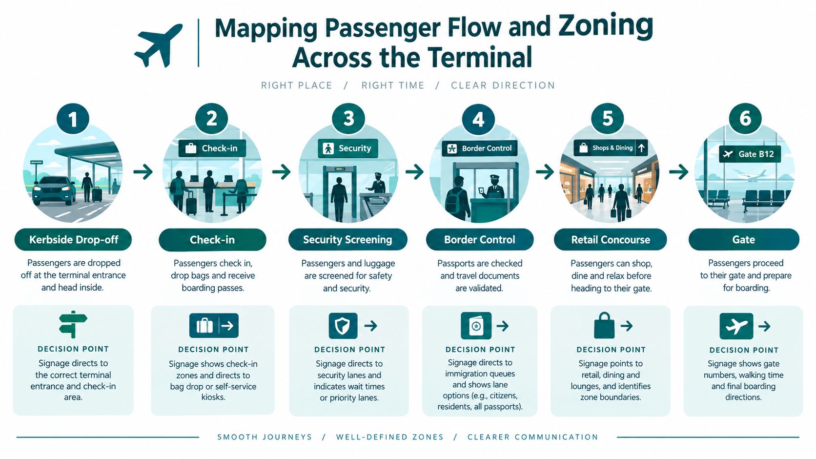
Passengers experience a terminal as a sequence of zones, not as a finished building. Each zone introduces a different question, and each transition creates a decision point where signage must communicate more than direction.
Kerbside and drop-off
The journey starts outside. Signs should identify departures and arrivals, accessible parking, assistance desks and step-free entrances from the car park, taxi area and drop-off zones. Passengers may be unfamiliar with the building, carrying bags and watching traffic, so the first signs need strong visibility and simple destination choices.
At this stage, the operator should verify whether a passenger can identify the assistance point without entering the terminal or relying on a member of staff. Exterior information also needs to remain accurate when entrances, road layouts or construction hoardings change.
Check-in and baggage acceptance
The check-in zone is a transition from open public space to a dense operational environment. Signage should separate airline desks, self-service kiosks, bag drop, toilets, information and assistance. The route to assistance must remain visible from the approach, rather than becoming apparent only after a passenger has joined a queue.
Where passengers receive tickets or boarding passes, check baggage or access aircraft boarding areas, the CAA states that required passenger information must be provided at each relevant location. The method isn't prescribed, but the information must be effective, and notices must be sufficiently prominent that passengers have a reasonable chance of seeing them. The CAA guidance on passenger information makes placement an operational issue, not just a graphics decision.
Security, border control and the airside concourse
Security creates queues, lane choices and uncertainty about what happens next. Signage should identify standard and assistance routes, toilets, lifts and the direction of the departures concourse. Border control introduces another controlled transition, particularly for international passengers who may depend heavily on familiar symbols rather than local language.
The airside concourse then combines operational messages with commercial content. Audit the route to gates through retail areas, paying attention to whether passengers can see the next directional sign after leaving security or border control.
Gate areas and connections
At the gate, signs should confirm the gate number, boarding status, seating, toilets, assistance point and route to connections where relevant. Walking distance matters here because passengers need to judge whether they can continue independently or should request support.
A 3D heat-map approach to passenger movement can help operators identify hesitation, backtracking and congestion around decision points. The output should inform sign placement and route design, not merely produce an attractive visualisation.
Accessibility, Multilingual Design and PRM Obligations
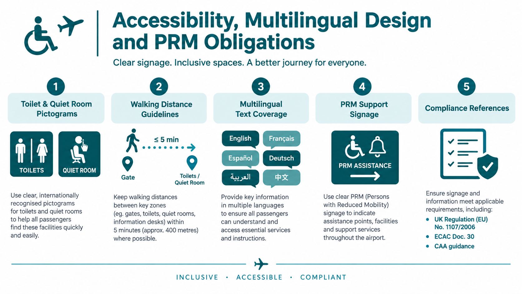
UK airport signage sits inside a passenger-rights and assistance framework. Regulation (EU) No. 1107/2006 requires airports to provide accessible flight-related information and enable disabled and reduced-mobility passengers to communicate their arrival and assistance request at designated points. ECAC Doc. 30 guidance, cited by the CAA, calls for internationally agreed signs at facilities reserved for disabled and reduced-mobility passengers.
The practical response is a system that communicates destination, effort and available support. A sign should help a passenger understand not only where the lift is, but whether the lift leads to the correct route and how far the next stage may be.
Use symbols consistently
CAA guidance recommends clear pictograms for toilets, quiet areas, information and assistance points. Operators should repeat the same symbols at approach routes, decision points and destinations. A symbol that changes shape or colour between kerbside and airside forces passengers to relearn the system.
Walking distances belong on key routes. CAA assessments recommend displaying distances between important locations so passengers can make informed choices about independent travel. This is especially valuable for passengers with reduced mobility, fatigue, cognitive disabilities or limited confidence in unfamiliar environments.
Call points need equal attention. One CAA assessment records a recommendation that designated call-point buttons should be approximately 20 mm in diameter and protrude slightly to improve tactile discoverability, as described in the CAA accessibility assessment. Assistance call points must also remain visually distinct from emergency devices, since ambiguity at the moment help is needed creates avoidable dependence.
Make multilingual information efficient
Multilingual design doesn't require every sign to become a paragraph. Use internationally recognisable symbols for core services, short text for destinations and consistent placement for language variants. Digital layers can provide spoken or written language choices without forcing every physical sign to carry every translation.
Audio, tactile and visual information should agree. A passenger should hear the same destination name that appears on the sign, and an accessible route should not disappear from the digital experience because the physical sign only shows the stairs. For teams building mobile guidance, RapidNative's resource on inclusive app development offers useful context on designing accessible digital interfaces.
The Waymap approach to multilingual wayfinding illustrates why language support belongs in the route layer. Operators should test the complete experience with disabled passengers, including blind and low-vision users, rather than evaluating only colour contrast and sign placement.
Where Static Signs Stop and Dynamic Wayfinding Starts
Static signs are dependable when the environment is stable. They work without a battery, app or network connection, and they establish the shared visual language that every passenger can use. Their weakness appears when routes change, information must be personalised, or a passenger needs step-by-step guidance to an exact door, lift or assistance point.

Compare the operating trade-offs
| Requirement | Static signage | Dynamic digital wayfinding |
|---|---|---|
| Route changes | Requires physical amendment | Can update the route data |
| Language coverage | Limited by available sign space | Can offer selected languages |
| Exact destinations | Works well for major zones | Can guide to specific doors and points |
| Maintenance | Physical inspections and replacement | Content and map governance |
| Blind and low-vision access | Needs audio or tactile support | Can provide spoken, step-by-step guidance |
| Infrastructure | No installed positioning hardware | Can operate through device-native sensing |
Waymap's underlying mechanism uses dead reckoning through smartphone-native motion sensors. The platform is designed for sub-3-metre accuracy in infrastructure-free environments, including signal-poor areas, and doesn't require a pre-mapped beacon network. That matters to estates teams who face capital restrictions, frequent layout changes or the operational burden of replacing hardware across a high-footfall terminal.
The model is complementary, not a reason to remove physical signs. A passenger without a smartphone still needs clear signs, and every passenger benefits from stable symbols at major decision points. A dynamic layer earns its place where static information becomes too general, too slow to update or too difficult to personalise. Waymap has applied this type of indoor navigation in venues including Lord's Cricket Ground, where visitors may need to reach exact entrances, facilities and points of interest rather than a broad zone.
The Waymap analysis of dynamic digital signage sets out the distinction between changing content and changing navigation. A screen can display a new message, but a navigation layer must also recalculate the passenger's route when the accessible path changes.
The following video shows how digital wayfinding can sit alongside the built environment rather than compete with it.
The return on investment is strongest where the operator can identify a recurring operational problem, such as temporary closures, complex interchanges, multilingual demand or repeated assistance requests. Installing another layer of hardware may solve positioning, but it also adds batteries, surveys, replacement cycles and ownership questions. Infrastructure-free navigation shifts more of that work into map and content governance.
What UK Airports Are Already Doing Differently
CAA assessments show that UK airport operators are addressing signage as a practical accessibility service rather than a finished design package. The examples are specific because the problems are specific.
At London Stansted, the CAA recorded signage for assistance lanes at security and border-control areas, alongside purple wayfinding lines through the terminal to identify routes intended for passengers with reduced mobility. The approach gives passengers a visible route language across a large building. It also demonstrates that floor markers can complement overhead signs when sightlines are interrupted by queues, retail fixtures or high ceilings.
At London Heathrow, the regulator recommended displaying walking distances at more points in the journey. The recommendation included locations in Terminal 3 and the route between Terminal 5A security and waiting areas. The operational lesson is straightforward. A sign can be directionally correct and still be incomplete if it doesn't tell a passenger how much walking lies ahead.
Exterior visibility matters
Edinburgh Airport provides another useful example. The CAA praised large exterior signage identifying the assistance desk from car parks and drop-off zones, while also reporting that designated assistance call points should be clearly visible and that walking distances between key points should appear on signs. Accessible airport signage therefore begins before the passenger reaches the main terminal hall.
The CAA's broader assessment for 1 April 2024 to 31 March 2025 covered 28 UK airports. 11 airports received a “very good” rating, 14 received “good”, and 3 received “needs improvement”, according to the CAA accessibility report. The three airports needing improvement represent about 10.7% of the assessed group, calculated from the CAA's published figures.
That distribution shouldn't encourage complacency. The regulator still identified wayfinding and signage as areas requiring further improvement, including consistency, internationally agreed standards, visible assistance areas and distance information. The CAA's 2023/24 findings also described unnecessarily long walking distances, inconsistent communication between terminal areas and missing assistance information along parts of the route.
Operating the Signage System Day to Day
Airport terminal signage should have an operating model, not just a capital budget. A sign register needs to record each asset's destination, category, owner, language treatment, accessibility role and last review. Facilities, operations, accessibility, security and commercial teams should use the same hierarchy so that a temporary campaign cannot obscure an assistance route.
Build governance into routine work
A practical operating rhythm includes:
- Route audits: Walk the passenger journey from car parks and drop-off zones through to gates, checking sightlines, symbols, distances and obstructions.
- Change control: Trigger a signage review after construction, queue reconfiguration, lift closure, gate-area changes or retail refit.
- Passenger testing: Re-check routes with disabled passengers, including people with mobility, visual and cognitive access needs.
- Content ownership: Assign one accountable team to approve destination names, translations and digital route updates.
- Assistance verification: Confirm that call points remain visible, tactilely discoverable and distinct from emergency devices.
The CAA guidance recommends a controlled sign hierarchy covering directional, identifying, informational, regulatory and commercial functions. It also connects assistance governance to airport scale. Airports serving 150,000 or more commercial passengers must establish assistance quality standards, as explained in CAA guidance for airports providing assistance.
Digital wayfinding needs the same discipline. A route update should have an effective date, a named approver and a test route. Map changes must be checked at the physical decision point, because a technically correct destination can still produce confusion if the sign, lift entrance or queue line has moved.
Measuring Performance and Planning the Next Move
A signage system is working when passengers can make decisions without unnecessary hesitation, backtracking or staff intervention. Track missed-flight incidents associated with decision points, assistance-call volumes by area, signage-related complaints, audit pass rates and dwell time around security and gate zones. Treat each measure as a diagnostic signal, not as a standalone verdict.
Warning signs include passengers clustering beneath signs, repeated questions at the same junction, assistance calls from locations that should be self-explanatory, and physical signs that remain correct only because staff compensate for them. More signs won't necessarily solve those problems. Inconsistent symbols, undisclosed walking demands and competing commercial messages can make a busy sign system harder to use.
Phase dynamic wayfinding where the physical system has a clear gap. Start with exact destinations, changing accessible routes, assistance points or complex transfers. Keep the physical sign hierarchy for shared orientation, then align the digital map, audio instructions and route updates with those same destination names and symbols.
The result is not a screen replacing a sign. It's a multimodal route system that gives passengers stable information in the building and personalised guidance when the building cannot answer every question.
Waymap provides indoor, outdoor and underground navigation to exact entrances, lifts, gates and other points of interest without GPS, Wi-Fi or installed beacons, using smartphone-native sensors for step-by-step guidance. Visit Waymap to discuss how an infrastructure-free digital layer could complement your airport terminal signage and support more independent passenger journeys.
