
Satisfaction Survey: Drive Real Change in 2026
By Monday morning, the survey dashboard says visitors were “mostly satisfied”. By Monday afternoon, your front-line staff are still answering the same questions at the entrance, people are missing lifts and platforms, and accessibility complaints are buried inside vague comments like “signage poor” or “layout confusing”. That's the usual failure point of a satisfaction survey in a large venue. It measures mood, but not friction.
For venue managers, that gap matters. A shopping centre, station, stadium, hospital or campus doesn't fail because visitors dislike the logo or the coffee queue in the abstract. It fails at specific moments: finding the right door, locating the accessible toilet, moving from entrance to destination, understanding whether to trust signs, staff or an app. If your survey doesn't isolate those moments, you can't fix them with confidence.
We write this as the Waymap team, from the practical end of operations. Good surveys don't just collect opinion. They create a short route from visitor feedback to operational change, especially where wayfinding and accessibility sit inside real budget, estate and maintenance constraints.
Primary keyword: satisfaction survey
Semantic variants used throughout: customer satisfaction survey, visitor feedback survey, customer feedback survey, satisfaction questionnaire, accessibility feedback survey
Meta description: A practical guide to building a satisfaction survey for large venues, with advice on survey design, distribution, analysis, and how to turn feedback into wayfinding and accessibility improvements.
Why Most Satisfaction Surveys Fail and How to Build One That Works
Most venue surveys fail because they ask for a verdict instead of evidence. “How was your visit?” produces broad sentiment, but it rarely tells an operations manager whether the problem sits in the car park, the concourse, the lift core, the platform change, or the accessible route from entrance to seat.
That weakness gets worse in complex estates. Hospitals, interchanges, retail centres and civic venues contain multiple journeys inside one visit. A parent trying to find a clinic, a commuter changing platform, and a wheelchair user looking for the step-free route may all rate the same building differently for entirely valid reasons. One average score hides all of that.
The better model is simple. Build your satisfaction survey around decision points, barriers, and next actions.
What a useful survey actually captures
A useful survey should tell you:
Where the problem happened
Entrance, corridor, platform access, toilet, reception, food court, exit.What the visitor tried to do
Find a gate, seat, department, platform, help point, shop, or accessible facility.How they found their way
Fixed signage, staff directions, prior familiarity, printed map, digital navigation.Whether the route felt inclusive
Clear for first-time visitors, disabled visitors, families, and people under time pressure.
Practical rule: If a survey answer can't lead to a work order, staffing change, content update or navigation improvement, the question is too vague.
Large organisations already use structured survey data to drive operational decisions. The 2025 Civil Service People Survey results highlights recorded 343,961 respondents across 102 organisations, showing how disciplined survey design supports improvement at scale, with engagement ranging from 57% to 71%.
For venue teams that are still working out governance, it helps to align the survey process with your privacy and data-handling practice from the start. Our guidance on IP address handling and GDPR considerations is a useful place to sanity-check how you collect and store feedback data. If you also need a simple model for public-facing query handling, 10Seat's guide to frequently asked questions is a helpful reference for turning repeated user issues into clearer operational content.
The build principle that changes results
Treat the survey as part of service delivery, not a reporting exercise.
That means the survey owner should sit close to operations, estates, accessibility, and front-line management. If marketing owns the tool but estates owns the fixes and customer service absorbs the complaints, nothing moves. A survey only works when one team can trace a line from feedback to action, then check whether the next wave of responses improves.
How to Design a Survey That Delivers Actionable Insight
Design starts with precision. If the question is broad, the answer will be broad. If the question names a task, location or barrier, the answer becomes useful.
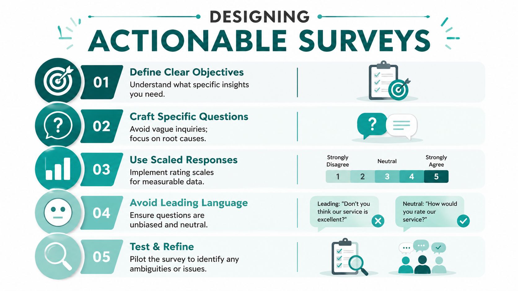
A venue survey should read like an operations checklist written in visitor language. You are not asking whether people “liked the experience”. You are asking whether they could complete the journey without unnecessary effort.
Start with task-based questions
Use the visitor's actual objective as the anchor.
Examples that work better than generic satisfaction prompts:
How easy was it to find your destination today?
This identifies navigation effort directly.What did you use most to find your way?
Options might include fixed signs, staff, memory from a previous visit, mobile navigation, or asking another visitor.At which point, if any, did navigation become unclear?
This turns a complaint into a location-specific issue.Were accessible facilities clearly marked and easy to locate?
This surfaces whether inclusion features are visible, not just whether they exist.Did anything on your route make the journey harder than it should have been?
Keep the text field optional. You want context, not a writing assignment.
The strongest questionnaires mix formats. Use a rating question for comparability, multiple choice for pattern detection, and a short open field for context. That combination gives you a measurable trend and an explanation for it.
Avoid the traps that produce bad data
Bad survey design usually comes from one of four mistakes:
| Survey mistake | What happens | Better approach |
|---|---|---|
| Vague wording | You get sentiment with no cause | Name the task or route |
| Leading language | Visitors feel pushed toward praise or criticism | Keep wording neutral |
| Too many questions | People quit before the useful part | Focus on the decision point |
| Accessibility as an afterthought | Core barriers stay invisible | Ask route and facility questions directly |
The British Social Attitudes Survey analysis from the Nuffield Trust is a good reminder that top-line improvement doesn't remove the need for detail. In 2025, satisfaction with the NHS rose to 26%, up 6 percentage points from 2024, yet only 4% were ‘very' satisfied. That's exactly why operators need more than one broad score.
Broad satisfaction tells you whether people felt better or worse. Specific questions tell you what to repair on Tuesday.
Build around operational pillars
For large venues, four pillars usually matter more than any brand metric:
Wayfinding clarity
Can people reach the right place without repeated correction?Accessibility of route
Can disabled visitors complete the journey with equivalent confidence?Reliance on staff intervention
Are employees solving preventable navigation problems?Confidence at transitions
Entrances, lifts, escalators, platform changes and exits often create the sharpest confusion.
That last point often predicts repeat complaints. Most visitors tolerate a long walk if they know they are on the right route. They become frustrated when they stop trusting the environment.
A useful operational companion to this thinking is our note on user retention metrics, because repeat use and repeat confusion are often linked. If people abandon a navigation aid or stop engaging with guidance content, the problem may be accuracy, clarity or timing rather than adoption alone.
Before full rollout, pilot the survey with staff and a small group of real visitors. Ask them where wording feels unclear, intrusive, or irrelevant. A survey that sounds obvious to head office often lands badly on a crowded concourse.
Later in the design process, training videos can help teams align on question quality and response handling. One useful explainer is below.
What Are the Best Distribution Strategies for Large Venues
Distribution shapes the quality of your dataset more than is often realized. A well-written survey sent at the wrong moment will still produce distorted feedback. In large venues, the method also affects who gets excluded.

The practical standard is clear. The Scorebuddy guide to customer satisfaction survey best practices advises keeping surveys to 2 to 4 questions, under one minute, and sending them within minutes of the interaction. It also recommends random sampling to avoid bias from repeat visitors or people with unusually strong opinions.
QR codes, follow-up messages, and in-app prompts
Each distribution route has trade-offs.
QR codes on site
QR codes are easy to deploy and useful near exits, help points and transfer areas. They work best when the visitor has just experienced the issue and can identify the location clearly.
Their weakness is inclusion. Not everyone can or wants to stop, scan, and type while moving through a busy venue. They also favour people who are already comfortable with mobile tasks and who have enough time to engage.
Post-visit email or SMS
Messages sent shortly after the visit can work well when the operator already has contact permission. They suit ticketed venues, booking-based services, and managed visitor flows.
The risk is recall blur. If the survey arrives too late, people remember frustration but forget where it happened. That weakens the operational value.
In-app prompts
In-app prompts are often the best fit when the venue already provides a digital journey layer. They can appear after arrival, after a route completes, or after a high-friction moment such as a service desk interaction.
They also allow better targeting. You can ask about a completed task rather than the visit in general.
Inclusive distribution matters as much as volume
If the method excludes disabled visitors, your survey will overstate performance in the very areas that need attention.
Use a mix of channels and check them against practical accessibility questions:
- Can a blind or low-vision visitor complete it independently
- Can a wheelchair user engage without repositioning awkwardly in a busy area
- Is the language plain enough for visitors under stress
- Does the format work for first-time visitors who don't know your site terminology
The best response rate is not the highest number. It is the most representative picture of who actually uses the venue.
This is also where operations and product teams need to talk to each other. Distribution should reflect user behaviour, not internal preference. Our thinking on user adoption strategies comes back to the same point. People respond when the prompt appears at the right moment, with the right level of effort, in the right context.
What works in practice
For most large venues, a blended model is strongest:
- Immediate on-site prompt for location-specific friction
- Short follow-up message for broader experience confirmation
- Accessible digital route that doesn't depend on one physical trigger
Use one primary channel, then add a secondary path for groups the main route may miss. That usually beats adding more questions or chasing more comments.
How to Analyse Feedback to Pinpoint Operational Flaws
Raw averages are comfortable, but they hide the operational truth. If your venue gets a respectable overall score while one user group struggles to find lifts, another can't identify the accessible entrance, and first-time visitors keep missing a platform change, the average is doing more harm than good.
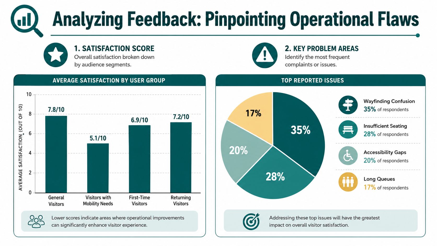
The right question isn't “What is our score?” It's “Whose journey breaks down, where, and under what conditions?”
Segment by journey, not just by respondent
Demographics can matter, but operational segmentation usually starts with the journey itself.
Useful cuts include:
- First-time versus returning visitors
- Assisted versus unassisted journeys
- Different entrances or concourses
- Peak-time versus quieter periods
- Visitors using accessible routes or facilities
- Tasks such as platform finding, clinic attendance, seat location, or exits
A complaint about poor wayfinding means little unless you can place it in a route, user type, and decision point. When teams skip that step, they often overcorrect with more signs in the wrong place.
National averages can conceal service inequality
The analysis of the UK's 2024 GP Patient Survey offers a strong lesson for venue managers. It found a 7% disparity in overall experience between the least deprived areas at 79% and the most deprived areas at 72%. Aggregated scores would miss that gap.
That matters beyond healthcare. A station, stadium or shopping centre often serves very different user groups across the same estate. If you only report one headline number, you can mask problems tied to access confidence, local familiarity, staffing pressure or route complexity.
A good analysis model doesn't ask whether the venue performed well overall. It asks where the experience becomes uneven.
Build a practical review model
A simple review rhythm works well for operations teams:
| Review layer | What to inspect | What to do next |
|---|---|---|
| Weekly | Repeated location-specific complaints | Check signage, route wording, staff instructions |
| Monthly | Patterns by route, entrance, or visitor type | Prioritise estates and service changes |
| Quarterly | Persistent barriers and unresolved effort points | Build capital or digital improvement case |
Open-text comments become more useful when you code them into a small number of operational categories such as route confusion, inaccessible entrance, poor toilet visibility, unclear platform transfer, or over-reliance on staff.
For teams in hospitality and food-led environments, this discipline mirrors how stronger operators move from comments to action. OrderOut's piece on data solutions for restaurants is a useful comparison because it shows how service data becomes operational decision-making when patterns are categorised rather than merely collected.
Connect survey feedback to operational evidence
Survey responses are strongest when checked against what staff already know.
Pair your satisfaction questionnaire with evidence such as:
- Help desk queries about directions or facilities
- Assistance requests on specific routes
- Repeated complaints tied to one entrance or level
- Observed stoppage points where visitors pause, turn back, or ask for help
Spatial views help here. Our work on 3D heat map analysis reflects the same operational logic. Once you can see where confusion clusters, it becomes easier to choose between content changes, staffing changes, physical alterations, or digital guidance updates.
Turning Survey Data into Wayfinding and Accessibility Wins
Survey data only matters if it changes the visitor journey. In practice, many venues stop one step too early. They identify wayfinding frustration, publish a report, add a few temporary signs, and move on. The same complaints then return in the next wave because the underlying route logic hasn't improved.
For wayfinding and accessibility, the operational choice usually comes down to three responses:
- Add more physical signage
- Add hardware-based navigation infrastructure
- Add a dynamic digital navigation layer
The first is familiar. The second can look attractive in procurement documents. The third is often the one that aligns with budget, maintenance and change.
Why static fixes often disappoint
More signs can help, but they don't solve every route problem. Sign clutter creates its own confusion. Signs also age badly in venues with phased refurbishments, temporary closures, service changes, retail churn, event layouts, or NHS estate pressures.
Hardware-based systems create a different burden. Beacons and similar infrastructure require install decisions, maintenance ownership, and a plan for what happens when layouts shift or devices fail. For NHS estates managers, transport operators and venue teams already under cost pressure, that recurring operational burden can kill momentum before the accessibility case is even fully heard.
What an actionable response looks like
A better response starts with the complaint pattern.
If the survey says visitors struggle to find the accessible entrance, don't just repaint one sign. Check whether the route description is intuitive, whether the entrance naming is consistent across channels, whether staff use the same terms, and whether a visitor can find their way independently.
If the survey shows repeated confusion at transitions, treat that as a route design problem. Entrances, lifts, gate lines, concourse splits, and platform interchanges need explicit guidance because that's where confidence collapses.
A practical action stack often looks like this:
Immediate fix
Correct naming, update maps, brief front-line staff, remove contradictory wording.Short-term improvement
Improve route instructions and destination labels across digital and physical touchpoints.Strategic change
Add a navigation layer that can adapt as the estate changes without new hardware every time.
Why infrastructure-free navigation changes the economics
A modern approach is key. Waymap provides dead reckoning using device-native sensors, delivering sub-3-metre accuracy in infrastructure-free environments without relying on GPS, Wi-Fi, or installed hardware. For venues with layout changes, constrained capital budgets, or high maintenance sensitivity, that changes the deployment discussion entirely.
Named deployments matter because they show the model works in real operational contexts. Waymap has been deployed in environments such as WMATA, Westfield London, SBS Transit, and the Royal Hospital for Children and Young People, where navigation has to work across varied routes, high footfall, and accessibility needs. Those are exactly the settings where a satisfaction survey often reveals that visitors are not failing to read signs. They are failing to trust the journey.
Our broader thinking on customer journey mapping aligns with this. The route itself is part of the service. If people can't get to the right place confidently, the service experience is already degraded before the appointment, purchase, seat entry or transfer begins.
Accessibility duties raise the bar
The Equality Act 2010, BS 8300, PAS 78, and BS EN 17210 all reinforce the same practical point. Accessibility isn't limited to the presence of features. It includes whether people can locate, understand and use the environment with dignity and independence.
That's why satisfaction survey findings about navigation and accessibility shouldn't be treated as soft complaints. They are evidence that a venue's built environment is harder to use than it should be. For public-facing organisations, that creates legal, reputational and operational pressure all at once.
If visitors need repeated staff rescue to complete a basic route, the environment is not functioning as intended.
The strongest operators act before dissatisfaction becomes normal. They use feedback to identify the route failures that signage alone can't solve, then choose tools that fit the realities of changing estates and finite budgets.
Frequently Asked Questions About Satisfaction Surveys
What is a satisfaction survey for a large venue
A satisfaction survey for a large venue is a structured way to capture how easily people can complete their visit, including navigation, accessibility, staff support, and overall confidence.
In practice, that means asking about specific tasks rather than general impressions. For a station, that could be finding a platform or step-free route. For a stadium, it might be locating the right entrance and seat. For a hospital, it often means reaching the correct department without stress or repeated staff intervention.
How many questions should a satisfaction survey include
For most venue use cases, a satisfaction survey should be short and tightly focused.
A short survey is more likely to be completed and more likely to reflect the actual visit rather than post-hoc frustration. The discipline is to ask only what will influence an operational decision. If a question won't change staffing, signage, route content, or service design, it probably doesn't belong.
What should a customer satisfaction survey ask about accessibility
A customer satisfaction survey should ask whether accessible routes and facilities were easy to locate, understand and use.
That means naming real visitor tasks. Ask about entrances, lifts, toilets, seating areas, route clarity, and whether the person could travel independently. Don't rely on a single question such as “Was the venue accessible?” because it compresses too many separate issues into one answer.
When should you send a visitor feedback survey
You should send a visitor feedback survey as close as possible to the relevant interaction or completed journey.
The closer the timing, the more accurate the memory of the route, barrier, or point of confusion. For complex venues, timing also helps distinguish a problem at the entrance from one at the transfer point or destination. That makes the result useful to operations rather than just informative to management.
How do you avoid bias in a satisfaction questionnaire
You avoid bias in a satisfaction questionnaire by using neutral wording, short completion time, and a sampling method that doesn't over-represent the loudest users.
The operational version of this is simple. Don't only survey complainants. Don't only survey loyalty app users. Don't only collect feedback from people who have spare time at the exit. Use multiple channels and make sure disabled visitors and first-time visitors are not excluded by the collection method itself.
What is the difference between a customer feedback survey and a satisfaction survey
A customer feedback survey is broader, while a satisfaction survey focuses more directly on perceived quality or ease of experience.
Both are useful, but they serve different decisions. If you want to understand brand perception, communication, or service preferences, a broader feedback survey may help. If you want to know whether people can find the right door, complete the route, and access the venue independently, a satisfaction survey with task-based questions is usually the stronger choice.
How do you turn survey responses into operational improvements
You turn survey responses into improvements by tagging issues by location, route, user type, and barrier, then assigning each pattern to a fix owner.
That owner might sit in estates, customer service, digital product, accessibility, or operations. The key is to avoid treating comments as isolated anecdotes. Once multiple responses point to the same entrance, platform transfer, toilet location, or inaccessible route, you have an operational issue that can be prioritised and tracked.
Should a satisfaction survey include open-text comments
Yes, but open-text comments should be optional and used to add context to structured answers.
A structured question tells you what category of problem occurred. The comment explains why it happened in the visitor's own words. Keep the field short and optional so it supports the survey rather than slowing it down.
How often should a venue review satisfaction survey results
A venue should review satisfaction survey results on a regular operational rhythm, not just in quarterly reporting cycles.
Weekly checks catch immediate friction. Monthly reviews help identify recurring route failures. Quarterly reviews are better for larger estate or procurement decisions. If teams only look at the data after a reporting deadline, they miss the chance to correct obvious visitor pain points quickly.
Can a satisfaction survey help with accessibility compliance
Yes, a satisfaction survey can help identify where the lived experience of accessibility falls short of policy or design intent.
It does not replace an accessibility audit or legal review, but it does show where real visitors lose confidence, require assistance, or fail to locate facilities independently. That evidence is often what pushes an organisation from passive compliance language to actual operational improvement.
If your survey keeps telling you something is wrong with navigation, but your team still can't see where to intervene, that's usually a sign the venue needs a more precise wayfinding layer, not another generic report. Waymap helps operators turn accessibility and wayfinding friction into clearer, updateable journeys across complex indoor, outdoor and underground environments, without the cost and maintenance burden of installed hardware.