
TransPennine Express Map Complete Guide for Passengers
You're on a platform concourse, the departure board is busy, and you need to get from one northern city to another without guessing which service serves your destination. That's where the TransPennine Express map earns its keep. It isn't just a picture of stations, it's a working guide to a cross-Pennine network that can be easier to use once you know how the diagram is built and why it looks the way it does.
For passengers, the main challenge is usually not finding the map, it's reading it correctly. TransPennine Express uses a topological Route Map under its national rail contract, so the layout prioritises connections and service relationships rather than perfect geography. If you understand that, the map stops feeling abstract and starts acting like a planning tool. For rail planners too, that distinction matters because route changes, stopping patterns and interchange logic all need to stay aligned across printed maps, station displays and digital channels. See how that logic extends into station navigation in Waymap's rail transport use cases.
Understanding the Evolution of the Network Map
The modern TransPennine Express map reflects a network that has changed shape more than once. The brand's modern franchise structure dates to 1 February 2004, after the franchise award announced in July 2003, then expanded in 2007 to include Manchester, Edinburgh Waverley and Glasgow Central routes, according to the historical record shared in the network timeline video source. That history matters because the map you see today grew out of service changes, so it is better read as a record of how the network works than as a static picture of where the railway lies.
Why the map is schematic rather than geographic
A schematic route map shows how services connect. In the TransPennine case, the operator's contract requires a map that covers all served stations plus key stations on other passenger routes in its area, and it may be topological, which means the layout can compress or reshape space to make connections clearer National Rail Contract. That choice suits a rail network that links city-regions, airport services and cross-country interchanges, because the main task is not to trace every curve of track but to show where one service joins another.
For passengers, that design can feel unfamiliar at first. A station may appear closer to a hub than it is in real space, or two places may seem evenly spaced even though the journey on the ground is not like that. The point is to show service logic, the same idea that underpins technology in mapping in Waymap's explanation of mapping technology, where the most helpful layout is the one that supports quick decisions rather than perfect geographic detail.
The Liverpool side of the network shows why this matters. The May 2018 timetable change redirected the Liverpool route so that all TransPennine Express services to and from Liverpool used the northern route network timeline. On the map, that should be read as a change in service geography, not just a line being moved on the page.
Practical rule: if a rail map feels “wrong”, check whether it is showing route logic rather than street-by-street geography.
That distinction also matters for accessibility. Different users read the same map in different ways, and a schematic design can help one person while confusing another if labels, spacing and connections are hard to scan. The best network maps make the service pattern visible without asking passengers to decode the whole railway at once.
How to Access and Download the Official Map
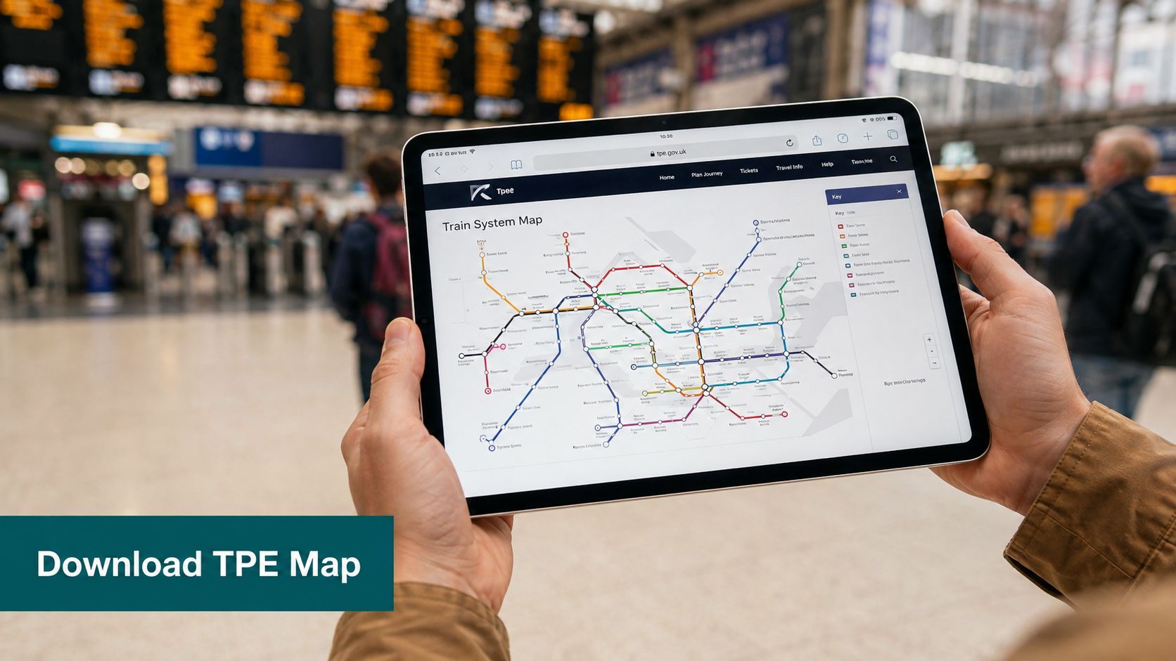
A passenger standing on a platform, trying to confirm whether the next service stops at the right interchange, needs the official TransPennine Express map rather than a reposted image with missing labels or cropped edges. The operator's maps page is the right place to start, because it gives you the current version in a format that fits the task, whether you want to print it, open it on a phone, or keep it for offline use. The route map is required to appear in passenger-carrying vehicles, at stations and on the website, so the official copy is the one to rely on.
How to use the map once you've opened it
Read the map like a service diagram, not like a street atlas. A map for rail passengers does not need to show every bend in the line to be useful, it needs to show where the service changes, where the interchanges sit, and how a journey is stitched together across the network.
Start with your origin and destination. Then look for the interchange points between them, because that is where the pattern of travel usually becomes clear. If a station seems closer or farther away than you expect, the map is usually showing how services connect, not exact ground distance.
A simple reading routine helps:
- Check your origin and destination first. Find the two ends of your trip before you worry about intermediate stops.
- Look for interchange hubs. Manchester, Leeds and York often matter more on the map than the shortest visual distance between places.
- Save a copy before you travel. A downloaded map is easier to use underground, in poor signal areas or when station Wi-Fi is weak.
- Print if you prefer paper. The route map is required on board and at stations, so paper copies remain a valid planning tool.
Accessibility matters here too. Different users scan the same schematic in different ways, and small labels, crowded junctions or unclear spacing can make a simple task harder than it should be. If you want a station-level aid alongside the network map, the Waymap app download page is a useful reference point for finding route-specific guidance while the operator map stays focused on the wider rail network.
Key Routes and Stations Explained
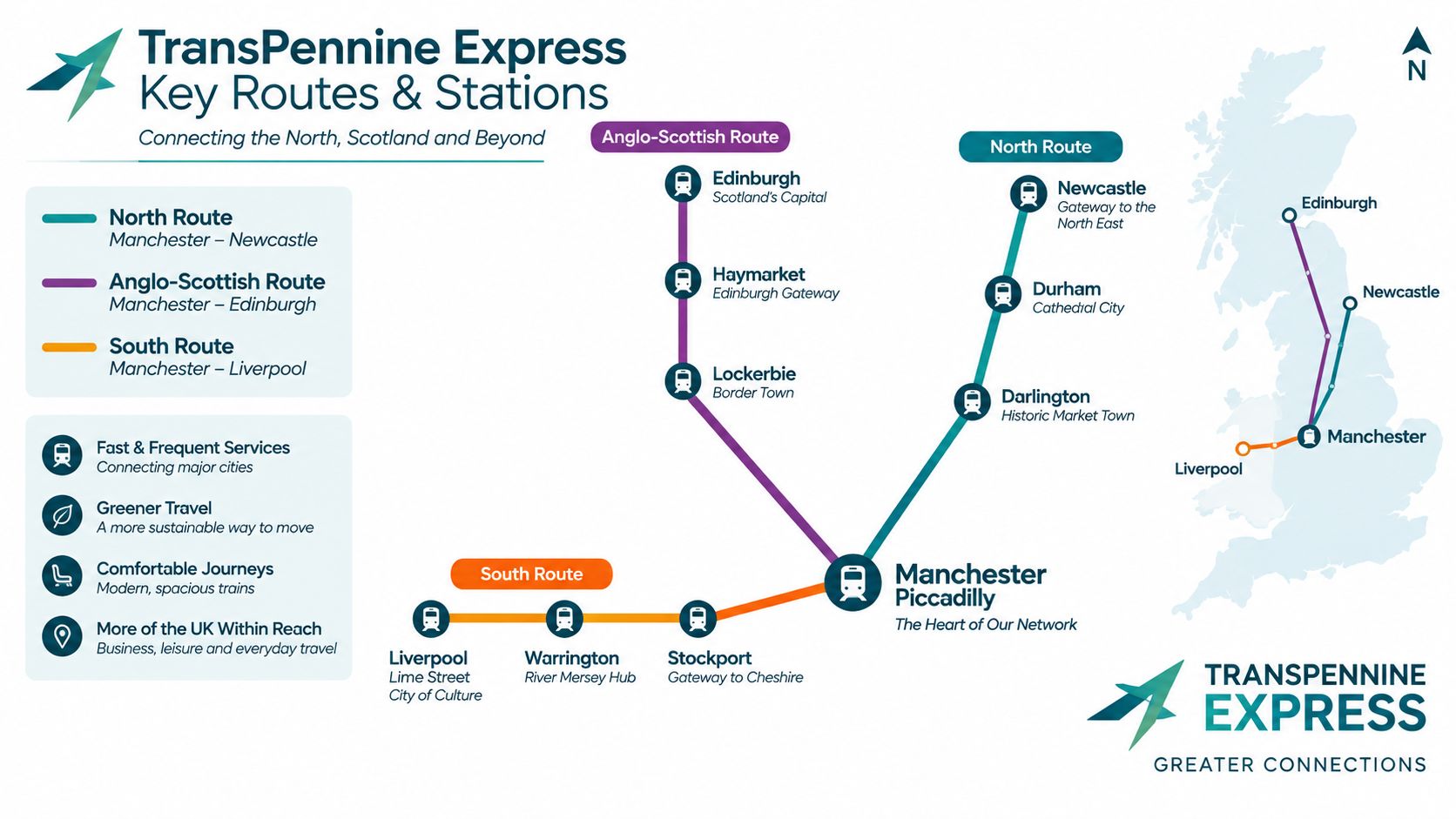
A TransPennine Express map works best when you read it as a set of linked route groups, not as one single line. The network structure is organised into three route groups, the North Route, the Anglo-Scottish Route and the South Route network structure. That layout helps passengers and planners see which corridors serve local interchange, which support longer cross-country trips, and which stations act as handoff points between service patterns.
The North Route
The North Route forms the core Manchester and Leeds corridor. On the map, it is the spine many travellers look at first, because it shows how the network links major northern centres before splitting into other service paths. If a journey continues beyond that central corridor, this route is usually the first piece to check.
For readers used to geographic maps, this can feel counterintuitive. A station may not sit where your eye expects it to, because the diagram is showing service relationships rather than exact ground distance. That is useful for planning, but it also means crowded labels and compressed junctions can make a busy corridor harder to scan for users with low vision or for anyone relying on a quick glance at a platform screen.
The Anglo-Scottish Route
The Anglo-Scottish Route uses the West Coast Main Line, so it is the clearest part of the map for journeys that extend northbound or southbound over a longer distance. It shows where the network steps beyond a regional corridor and into travel that connects northern English cities with Scotland network structure.
Passengers sometimes ask, “Which route group am I using?” The answer usually depends on whether the trip stays within the Manchester and Leeds core or moves onto the corridor that serves Scotland-bound travel. Once you identify that split, the rest of the map becomes easier to read, because the route group tells you what kind of service pattern to expect.
The South Route
The South Route includes the Hope Valley Line and the South Humberside Main Line network structure. Its role is different from the main Manchester-Leeds spine, because it serves a mix of smaller towns, industrial corridors and journeys that may connect into airport-related travel.
That makes it a route group worth checking carefully if your trip does not fit the obvious big-city pattern. Some passengers see a stop that looks close on the page and assume it is a short trip, but the map is often signalling how services connect rather than how far the stations sit apart in physical space. For accessibility, that distinction matters, because a clear route grouping can help users interpret where they are on the network even when labels are tight or visual spacing is uneven.
Interchange Points and Service Patterns
The map is only half the story. A passenger also needs to know where services are worth changing and where the network is trying to protect flow across a busy corridor. In 2022/23, TransPennine Express recorded 19.2 million passenger journeys, 79,143 planned services and 52.2% on-time performance ORR key statistics. Those figures help explain why interchange logic and reliability sit so close together on a rail map.
Why interchange hubs stand out
On a topological map, some places feel larger than their literal footprint because they function as decision points. A station that links several service patterns deserves more visual weight than a smaller stop that appears more central on a geographic map. That's one reason passengers often treat Manchester, Leeds, York, Newcastle and Sheffield as reference points when planning across the network.
The map also reflects service pattern structure rather than just station count. If a corridor has more frequent services, it usually becomes the backbone for changes of train. If a corridor is more limited or less punctual, passengers tend to plan around the bigger hubs instead of making fine-grained assumptions about every stop.
Planning habit: use the map to identify the change point, then check the timetable for the exact train you need.
For operators and planners, the lesson is simple. A map that looks neat but hides service fragility can mislead passengers. A map that shows the actual interchange logic helps people make fewer risky assumptions at the station.
Accessibility and Practical Navigation Tips
The hardest part of the TransPennine Express map for many users is legibility, not route coverage. Independent reviewers note that the map uses very small point sizes, tiny airport symbols and inconsistent station label sizing, which makes it difficult to read on paper and requires substantial zoom on screen map review. The same review also raises geography choices that can confuse users, which is exactly why passengers with low vision or unfamiliar with the network may need more than one navigation layer.
How to make the map easier to use
A few practical adjustments reduce friction right away:
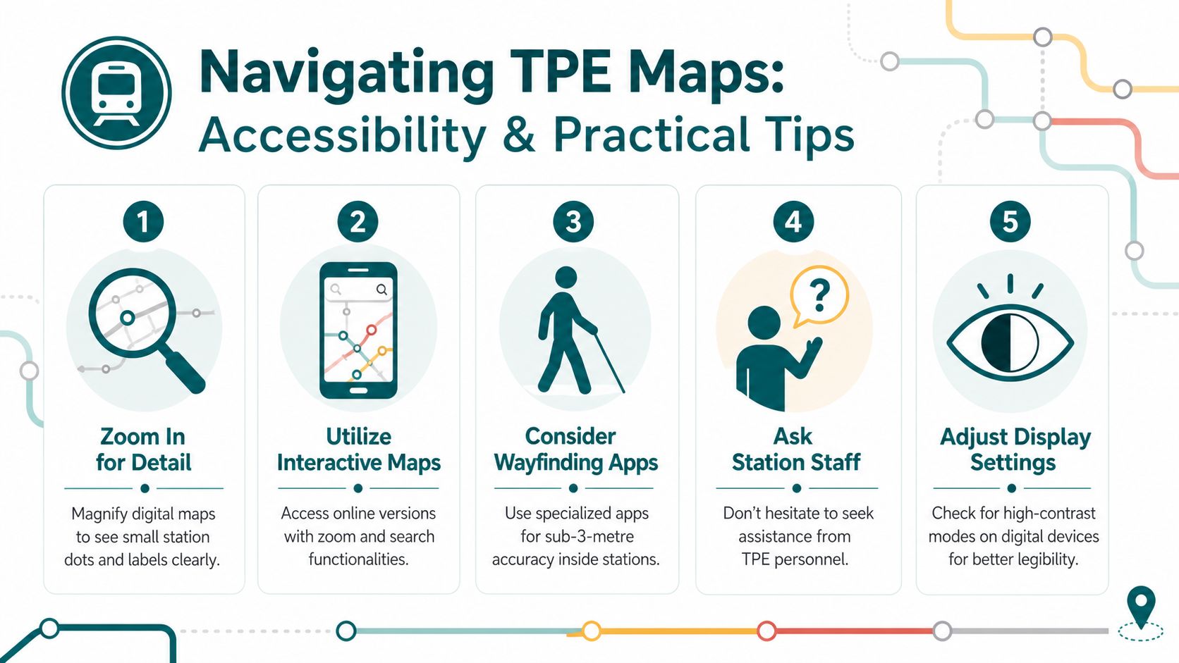
- Zoom aggressively on digital copies. Small station dots and labels need space to breathe.
- Use high-contrast display settings. Label differences become clearer when the background is less busy.
- Cross-check with station signage. The map tells you the route logic, but the station tells you the platform reality.
- Ask staff early. If the map feels ambiguous, getting help before boarding is faster than recovering from a missed train.
- Use accessible wayfinding where available. For some passengers, an indoor navigation app is a better fit than a static diagram.
Waymap's approach is relevant here because it supports station navigation with step-by-step audio guidance indoors, outdoors and underground, without relying on GPS, Wi-Fi or installed hardware. That matters for rail operators and venue managers who need more accessible wayfinding without creating extra maintenance burden. For a related overview of inclusive station design, see Waymap's work on technology for the visually impaired.
The wider regulatory context also matters. A route map that is technically available but hard to interpret doesn't fully serve passengers with different access needs. That is why usability should be treated as part of the map itself, not as an afterthought.
How Waymap Enhances Station and Platform Navigation
A static TransPennine Express map can tell you where the network goes, but it can't guide you through the station environment once you arrive. That gap is where indoor navigation becomes useful, especially for passengers who need platform-level confidence rather than just route-level reassurance. Waymap uses device sensors to provide turn-by-turn guidance without Wi-Fi, GPS or installed infrastructure, which suits busy stations where layouts change and staff can't carry the burden of physical hardware everywhere.
Why the map and navigation layer belong together
The point is not to replace the route map. The point is to connect it to the platform, concourse and exit you need. Waymap is built for exact indoor and underground guidance, so a passenger can move from station entrance to the right platform with less guesswork, then use the operator map to understand the wider journey pattern. That pairing is especially relevant where accessibility duties and day-to-day passenger flows meet.
For station teams, the operational issue is straightforward. Static signage and printed maps do one job, but they don't help users who need live, step-accurate wayfinding through gates, corridors and platform changes. For passengers, that means fewer points where a journey can fall apart because the network map was readable but the station environment wasn't.
Waymap's station floor plan guidance shows how indoor navigation can complement a broader rail map without asking passengers to interpret a second schematic under pressure. That's the useful model for complex hubs. Use the network map to understand the rail system, then use indoor guidance to reach the right place inside the station.
Conclusion and Next Steps
The TransPennine Express map is easier to read once you treat it as a topological network tool rather than a literal picture of distance. The route lines show how services connect, while the station names and interchange points show where decisions need to be made. That distinction matters for passengers who are trying to match a platform, a connection, or an accessible route with the wider rail pattern.
Accessibility is where many readers run into trouble. Small labels, dense symbols, and simplified junctions can all hide details that matter for low-vision users, first-time passengers, and anyone moving quickly through a busy station. The map can show the service pattern clearly, but it cannot always explain the walking route from entrance to platform, which is why planners and passengers need to read it alongside station-level guidance.
As noted earlier, the official version should be the one used for trip planning and station information. Printed copies, on-train displays, and website versions should stay aligned so passengers are not working from an outdated diagram. When a map is used this way, it becomes a shared reference point, one layer for the rail network and another for the physical station.
For passengers who need more than route-level clarity, an indoor navigation layer helps bridge the gap between the diagram and the platform. That is especially useful in large hubs, where a simple line on a map does not show stairs, barriers, or the quickest way through the concourse. The practical habit is straightforward, check the route map first, then use accessible navigation for the station itself.
If you want to make TransPennine Express journeys easier to follow inside the station as well as across the wider network, Waymap provides indoor, outdoor and underground navigation that complements route maps with step-by-step guidance. Visit the site to see how it supports exact wayfinding for stations, platforms and complex transport environments.
