
Theme Park Map Maker: Design Interactive Maps for 2026
If you're still relying on a printed park map, you already know the symptoms. Guests stop staff for directions to toilets that are marked but hard to find. A route that looked simple in the design file turns awkward when a path closes, an entrance changes, or a queue line spills into circulation space. Marketing wants the map to look beautiful. Operations needs it to stay accurate. Accessibility teams need it to work for people who can't use a visual map at all.
That tension is why a theme park map maker can't just be a design tool anymore. For a modern operator, it has to support live operations, inclusive navigation, and the legal duty to make reasonable adjustments under the Equality Act 2010. In practice, that means moving from artwork to structured wayfinding data, then turning that data into a digital asset that can change as fast as the park does.
By Tom Pey, Founder of Waymap and blind accessibility technologist.
From Souvenir to System The Evolution of Park Maps
A family unfolds a paper map at the entrance. One person rotates it to match the path ahead. Another tries to find the nearest toilet. Someone spots the ride they want, but not the accessible route to reach it. By the time they agree on where to go, they've already lost momentum.
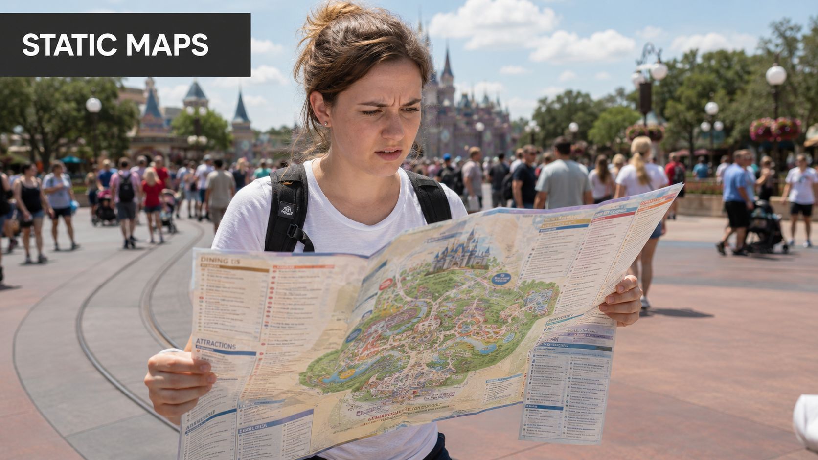
That scene isn't a failure of graphic design. It's the result of using a static object for a live environment. Theme parks change by the hour. Queues move, entrances switch, seasonal overlays appear, and service points matter just as much as headline attractions.
Park maps started as branded illustration
Theme-park mapping has deep roots in promotional art. Historical accounts of Disney maps note that early souvenir postcards and brochures featured park imagery by Peter Ellenshaw, and that Disney Imagineer Sam McKim later became the key creator of Disney's theme-park maps, marking the shift from illustration to a specialised orientation tool that included attractions, toilets, exits, and services, as documented by the ICA thematic map design archive.
That shift matters because it changed the role of the map maker. The job stopped being only about showing the park attractively. It became about helping people move through it reliably.
A useful operational lesson sits in the history of other parks too. Some large attractions were still late adopters of formal park mapping. A documented example is Hersheypark, which did not produce maps of the park until a third-party map was inserted into its rack brochure in 1972. That tells you how recent formal in-park navigation really is, and why many legacy map processes still feel like print publishing rather than wayfinding design.
The modern park map has to behave like a system
Today, guests expect more than orientation. They expect relevance. They want to know where they are, what route is open, which path is step-free, and how to get from a ride to food, an exit, or a quieter area without guesswork.
A park map now sits between visitor experience and venue operations. If it can't change with the site, it stops being a navigation tool and becomes a poster.
That's why the modern theme park map maker has to support structured points of interest, accessibility cues, transport links, service areas, and regular updates. It also has to connect with the wider shift in digital navigation across large venues. The same operational logic now applies in campuses, transport hubs, hospitals, and entertainment districts, which is why this broader technology in mapping perspective matters for park operators as well.
What operators need to change
The practical change is simple to state and harder to execute. Stop treating the map as a finished artwork. Start treating it as a maintained operational layer.
That means:
- Map more than rides: Include toilets, first aid, entrances, exits, retail, food, transport links, and service areas.
- Plan for updates: Assume closures, temporary restrictions, and seasonal changes are normal.
- Design for different users: Families, disabled visitors, international guests, and first-time visitors all need different kinds of support.
A good illustrated map can still play a role. It just can't carry the whole wayfinding burden on its own.
Why Your Static Map Is a Barrier to Growth and Compliance
A static map creates friction long before anyone complains about it. It slows decisions, creates dependency on staff, and leaves disabled visitors doing extra work just to understand whether a route is usable.
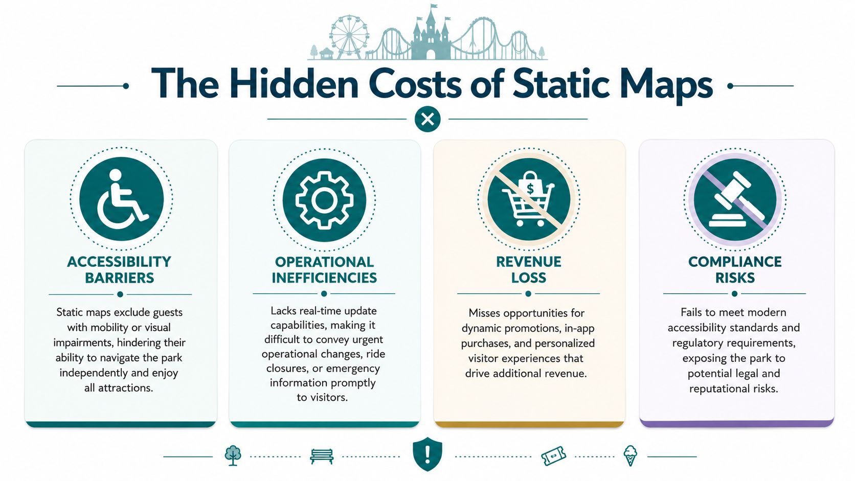
For UK operators, the problem isn't only operational. It's regulatory. The Equality Act 2010 requires service providers to make reasonable adjustments, and common theme park map content still tends to prioritise attractive layouts over whether disabled visitors can find their way independently, a gap highlighted in this accessibility-focused discussion of amusement park mapping.
Static maps fail differently for different guests
A printed map may work tolerably for a confident sighted visitor on a calm day. It often breaks down for everyone else.
Consider the main failure points:
- Blind and low-vision visitors: A visual map doesn't provide independent route guidance.
- Wheelchair users and others needing step-free travel: A stylised path network may not show gradients, barriers, or accessible route choices clearly enough.
- Visitors with anxiety or cognitive overload: Predictable, turn-by-turn journeys reduce uncertainty. A static overview does not.
- International visitors: Symbol-heavy design helps, but it doesn't solve navigation when live conditions change.
The issue isn't that paper maps are useless. It's that they're incomplete as an accessibility measure.
The hidden operating cost sits in maintenance
Most operators think about the cost of reprinting. The bigger cost is decision lag. Every time ride access changes, a route is closed, or a seasonal feature alters circulation, your map becomes less accurate than your park.
That creates a chain of avoidable problems:
| Operational issue | What a static map does | What the park then absorbs |
|---|---|---|
| Temporary closure | Shows outdated route or destination | Staff interruptions and guest frustration |
| Access restriction | Gives no live reroute | Manual intervention at the point of failure |
| Emergency change | Cannot update in place | Reliance on ad hoc verbal directions |
| Seasonal overlay | Forces workaround communication | Confusion between published and real conditions |
Practical rule: If your operations team changes the site faster than your map can change, your map is already underperforming.
A static map also limits commercial agility. You can't easily surface relevant food, retail, or service information based on location and route context. Beyond that, you can't present those options in a way that remains useful when paths, entrances, or crowd conditions shift.
Compliance needs usable navigation, not just a map file
Accessibility compliance isn't satisfied by publishing a PDF and assuming the duty is done. The real question is whether a disabled visitor can complete common journeys with reasonable independence.
That's where many parks run into trouble. They've documented facilities, but not usable routes. They've marked accessible toilets, but not shown how someone reaches them from where they are. They've produced a map, but not a navigation experience.
For operators reviewing policy and estate obligations, this broader building code compliance guidance is useful because it frames accessibility as an operational design issue rather than a signage afterthought.
The growth point is straightforward. A map that supports more guests independently reduces reliance on staff direction, copes better with live change, and gives you a stronger basis for demonstrating reasonable adjustments in practice.
How to Plan Your Digital Map Project
Most digital map projects go wrong before any design work starts. The failure usually isn't the software. It's the data model.
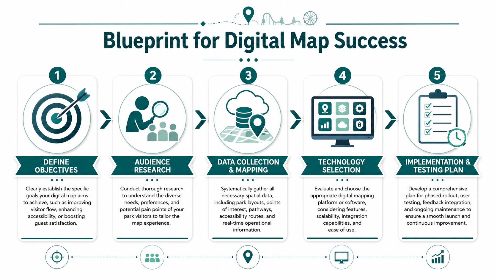
If your team starts by discussing icons, colours, or app screens, stop and go backwards. The stronger starting point is the survey-to-symbolisation pipeline described by Mappedin for venue mapping: gather authoritative base geometry, normalise points of interest into a geodatabase, separate circulation, attractions, services, and safety assets into distinct layers, then style the output, as outlined in Mappedin's theme park mapping workflow.
Start with authoritative geometry
Use the most reliable source you have for the physical estate. That usually means site plans, CAD files, or formally maintained base layouts. Then verify them against how the park operates in practice, not just how it was designed.
Many projects underestimate complexity. A route that exists on a plan may not function as a route once queue rails, seasonal kiosks, or access controls are in place.
A planning stack should include:
- Base layout files: Site plans, floor plans, outdoor path geometry, transport interchange points.
- Circulation checks: Guest pathways, staff-only areas, bottlenecks, crossing points, lifts, ramps, and entrances.
- Service mapping: Toilets, first aid, guest services, food, retail, lockers, exits, and waiting areas.
- Safety assets: Emergency routes, muster points, restricted zones, and temporary closure processes.
Build the POI schema before the interface
Each point of interest needs to exist as a structured record, not a label on a drawing. Name, category, accessibility attributes, route eligibility, opening state, and multilingual fields should all be considered early.
Here's a simple approach:
- Audit every visitor-facing point. Don't limit this to attractions.
- Standardise naming. “Main Entrance” and “Front Gate” shouldn't coexist unless they mean different things.
- Separate permanent from temporary data. A toilet block is permanent. A Halloween maze entrance may not be.
- Assign ownership. Someone must be responsible for keeping each layer current.
That sequence matters more than visual polish. If your underlying data is messy, every downstream output inherits the problem.
Later in the project, teams often need to connect mapping with a wider mobile product roadmap. If you're thinking beyond navigation into app delivery, monetisation, or phased rollout, this 2026 app playbook is a useful companion because it frames the product and business decisions around implementation, not just interface ideas.
Put the right people in the room early
Mapping projects fail when they sit only with design or only with IT. Parks need a cross-functional owner group.
A practical working group usually includes:
- Operations: Because they know what changes daily.
- Accessibility leads: Because route usability isn't the same as route existence.
- Marketing and brand teams: Because the map still needs to look like your park.
- Digital product or IT: Because data governance and integrations matter.
- Guest services: Because they hear where visitors get lost.
Before design reviews begin, many teams benefit from understanding how venue geometry becomes a usable navigation layer inside dedicated floor mapping software.
Place the visual interface later in the process. That doesn't make design less important. It makes it more reliable.
Later, when you move into implementation detail, this walkthrough is a useful reference point:
Which Theme Park Map Maker Platform Is Right for You
Not every theme park map maker solves the same problem. Some tools create attractive illustrations. Some create interactive web maps. Some support navigation as a live operational service.
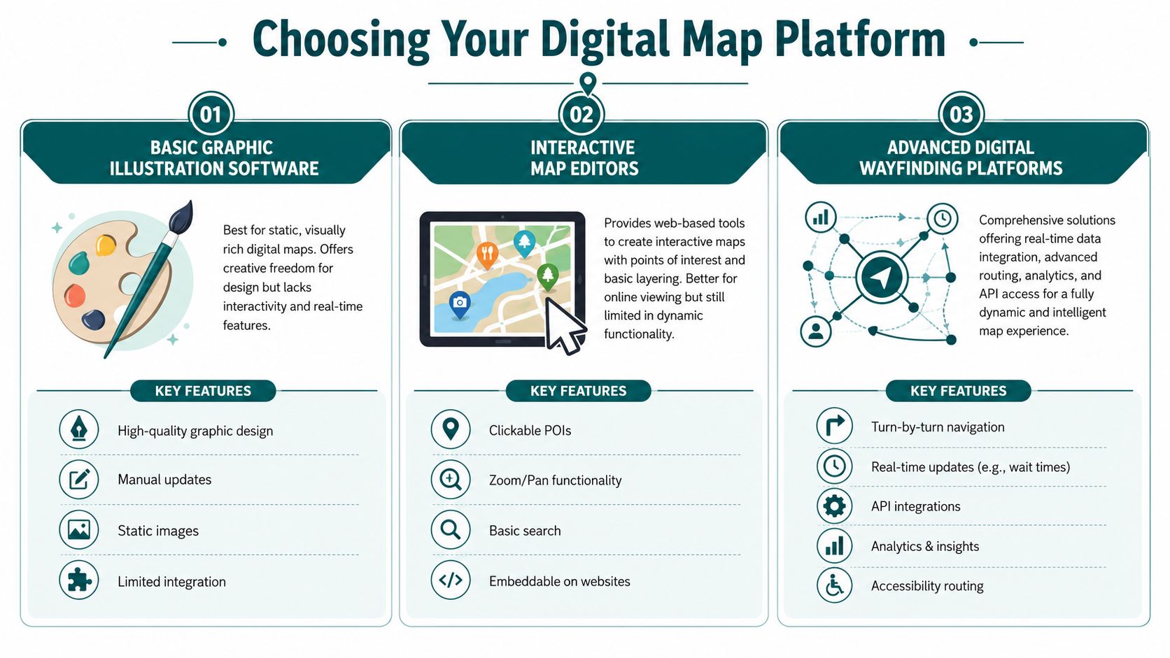
The wrong choice usually comes from evaluating software by what it draws, not by what it has to maintain. For a park environment with closures, overlays, and changing access conditions, the core question is whether the platform supports a live navigation layer. That gap is often missing from generic map-maker content, even though operationally a polished static map can be less useful than one that updates quickly for closures or emergencies, as noted in this discussion of dynamic venue mapping needs.
Three platform categories to compare
| Platform type | Works well for | Breaks down when |
|---|---|---|
| Graphic illustration software | Branded print maps and promotional visuals | You need live updates, routing, or accessibility logic |
| Interactive map editors | Basic online exploration with clickable POIs | The site changes often or requires route-aware guidance |
| Digital wayfinding platforms | Navigation, dynamic updates, accessibility routing, operational control | Your data governance is weak or ownership is unclear |
Graphic tools are still useful. They're often the right choice for brochure art, seasonal visitor guides, and campaign assets. The trouble starts when operators expect them to perform as navigation systems.
Interactive editors are a step forward. They support zoom, search, and clickable points. But they often remain display tools rather than route engines.
What to test before you buy
Ask every vendor the same operational questions:
- How are closures handled? Can a route be withdrawn or changed quickly?
- What supports accessibility routing? Can the platform distinguish verified step-free routes from general circulation?
- What infrastructure is required? Beacons, Wi-Fi dependencies, GPS assumptions, or none.
- Who maintains the data? Your team, the vendor, or both.
- How does it perform in low-signal areas? Indoor zones, tunnels, covered queues, and complex mixed environments matter.
Don't buy a map platform on demo-day appearance alone. Buy it on how calmly it handles a bad operating day.
One category worth separating out is infrastructure-free navigation. Waymap uses dead reckoning through smartphone native sensors to provide sub-3-metre accuracy in environments without GPS, Wi-Fi, or installed hardware, which changes the maintenance equation for venues that don't want the capital and operational burden of beacon estates. For dynamic sites, it's also relevant that this approach can support indoor, outdoor, and underground navigation within the same venue context. If you're comparing architectures, this broader guide to indoor navigation technology comparison helps frame the trade-offs.
Match the platform to your real burden
If your park changes frequently, hardware-heavy systems can create their own maintenance problem. If your layout is relatively stable and the goal is online browsing only, a lighter tool may be enough.
The decision is less about feature lists than about fit:
- Choose illustration software when your deliverable is mainly visual.
- Choose an interactive editor when users need exploration, not guided navigation.
- Choose a navigation platform when accuracy, accessibility, and live operations matter together.
That's the point where “map maker” stops being a creative brief and becomes an estate capability.
How to Design for True Navigational Accessibility
Accessible mapping starts with a simple test. Can a disabled visitor complete a common journey independently, confidently, and without needing to improvise?
If the answer is no, the map isn't accessible enough. It may still be attractive. It may even be informative. But that's not the same thing.
The strongest production method available here is an iterative design-thinking loop. A peer-reviewed theme-park app study used a sequence of benchmarking existing apps, interviewing domain experts, building a prototype from those findings, and then testing usability against predefined tasks, as described in the PMC study on theme park app development and usability. That process matters because it keeps the focus on navigation success, not visual completeness.
Start with journeys, not icons
Operators often begin accessibility work by adding symbols. That's too late in the process. The right starting point is the set of journeys people must make.
For a park, that usually includes:
- Entrance to first attraction
- Attraction to nearest toilet
- Attraction to food or seating
- Any location to guest services
- Any location to exit or transport connection
Map each journey for different users. A route that works for a sighted adult with no mobility requirement may fail completely for someone using a wheelchair, a cane, or audio guidance.
Define what accessible means on your site
“Accessible route” shouldn't be a loose label. It should be a verified route type with clear operational criteria.
That normally requires checking:
| Accessibility element | What to verify on the ground |
|---|---|
| Step-free path | No stairs or barriers along the route |
| Surface usability | Route remains practical in all expected conditions |
| Entry and exit points | Doorways, gates, and queue entrances are navigable |
| Decision points | Turns and forks are clear enough for independent travel |
| Alternative routing | A valid option exists when the preferred path is blocked |
Standards thinking matters. In UK built-environment work, BS 8300 and PAS 78 are useful anchors because they push teams to think in terms of practical usability and inclusive access, not only minimum provision. The park map should reflect how accessible movement works, not how it appears on a planning drawing.
Audio guidance changes the design brief
Once you design for blind and low-vision visitors, the map stops being only visual. It becomes a route instruction system.
That changes what matters:
- Landmarks need naming discipline: “Turn left at shop” is only useful if the shop name is stable and recognisable.
- Decision points need precision: Audio guidance has to distinguish closely spaced forks, entrances, and crossings.
- Route states must be current: A blocked path isn't a minor data issue when someone is navigating non-visually.
- Low-signal performance matters: Covered areas, indoor zones, and transport-linked spaces can't depend on perfect connectivity.
Accessibility-first mapping often improves navigation for everyone else, because the route data has to become clearer, more precise, and more consistently maintained.
A useful reference for teams formalising this work is Waymap's guidance on inclusive design principles, especially where digital navigation has to support mixed user needs in real venues.
Prototype with the people you need to serve
Usability testing shouldn't be a final polish stage. It should be where assumptions fail early.
A practical testing programme for park navigation should include people with different mobility, sensory, and confidence profiles. Don't only ask whether the interface is clear. Ask whether they can complete the route.
Good prototype tasks include:
- Find a specific ride from the entrance.
- Go from a ride to the nearest accessible toilet.
- Reroute to an exit after a path is marked unavailable.
- Reach guest services without staff intervention.
- Follow the route in a busy or noisy part of the park.
The test result you want isn't “users liked it”. It's “users got there”.
That distinction matters in complex public venues. At the Royal Hospital for Children and Young People, the core navigational challenge is not visual elegance. It is helping people move independently through a high-stress environment with different mobility and sensory needs. Theme parks are different settings, but the usability principle is the same. If navigation has to work when people are distracted, uncertain, or overloaded, accessibility can't be layered on afterwards.
What operators should insist on before launch
Before approving any digital park map for production, insist on these conditions:
- Verified route categories: Not generic accessibility labels.
- Task-based usability evidence: The map has been tested on real journeys.
- Clear update ownership: Someone can change routes and POIs when operations change.
- Multilingual logic where needed: Especially for transport links, guest services, and safety-critical destinations.
- Fallback behaviour: If a route becomes unavailable, the system needs a practical alternative.
That's what true navigational accessibility looks like. It isn't decorative inclusion. It's independent movement.
Frequently Asked Questions About Digital Park Maps
What is a theme park map maker
A theme park map maker is the process or platform used to create and maintain maps for guest orientation and navigation in a park. In practice, that can range from illustration software for print artwork to a digital wayfinding system that manages structured points of interest, route logic, accessibility information, and operational updates.
For operators, the important distinction is whether the tool produces a static map or supports a maintained navigation layer. If your park changes often, that distinction matters more than the visual style.
Can a digital park map replace printed maps completely
Not always. Many parks still need printed maps for souvenir value, quick orientation, or visitors who prefer a paper handout.
What changes is the role of print. Print can remain a useful overview, while digital handles live accuracy, accessibility routing, and operational updates. The two formats work best when print stops pretending to do the job of a navigation system.
Does a digital map help with Equality Act 2010 duties
Yes, it can help if it improves independent access and supports reasonable adjustments in practice. A digital map on its own does not prove compliance, but it can form part of a stronger accessibility approach when it provides usable route information, step-free options, and navigation support that a static map often cannot.
The key question is functional. Can disabled visitors use it to complete common journeys with reasonable independence?
What data do we need before starting a digital mapping project
You need reliable base geometry, a full audit of visitor-facing points of interest, and clear route information. You also need a structured schema for accessibility attributes, services, circulation, and any temporary or seasonal changes that affect movement.
If those foundations are weak, the interface will inherit the problem. Clean data beats polished design every time.
What should we look for in a theme park map platform
Look for maintainability, accessibility support, and operational fit. The right platform should let your team update closures, route changes, and points of interest without rebuilding the map every time something changes.
It should also reflect how your park operates. A good buying process tests route handling, ownership model, infrastructure requirements, and low-signal performance before aesthetics.
How do we test whether our park map is actually usable
Test it against real journeys, not internal opinions. Ask representative users to complete tasks such as entrance-to-ride, ride-to-toilet, and ride-to-exit, then watch where they hesitate, reroute, or need help.
Usability testing is particularly important for disabled visitors and first-time guests. If they can't complete the route independently, the map needs more work.
Do theme parks need accessibility-first routing or just accessibility information
They need routing. Accessibility information is useful, but it doesn't tell someone how to move through the park from where they are now.
A toilet marked as accessible still isn't usable if the route to reach it is unclear, blocked, or not step-free. Operators should think in terms of accessible journeys, not accessible icons.
Is hardware-free navigation relevant for theme parks
Yes, especially for parks with frequent layout changes or mixed indoor and outdoor spaces. Hardware-free navigation removes the burden of installing and maintaining physical devices across a dynamic estate.
That matters operationally because every additional hardware layer creates another maintenance dependency. For many venues, simpler infrastructure means fewer points of failure.
If your park needs to move from a static visitor map to a live, accessible navigation layer, Waymap can help you assess the route data, accessibility requirements, and operational model needed to make that transition realistically.