
When do colorful QR codes become an operational risk?

Colorful QR codes can align your branding with digital touchpoints, but getting them right is more complex than it appears. A reliably scannable code depends on one critical factor: high contrast between the dark data modules and the light background. Nearly every scan failure we see in venues stems from a misunderstanding of this single requirement.
Why most colorful QR codes fail in public venues
Standard black-and-white QR codes are functional, but they can clash with a carefully designed brand aesthetic. This leads many venue managers and marketing teams to create colorful versions for signage, packaging, or digital displays. The problem is that most of these custom-designed codes are unreliable in the real world.
A QR code scanner does not see color; it is a monochromatic reader that only understands contrast. The scanner's function is to differentiate between the dark data modules and the light background spaces. If that contrast ratio is too low, the scanner perceives a blur, and the scan fails.
How low contrast creates operational liabilities
We have seen many color combinations that, from an operational perspective, are significant liabilities. A few common pairings that are almost guaranteed to cause scan failures include:
- Red on Green: While festive, these colors often share a similar tonal value, making them nearly impossible for a scanner to distinguish.
- Blue on Black: This combination lacks sufficient brightness difference for a scanner to define the code’s edges clearly.
- Pastels on White: Light-colored modules on an already light background create an extremely low-contrast situation that scanners cannot process.
For any venue using QR codes for essential functions—like processing payments, accessing a digital menu, or initiating a wayfinding journey—this is not just a minor design issue. A failed scan represents a broken touchpoint and a genuine operational risk. You can read more on ensuring your digital systems are dependable in our article on the benefits of infrastructure-free solutions.
A single failed scan might seem trivial, but a pattern of unreliability undermines visitor confidence and accessibility. When a QR code is the gateway to a critical service, its failure erodes trust in the entire system, turning a tool meant to help into a point of frustration.
Ultimately, this undermines the reason for using the QR code. Instead of providing instant access, it becomes a barrier, especially for visitors who rely on these tools for navigation or information. The issue is not the use of color itself, but the failure to prioritize contrast above all else.
How to design QR codes for reliable scanning
Moving beyond the vague advice to “use high contrast,” the standard for what makes a colorful QR code work every time comes from digital accessibility, specifically the Web Content Accessibility Guidelines (WCAG).
This is not about compliance for its own sake. For a QR code to be reliable for everyone—including people with low vision—it must meet a specific technical benchmark. We insist on a minimum contrast ratio of 4.5:1 between the dark data modules and the light background. This should be treated as a strict rule, not a suggestion. It is the only way to ensure that both phone cameras and the human eye can instantly distinguish the pattern. Adhering to this allows you to write clear design briefs and know precisely what to look for when reviewing others' work.
The non-negotiable rules of color and structure
Beyond the core ratio, two other rules are essential for creating dependable colorful QR codes.
First, the "quiet zone" — the blank border framing the code — must be a light, solid color. Scanners use this space for orientation, and a dark or patterned quiet zone will almost certainly cause the scan to fail. This is a simple but common mistake.
Second, you must never invert the colors. A light-colored code on a dark background might look striking, but it is a recipe for failure. QR code readers are engineered to find dark modules on a light field. Reversing that convention breaks their fundamental logic, rendering the code useless for most devices.
This infographic shows precisely what happens when contrast is correct—and what happens when it is not.

As you can see, high contrast is the foundation of a successful scan. Anything less introduces a serious risk of user frustration and operational disruption.
Quick reference for QR code color contrast
To remove the guesswork, here is a quick reference table. Use this guide to select scannable foreground and background color combinations. 'Safe' pairings typically meet or exceed the recommended 4.5:1 contrast ratio.
Foreground Colour (Dark)Background Colour (Light)Scan ReliabilityNoteBlack, Dark GreyWhite, Off-White, Pale YellowExcellentThe safest and most reliable combination available.Navy Blue, Forest GreenWhite, Light Grey, CreamGoodStrong contrast that performs well in most lighting conditions.Deep Purple, BurgundyLight Beige, Pale PinkGoodOffers good scannability while adding a touch of brand colour.Bright Yellow, Light BlueDark Grey, BlackFAILInverted colours. This will not scan reliably on most devices.Mid-Tone GreenMid-Tone RedFAILColours lack sufficient contrast and may be hard for some users to see.Dark GreyDark BlueFAILBoth colours are too dark, resulting in very low contrast.
Sticking to the "Good" and "Excellent" pairings is the simplest way to ensure your QR codes perform flawlessly.
While detailed UK-specific data on colorful QR code adoption is not readily available, the physics of scanning and the principles of digital accessibility are global constants. A code that fails to meet contrast standards will fail regardless of its geographic location. Explore more global trends with these QR code statistics from ElectroIQ.
These rules are not intended to stifle creativity. They exist to ensure your digital touchpoints are robust, accessible, and functional for every person, every time. Mastering contrast ensures your brand’s aesthetic supports the user experience, rather than obstructing it.
Why high error correction is a strategic necessity
When you add creative elements like logos or brand colors to a QR code, you introduce a higher risk of scan failure. This is where error correction becomes your most important strategic advantage. It is a built-in redundancy feature that allows a QR code to be read perfectly even when partially damaged, obscured, or printed on a crumpled surface.
This is a choice made when generating the code. There are four levels, each capable of restoring a different amount of missing data:
- Level L (Low): Recovers up to 7% of data.
- Level M (Medium): Recovers up to 15% of data.
- Level Q (Quartile): Recovers up to 25% of data.
- Level H (High): Recovers up to 30% of data.
A lower setting creates a visually simpler code but leaves almost no margin for error. For any QR code intended for public display in a busy environment, this is an unacceptable risk.
Why 'Level H' is the only professional choice
For any branded, customized, or colorful QR code deployed in a public venue, Level H is the only acceptable choice. This is non-negotiable.
Setting the error correction to 'High' provides the resilience needed to embed a logo or to withstand the inevitable wear and tear of a high-traffic environment like a train station or a hospital. For example, Waymap’s audio navigation for Washington D.C.’s Metro is engineered for resilience, guiding people even in areas with poor signal. Your QR codes require the same robust design philosophy. A scratched sticker or a worn sign should not become a dead end for a visitor.
This is not just a technical detail; it's a decision about operational resilience. Choosing high error correction builds fault tolerance directly into your visitor experience, preventing a critical information link from failing when it's needed most.
By always selecting the highest level of error correction, you are not just making a technical choice; you are strategically planning for real-world conditions. You are ensuring your digital touchpoints remain dependable for every person, every time.
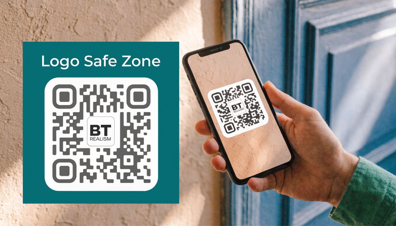
How to add branding without breaking function
Placing your logo on a colorful QR code can make it instantly recognizable, but the process requires precision. An incorrect application will result in a code that does not scan.
Success begins before you consider your logo. You must generate the QR code with the highest error correction setting, Level ‘H’. This creates enough data redundancy to withstand the interference that your logo will introduce.
What are the rules for logo placement and size?
Once you have your high-resilience QR code, the logo’s position is fixed: it must go in the center. The center is the most forgiving part of the code, where error correction is most effective.
Crucially, your logo must not cover any of the three large squares in the corners. These are the finder patterns, which a phone’s camera uses for orientation. Obscuring them will cause the scan to fail every time.
Your logo should never occupy more than 15-20% of the total QR code area. This rule keeps the obstruction well within the 30% data correction buffer that the Level ‘H’ setting provides. Exceeding this limit is the most common reason we see branded QR codes fail in real-world use.
A professional technique is to add a thin, high-contrast border around the logo itself. This creates a clean separation, helping the scanner’s camera clearly distinguish between your branding and the code’s data points and preventing them from blurring into an unreadable image.
The goal is to balance brand aesthetics with technical function. It is possible to have a code that is both visually appealing and completely reliable for your visitors.
While these technical principles are universal, it is interesting to note a lack of UK-specific research on usage patterns for colorful QR codes, despite available data from global and North American sources. You can explore some of the wider trends from these QR code statistics from Wave.
A well-made branded QR code is more than a marketing element; it is a functional key to digital services, including essential tools like accessible navigation. If you would like to read more on that subject, we have an article on technology for the visually impaired.
What is a realistic testing protocol before deployment?
A common scenario we encounter is a colorful QR code that looks and scans perfectly on a designer’s high-resolution monitor, but fails completely when printed on a sign in a dimly lit corridor. This is why a robust testing protocol is not just recommended—it is the final, essential quality check that prevents a system-wide failure from eroding public trust and blocking access.
You must test the code in its final form, exactly as visitors will encounter it. Whether it is printed on vinyl, etched into metal, or displayed on a digital screen, it needs to be tested under real-world conditions: in bright sunlight, in evening low-light, from various angles, and from multiple distances. A code that only works when a phone is held perfectly still, 15 centimeters away, is not fit for purpose.

Why must testing include diverse devices and file formats?
Your testing must cover a wide spectrum of devices, not just the latest flagship smartphone. It is crucial to include older Android models, budget phones, and devices with known camera limitations. This ensures your QR code works for everyone, not just those with high-end technology.
The file format you choose is also a critical part of this process.
- For print: Always use SVG (Scalable Vector Graphics). SVGs maintain sharpness regardless of scale, from a small sticker on a ticket machine to a large banner in a concourse.
- For digital screens: Use PNG (Portable Network Graphics). They are optimized for a crisp, clean display on monitors and phone screens.
This rigorous, real-world testing is not an optional extra. It is the most critical part of the process, determining if your design choices—from color contrast to error correction—hold up under pressure. It is the difference between a reliable digital tool and an operational headache.
While guidance is available, such as this report from Impact Canada on design performance, what truly matters is applying these principles in your specific environment.
This level of effort ensures that when a visitor needs to access information or find their way, the link simply works. This becomes even more vital when these codes are a gateway to accessibility tools, a topic we address in our guide on Braille and QR codes for accessibility.
Frequently Asked Questions About Colorful QR Codes
Here are direct answers to the questions we hear most often from facility directors and operations leads.
Is it acceptable to use a light-colored QR code on a dark background?
No, you should never use light-colored modules on a dark background. QR code scanners are programmed to detect a specific pattern: dark modules on a light field. Inverting this color scheme will cause the code to be unreadable by the majority of scanning devices, leading to widespread scan failures.
What are the safest color combinations for a scannable QR code?
The most reliable combination is black on white, as it provides the maximum possible contrast. If you must use brand colors, pair a very dark foreground color (e.g., navy blue, forest green, dark charcoal) with a very light, non-patterned background (e.g., off-white, pale cream). The goal is to achieve a minimum contrast ratio of 4.5:1, which can be verified with a free online contrast checker before production.
What is the maximum size for a logo embedded in a QR code?
The logo should not exceed 15-20% of the QR code's total surface area. This is only safe if you have set the error correction to its highest level, 'H', which allows the code to function even if up to 30% of its data is obscured. This provides the necessary margin to accommodate the central logo without compromising scan reliability.